This content originally appeared on DEV Community and was authored by LIN Chen
The new version of Flutter visualization library Graphic optimized its declarative specification grammar, so that it can better represent the nature of the Grammar of Graphics.
In this article, we vary a specification several times, thus transform a bar chart to a pie chart. This work displays the flexibility and diversity of the Grammar of Graphics, and also shows beginners the basic concepts of the Grammar of Graphics.
If you have never learned the Grammar of Graphics before, there is no problem to read this article. It is also a starting handbook of Graphic.
Bar charts and pie charts are both very common in data visualization. They look quite different at first sight, but they have the same nature. Why? Let's transform a bar chart to a pie chart step by step, to look into the intrinsic reasons.
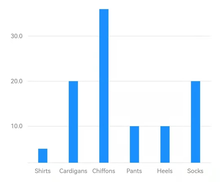
Let's start with a simple bar chart. The data is the same as the starting example of ECharts:
const data = [
  {'category': 'Shirts', 'sales': 5},
  {'category': 'Cardigans', 'sales': 20},
  {'category': 'Chiffons', 'sales': 36},
  {'category': 'Pants', 'sales': 10},
  {'category': 'Heels', 'sales': 10},
  {'category': 'Socks', 'sales': 20},
];
Declarative Specification
Graphic adopts a declarative specification. All grammars of visualization is specified in the constructor of the Chart widget:
Chart(
  data: data,
  variables: {
    'category': Variable(
      accessor: (Map map) => map['category'] as String,
    ),
    'sales': Variable(
      accessor: (Map map) => map['sales'] as num,
    ),
  },
  elements: [IntervalElement()],
  axes: [
    Defaults.horizontalAxis,
    Defaults.verticalAxis,
  ],
)
Data and Variable
The data of a chart is imported by the data property. It can be a List of any type. Inside the chart, the data items are converted to uniform Tuple objects. How Tuple fields are extracted from data items is defined by Variables.
We can see from the example code that the grammar of the specification is concise, yet the variables definition takes half the length. Since Dart is a strict typed language, in order to allow any input datum type, detailed Variable definitions are quite necessary.
Geometry Element
The greatest idea of the Grammar of Graphics is distinguishing the difference between abstract graph and perceivable graphic.
For instance, whether a datum is an interval of values or a point of a value, is called the graph; whether the item on canvas is a bar or a triangle, the width, and the height, is called the graphic. The steps to create a graph and a graphic are called geometry and aesthetic, respectively.
The concepts of graph and graphic reach the intrinsic relationship between data and graphics. They are the key for the Grammar of Graphics to get free from the constraints of chart typologies.
The GeomElement is where these two concepts are defined. Its types determine the graph type, and they are:
- PointElement: points.
- LineElement: a line connecting points.
- AreaElement: an area between lines.
- IntervalElement: intervals between two points.
- PolygonElement: polygons partitioning a plane.
The height of a bar in the chart represents the interval between 0 and the datum value, so we choose IntervalElement. Thus we get a very common bar chart:
Let's get back to the beginning quest. The angles in a pie chart also display intervals, so we should also choose the IntervalElement. But why a bar chart renders rectangles, while a pie chart renders sectors?
Coordinate
A coordinate assigns variables into different dimensions in the plane. For rectangle coordinates (RectCoord), the dimensions are horizontal and vertical; and for polar coordinates (PolarCoord), dimensions are angle and radius.
The example above doesn't indicate the coord property, so a default rectangle coordinate is set. Since the pie chart display intervals with angles, it should be a polar coordinate. We add a definition to indicate that:
coord: PolarCoord()
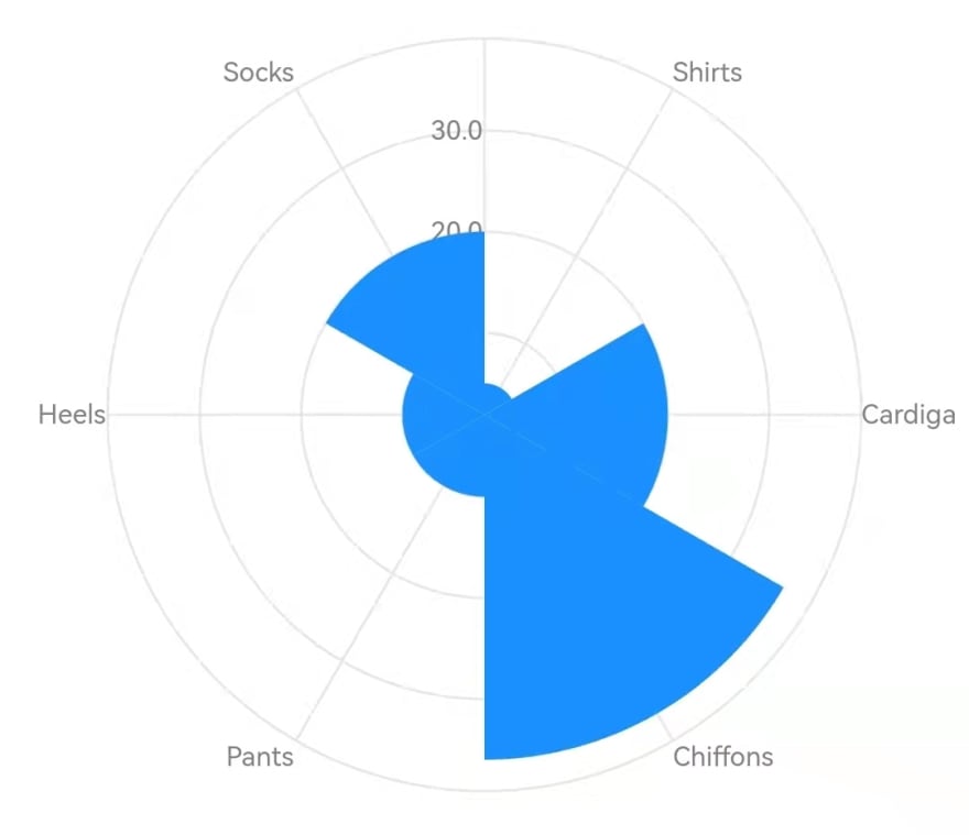
Then the chart becomes a rose chart:
This seems getting close to a pie chart. But the graphics looks imperfect. It needs some fixing.
Scale
The first problem is, the proportions of the sector radiuses seem not equal to the proportions of the salse values.
This problem revolves an important concept of the Grammar of Graphics: the Scale.
The original data values could be numbers, strings, or time. Even only of numbers, the values may range several orders of magnitude. So before used in the chart, they should be normalized. This step is called scaling.
The continuous data, such as numbers and time, should be normalized to [0, 1]; while the discrete data, such as strings, should be mapped to natural number indexes like 0, 1, 2, 3...
Every variable has a responsive scale, which is set in Variable's scale property. The variable values in Tuples can be one of num, DateTime, or String, so the scale is classified by the input value types:
-
LinearScale: normalizes a range of numbers to
[0, 1], continuous. -
TimeScale: normalizes a range of time to
[0, 1]numbers, continuous. - OrdinalScale: maps strings to natural number indexes in order, discrete.
For numbers, The default LinearScale will determine the range by input data, so the range minimum may not be 0. For a bar chart, this makes the chart focus on height differences of bars. But it is not fit for the rose chart, because people tend to regard radius ratios as value ratios.
So, the range minimum of LinearScale should be set to 0 manually:
'sales': Variable(
  accessor: (Map map) => map['sales'] as num,
  scale: LinearScale(min: 0),
),
Aesthetic Attribute
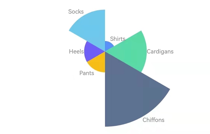
The second problem is, since the sectors are adjacent, their colors should be distinguishable. And people prefer to use labels, not axis, to annotate the rose chart.
Attributes for perceiving graphics, like color or label, are called aesthetic attributes. In Graphic they are:
positionshapecolorgradientelevationlabelsize
Except position, each of them are defined in GeomElement by a corresponding Attr class. According to definition properties, they can be specified in these ways:
- Indicates the
valuedirectly. - Indicates corresponding
variable, and target attributevaluesandstopes. The variable values will be interpolated or mapped to attribute values. These kind of attributes are called ChannelAttrs. - Indicates how a tuple is encoded to an attribute value by
encoder.
In this example, we specify colors and labels in the second way:
elements: [IntervalElement(
  color: ColorAttr(
    variable: 'category',
    values: Defaults.colors10,
  ),
  label: LabelAttr(
    encoder: (tuple) => Label(
      tuple['category'].toString(),
    ),
  ),
)]
Thus we get a better rose chart:
But how to transform the rose chart to a pie chart?
Transpose Coordinate
Variables of data often have a function relation: y = f(x). We say that the x is in the domain dimension, and the y is in the measure dimension. Customarily, for a plane, the rectangle coordinate assigns the domain dimension to the horizontal direction and the measure dimension to the vertical direction; while the polar coordinate assigns the domain dimension to angles and the measure dimension to radiuses.
A rose chart displays values with radiuses, while a pie chart displays values with angles. So the first step is to switch the correspondence of dimensions. This is called transposing:
coord: PolarCoord(transposed: true)
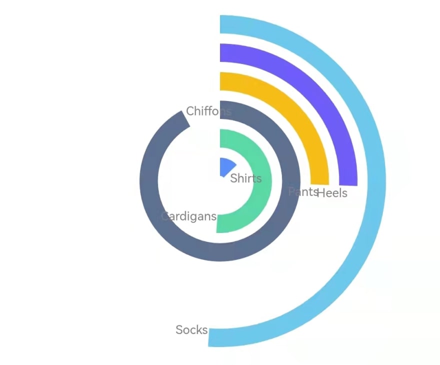
Then the graphics transform to a racing chart:
It seems to get closer to a pie chart.
Variable Transform
The sectors in a pie chart compose a whole circle, the ratios of arcs to the perimeter is the ratios of values to the sum. But in the above chart, the sum of arcs is obviously larger than the perimeter.
One solution is to set the scale range of sales between 0 and the sum of all sales, then the scaled sales values are the ratios to the sum. But for dynamic data, we usually don't know the values when defining the chart.
Another solution is that if the measure dimension variable is the proportion of sales, then we only need to set the scale range to [0, 1].
That is why we need VariableTransform. It can apply statistical transforms to current variables, to modify the tuples or create new variables. Here we use Proportion, which calculates the proportions of sales values and assign them to a new percent variable, whose default scale range is [0, 1]:
transforms: [
  Proportion(
    variable: 'sales',
    as: 'percent',
  ),
]
Graphics Algebra
A new problem occurs after we applied the transform. The tuple had only two variables category and sales before, and they happens can be assigned to the two dimensions respectively. Nothing need to set. But now, an additional variable percent is added. How to assign three chestnuts to two monkeys? There needs a clear specification.
To define the relation between variables and dimensions, we need the graphics algebra.
The graphics algebra specifies the variables relations and how they are assigned to dimensions with an expression that connects Varsets (variable sets) with operators. There are tree operators:
-
*: cross, which assigns two operands to two dimensions in order. -
+: blend, which assigns two operands to a same dimension in order. -
/: nest, which groups all tuples according to the second operand.
We need to assign category and transformed percent to the domain dimension and the measure dimension respectively. Benefited form the operator overriding of Dart, Graphic implements all graphics algebra by the Varset class. So we define position as:
position: Varset('category') * Varset('percent')
After variable transform and graphics algebra are set, the graphics become:
Grouping and Modifier
The arc length of sectors are handled, then we should "splice" them. The first step of splicing is to adjust their positions to end to end.
This position adjusting is specified by Modifiers. The object of the adjusting is not single tuples, but tuple groups. So we should group the tuples by category. Thus for the example data, each group will have a single tuple. The grouping is specified by nest operator of the graphics algebra. And after that we can set the StackModifier:
elements: [IntervalElement(
  ...
  position: Varset('category') * Varset('percent') / Varset('category'),
  modifiers: [StackModifier()],
)]
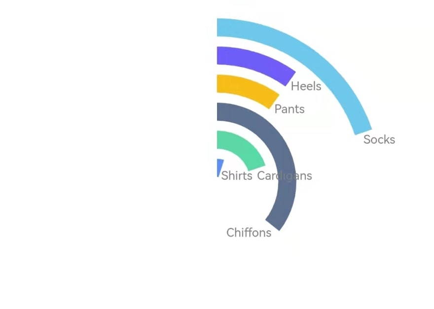
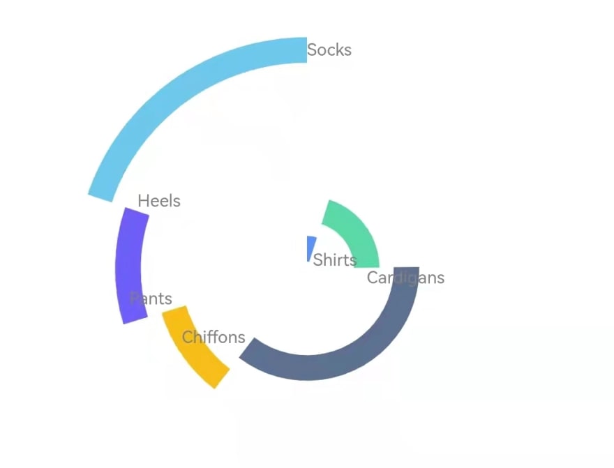
Since we have made the total arc length equals to the perimeter, the sectors become end to end after stacked, which can be regarded as a sunrise chart:
Coordinate Dimensions
Since the angles of sectors are in position, there needs only one final step: to inflate the radiuses so that the sectors make a hole pie.
Let's look into the radius dimension. We have just assigned the category variable to it by algebra, so the sectors fall into different "tracks" respectively. But in fact, we don't want they differ in the radius dimension. We only need they vary in angles. In another word, we prefer the polar coordinate to be a 1D coordinate.
We just need to indicate the coordinate dimension count to 1, and remove category from the algebra expression:
coord: PolarCoord(
  transposed: true,
  dimCount: 1,
)
...
position: Varset('percent') / Varset('category')
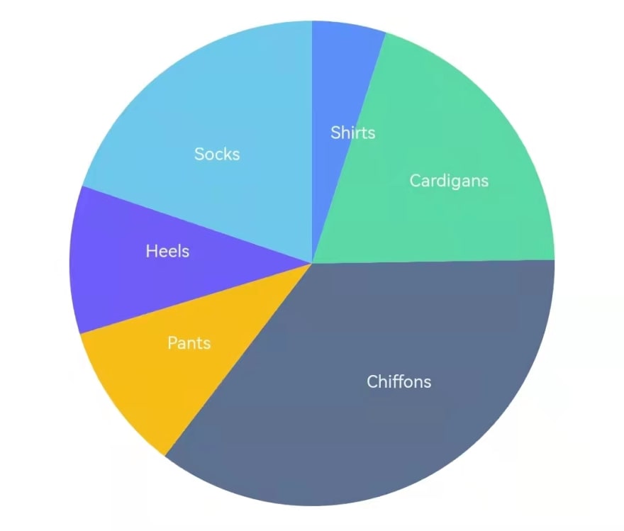
Then the sectors inflates the circle radius, and we finished the pie chart:
The complete specification is:
Chart(
  data: data,
  variables: {
    'category': Variable(
      accessor: (Map map) => map['category'] as String,
    ),
    'sales': Variable(
      accessor: (Map map) => map['sales'] as num,
      scale: LinearScale(min: 0),
    ),
  },
  transforms: [
    Proportion(
      variable: 'sales',
      as: 'percent',
    ),
  ],
  elements: [IntervalElement(
    position: Varset('percent') / Varset('category'),
    groupBy: 'category',
    modifiers: [StackModifier()],
    color: ColorAttr(
      variable: 'category',
      values: Defaults.colors10,
    ),
    label: LabelAttr(
      encoder: (tuple) => Label(
        tuple['category'].toString(),
        LabelStyle(Defaults.runeStyle),
      ),
    ),
  )],
  coord: PolarCoord(
    transposed: true,
    dimCount: 1,
  ),
)
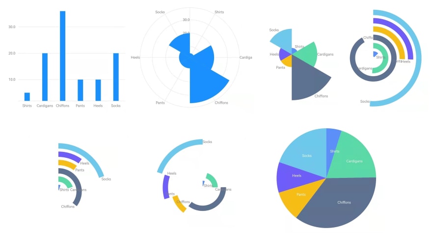
In the process above, we transformed the graphics incessantly by changing the specifications such as the coordinate, scales, aesthetic attributes, variable transforms, and modifiers. And we got a bar chart, a rose chart, a racing chart, a sunrise chart, and a pie chart of traditional chart typologies in order:
We can conclude that the Grammar of Graphics jumps out of the constraint of traditional chart typologies, and can generates more visualization graphics with better flexibility and extensibility. More importantly, It reveals the intrinsic relations of different visualization graphics, and provides a theory foundation for data visualization science.
This content originally appeared on DEV Community and was authored by LIN Chen
LIN Chen | Sciencx (2022-02-16T07:07:29+00:00) The Grammar of Graphics in Flutter Charts. Retrieved from https://www.scien.cx/2022/02/16/the-grammar-of-graphics-in-flutter-charts/
Please log in to upload a file.
There are no updates yet.
Click the Upload button above to add an update.

