This content originally appeared on DEV Community and was authored by Sophia Parafina
When I read an article about earthquakes caused by fracking in west Texas, I wanted to map the data. Additional research referenced a report published in Science. Titled "High-rate injection is associated with the increase in U.S. mid-continent seismicity," the report provided data sources that I could use for the map.
Data sources
I used the following data sources for the map.
Design Process
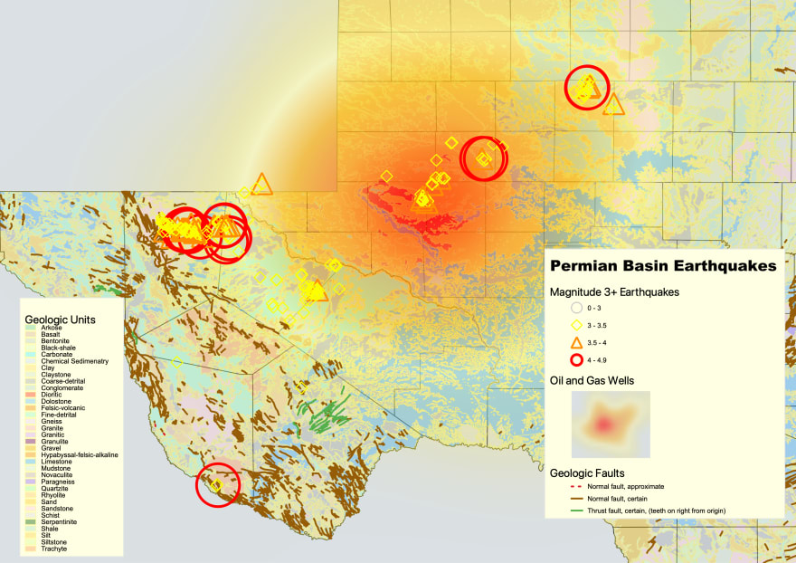
Base map: While a simple map of county boundaries gives the viewer a sense of location, I wanted to show the underlying geology and structures. Earthquakes occur in counties with sandstone, a relatively stable geologic unit not prone to earthquakes. Similarly, faults are associated with earthquakes but are far from earthquakes. Adding the major geologic units adds context to the map.
Wells: Showing the distribution of wells in west Texas was an interesting problem. One method to show the density of wells would be to aggregate the number of wells by county and color the counties in ascending order using a color ramp. This method would be effective, but it would occlude the geologic map. Additionally, the additional colors and the geologic units would be visually confusing. I choose to use a heat map to display the distribution of wells. I can overlay the well data with decreased opacity and display the underlying geologic units remain visible.
Earthquakes: The earthquake data contains many records less than 3 magnitude on the Richter scale. I opted not to display the lesser magnitude earthquakes because they are typically not felt. Earthquakes with a magnitude of 3 to 5 are often felt and might cause damage. The Richter scale is logarithmic; this quote explains ground motion at different magnitudes.
"Magnitudes are based on a logarithmic scale (base 10). This means that for each whole number you go up on the magnitude scale, the amplitude of the ground motion recorded by a seismograph goes up ten times. Using this scale, a magnitude 5 earthquake would result in ten times the level of ground shaking as a magnitude 4 earthquake (and about 32 times as much energy would be released). To give you an idea of how these numbers can add up, think of it in terms of the energy released by explosives: a magnitude 1 seismic wave releases as much energy as blowing up 6 ounces of TNT. A magnitude 8 earthquake releases as much energy as detonating 6 million tons of TNT. Pretty impressive, huh? Fortunately, most of the earthquakes that occur each year are much too small to be felt by most people."
I choose different geometric shapes and colors to represent earthquakes of different magnitude. Because I wanted to convey the difference in ground motion, the marker size becomes progressively larger as the magnitude increases. The different shapes, colors, and sizes also help reduce visual clutter.
Cartographic Process
I used QGIS to prototype the map. The data was in various formats ranging from geodatabases, shapefiles, and CSV files. In addition, the data was in different projections. QGIS is handy for reading different data formats and reprojecting them into a standard projection. It also has a good set of tools for manipulating data and tools for styling.
The USGS provides a qml style file file, which is how QGIS saves style information. Unfortunately, the USGS qml file is an older format that is unsupported by the current version of QGIS. I had to rebuild the styles from the USGS qml file manually. Tedious, but not terrible.
In addition, I used the heatmap style to show the distribution of wells. This makes for a striking image, but I'll discuss why this was not the best choice in the follow-up post.
Here's the final map styled using QGIS.
Next Steps
The map rendering is complicated, and implementing it would take some time as a web map. I'll show how to deploy the map as a static web application in the following post.
This content originally appeared on DEV Community and was authored by Sophia Parafina
Sophia Parafina | Sciencx (2022-02-18T19:37:10+00:00) Mapping Earthquakes in the Permian Basin. Retrieved from https://www.scien.cx/2022/02/18/mapping-earthquakes-in-the-permian-basin/
Please log in to upload a file.
There are no updates yet.
Click the Upload button above to add an update.

