This content originally appeared on DEV Community and was authored by DEV Community
This guest post was written by Osinachi Chukwujama. He is a web developer and technical writer. He enjoys building backend applications and utilizing cloud computing. He plays the organ and creates casual animations when he isn't coding. You can get in touch with him through his website.
In a world where every organization has big data, a simplified approach to data analysis has never been more sought after. Thankfully, open source charting libraries like Chart.js, Recharts, and Apache ECharts are robust enough to handle big-data analytics. Tools like Power BI, Snowflake, and Cube also help simplify analytics by making it easier for organizations to use their data to make decisions.
In this article, you’ll learn how to use Apache ECharts, Cube, and React to build an e-commerce analytics dashboard.
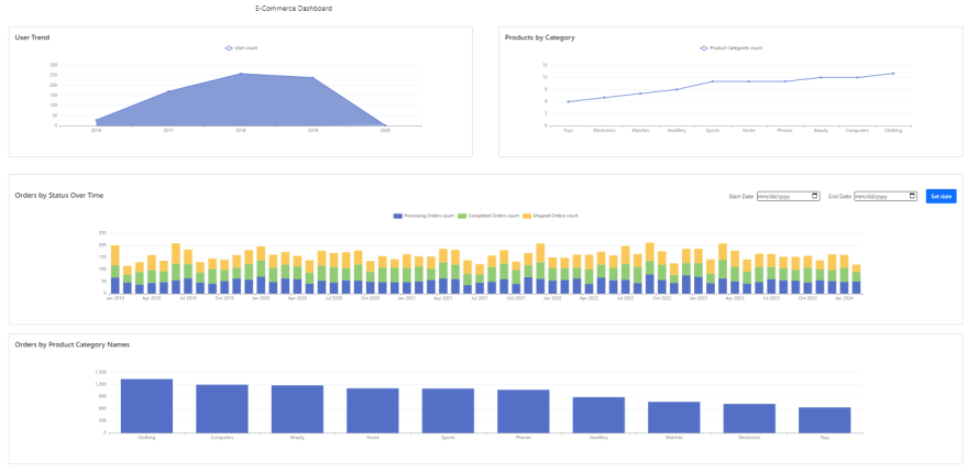
On completing this tutorial, you will have built a React application that displays charts of different metrics in an e-commerce store.
The result should look like this:
You can find a live demo here or view the React app source code in this GitHub repo.
What Is Apache ECharts?
Apache ECharts is a robust JavaScript charting library. It’s fully packaged, offering common chart types like line, column, and pie and even more complicated chart types like graph, themeRiver, and gauge.
ECharts is primarily used for building data applications, but it also works well for applications that require a lot of visualized data points. It’s free to use, and its source code is open source, which means it’s flexible and has longevity.
It’s also incredibly customizable by allowing color and size alteration to fit your application’s needs. However, rendering happens on the client side. So if the device that renders the chart is low on memory, the visualization will be slower. Rendering is faster if you use Google Charts, but all your data doesn’t live on your own server like it does with ECharts, which means it can be viewed by Google or any other third party.
Unlike Recharts, ECharts is primarily a JavaScript library. This means that you don’t get React components for axes, legends, and other parts of a chart. Instead, you’ll use an object to declaratively define the rendering and behavior of a chart.
Why Integrate with Cube?
ECharts integrates seamlessly with Cube, offering superb visualizations for data returned by Cube’s API. All you need is your data and to build a few queries and feed the resulting API through an ECharts chart.
Implementing an ECharts Dashboard with React and Cube
The following sample project has three main components:
- A relational database (PostgresSQL in this tutorial, but you can use MySQL, MongoDB, or any other database supported by Cube)
- A Cube schema
- Setting up ECharts in React
To follow along, you should have Docker installed.
Setting Up Cube
To set up Cube using Docker, change the directory into the desired location and run the following command:
docker run -p 4000:4000 \
  -v ${PWD}:/cube/conf \
  -e CUBEJS_DEV_MODE=true \
  cubejs/cube
This command downloads the Cube Docker image and opens port 4000 to the Cube Playground. You can navigate to http://localhost:4000 in your browser to see the playground.
From here, you’re supposed to select the database type and parameters This article will use a hosted Postgres database offered by Cube. Choose Postgres as the database type and use the parameters below to complete your Cube instance setup:
Hostname: demo-db.cube.dev
Database: ecom
Username: cube
Password: 12345
Generating a Data Schema with Cube
Cube comes with a schema builder that lets you build your desired queries. These queries help you ask analytical questions about your data like the following:
- How many orders were made this month?
- What’s the total number of products sold?
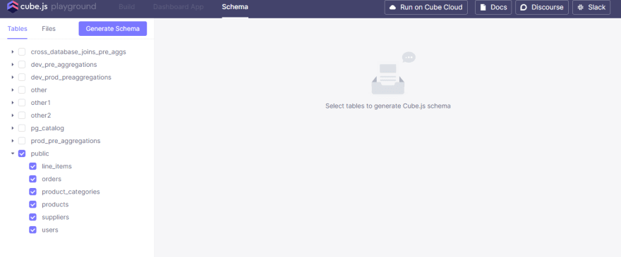
To proceed, select all the tables under the public schema in the Schema tab of the Cube playground.
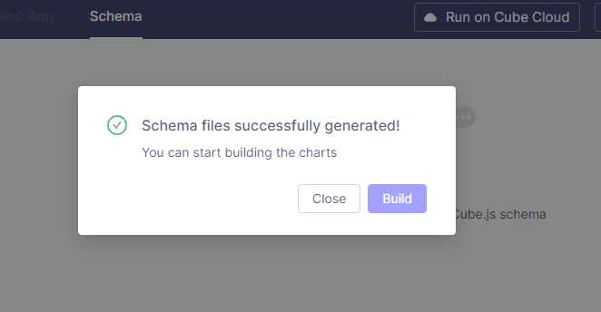
After selecting your target tables, click the Generate Schema button. A prompt will appear letting you know that the schema files have been created, and you can start building charts.
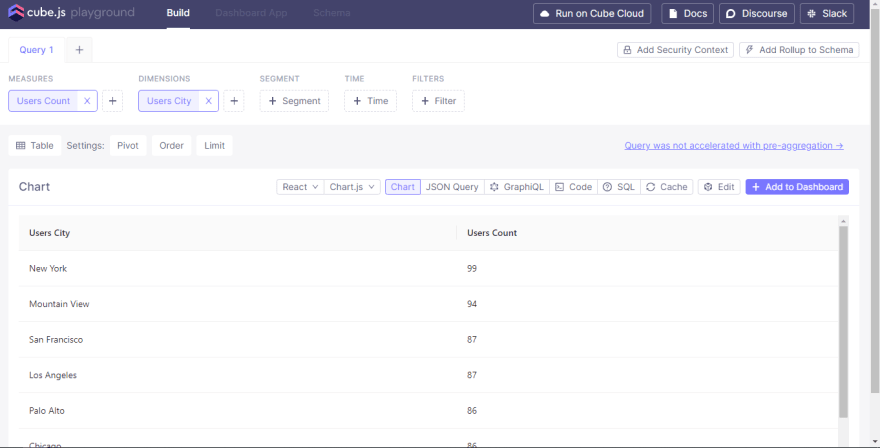
Click on the Build button.
Overview of the Cube Playground
The Cube Playground consists of three tabs.
- The Build tab, for building charts from a data schema
- The Dashboard App tab, for viewing charts generated in the Build tab
- The Schema tab, for selecting the tables where the data will be used to build charts
The schema generated by Cube is a JavaScript object that consists of measures and dimensions. It’s used to generate SQL code that will be queried against the database for analytics.
The code snippet below shows a data schema for a users table. It contains a count measure and three dimensions that correspond to columns in the users table:
cube(`Users`, {
  sql: `SELECT * FROM users`,

  measures: {
    count: {
      sql: `id`,
      type: `count`,
    },
  },

  dimensions: {
    city: {
      sql: `city`,
      type: `string`,
    },

    signedUp: {
      sql: `created_at`,
      type: `time`,
    },

    companyName: {
      sql: `company_name`,
      type: `string`,
    },
  },
});
Cube lets you combine measures and dimensions to ask questions like “Which companies do our users work for?”:
{
   measures: ['Users.count'],
   dimensions: ['Users.companyName']
}
Or “Where are our users based?”:
{
   measures: ['Users.count'],
   dimensions: ['Users.city']
}
Setting Up ECharts in a React Project
To set up ECharts in a React project, create a new React project in your desired directory and start the dev server using the command below.
npx create-react-app cube-echarts-app
cd cube-echarts-app
npm start
Now, install the required dependencies:
npm i --save @cubejs-client/core @cubejs-client/react echarts echarts-for-react react-loader-spinner dayjs react-bootstrap bootstrap
Basic App Setup
Now that you have your dependencies in place, create the components folder using this command:
mkdir src/components
Replace the content of App.js with the following:
import React from "react";
import { CubeProvider } from "@cubejs-client/react";
import cubejs from "@cubejs-client/core";
import { Navbar, Container, Row, Col } from "react-bootstrap";

export const cubejsApi = cubejs(process.env.REACT_APP_CUBEJS_TOKEN,
  { apiUrl: "http://localhost:4000/cubejs-api/v1" }
);

const App = () => {
  return (
    <CubeProvider cubejsApi={cubejsApi}>
      <div className="bg-gray">
        <Navbar>
          <Container>
            <Navbar.Brand href="#home">E-Commerce Dashboard</Navbar.Brand>
          </Container>
        </Navbar>
      </div>
    </CubeProvider>
  );
};

export default App;
You don’t have to set the REACT_APP_CUBEJS_TOKEN on your development environment as it is strictly used in production. If you do want to set it, you need to sign a JWT on https://jwt.io or using your favorite tool with the CUBEJS_API_SECRET as the secret key. You can find the CUBEJS_API_SECRET in the .env file of the Cube back-end set up which is automatically created by Cube.
The dashboard will contain four charts:
- An area chart containing the revenue growth over the previous year
- A line chart containing orders over the last thirty days
- A stacked bar chart containing the orders by status over time
- A bar chart containing orders by product category name
To get started creating these charts, create the necessary chart files and loader:
touch src/components/AreaChart.jsx
touch src/components/BarChart.jsx
touch src/components/LineChart.jsx
touch src/components/StackedBarChart.jsx
touch src/components/Loader.jsx
Add the following to Loader.jsx:
import { Oval } from "react-loader-spinner";

function Loader() {
  return (
    <div className="d-flex justify-content-center align-items-center">
      <Oval heigth="100" width="100" color="#5470C6" ariaLabel="loading" />
    </div>
  );
}

export default Loader;
Open AreaChart.jsx and add the following:
import React from "react";
import ReactECharts from "echarts-for-react";
import { useCubeQuery } from "@cubejs-client/react";
import Loader from "./Loader";
import { Card } from "react-bootstrap";
import dayjs from "dayjs";

function AreaChart() {
  const { resultSet, isLoading, error, progress } = useCubeQuery({
    measures: ["Users.count"],
    timeDimensions: [
      {
        dimension: "Users.createdAt",
        granularity: "year",
      },
    ],
    order: {
      "Users.createdAt": "asc",
    },
  });

  if (error) {
    return <p>{error.toString()}</p>;
  }
  if (isLoading) {
    return (
      <div>
        {(progress && progress.stage && progress.stage.stage) || <Loader />}
      </div>
    );
  }

  if (!resultSet) {
    return null;
  }

  const workingData = resultSet.loadResponse.results[0].data;
  const userCount = workingData.map((item) => item["Users.count"]);
  const userCreationDate = workingData.map((item) =>
    dayjs(item["Users.createdAt.year"]).format("YYYY")
  );

  const options = {
    legend: {
      data: ["User count"],
    },
    tooltip: {
      trigger: "axis",
      axisPointer: {
        type: "shadow",
      },
    },
    xAxis: {
      data: userCreationDate,
    },
    yAxis: {},
    series: [
      {
        name: "User count",
        data: userCount,
        type: "line",
        areaStyle: {},
      },
    ],
  };

  return (
    <Card className="m-4">
      <Card.Body>
        <Card.Title>User Trend</Card.Title>
        <ReactECharts option={options} />
      </Card.Body>
    </Card>
  );
}

export default AreaChart;
The first part of the file contains a React hook that fetches data from the Cube back end as seen below:
const { resultSet, isLoading, error, progress } = useCubeQuery({
  measures: ["Users.count"],
  timeDimensions: [
    {
      dimension: "Users.createdAt",
      granularity: "year",
    },
  ],
  order: {
    "Users.createdAt": "asc",
  },
});
The object within this hook can be obtained from the Cube playground as a JSON query.
The second part of AreaChart.jsx shows the returned state being used for conditional rendering:
if (error) {
  return <p>{error.toString()}</p>;
}
if (isLoading) {
  return (
    <div>
      {(progress && progress.stage && progress.stage.stage) || <Loader />}
    </div>
  );
}

if (!resultSet) {
  return null;
}
The third part of AreaChart.jsx transforms the returned data to a form that the chart can render. The chart answers the question “How many users joined each year?” and the userCount and userCreationDate will be isolated from the returned data:
const workingData = resultSet.loadResponse.results[0].data;
const userCount = workingData.map((item) => item["Users.count"]);
const userCreationDate = workingData.map((item) =>
  dayjs(item["Users.createdAt.year"]).format("YYYY")
);
Finally, the chart data and metadata are declared in an options object and fed to the ReactECharts component:
const options = {
  legend: {
    data: ["User count"],
  },
  tooltip: {
    trigger: "axis",
    axisPointer: {
      type: "shadow",
    },
  },
  xAxis: {
    data: userCreationDate,
  },
  yAxis: {},
  series: [
    {
      name: "User count",
      data: userCount,
      type: "line",
      areaStyle: {},
    },
  ],
};

return (
  <Card className="m-4">
    <Card.Body>
      <Card.Title>User Trend</Card.Title>
      <ReactECharts option={options} />
    </Card.Body>
  </Card>
);
To see the chart on the browser, update the content of App.js to include it.
+ import AreaChart from "./components/AreaChart";

const App = () => {
...
<div className="bg-gray">
  <Navbar>
    <Container>
      <Navbar.Brand href="#home">E-Commerce Dashboard</Navbar.Brand>
    </Container>
  </Navbar>

+  <Row>
+   <Col>
+     <AreaChart />
+    </Col>
+  </Row>

</div>
...
Add the following content to the remaining files as specified below.
LineChart.jsx:
import React from "react";
import ReactECharts from "echarts-for-react";
import { useCubeQuery } from "@cubejs-client/react";
import Loader from "./Loader";
import { Card } from "react-bootstrap";

function LineChart() {
  const { resultSet, isLoading, error, progress } = useCubeQuery({
    measures: ["Products.count"],
    order: [["Products.count", "asc"]],
    dimensions: ["ProductCategories.name"],
  });

  if (error) {
    return <p>{error.toString()}</p>;
  }
  if (isLoading) {
    return (
      <div>
        {(progress && progress.stage && progress.stage.stage) || <Loader />}
      </div>
    );
  }

  if (!resultSet) {
    return null;
  }

  const workingData = resultSet.loadResponse.results[0].data;
  const productCategoryNames = workingData.map(
    (item) => item["ProductCategories.name"]
  );
  const productCategoriesCount = workingData.map(
    (item) => item["Products.count"]
  );

  const options = {
    legend: {
      data: ["Product Categories count"],
    },
    tooltip: {
      trigger: "axis",
      axisPointer: {
        type: "shadow",
      },
    },
    xAxis: {
      data: productCategoryNames,
    },
    yAxis: {},
    series: [
      {
        name: "Product Categories count",
        data: productCategoriesCount,
        type: "line",
      },
    ],
  };

  return (
    <Card className="m-4">
      <Card.Body>
        <Card.Title>Products by Category</Card.Title>
        <ReactECharts option={options} />
      </Card.Body>
    </Card>
  );
}

export default LineChart;
StackedBarChart.jsx:
import React from "react";
import ReactECharts from "echarts-for-react";
import { useCubeQuery } from "@cubejs-client/react";
import dayjs from "dayjs";
import Loader from "./Loader";
import { Card } from "react-bootstrap";

function StackedBarChart() {
  const { resultSet, isLoading, error, progress } = useCubeQuery({
    measures: ["Orders.count"],
    timeDimensions: [
      {
        dimension: "Orders.createdAt",
        granularity: "month",
      },
    ],
    order: [
      ["Orders.count", "desc"],
      ["Orders.createdAt", "asc"],
    ],
    dimensions: ["Orders.status"],
    filters: [],
  });

  if (error) {
    return <p>{error.toString()}</p>;
  }
  if (isLoading) {
    return (
      <div>
        {(progress && progress.stage && progress.stage.stage) || <Loader />}
      </div>
    );
  }

  if (!resultSet) {
    return null;
  }

  const returnedData = resultSet.loadResponse.results[0].data.sort(
    (first, second) =>
      dayjs(first["Orders.createdAt.month"]).diff(
        dayjs(second["Orders.createdAt.month"])
      )
  );

  const filterOrderStatusBy = (type) =>
    returnedData
      .filter((order) => order["Orders.status"] === type)
      .map((order) => order["Orders.count"]);

  const ordersProcessing = filterOrderStatusBy("processing");
  const ordersCompleted = filterOrderStatusBy("completed");
  const ordersShipped = filterOrderStatusBy("shipped");

  const orderMonths = [
    ...new Set(
      returnedData.map((order) => {
        return dayjs(order["Orders.createdAt.month"]).format("MMM YYYY");
      })
    ),
  ];

  const options = {
    legend: {
      data: [
        "Processing Orders count",
        "Completed Orders count",
        "Shipped Orders count",
      ],
    },
    tooltip: {
      trigger: "axis",
      axisPointer: {
        type: "shadow",
      },
    },
    xAxis: {
      data: orderMonths,
    },
    yAxis: {},
    series: [
      {
        name: "Processing Orders count",
        data: ordersProcessing,
        type: "bar",
        stack: "x",
      },
      {
        name: "Completed Orders count",
        data: ordersCompleted,
        type: "bar",
        stack: "x",
      },
      {
        name: "Shipped Orders count",
        data: ordersShipped,
        type: "bar",
        stack: "x",
      },
    ],
  };

  return (
    <Card className="m-4">
      <Card.Body>
        <Card.Title>Orders by Status Over Time</Card.Title>
        <ReactECharts option={options} />
      </Card.Body>
    </Card>
  );
}

export default StackedBarChart;
BarChart.jsx:
import React from "react";
import ReactECharts from "echarts-for-react";
import { useCubeQuery } from "@cubejs-client/react";
import Loader from "./Loader";
import { Card } from "react-bootstrap";

function BarChart() {
  const { resultSet, isLoading, error, progress } = useCubeQuery({
    measures: ["Orders.count"],
    timeDimensions: [],
    order: {
      "Orders.count": "desc",
    },
    dimensions: ["ProductCategories.name"],
  });

  if (error) {
    return <p>{error.toString()}</p>;
  }
  if (isLoading) {
    return (
      <div>
        {(progress && progress.stage && progress.stage.stage) || <Loader />}
      </div>
    );
  }

  if (!resultSet) {
    return null;
  }

  const workingData = resultSet.loadResponse.results[0].data;
  const productCategoryNames = workingData.map(
    (item) => item["ProductCategories.name"]
  );
  const orderCount = workingData.map((item) => item["Orders.count"]);

  const options = {
    xAxis: {
      type: "category",
      data: productCategoryNames,
    },
    yAxis: {
      type: "value",
    },
    series: [
      {
        data: orderCount,
        type: "bar",
      },
    ],
  };

  return (
    <Card className="m-4">
      <Card.Body>
        <Card.Title>Orders by Product Category Names</Card.Title>
        <ReactECharts option={options} />
      </Card.Body>
    </Card>
  );
}

export default BarChart;
Finally, update App.js to include the new charts:
+ import LineChart from "./components/LineChart";
+ import StackedBarChart from "./components/StackedBarChart";
+ import BarChart from "./components/AreaChart";

const App = () => {
...
<div className="bg-gray">
  <Navbar>
    <Container>
      <Navbar.Brand href="#home">E-Commerce Dashboard</Navbar.Brand>
    </Container>
  </Navbar>

   <Row>
    <Col>
      <AreaChart />
     </Col>
+   <Col>
+     <LineChart />
+   </Col>
+ </Row>
+ <StackedBarChart />
+ <BarChart />
</div>
Adding Interactivity to Your Dashboard
For a dashboard to be user-friendly, users should be able to sort, filter, and export data. In this section, you’ll add date filters to your stacked bar chart to add some interactivity to it.
Navigate to the StackedBarChart.jsx component and import the following:
import { useState } from "react";
import { Card, Form, Button } from "react-bootstrap";
Then define the start date, end date, and JSON query hooks:
const [startDate, setStartDate] = useState("");
const [endDate, setEndDate] = useState("");

const [jsonQuery, setJSONQuery] = useState({
  measures: ["Orders.count"],
  timeDimensions: [
    {
      dimension: "Orders.createdAt",
      granularity: "month",
    },
  ],
  order: [
    ["Orders.count", "desc"],
    ["Orders.createdAt", "asc"],
  ],
  dimensions: ["Orders.status"],
  filters: [],
});
const { resultSet, isLoading, error, progress } = useCubeQuery(jsonQuery);
Afterwards, add a function that will handle updating the date:
const updateDate = (event) => {
  event.preventDefault();

  setJSONQuery((prevJSONQuery) => {
    return {
      ...prevJSONQuery,
      filters: [
        {
          member: "Orders.createdAt",
          operator: "inDateRange",
          values: [startDate, endDate],
        },
      ],
    };
  });
};
Then update the content of Card.Body with the following:
<Card.Body>
  <div className="d-flex align-items-center justify-content-between my-4">
    <Card.Title>Orders by Status Over Time</Card.Title>
    <Form onSubmit={updateDate} className="d-flex align-items-center  gap-4">
      <div className="d-flex gap-2 align-items-center">
        <div>
          <label htmlFor="startDate">Start Date</label>
        </div>

        <input
          id="startDate"
          name="start-date"
          value={startDate}
          onChange={({ target }) => setStartDate(target.value)}
          type="date"
        />
      </div>
      <div className="d-flex gap-2 align-items-center">
        <div>
          <label htmlFor="endDate">End Date</label>
        </div>
        <input
          id="endDate"
          name="end-date"
          value={endDate}
          onChange={({ target }) => setEndDate(target.value)}
          type="date"
        />
      </div>
      <Button type="submit">Set date</Button>
    </Form>
  </div>

  <ReactECharts option={options} />
</Card.Body>
If you check your chart in the browser, you should be able to see the date form on the chart and be able to update the date yourself. The video below shows a demo of the date filter:
Check out this guide on D3 or this guide on Material UI to learn more about adding interactivity to your charts.
Conclusion
Apache ECharts and Cube offer a robust way of building analytics applications and dashboards. In this tutorial, you learned how to build an analytics dashboard from scratch using React, Apache ECharts, and Cube. You also learned how to add a date range form to your charts, giving you a way to filter data.
Cube is a headless API layer that connects your database through any of 3 APIs, including REST, GraphQL, and SQL, to your front-end code so you can build data applications faster. This simplifies the process of adding analytic elements to your existing applications. With Cube you can create an API layer, manage access control, aggregate data, and cache queries for increased performance and integrate Apache ECharts with ease.
This content originally appeared on DEV Community and was authored by DEV Community
DEV Community | Sciencx (2022-02-24T15:02:06+00:00) Building an Apache ECharts dashboard with React and Cube. Retrieved from https://www.scien.cx/2022/02/24/building-an-apache-echarts-dashboard-with-react-and-cube/
Please log in to upload a file.
There are no updates yet.
Click the Upload button above to add an update.


