This content originally appeared on DEV Community and was authored by elvis kahoro
It’s no secret that people love to customize their UIs. With the rampant adoption of light mode and dark mode and the long history of themes in terminals and IDEs, the power to make your UI fit your functionality or aesthetic needs is huge. Here at Warp we knew how important it is to create a great theming system for our users. Some key goals were to ensure compatibility with existing themes, easy customization and sharing.
Let’s start with how themes work in existing terminals and what we wanted to improve.
- Themes only control the text display, yet the rest of the UI remains the same. We want to deliver a more cohesive and immersive experience.
- Themes are hard to control, you have to turn a ton of individual “knobs” in order to get something that looks good. It’s not easy to get what you want and add your personal preference. We want to make customization simple, flexible and quick.
- Themes are hard to share. Importing and exporting themes are different and can require several steps. We want to make it a one click simple experience to import and share.
The foundation
To ensure warp could be compatible with all other existing themes we started with the standard foundation of 16 ANSI colors. Using these standards as our foundation allows practically every terminal theme to be used in warp.
We wanted to take it one step further and have the theme extend to the whole UI. Since we custom built Warp’s UI this allows us to have full control of the look and feel.
The first step of that was to consider the UI accent areas like the tab indicator and block selection. We want these areas to pop and gain your attention while also adding some visual flair. We needed to add another color attribute which we naturally called the accent color.
Being able to change the accent color gave themes a wider range of customization just from one color change without changing the look and functionality of the core theme.
UI theming
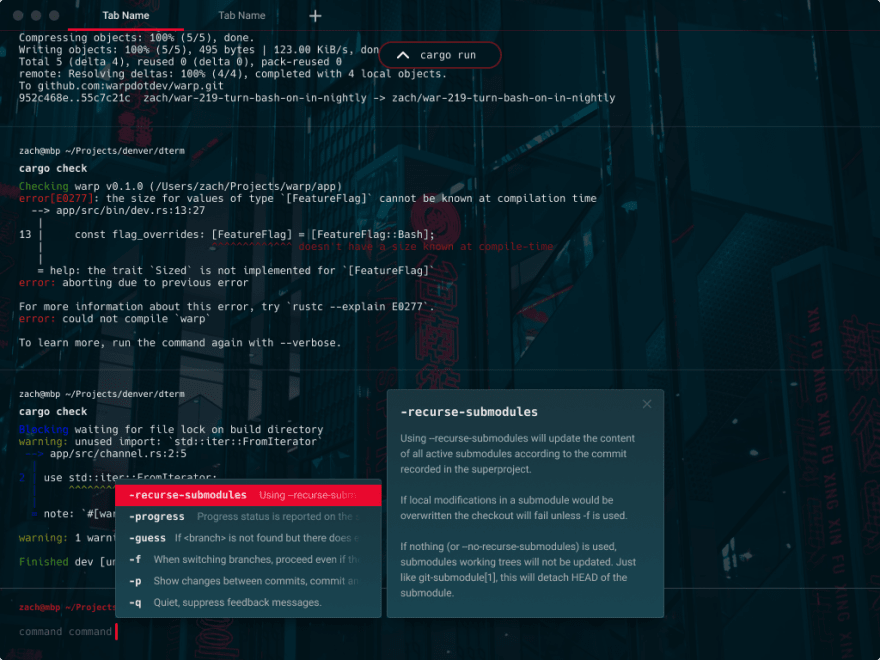
There is a bit more UI to cover within Warp like contextual menus, auto suggestion overlays, dialogs, command palette. The text coloring could easily be inherited from the theme and the accent color used for the same conditions, though we wanted the UI surface to stand out from the background. The last thing we wanted to do is to add yet another color attribute.
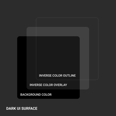
Starting with dark and light themes we had to handle the UI layering in different ways. To achieve separation from the background for dark themes, we added a white overlay which aligns with the core text color, and for light themes the opposite, black overlay which also aligns with the core text color.
We created a consistent style called “UI surface” which would be the background of all the overlay UI elements.
It consists of the theme background color, the opposite overlay color and an outline.
This basic system allows for a different UI surface leveraging the same color system. Seen here in dark and light mode.
The really neat part is how this easily extends to existing themes like Dracula and Solarized. For existing themes we convert, we will choose an accent color from the core 16 colors that we feel match the best. If you want to change it, no sweat, you can customize the accent color to any of the 16 theme colors or any custom color you like to add your personal preference to existing themes.
Image backgrounds
So with the standard theme color system and an added accent color attribute, we can easily customize the whole Warp UI. Yet we didn’t want to stop there, what about adding photos and advanced color treatment?
We experimented with adding photo backgrounds with color themes that matched and loved the results.
We also added the ability to support gradients, which can drastically change the look of a theme and add additional depth and visual pizzaz.
Dracula regular:
Dracula with gradients:
Customization
We want our user to have the power to make amazing themes, so we are working on a theme editor that makes customizing themes super simple. For lightweight use, you can start with our default dark or light theme and change the accent color. Choose one of many popular themes we have built into warp or import your favorite. If you want to go for even more customization, add a photo, make your accent color a gradient. With just a few customization you can radically change the way your terminal looks and feels.
Sharing
Currently, there are ton of different sites and resources to get terminal themes, each of them with totally different ways to download themes, from a file download, github repo, etc.
For Warp themes, we want to build a one stop shop for themes. One spot where you can browse, install and share themes all with one click. We also want individual themes to be easily shareable from user to user within the app.
Check out themes now
It’s been really exciting working on themes in Warp. Building a system that can accommodate existing themes, expanding on them within Warp and giving users more control to customize and share. We can’t wait to see what themes get created.
You can check out the base theme experience in Warp now, where you can choose from a set of themes and customize via an external file. Shortly gradients and image support will be rolling out. Customization and sharing are down the road.
We are all super excited to get all these theming features out, we have a bit of work ahead of us! Please let us know if there are any ideas that brew up, we would love your input!
Request early access to our beta. We look forward to your input!
This content originally appeared on DEV Community and was authored by elvis kahoro
elvis kahoro | Sciencx (2022-03-17T05:16:23+00:00) How we designed themes for the terminal – a peek into our process. Retrieved from https://www.scien.cx/2022/03/17/how-we-designed-themes-for-the-terminal-a-peek-into-our-process/
Please log in to upload a file.
There are no updates yet.
Click the Upload button above to add an update.


