This content originally appeared on Geoff Graham and was authored by Geoff Graham
Hey, so this is cool. Chrome 100 shipped yesterday and, with it, a landing page celebrating a curated collection of 100 cool moments between the time Chrome was introduced to the current release.
The list of moments spurred a flood of personal memories throughout my career. The landing page itself is pretty slick. So, I thought I’d share a few choice selections that sparked the most memories, as well as a few choice observations of what I like about the page.
The comic!
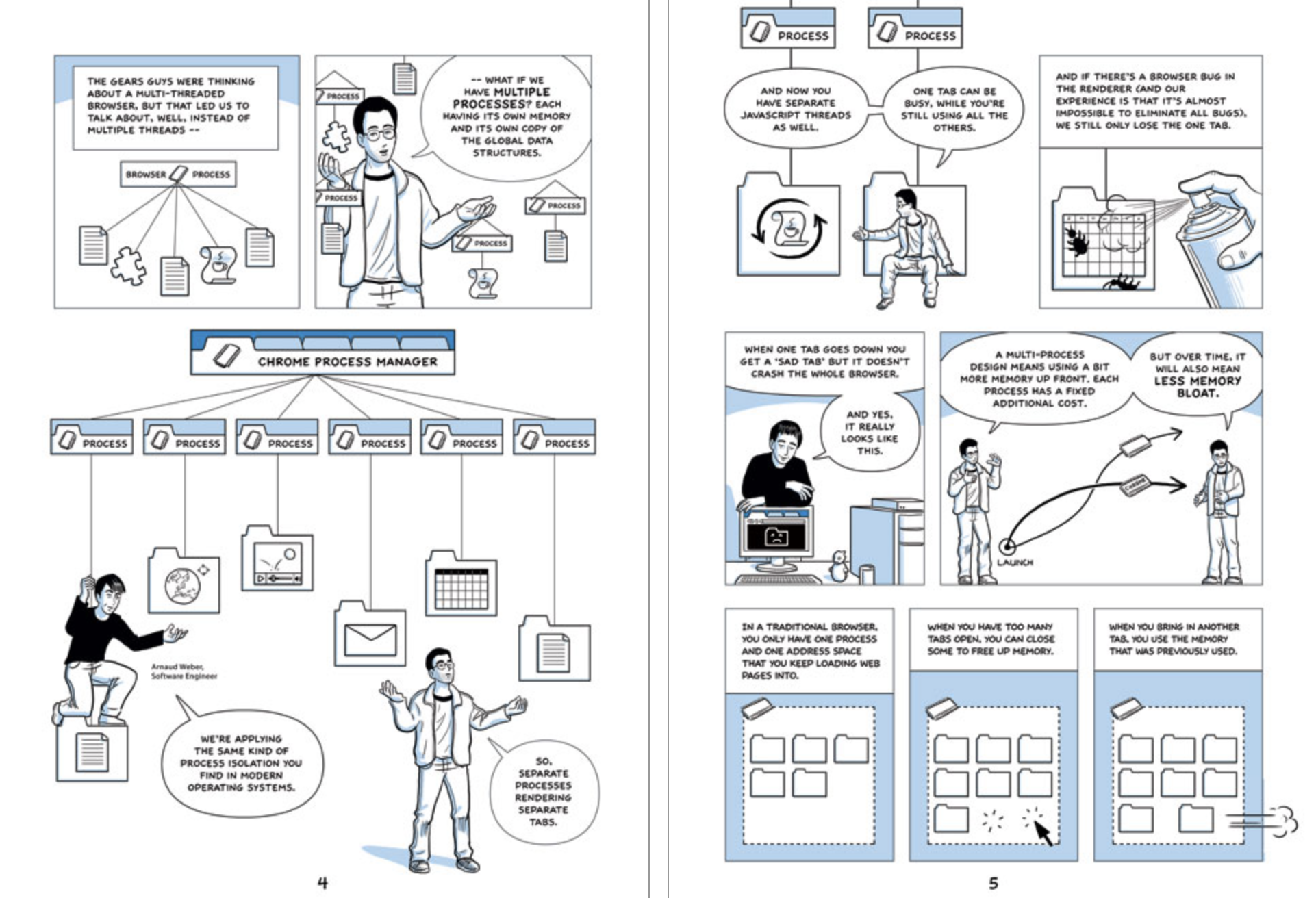
I still think Chrome was introduced in one of the coolest ways: an illustrated comic. It’s not only that the illustrations are so gosh-darned great (and they are!), but that the characters provide a wonderful explanation of what Chrome was out to solve. We already had Internet Explorer, Firefox, and Safari — what do we gain from a new kid on the block? This specific spread showed me the problems associated with tabs running multiple processes and why a new solution was needed, one that started with a relatively clean slate as a new product.

I still remember the desk I was sitting at when I read that, the office I was in, the direction I was facing, and even the computer I was using. The only things I can’t recall are what I was wearing or what I had for lunch that (but it was likely a button-up flannel shirt and a PB&J sandwich).
First interactive Google Doodle
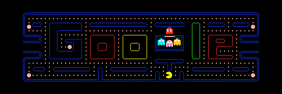
Not too long after Chrome was introduced, I remember the entire office stopping and everyone gathering around desks to play Pac-Man straight from the Google homepage. It’s still available!

That was a fun day. I remember how amazed I was to see such an interactive experience that didn’t require Flash. It helped me learn about <canvas> even if the concept is still mystified in my head.
Chrome Forks WebKit
This was a mend-bender! This was around the time when cross-browser testing became a “thing” in front-end development, and I remember my initial reaction to the news that Chrome was breaking away from the WebKit engine used by Safari…
“Crap, that’ll be another browser to test.”
It was a lazy reaction, of course, but certainly emblematic of the growing complexity cropping up in front-end development at the time. Remember, we’re talking 2013 which somehow sounds like a long time ago, but looks a lot shorter when I type it out. We were getting deeper in responsive designs, build processes, web fonts, browser compatibility, unit tests, and CSS frameworks among a slew of other newfangled tech that was making our work both more difficult and easier at the same time.
Rachel Andrew once wrote that the technical barriers to entry for someone getting into front-end development have become super high, to the extent that it has likely turned away potential developers. She wrote that in 2019 and likely was not thinking about this specific fork in web history, but I can’t help but think of it when I re-read her words today.
Since then, we’ve actually bemoaned the shrinking diversity of the browser ecosystem as some browsers have combined with others, died out, or are on a perpetual decline into obscurity. It seems we’ve historically been on the fence about whether more or fewer browsers and the differences between them are a good thing.
Material Design released
No, I’ve never really used Material Design in my work, except for some light prototyping and inspiration. I mean, remember seeing those gorgeous drop shadows for the first time?! The way Material Design documented and explained concepts such as “elevation” helped me realize the web doesn’t have to be approached as a two-dimensional medium.
But as far as memories go, this is the penultimate moment when Apple’s dominance in design and its “Human Interface Guidelines” became less, well, dominant. Google had always resembled a sorta new-look Microsoft, at least in my mind, because it prioritized technology and features over aesthetics. Google was never a “design” company, but that changed with Material Design as it was implemented across many of Google’s products and properties. It was the first time I remember Google having a consistent user experience.
Edge Adopts Chromium
Microsoft offed Internet Explorer and released its own new browser, Edge, using a new Edge rendering engine. Then they pulled a reverse-Chrome, and instead of forking in a new direction, Edge straight up adopted Chrome’s Blink engine, the one made when Chrome forked WebKit.

I still remember my initial reaction to the news:
“Crap, now Chrome is going to monopolize the market.”
Again, it’s funny how feelings evolve over time.
The Chrome logo
I love how the Chrome logo in the top-left corner transitions from its first iteration to its current as you scroll through the timeline. Notice how the logo goes flat in 2014. That was a new design trend at the time, and one that has largely stuck around as SVG plays a bigger role in designs.
Odds and ends
Like many of you, I had thoughts about the landing page and had DevTools open while browsing it.
For one, my mind went straight to CSS Scroll Snap. This layout is practically begging for it. But I can understand how it may not have been a good pairing with the way the timeline’s navigation works.
Then, there was this UA-style:
text-align: match-parent;I’ve never seen that value! Or maybe I have, but never paid attention. I mean, it’s documented and all (including a reference on the default UA usage), so it’s not some mystery or anything. What’s old is new! If I understand the value correctly, it’s a lot like inherit in the sense that it adopts the alignment of the parent element, but different in that it’s based on inherited logical direction values, like start and end so that writing modes are properly supported.
I also caught that the footer credits Jay Hoffman with the inspiration for the page. Heck yeah! Jay is a superb writer with a keen understanding of the web’s early history. He has his own website, which is what Google cites. I also had the pleasure of working with Jay on a giant CSS-Tricks series on web history. You should read anything and everything he publishes.
Wonderful work, Chrome Team! Congrats on 100 releases and thanks for all the memories, old and ongoing.
The post #100CoolWebMoments appeared first on Geoff Graham.
This content originally appeared on Geoff Graham and was authored by Geoff Graham
Geoff Graham | Sciencx (2022-03-30T17:45:36+00:00) #100CoolWebMoments. Retrieved from https://www.scien.cx/2022/03/30/100coolwebmoments/
Please log in to upload a file.
There are no updates yet.
Click the Upload button above to add an update.
