This content originally appeared on Telerik Blogs and was authored by Genady Sergeev
Missing Web 1.0? So were we.
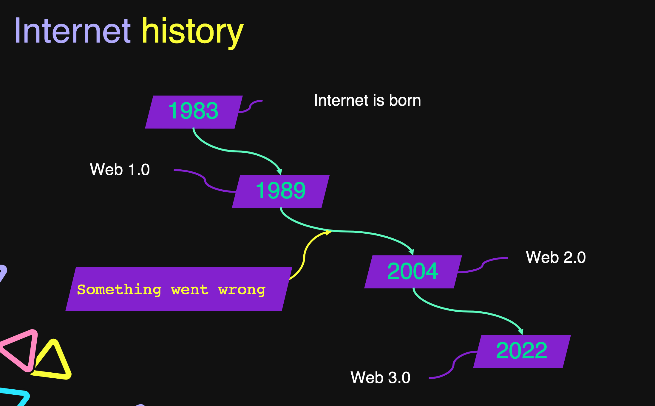
We are not huge fans of where the web has been going the last couple of years. We are looking at Web 3.0, and we are not exactly sure what that is and how it connects to the way we used to build websites and apps.
How did we get here? Web 2.0 has been evolving for good 16+ years, but Telerik rode the wave and introduced the Telerik UI for ASP.NET AJAX in 2007. Yes, we had a few good things like table layouts, sprites and … AJAX, but something was not right. Let’s go a bit further back, to our favorite era—the 2000s and Web 1.0!

- Tables & layouts – Back in the day, it was simple. You use tables for layouts. It was straightforward and easy to read. Ok, the readability aspect is maybe not exactly true, but we also didn’t need to think about responsive layouts. And, well, it was still years until flexbox.

-
Images – How many of you remember this awesome technology called a “sprite”? Yes, the one that allows you to combine many images in one single big image and hence reduce the amount of web requests. Simple and ingenuitive. And they were also used for rounded corners back in the day. Because who needs a border radius?
-
Marquee element – If there was a ranking of ingenuitive but never used HTML elements, Marquee would definitely be a top contender. But it hasn’t always been like that. Back in the ’90s and early 2000s, we really used that element to move text around the screen.
-
Call-to-action buttons – We are used to the colored buttons that hint to us where to click to buy something, like this awesome suite of UI components. But do you know that this was not always the case? In the ’90s all those buttons were gray and looked exactly the same.
-
Linear information – Annoyed by those animated and interactive content boxes moving around in modern websites? In Web 1.0, content was linear, and so were the links and the navigation panes. It was easy to grasp all navigation options and pick wisely.
-
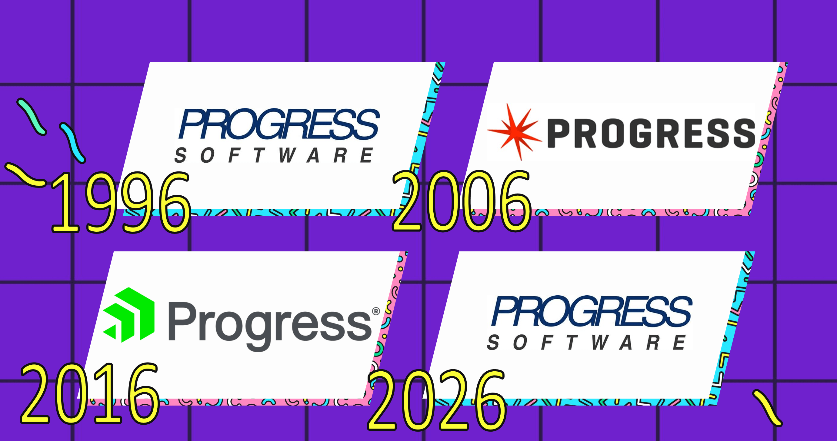
The Progress logo – It’s not like we don’t like our logo. We do and it’s awesome. But there is something brilliant in the logo from the ’90s as well. Look at these—we have a clear winner, don’t we?

If this brief visit to some of the iconic elements of ’90s websites has made you feel sweet nostalgia for these glorious days, we have a treat for you! Check out the new and improved KendoReact home page, where we’ve used all these awesome web practices to achieve the ultimate Web 1.0 design.
Thanks for having a little fun with us on April Fools’ Day. Stay tuned for real upcoming releases.
This content originally appeared on Telerik Blogs and was authored by Genady Sergeev
Genady Sergeev | Sciencx (2022-04-01T11:00:00+00:00) Things We Miss From Web 1.0 Websites—And What We Did About It. Retrieved from https://www.scien.cx/2022/04/01/things-we-miss-from-web-1-0-websites-and-what-we-did-about-it/
Please log in to upload a file.
There are no updates yet.
Click the Upload button above to add an update.
