This content originally appeared on Geoff Graham and was authored by Geoff Graham
I pushed the third major design iteration of my site yesterday, and it’s definitely a new look compared to the second version, though still in the same vein as far as simplicity. And even though there are no leftovers from the first iteration, I’d say version 3 is somewhat spiritually related to it when it comes to aesthetics.
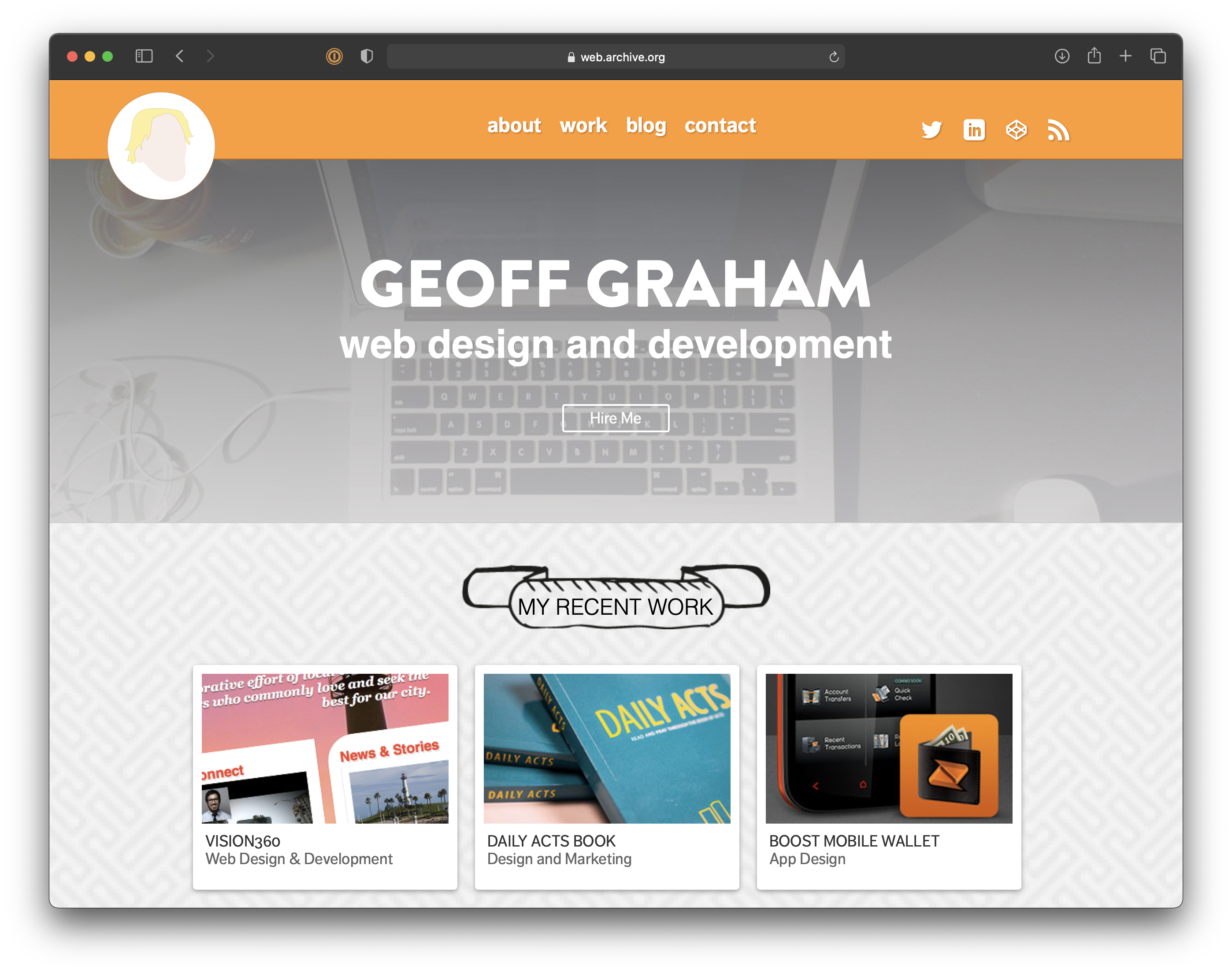
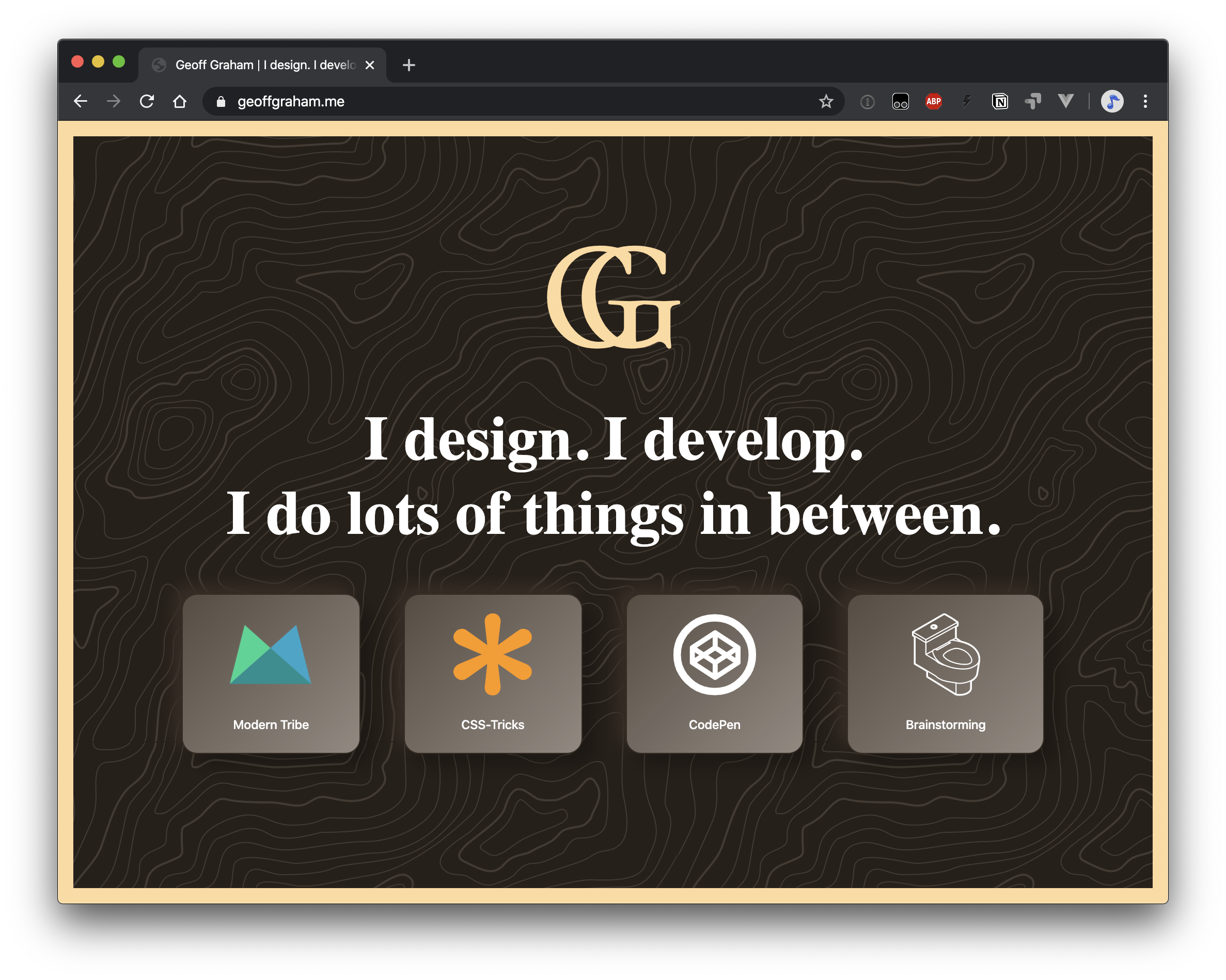
What’s new
It’s all about design! Everything else is exactly as it was before, content and all. I had toyed with the idea of displaying random facts about myself on the homepage and had created a custom post type in WordPress to do it. But, in the end, I realized I had a lot more interest in the look and feel of the site than the actual guts. Why fix what ain’t broken, right?
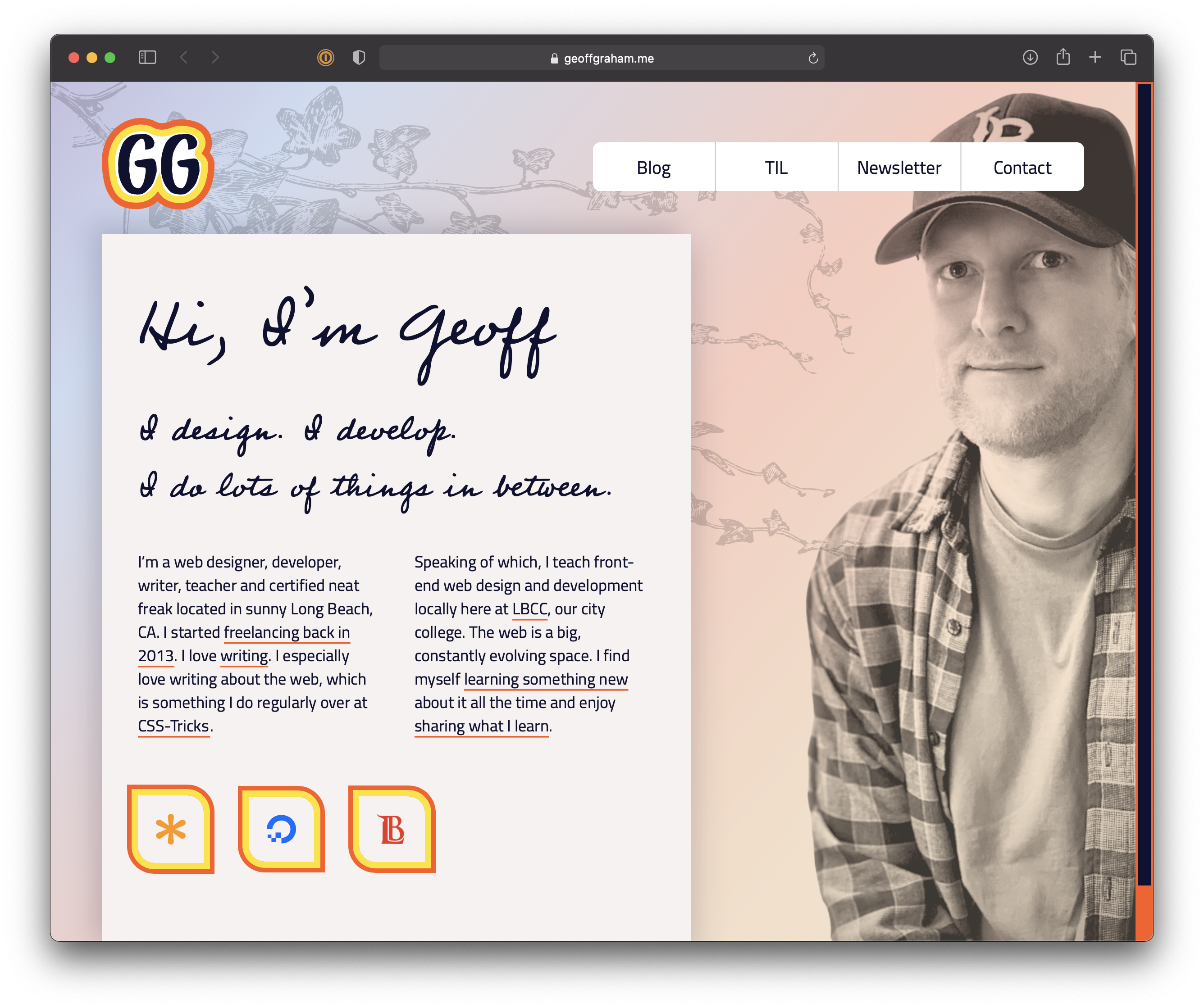
Perhaps the biggest design change, at least for me personally, is the big ol’ picture of me on the homepage. I’m not thrilled about it. Not only is it a little weird to look at myself, but the image file itself is rather large and could use more work for better performance. At the same time, I figure this is a personal website where I hope folks will get to know me a little better, so the image makes a lot of sense. I’ll get to the performance part later, I guess.
The other thing I did was rip out what I was calling a “slide panel” on the homepage.
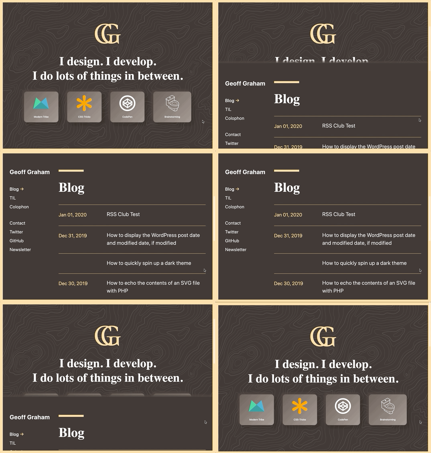
I actually really liked that component. However, it was problematic in a few awkward ways, like having to use a hash to link to bog posts. I may decide to bring it or something similar to it back in the future, but I’m also enjoying the fact that everything is right there without the extra scrolling.
Fonts
I decided to make typography a first-class citizen in this design. I quite literally used Times New Roman and system fonts in the last iteration because I was super into loading as little as possible at that time. But I’ve missed having the personality that web fonts bring to a site and decided to add a couple to the overall cost of using this website.
I started with the body font. I’ve always used sans-serif fonts in the past and continue to do so here. Only this time, I ran with Adobe Fonts. I can’t tell you just how many fonts I wanted to use. To help whittle down my options, I took a paragraph of text from one of my blog posts and pasted it into Adobe’s preview tool, allowing me to see the font in context. Making sure that whatever I font I chose is legible whether the text is large, small, all caps, numeric, or whatever was my primary focus. And for that, I landed with Cairo.

It’s sans-serif, but has a little edge to it that I think fits well with code — you know, the thing I write about the most. It kind of reminds me of a futuristic version of Proxima Nova.
With that decision locked down, I moved on to finding a display font. This is where I was going to look for something serif, thin, and elegant but wound up going a completely different route and used a handwriting font called, appropriately, Professor.

This is way outside my normal aesthetic, but I’m probably most stoked about this than any other part of the new design. Sure, there are many, many, many way more legible options out there. Like the image of myself on the homepage, however, I decided that Professor both suits my personality (I have pretty nice cursive handwriting IRL) and is more personable — perfect traits for a personal website! If this were a client project and money was on the line, then there’s no way I would’ve done this.
Accessibility
I did some thorough work in this area last time I launched a redesign, so all I really had to do here was make sure that I didn’t screw anything up with the design. That meant watching color contrast ratios, font size legibility, tap target sizes, and whatnot.
The homepage itself might be more accessible than it was when the sliding panel thing was around. While auditing failed to flag it as an issue last time, there was something that felt inaccessible about it.
I re-audited the site with WAVE and Lighthouse after publishing the redesign, and looks like I did A-OK on not jacking stuff up.
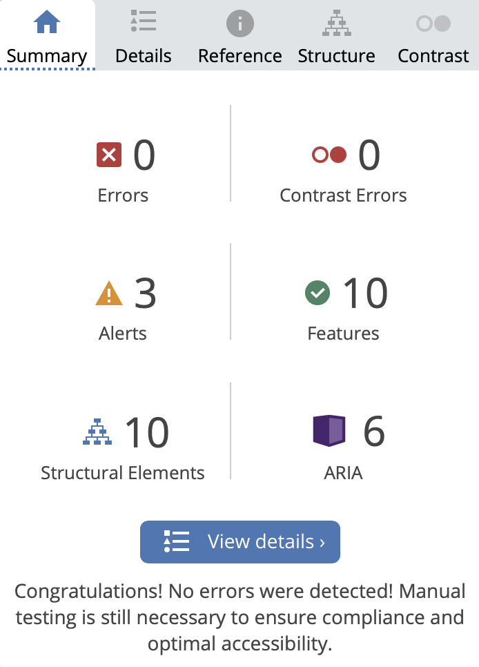
<noscript> instances.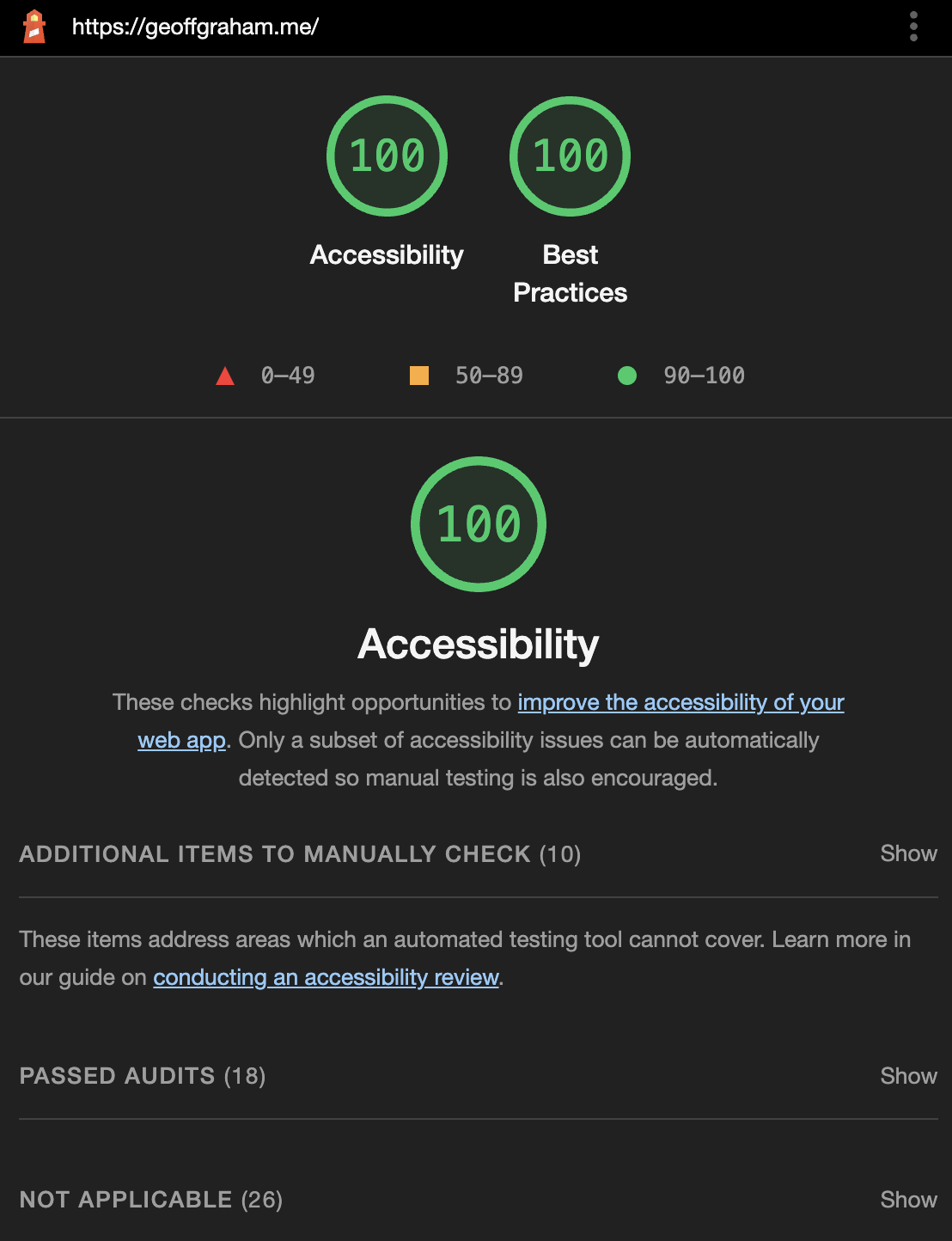
Last time, I noted that my light testing with screen readers went pretty well. I gave it another go, again with VoiceOver and JAWS. And, again, pretty nice results (considering how frustrating it is to use a screen reader in the first place).
Performance
Here’s the side-by-side comparing version 2 to version 3:
| Metric | Version 2 | Version 3 | Difference |
|---|---|---|---|
| Time to First Byte | 2.362s | 0.163s | -93% |
| Fully Loaded | 2.907s | 2.029s | -30% |
| Requests | 8 | 21 | +160% |
| Data | 182 KB | 923 KB | +245% |
| Repeat Load | 0.412s | 0.533s | +29% |
| Repeat Requests | 0 | 0 | 0 |
| Repeat Data | 0 KB | 0 KB | 0 |
I got a natural boost earlier this year when I switched to Flywheel’s hosting. I had been using another host for, like, five years and I wanted to move somewhere that was optimized specifically for WordPress. That was a good move and I have no regrets there!
Faster TTFB! Quicker to fully loaded!
But I clearly lost ground with this new design. I knew the big fat image of myself was going to ding my results, but I didn’t realize just how many other little decisions added up…
Requests (+160%)
The large image, no doubt. But I’ll be danged if a few new resources were sneaking in:
- Custom fonts (4 requests)
- WordPress analytics (2 requests)
- Jetpack scripts (2 requests)
- IndieWeb resources (2 requests)
- New images (3 requests)
That’s 13 new requests on top of the eight that were there before, adding up to a grand total of 21 requests. I disabled the IndieWeb plugins and a few Jetpack settings. That brought me down to 17 requests and 897 KB, and no substantial improvement to the time to fully load. So, I flipped them back on.
I’ll just have to re-evaluate how important that big image is to the overall site, as well as possibly swapping out some images for inline SVG. Seeing as images make up 57% of the site’s total bytes, that’s definitely that’s definitely the largest area for improvement.
There’s always more to do…
I believe that a website is never done. There’s always more ways to add value and create better user experiences, and no shortage inspiration out there to act as motivation.
But I’m putting the site “down” for now. I clearly have work to do on the performance end of things, but nothing so drastic that makes me think about reverting back to version 2. So, when I do decide to pick this back up, I might focus on a few things including:
- Performance wins
- Adding a dark mode
- Adding a page for likes
- Adding a “SF Giants” theme
Or who knows? I might just blow it all up again!
I had an absolute blast working on this. You know the feeling you get when you’re in the zone and hours pass like minutes? That was my entire experience with this. That’s how I know I’m in the right business. 
The post Version 3 appeared first on Geoff Graham.
This content originally appeared on Geoff Graham and was authored by Geoff Graham
Geoff Graham | Sciencx (2022-04-07T12:35:00+00:00) Version 3. Retrieved from https://www.scien.cx/2022/04/07/version-3/
Please log in to upload a file.
There are no updates yet.
Click the Upload button above to add an update.
