This content originally appeared on Telerik Blogs and was authored by Vladimir Iliev
How do you make a React table (data grid) component accessible? Read this blog post for a comprehensive tutorial by one of our most experienced software engineers and accessibility experts. Don’t worry if you’re new to the topic—we’ll start with defining what web accessibility is.
Building accessible data grids for the web is hard—they’re incredibly complex UI components. React developers face an extra challenge when building data tables because of how React works under the hood. One React-specific challenge is that a parent component doesn’t necessarily know the current state of the child components.
While it can feel intimidating to take on the project of making a component with so many moving parts accessible, here’s the good news: The KendoReact team has lots of experience creating accessible web components, and we’re going to walk you through everything you need to know to create your own accessible React data grid. We’ll go over all the accessibility (A11Y) requirements, as well as the tooling that will help you implement them in React. Then, we’ll talk through the specific things you need to do to make your grid accessible for screen readers and keyboard navigation.
Note: While we will be using React for the examples in this blog, most of the content below is relevant for any web data grid.
Of course, if you’d rather just skip the work of building your own and start using a fully accessible, beautiful data table in your application right away, there’s a way to do that! The KendoReact Data Grid component is Section 508 compliant, as well as 100% keyboard navigable. Check out the React Data Grid accessibility docs and see whether it could be a good fit for your project—and save you some serious time.
What Is Accessibility?
The MDN definition of accessibility is one of the best, because it’s simple, yet comprehensive: Accessible components can be used by as many users as possible in as many contexts as possible. When we’re building our table component, this definition is our guiding principle.
Accessibility Guidelines at a Glance
Accessibility is not only the morally the right thing to do, but it is also a smart business decision (allowing access to new market segments), as well as a legal requirement in many parts of the world.
These are the most popular standards, policies, specifications and guidelines that govern how accessible applications and websites should be created.
- Standards and policies:
- Technical specifications:
- W3C WAI-ARIA – Web Accessibility Initiative for Accessible Rich Internet Applications
- Guidelines and training resources:
Accessibility Tools for Developers
To help developers comply with accessibility guidelines, there are lots of tools that you can use to develop, test and evaluate components and pages for A11Y compliance:
- axe DevTools – A free browser extension for Chrome and Firefox that analyzes the page and lists possible errors, with additional paid tools available
- Chrome – Accessibility tree view, enabled as an experiment
- Firefox – Accessibility tree view and page tab order view
- Most popular screen readers:
- NVDA – Supports Windows, free with an option for donation
- Jaws –Supports Windows, free trial and paid subscription
- VoiceOver – Native screen reader for macOS and iOS; no download needed—find it in the Accessibility section of your macOS or iOS System Preferences
- Narrator – Native screen reader for the Windows OS; no download needed—find it in the Ease of Access section of your Windows Settings
Who Benefits From Accessibility?
To better understand how to approach developing accessible data grids, let’s think about the people who will be using them. As we mentioned before, accessibility features are not only useful to your disabled users—they benefit everyone who uses your application!
- Visually impaired users
This includes both low-vision and blind users, as well as users with various forms of colorblindness.
Further reading: Vision Disabilities and What You Need for Accessibility.
- Users with motor function impairments
This includes users with limited use of their arms and hands, users with missing limbs or amputations, as well as users with tremors or other fine motor control issues.
Further reading: Motor Disabilities and What You Need for Accessibility.
- Users with cognitive disabilities
This includes users with learning disabilities, motion sickness or light sensitivity, ADHD, dyslexia and more.
Further reading: Types of Disabilities and User Experience.
- Users with temporary impairments
This includes users with impairments that will eventually resolve, such as a broken arm or an eye infection. This also includes users with very short-term impairments, such as users who are not wearing their glasses, or users who have a migraine.
- Power users
Some users simply prefer to navigate their systems using keyboard or voice because those methods are faster and more effective for them.
How To Build an Accessible React Table Component
When you’re coding an accessible React data table, there are two main scenarios you need to be aware of:
- Screen readers – According to the 2021 Web AIM screen reader survey, the typical user of the Jaws or NVDA screen readers is visually impaired. These screen readers have special navigation modes (browse and focus) that ignore any JavaScript-based navigation.
- Keyboard only – Making an application keyboard navigable involves enabling tab-based navigation for switching between components on the page. Complex components such as data grids require custom keyboard navigation to be single-tab-stop. Single-tab-stop means that the component can be skipped with single tab key press, and the user can continue with navigation on the rest of the page.
Implementing Screen Reader Support for Your React Data Grid
Screen reader accessibility for your Data Grid can be achieved using a combination of <div> and <table> elements. As mentioned above, screen readers have their own special navigation modes; in this section, we’ll go over the HTML you need to write to ensure that your component works well with these navigation modes.
The instructions below apply to all web grids, but in the examples below, we’ll use the React Data Grid that’s part of the KendoReact library. We’ll build our data grid using two <table> elements, one for the header and one for the body. This approach ensures backward-compatibility—supporting all features in older browsers.
For the best experience across different browsers and screen readers, we suggest applying all relevant ARIA roles to the <table> implemented Data Grid as well. ARIA stands for “Accessible Rich Internet Applications,” and ARIA attributes exist to add context to non-semantic HTML elements, so that more complex widgets and custom tools can still be accessibly used.
- Add root
<div>Grid element.- Add
role="grid"attribute. - Add
aria-colcount=""attribute with the current number of columns. - Add
aria-rowcount=""attribute with the current number of rows.
- Add
- Add the header rows in
<table>containing only<thead>element.- Add
role="row"attribute. - Add
aria-rowindex=""attribute with the current index of the row, starting from 1.
- Add
- Add the header cells as
<th>elements.- Add
role="columnheader"attribute. - Add
aria-colindex=""attribute with the current index of the column, starting from 1. - Add
aria-sort="ascending|descending|none"attribute if the column is sortable. - Add
aria-selected="true|false"attribute if the grid supports selection.
- Add
- Add the body rows in new
<table>containing only<tbody>element.- Add
role="row"attribute. - Add
aria-rowindex=""attribute with the current index of the row, starting from last index of the header rows.
- Add
- Add the body cells as
<td>elements.- Add
role="gridcell"attribute. - Add
aria-colindex=""attribute with the current index of the column, starting from 1. - Add
aria-selected="true|false"attribute if the grid supports selection.
- Add
- Mark any elements between the above element levels with
role="presentation"to denote them as purely presentational and UI related. This tells the screen reader that there is no information in those elements, and it can safely remove them from accessibility tree.
Now that you’ve gone through the above steps, your React Grid is perfectly accessible for screen readers. This can be seen for example in the NVDA screen reader “speech viewer” console when navigating from the header to the body of the Data Grid:

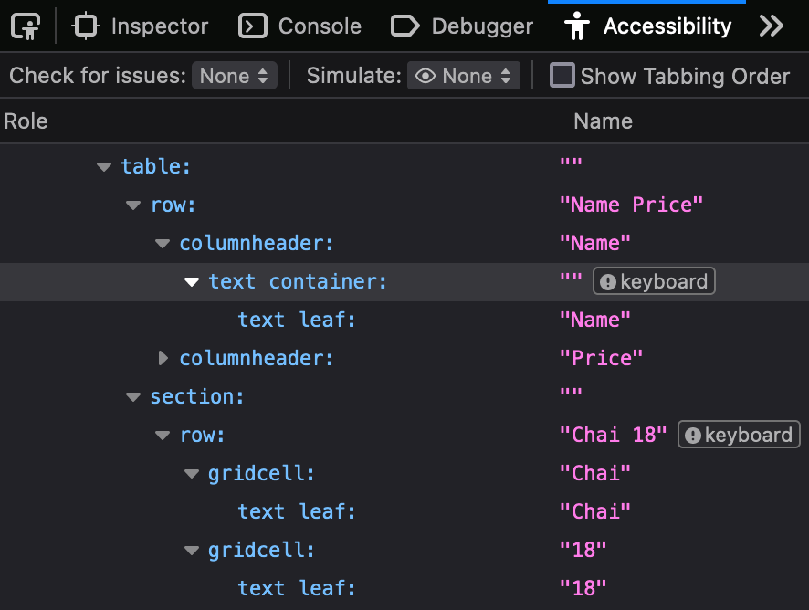
You can also check if you’ve implemented the above steps correctly by opening the table in accessibility tree view. It should look like the following screenshot:

Implementing Grid Accessibility Through Keyboard Navigation
Now let’s focus on the second group of users we want to enable to access our React Data Grid—people navigating our Grid using only their keyboard. This involves two main tasks: implementing single-tab-stop navigation and managing the roving tabindex.
Implementing Single-Tab-Stop Navigable Components
According to WAI-ARIA guidelines, our Data Grid needs to be single-tab-stop so that elements can be quickly skipped with a single key press and navigation isn’t clunky or difficult for our users.
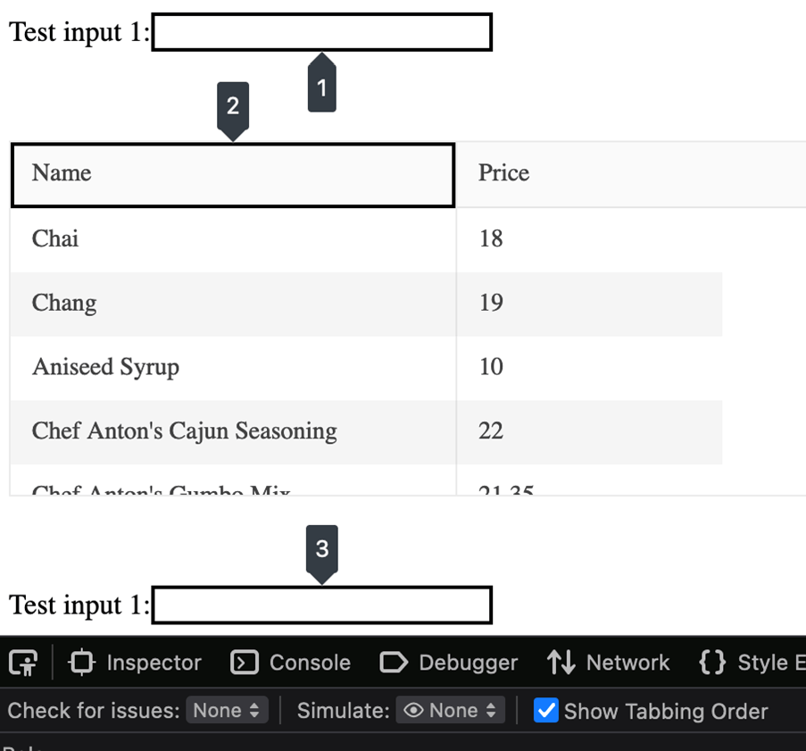
The first step to achieve this is to make only one interactive element focusable with tabindex="0" and the rest of them not focusable with tabindex="-1".
You can see how this looks in the following screenshot from Firefox with “Show Tabbing Order” option enabled:

Managing Roving Tabindex in React
“Roving Tabindex” is a technique where we maintain the component focus state by moving the focus and tabindex between interactive elements in the container. This can be done by listening to the onKeyDown event of the container in order to respond to keyboard events. Here is an example based on the previous screenshot:
- First interactive element,
Namecolumn header, hastabindex="0"and focus. - User presses
Down arrowkeyboard key. In respond to the event:- Make
Chaicell withtabindex="0". - Focus
Chaicell. - Make
Namecell withtabindex="-1".
- Make
This can be difficult. One naïve approach would be to implement the keyboard navigation outside React, using vanilla JavaScript—however, this approach is not a stable or sustainable choice if your components are (correctly) written using the declarative React style. This is because React can modify the underlying DOM tree dynamically, which means your focus state will be lost when the UI changes. A better solution is to use the React context API to communicate changes in focus position to the leaf navigation nodes. This approach should also use the React lifecycle methods and hooks inside the Data Grid to maintain the focus and navigation position between re-renders.
Testing for Accessibility
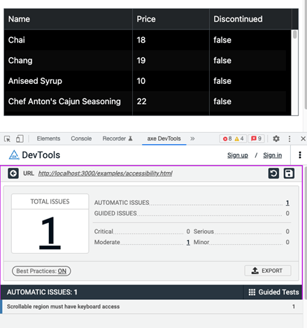
Your work isn’t really done if you haven’t tested whether the accessibility features you implemented actually work—and work well. Testing your solution is best done as combination of static analysis (using tools such as axe DevTools) and manual testing (using a screen reader and keyboard to navigate your component). If we run the axe tool on the KendoReact Data Grid with a high-contrast theme, the result looks like this:

As you see, there is only one error: The scrollable region doesn’t have keyboard access. This is a good example of a false-positive error! As we implemented the keyboard navigation with a roving tabindex, it’s been dynamically moved to the scrollable region.
For manual testing, I suggest starting with NVDA. It’s free, and it has a few helpful options to make testing your implementation even easier:
- Speech viewer console: This section contains a written record of everything that gets read out by the screen reader. It can be turned on by right-clicking on the NVDA system tray icon and selecting Tools -> Speech Viewer.
- Highlighting: This is useful to see the exact navigation position, as well as helping to distinguish browse (red border) and focus (blue border) modes. It can be turned on by right-clicking on the NVDA system tray icon and selecting Preferences -> Settings -> Vision -> Enable Highlighting.
Ready To Update Your Data Grid for Full Accessibility?
You should now have a good overview of what accessibility on the web involves, as well as all the information you need to make your React table component accessible for screen readers and keyboard navigation.
Both building a React data grid and making it accessible are complex, time-consuming tasks. There is an alternative: You can use ready-made components that have accessibility already built in. One excellent option is the KendoReact UI component library, which includes 100+ accessible components, including a powerful React Data Grid component.
Whatever you choose, your users will thank you for prioritizing accessibility and making their experience intuitive and accessible—no matter how they’re navigating your application!
This content originally appeared on Telerik Blogs and was authored by Vladimir Iliev
Vladimir Iliev | Sciencx (2022-04-12T07:52:03+00:00) Tutorial: How To Build an Accessible React Table (Data Grid). Retrieved from https://www.scien.cx/2022/04/12/tutorial-how-to-build-an-accessible-react-table-data-grid/
Please log in to upload a file.
There are no updates yet.
Click the Upload button above to add an update.
