Chakra-UI Crash Course

In this blog, I will teach you how to get started with Chakra-UI.

Video Tutorial

https://medium.com/media/23ebfca1024edf84c39d43574d917f6f/href

What is Chakra-UI?

Chakra-UI is a React UI library that has tons of pre-styled components and utilities that you can use on the website.

Installation

  • I will use Nextjs.
yarn create next-app <my-app>
  • Install packages:
cd <my-app>
yarn add @chakra-ui/react @emotion/react@^11 @emotion/styled@^11 framer-motion@^6

Setup Chakra-UI with next

  • Wrap the Component component with the ChakraProvider component.
import { ChakraProvider } from '@chakra-ui/react'

function MyApp({ Component, pageProps }) {
return (
<ChakraProvider>
<Component {...pageProps} />
</ChakraProvider>
)
}

export default MyApp

Now we can use chakra-UI components.

How to import components

Always import the components and utilities as a named import from the @chakra-ui/react package.

import { Button, Text, Heading, Box, Link, useTheme } from '@chakra-ui/react'

const Index = () => {
return <Heading>Heading 1</Heading>
}

export default Index

Custom styles

There are two ways to customize the styles.

  • Style Props: With style props, you can use almost any CSS property as props.
const Index = () => {
return (
<Heading color='red' fontSize='5rem'>
Heading 1
</Heading>
)
}
  • SX prop: With sx prop, you can use any custom style as an object.
const Index = () => {
return (
<Heading
sx={{
color: 'red',
fontSize: '5rem',
}}
>
Heading 1
</Heading>
)
}

Change the color mode

We can change the color mode using the useColorMode hook.

import React from 'react'

import { IconButton, useColorMode } from '@chakra-ui/react'

import { MoonIcon, SunIcon } from '@chakra-ui/icons'

const ToggleMode = () => {
const { colorMode, toggleColorMode } = useColorMode()
return (
<IconButton
icon={colorMode === 'dark' ? <SunIcon /> : <MoonIcon />}
onClick={toggleColorMode}
/>
)
}

export default ToggleMode

Light mode

Dark mode

To learn more please watch the video tutorial.


Chakra-UI Crash Course was originally published in Level Up Coding on Medium, where people are continuing the conversation by highlighting and responding to this story.


This content originally appeared on Level Up Coding - Medium and was authored by Anjan Shomodder

In this blog, I will teach you how to get started with Chakra-UI.
Video Tutorial

What is Chakra-UI?

Chakra-UI is a React UI library that has tons of pre-styled components and utilities that you can use on the website.

Installation

  • I will use Nextjs.
yarn create next-app <my-app>
  • Install packages:
cd <my-app>
yarn add @chakra-ui/react @emotion/react@^11 @emotion/styled@^11 framer-motion@^6

Setup Chakra-UI with next

  • Wrap the Component component with the ChakraProvider component.
import { ChakraProvider } from '@chakra-ui/react'

function MyApp({ Component, pageProps }) {
return (
<ChakraProvider>
<Component {...pageProps} />
</ChakraProvider>
)
}

export default MyApp

Now we can use chakra-UI components.

How to import components

Always import the components and utilities as a named import from the @chakra-ui/react package.

import { Button, Text, Heading, Box, Link, useTheme } from '@chakra-ui/react'

const Index = () => {
return <Heading>Heading 1</Heading>
}

export default Index

Custom styles

There are two ways to customize the styles.

  • Style Props: With style props, you can use almost any CSS property as props.
const Index = () => {
return (
<Heading color='red' fontSize='5rem'>
Heading 1
</Heading>
)
}
  • SX prop: With sx prop, you can use any custom style as an object.
const Index = () => {
return (
<Heading
sx={{
color: 'red',
fontSize: '5rem',
}}
>
Heading 1
</Heading>
)
}

Change the color mode

We can change the color mode using the useColorMode hook.

import React from 'react'

import { IconButton, useColorMode } from '@chakra-ui/react'

import { MoonIcon, SunIcon } from '@chakra-ui/icons'

const ToggleMode = () => {
const { colorMode, toggleColorMode } = useColorMode()
return (
<IconButton
icon={colorMode === 'dark' ? <SunIcon /> : <MoonIcon />}
onClick={toggleColorMode}
/>
)
}

export default ToggleMode

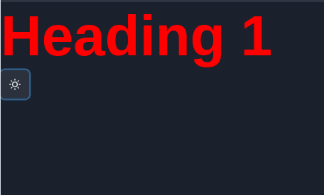
Light mode

Dark mode
To learn more please watch the video tutorial.


Chakra-UI Crash Course was originally published in Level Up Coding on Medium, where people are continuing the conversation by highlighting and responding to this story.


This content originally appeared on Level Up Coding - Medium and was authored by Anjan Shomodder


Print Share Comment Cite Upload Translate Updates
APA

Anjan Shomodder | Sciencx (2022-04-14T00:21:51+00:00) Chakra-UI Crash Course. Retrieved from https://www.scien.cx/2022/04/14/chakra-ui-crash-course/

MLA
" » Chakra-UI Crash Course." Anjan Shomodder | Sciencx - Thursday April 14, 2022, https://www.scien.cx/2022/04/14/chakra-ui-crash-course/
HARVARD
Anjan Shomodder | Sciencx Thursday April 14, 2022 » Chakra-UI Crash Course., viewed ,<https://www.scien.cx/2022/04/14/chakra-ui-crash-course/>
VANCOUVER
Anjan Shomodder | Sciencx - » Chakra-UI Crash Course. [Internet]. [Accessed ]. Available from: https://www.scien.cx/2022/04/14/chakra-ui-crash-course/
CHICAGO
" » Chakra-UI Crash Course." Anjan Shomodder | Sciencx - Accessed . https://www.scien.cx/2022/04/14/chakra-ui-crash-course/
IEEE
" » Chakra-UI Crash Course." Anjan Shomodder | Sciencx [Online]. Available: https://www.scien.cx/2022/04/14/chakra-ui-crash-course/. [Accessed: ]
rf:citation
» Chakra-UI Crash Course | Anjan Shomodder | Sciencx | https://www.scien.cx/2022/04/14/chakra-ui-crash-course/ |

Please log in to upload a file.


There are no updates yet.
Click the Upload button above to add an update.

You must be logged in to translate posts. Please log in or register.