This content originally appeared on Level Up Coding - Medium and was authored by Ryan Tan
Using backgrounds in CSS is very common, normally when adding color or images to web pages. But backgrounds can be more than just that.
The background property
background is essentially a combination of the following properties:
- background-image
- background-size
- background-position
- background-color
and more, but I will be focusing on the above in this article.
This allows backgrounds to be more dynamic and customizable.
Multiple images
Meet Bob.
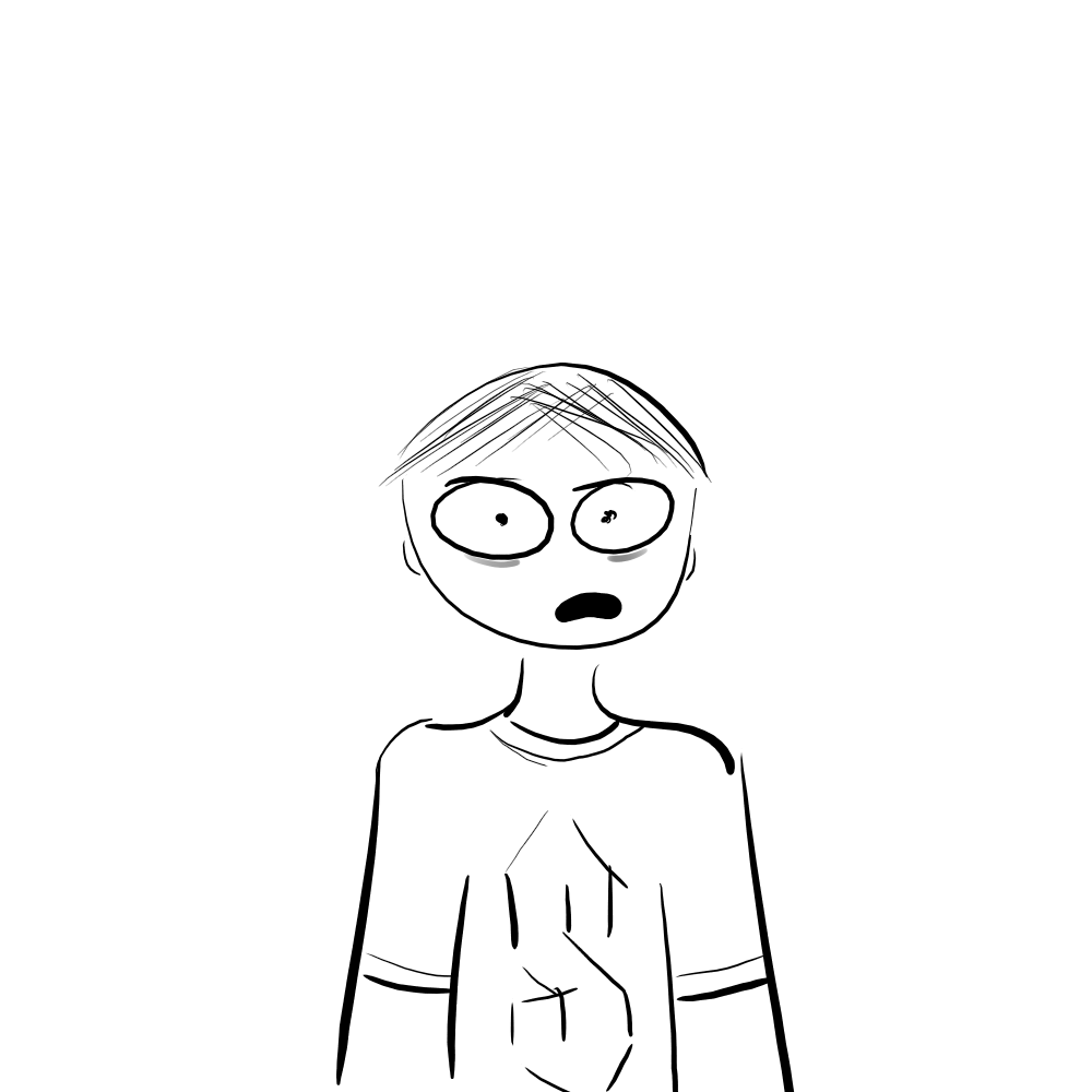
Bob is an indoor person who stays in his room and codes all day. As a result, he has never experienced what is called “touching grass”. So, today, we are going to help him do just that.
In this <div>, we have a background image.
It is positioned in the center , and has size cover so it will fill the whole <div>. no-repeat is used so that the background doesn’t repeat itself. The position and size is split using the forward slash (/)
background: center / cover no-repeat url("/img/bg.jpg");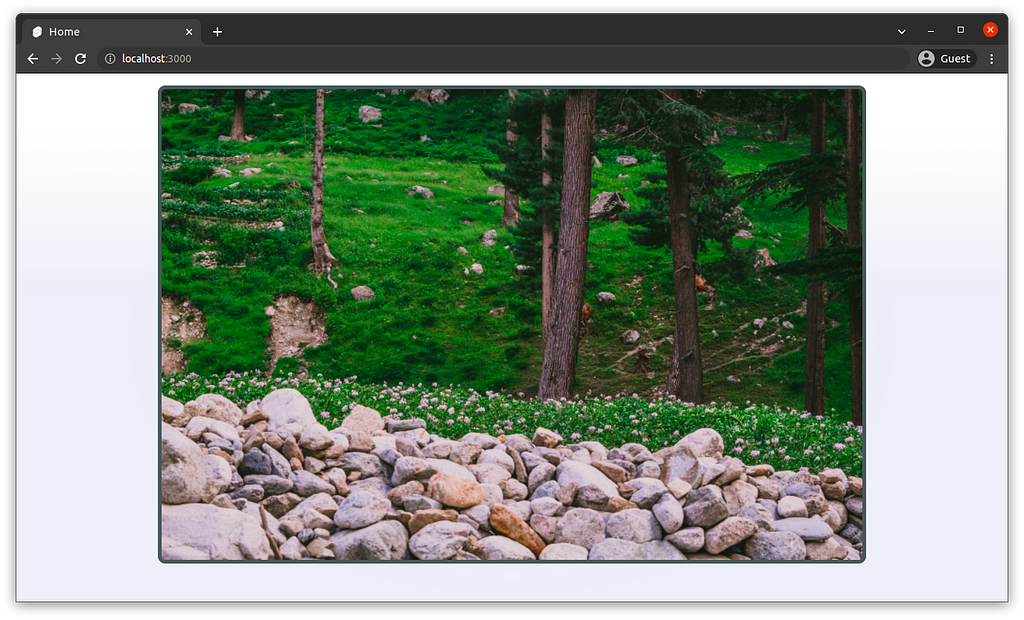
Let’s add Bob to the background in the same line.
Multiple images/elements in the background can be separated by commas. Here, we can make Bob 30% the width/height of the <div>.
background: center / cover no-repeat url("/img/bg.jpg"),
   center / 30% no-repeat url("/img/bob.png");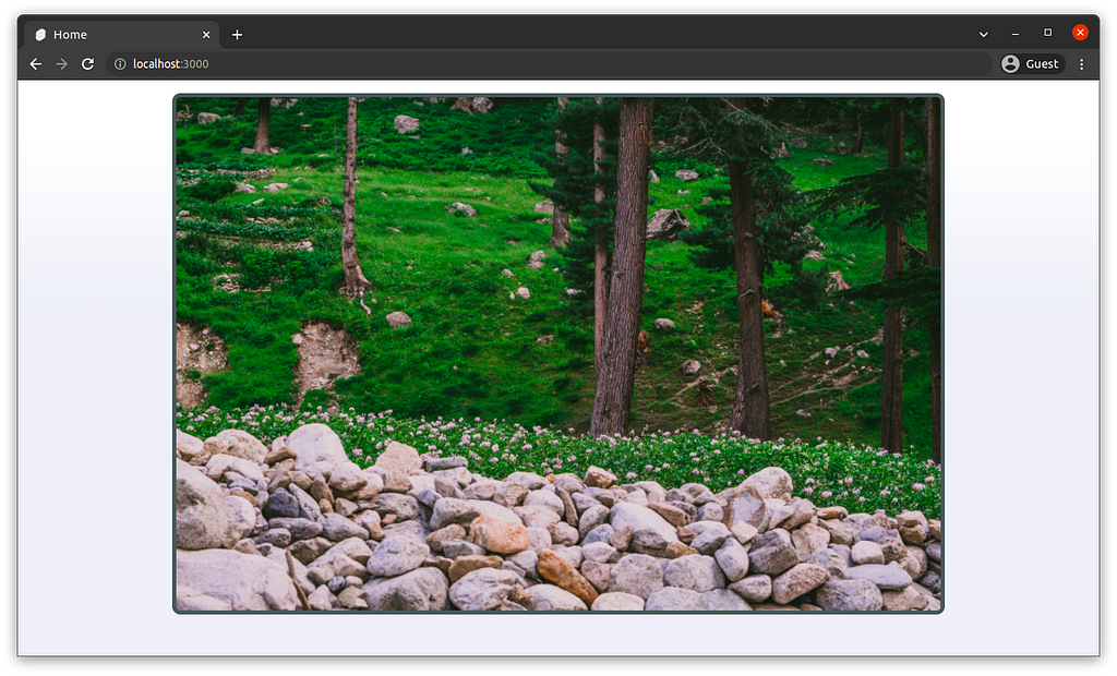
Huh? Why is Bob not visible?
Elements in the background property are displayed in the order specified in the CSS code. In the above code, Bob was added after the background, so actually, Bob is behind the background.
Let’s bring Bob to the front.
background: center / 30% no-repeat url("/img/bob.png"),
   center / cover no-repeat url("/img/bg.jpg");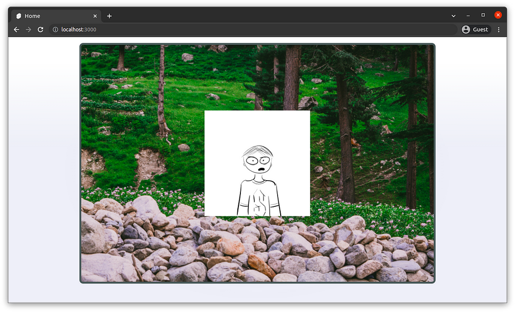
And just like that, Bob is visible. But, he is still not touching the grass. Let’s reposition him.
Repositioning and resizing is fairly simple. I will position him 30% along x and 20% along y, and resize him to 15% of the width/height.
background: 30% 20% / 15% no-repeat url("/img/bob.png"),
   center / cover no-repeat url("/img/bg.jpg");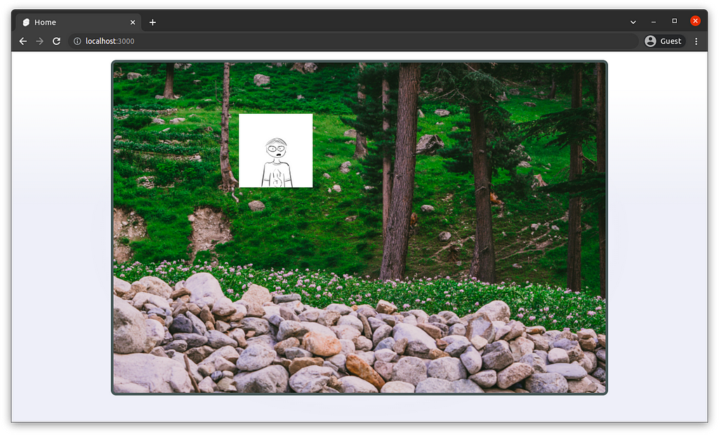
Finally, Bob is where we want him to be, and he can finally touch grass.
And that was how to resize and position different images in the background property.
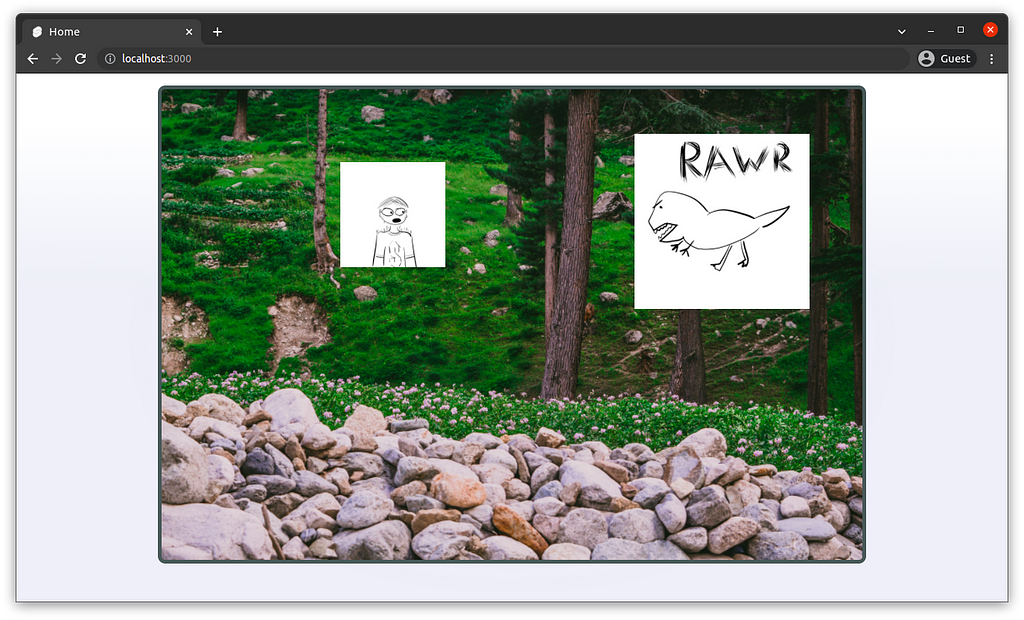
Uh oh, it seems like we have disturbed the dinosaurs, lets get out of here while we can…
linear-gradient and radial-gradient
The dino may be fast, but we managed to escape to the car.
Bob is proud of his car and would like to take a photo. So here we have Bob standing in front of his car:
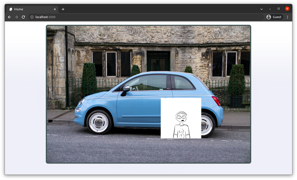
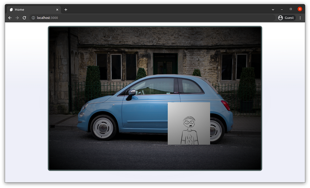
Lets make a vignette effect around the image.
Here, we can use radial-gradient as an overlay. Remember, the order matters.
background: radial-gradient(rgba(0, 0, 0, 0.05), rgba(0, 0, 0, 1)),
   70% 75% / 20% no-repeat url("/img/bob.png"),
   center / cover no-repeat url("/img/bg2.jpg");
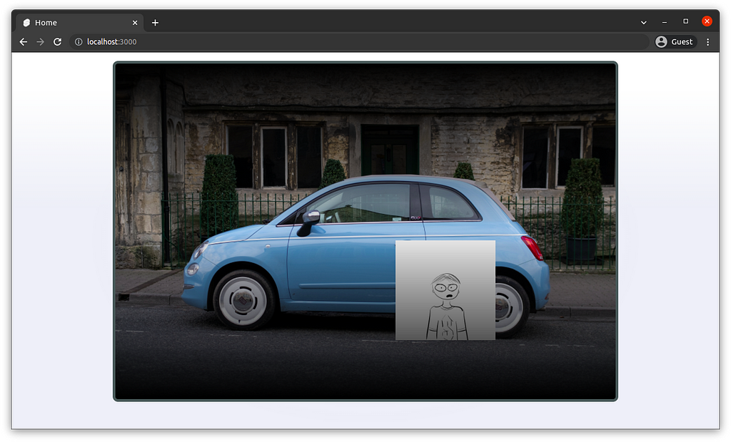
We could also use linear-gradient as an overlay instead for a different effect.
background: linear-gradient(rgba(0, 0, 0, 1), rgba(0, 0, 0, 0.05), rgba(0, 0, 0, 1)),
   70% 75% / 20% no-repeat url("/img/bob.png"),
   center / cover no-repeat url("/img/bg2.jpg");
This is how I applied the technique on a production website I develop.

Conclusion
Using the background property, I am able to use the background as a canvas, which is very flexible. I feel like there is also great potential for cool effects with much experimentation. I hope these demonstrations are helpful to you. Thank you for reading!
Sources:
Getting creative with the CSS background property was originally published in Level Up Coding on Medium, where people are continuing the conversation by highlighting and responding to this story.
This content originally appeared on Level Up Coding - Medium and was authored by Ryan Tan
Ryan Tan | Sciencx (2022-04-14T00:35:28+00:00) Getting creative with the CSS background property. Retrieved from https://www.scien.cx/2022/04/14/getting-creative-with-the-css-background-property/
Please log in to upload a file.
There are no updates yet.
Click the Upload button above to add an update.
