
This content originally appeared on Bram.us and was authored by Bramus!
Late last week, I was very delighted to see that Chromium will start prototyping with CSS Toggles, a proposal currently only in Editor’s Draft, authored by Tab Atkins and Miriam Suzanne (who else?!).
CSS toggles are a mechanism for associating toggleable state with a DOM element. This state can be defined and connected to activations through CSS properties, and can be queried in CSS selectors. This provides a declarative mechanism for specifying state that describes behaviors like the existing HTML behaviors for checkboxes or radio buttons.
🤔 Editor's Draft?
A Editor's Draft (ED) is an unofficial version of a specification. They have no official standing, and do not necessarily imply consensus of the CSS Working Group. These Editor's Drafts can describe modules that are not part of the Recommendation Track yet, or can contain in-progress versions of Modules that already are part of the Rec Track.
If an Editor's Draft gets picked up by the CSSWG, a “First Public Working Draft” gets published. This makes the Module officially part of the Rec Track and marks the start of the Working Draft (WD) phase. From there on the proposal can advance further down the Recommendation Track.
In visual form, the Recommendation Track looks something like this:
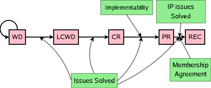
See An Inside View of the CSS Working Group at W3C for more details on all phases.
~
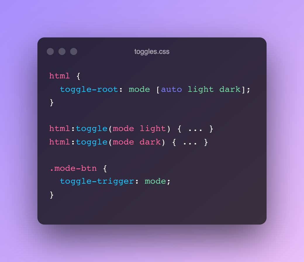
The basic use-case would be something that resembles a checkbox, which can go from 0 (inactive) to 1 (active)
html {
  toggle-root: checkbox; /* Create a toggle named checkbox. It will cycle between 0 (inactive, default) and 1 (active) */
}

button {
  toggle-trigger: checkbox; /* When clicking the button, toggle the checkbox */
}

html:toggle(checkbox) {
  /* Styles to apply when the checkbox toggle is active */
}
~
But there’s a lot more to the spec than just this basic use case:
- A toggle can have more than 1 active state, and they don’t need to be numbers
- The initial toggle state can be defined
- An element can be both the
toggle-rootand thetoggle-trigger, use thetoggleproperty - The scope of a toggle value can be narrowed down to descendant elements only (instead of being visible to siblings and their descendants)
toggle-visibilityallows you to show/hide an element based on a toggle value. Its contents however, is always available to the UA for in-page-find and the like- Toggles can be grouped using
toggle-group. Handy for tab interfaces, where only 1 tab can be active at the same time. - Sticky toggles can not become inactive, there will always be one item active
- State machines with transitions are being considered
It’s pretty powerful stuff, which will take some time to wrap your head around. For me, it clicked once I saw Miriam’s demo site in action, which uses a polyfill to make things work.
~
CSS Toggles Explainer →
CSS Toggles Demo Page (with Polyfill) →
CSS Toggles (Unofficial Draft) →
CSS Toggles Polyfill →
CSS WG Issue #6991: CSS Toggles →
This content originally appeared on Bram.us and was authored by Bramus!
Bramus! | Sciencx (2022-04-19T23:07:44+00:00) The Future of CSS: CSS Toggles. Retrieved from https://www.scien.cx/2022/04/19/the-future-of-css-css-toggles/
Please log in to upload a file.
There are no updates yet.
Click the Upload button above to add an update.