How we Use Design Tokens in React

Master design tokens in your React component design system. Better UI consistency and developer with designer collaboration.

Based on this incredible article by my teammates Sunil Sandhu and Nitsan Cohen. Check it out to play with our real code examples and more.
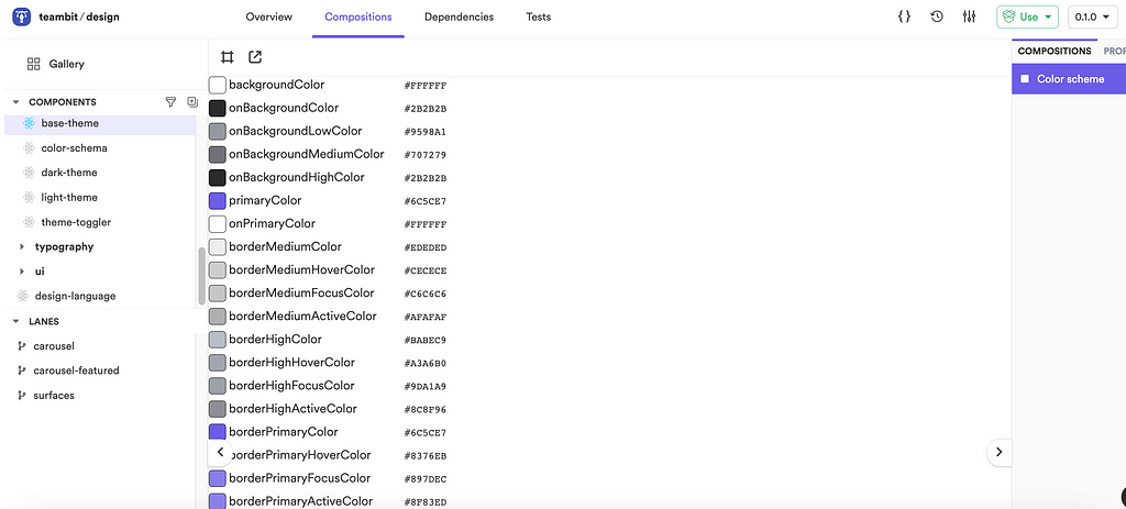
Design Tokens in our composable theming component

At Bit we build everything in a composable way, in components.

For Frontend, this means we use Bit to turn our own components in React into Lego pieces we can develop, version, and compose into apps and products.

Since we use every component in many different places, keeping our UI consistent and making it easy for designers and developers to build together has become a critical mission for us.

That’s where Design Tokens come in. By putting together design tokens and composable components,

Through the combination of React + Bit + Design Tokens we create an experience for controlling the design of many applications like never before possible, and make it easier to collaborate together than every before.

In this post, I’ll show you how we work and help you do the same.

1. Designer and Developer collaboration in your React Design System

Sadly, product stakeholders, typically, do not share a common language, common tools, or a common source of truth. While such issues propagate across stakeholders, some of the main causes of friction occur during collaborative efforts between design and development.

Designers work with tools such as Figma/Sketch/Adobe/[insert design tool]. Developers work with tools such as VSCode/WebStorm/Atom/[insert IDE].

For designers, a component is a visual image; for developers, a component is code, likely written in JavaScript and React/Angular/Vue.js/[insert frontend framework].

One speaks of code; another speaks of visual language.

Roses are #ff0000, Violets are cta-background-purple-500

While access to a set of high fidelity wireframes, and a design guide in the form of a Google Doc may be shared with product stakeholders, design teams find themselves at the mercy of engineering teams when it comes to translating visual images and a design guide into components and code. This leaves us susceptible to inconsistencies, mistakes, compromises, and so on.

Furthermore, this code is often built and compiled into a single package, making it even more difficult to reverse the aforementioned inconsistencies, mistakes, and compromises.

However, it isn’t all doom and gloom, as modern design practices have facilitated better collaboration amongst design and engineering teams.

Enter design tokens.

We first started to hear publicly about design tokens in 2014.

Created by Salesforce’s Design System team, design tokens, in their words, “are the visual design atoms of the design system — specifically, they are named entities that store visual design attributes. We use them in place of hard-coded values (such as hex values for color or pixel values for spacing) in order to maintain a scalable and consistent visual system for UI development.”

With this in mind, a component will be composed of a set of design tokens.

2. Design Tokens in our React Design System

Let’s take a moment to look at the example of a design token.

Here is our composable design system created in Bit and React, so that each component is independently developed, versioned, and can be installed and used in any application. We use this “Lego box” to build everything we make: From bit.dev to bit.cloud and even the local Bit workspace UI!
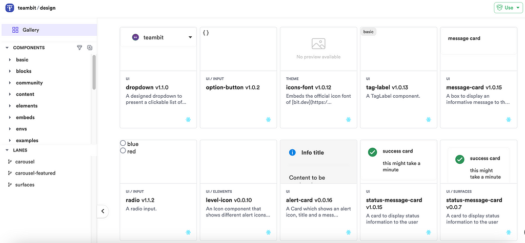
Our composable component design system in React

Below is the component that contains list of design tokens used in the Base Theme here at Bit. Take a look at is here:
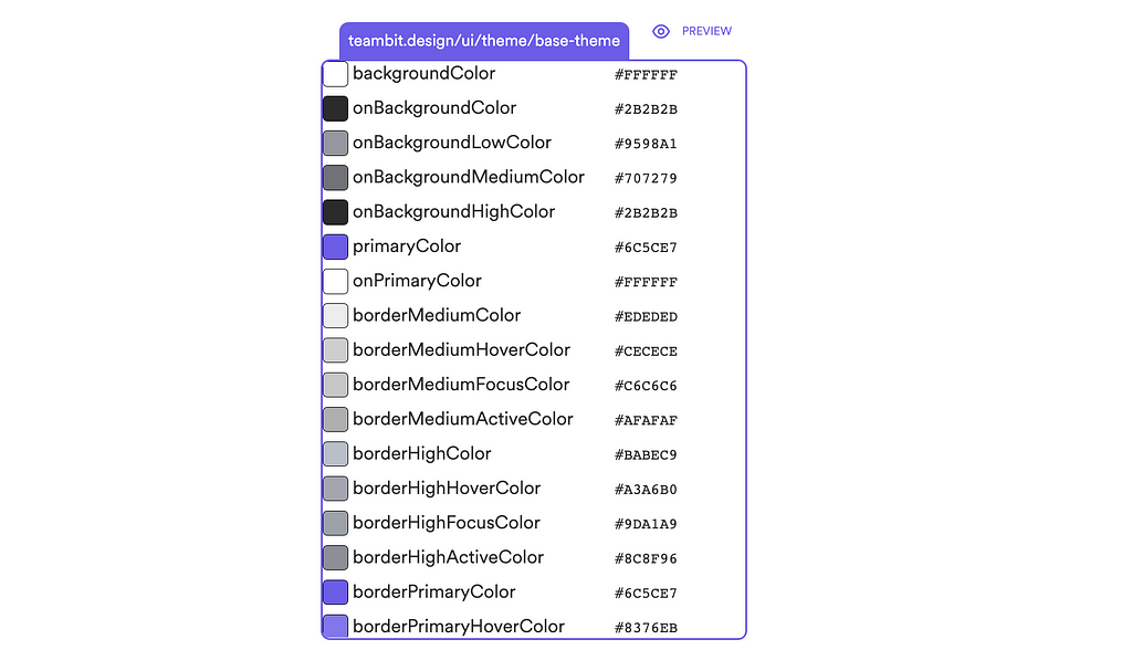
design / themes / base-theme

If you want, you are welcome to fork our base theme component:

bit fork teambit.design/themes/base-theme

First, let’s look at base-theme-schema.ts. It is the glossary for our design tokens.

You’ll notice that there are roughly three kinds of tokens:

  • nameOfTokenColor. For example: backgroundColor.
  • onNameOfTokenColor. For example: onBackgroundColor.
  • nameOfTokenStateColor. For example: borderMediumHoverColor.

The first one is the color that is used as the background. Second, we have tokens that begin with the word on. This signifies that the color will be used on top of the first color. In the base-theme component, the backgroundColor is white (#FFFFFF), and the onBackgroundColor is black (#2B2B2B). The third type of token indicates a specific state: hover, active, etc.

You will notice that token names for these color properties are not intrinsically linked to the color itself, but rather the purpose it serves within the branding. This creates a self-documenting system where each token is an entity that can be overridden if required, while still maintaining its naming. In other words, we have not assigned a token the name of purple simply because its initial color is purple.

If we were to set up the token to change color when given a different theme (eg. a dark theme), the color might no longer be purple, but still has a token name of purple — rendering the naming convention ineffective and susceptible to confusion.

3. Cross-team and cross-app workflows with design tokens

Salesforce realized that if you establish a new data layer on top of your visual language elements, and manage them from a single source of truth, you could use a system to consistently scale to all platforms.

Design tokens can be created in such a way that those token values can be parsed according to device. In other words, you can send JSON values to web and iOS, XML to Android, and so on.

They can be transformed and formatted to meet the needs of any platform. This decoupling of design decisions from platforms and languages facilitates consistency at scale.

Design tokens create a system that is flexible enough for designers to become active contributors directly over code, but without risking or compromising developer control and velocity. Design teams will own the tokens.

With this comes a reliance from designers to ensure that tokens are named correctly, are used in the correct places, are not misused, are in sync between design tools and code. With great power, comes great responsibility.

Fortunately, this responsibility can be delegated to components.

Design tokens in a shared React component — Example

Here is the “Hero” component we use on the top fold of the majority of our websites. It’s written in React and thanks to Bit we can use it anywhere.
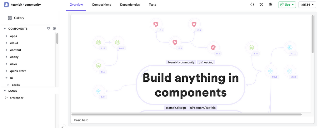
Now let’s see how this component is being used in two completely different web apps. The first is bit.dev, our community open source website. The second is The Bit Blog which lives on bit.cloud.
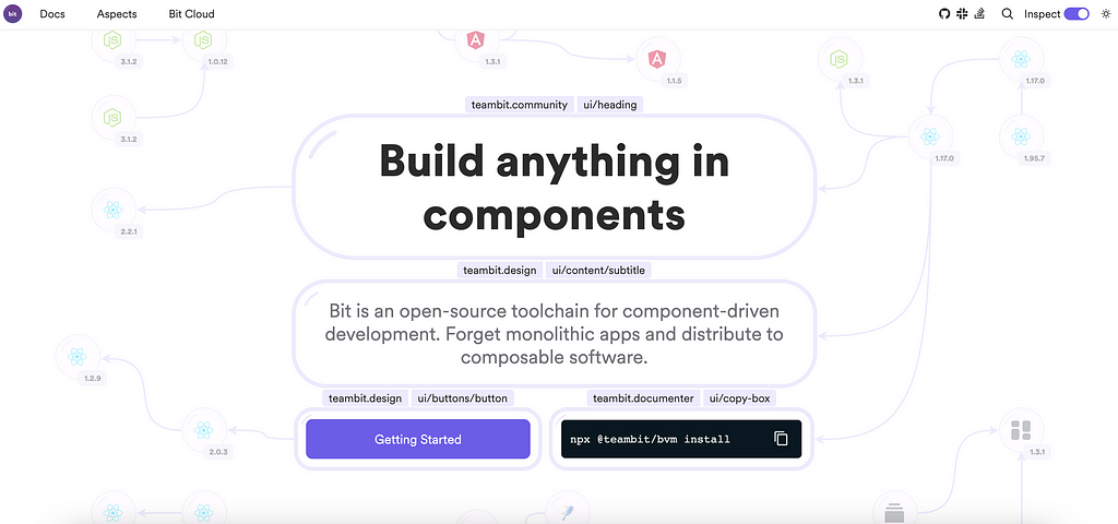
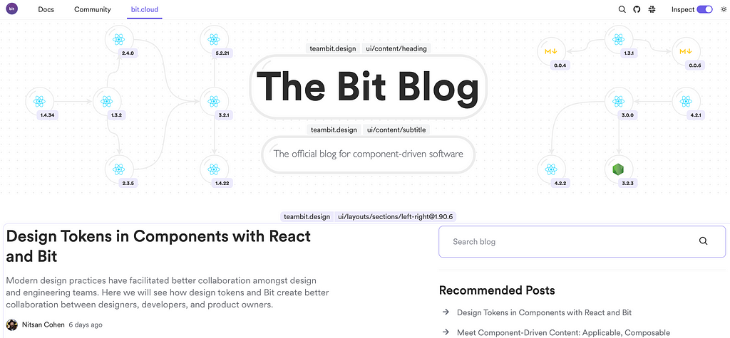
We have different variations of the Hero component, where one uses the other and builds on top of it. Yet still, they depend on each other and when you update the original Hero component, all apps and pages that depend on it will get the update too. Neat right?

Design tokens + Bit + React = The ultimate design system combo

Design Tokens are an API between devs and design. React turns design into code components. Bit turns components into reusable composable Lego.

Together, they are extremely powerful for a design system.

With Bit, components can be used and composed into many different applications, and can be used by many different teams.

This means the same component can “live” in a hundred different applications, and every change to it will change all of them.

An update to a single component can propagate to every relevant page on different apps throughout the organization and make sure that the organization keeps brand and design consistency at every touchpoint.

With Bit, we can create greater levels of granularity for design systems. The design tokens that feed the atoms in a design system can be split up according to your own needs. You may choose to split design tokens into multiple components, based on value types such as typography, size, color, grid etc.

Each component can be independently tagged and versioned, making it easier to manage subsections of a design system.

As a single change propagates through the system, ongoing visual consistency across every touchpoint, page, and application can be guaranteed. And if something needs to be reverted, it’s as simple as rolling back a version of the component.

Distributed design tokens are especially powerful, as it grants the design team control over changes to a design system down to the granular level.

For example, when handling things such as internationalization, or line height differences amongst different languages, you can make specific adjustments right at the point of use, rather than having to update an entire library of design tokens in a monolithic structure.

Under our hood

At Bit, we decouple tokens from themes, and pass tokens to components through a theme provider.

With this, we are now able to update a single theme prop in a single component and the change will propagate throughout the application.

We can start by defining the values for our design tokens:

import { BaseThemeSchema } from './base-theme-schema';

/**
* maintained by design tokens go here!
* the designer.
*/
export const baseThemeDefaults: BaseThemeSchema = {
backgroundColor: '#FFFFFF',
onBackgroundColor: '#2B2B2B',
borderMediumColor: '#9598A1',
onBackgroundMediumColor: '#707279',
onBackgroundHighColor: '#2B2B2B',
...
};

Now that we have defined the values of the design tokens, we can use them in our createTheme function.

const { useTheme, ThemeProvider } = createTheme<BaseThemeSchema>({
theme: baseThemeDefaults,
});
};

This function returns a useTheme hook and a ThemeProvider component.

After wrapping your app with the ThemeProvider, you gain access to the theme values inside of our components by using the useTheme hook:

const ButtonStyledWithJs = () => {
const { backgroundColor, onBackgroundColor, borderMediumColor } = useTheme();
  const jsVars = {
backgroundColor: backgroundColor,
color: onBackgroundColor,
borderColor: borderMediumColor,
};
return <button style={jsVars}>A Button Styled using JS Vars</button>;
};

Another way to access the values is by using CSS variables. All of the components wrapped with ThemeProvider wiil have access to the theme values by using the var keyword. For instance:

const ButtonStyledWithCss = () => {
/*
* the `createTheme` function generated these CSS props. They are made available on the page by the generated Theme component.
*/
const cssProps = {
backgroundColor: "var(--background-color)",
color: "var(--on-background-color)",
borderColor: "var(--border-medium-color)",
};
return <button style={cssProps}>A Button Styled using CSS Props</button>;
};

Design tokens can be created in such a way that they can be used agnostically to the rest of the application. If one product in your company was built with SCSS, and another product was built with CSS-in-JS, the same set of design tokens can be used and translated to work across different technologies.

Effortless UI consistency for the organization

When a UI component is using a design token, this gives the team behind it (for example: the design system team) the power to easily ship, change, and control design across the organization’s teams and applications. This is a very powerful thing to have for any sizeable modern organization.

At the same time, developers can spend more time working on the creation of business features, and less on manual updates to styles. And when design tokens are coupled with theming, the time it takes to adapt and change the look and feel of an interface is greatly reduced.

Design tokens enable consistency across many products, teams, and pages. Product owners can expect to see fewer tickets related to styling bugs, and the potential for better collaboration between designers and developers. This creates a better experience for users, and better results for the business.

A glimpse into the future

More and features are being added to Bit each week. Soon, you will be able to edit design tokens directly from the web via bit.cloud. Visual editors in the form of workspaces will make it easier than ever for designers to influence the development process.

A designer will be able to change a design token, update a component version, tag and export right on the cloud. Ripple CI will run and all apps and teams will get the new token update. Engineering teams and other stakeholders like PMs will be able to define permissions and rules for the update, with granular overview and control over the process before changes are deployed.

Conclusion

Design tokens provide a gateway to a frictionless experience between designer / developer collaboration. Designers are given the power to create a visual language that can be more easily translated into code. Coupled with tools such as Bit, those tokens can be propagated across components, applications, and systems.

Design tokens create a single source of truth that can be actively used by product teams across the organization. Rather than copying and pasting values from style guides, design tokens can be created and used as code.

When design tokens are combined with React and Bit, the organization can build all of its apps like Lego in composable components which greatly helped to improve consistency. When design tokens are combined into this workflow, control over design across every page and app in the organization becomes effortless, flexible, and empowers the design system like never before.

Learn more


How we Use Design Tokens in React was originally published in Bits and Pieces on Medium, where people are continuing the conversation by highlighting and responding to this story.


This content originally appeared on Bits and Pieces - Medium and was authored by Jonathan Saring

Master design tokens in your React component design system. Better UI consistency and developer with designer collaboration.

Based on this incredible article by my teammates Sunil Sandhu and Nitsan Cohen. Check it out to play with our real code examples and more.
Design Tokens in our composable theming component

At Bit we build everything in a composable way, in components.

For Frontend, this means we use Bit to turn our own components in React into Lego pieces we can develop, version, and compose into apps and products.

Since we use every component in many different places, keeping our UI consistent and making it easy for designers and developers to build together has become a critical mission for us.

That’s where Design Tokens come in. By putting together design tokens and composable components,

Through the combination of React + Bit + Design Tokens we create an experience for controlling the design of many applications like never before possible, and make it easier to collaborate together than every before.

In this post, I’ll show you how we work and help you do the same.

1. Designer and Developer collaboration in your React Design System

Sadly, product stakeholders, typically, do not share a common language, common tools, or a common source of truth. While such issues propagate across stakeholders, some of the main causes of friction occur during collaborative efforts between design and development.

Designers work with tools such as Figma/Sketch/Adobe/[insert design tool]. Developers work with tools such as VSCode/WebStorm/Atom/[insert IDE].

For designers, a component is a visual image; for developers, a component is code, likely written in JavaScript and React/Angular/Vue.js/[insert frontend framework].

One speaks of code; another speaks of visual language.

Roses are #ff0000, Violets are cta-background-purple-500

While access to a set of high fidelity wireframes, and a design guide in the form of a Google Doc may be shared with product stakeholders, design teams find themselves at the mercy of engineering teams when it comes to translating visual images and a design guide into components and code. This leaves us susceptible to inconsistencies, mistakes, compromises, and so on.

Furthermore, this code is often built and compiled into a single package, making it even more difficult to reverse the aforementioned inconsistencies, mistakes, and compromises.

However, it isn’t all doom and gloom, as modern design practices have facilitated better collaboration amongst design and engineering teams.

Enter design tokens.

We first started to hear publicly about design tokens in 2014.

Created by Salesforce’s Design System team, design tokens, in their words, “are the visual design atoms of the design system — specifically, they are named entities that store visual design attributes. We use them in place of hard-coded values (such as hex values for color or pixel values for spacing) in order to maintain a scalable and consistent visual system for UI development.”

With this in mind, a component will be composed of a set of design tokens.

2. Design Tokens in our React Design System

Let’s take a moment to look at the example of a design token.

Here is our composable design system created in Bit and React, so that each component is independently developed, versioned, and can be installed and used in any application. We use this “Lego box” to build everything we make: From bit.dev to bit.cloud and even the local Bit workspace UI!

Our composable component design system in React

Below is the component that contains list of design tokens used in the Base Theme here at Bit. Take a look at is here:

design / themes / base-theme

If you want, you are welcome to fork our base theme component:

bit fork teambit.design/themes/base-theme

First, let’s look at base-theme-schema.ts. It is the glossary for our design tokens.

You’ll notice that there are roughly three kinds of tokens:

  • nameOfTokenColor. For example: backgroundColor.
  • onNameOfTokenColor. For example: onBackgroundColor.
  • nameOfTokenStateColor. For example: borderMediumHoverColor.

The first one is the color that is used as the background. Second, we have tokens that begin with the word on. This signifies that the color will be used on top of the first color. In the base-theme component, the backgroundColor is white (#FFFFFF), and the onBackgroundColor is black (#2B2B2B). The third type of token indicates a specific state: hover, active, etc.

You will notice that token names for these color properties are not intrinsically linked to the color itself, but rather the purpose it serves within the branding. This creates a self-documenting system where each token is an entity that can be overridden if required, while still maintaining its naming. In other words, we have not assigned a token the name of purple simply because its initial color is purple.

If we were to set up the token to change color when given a different theme (eg. a dark theme), the color might no longer be purple, but still has a token name of purple — rendering the naming convention ineffective and susceptible to confusion.

3. Cross-team and cross-app workflows with design tokens

Salesforce realized that if you establish a new data layer on top of your visual language elements, and manage them from a single source of truth, you could use a system to consistently scale to all platforms.

Design tokens can be created in such a way that those token values can be parsed according to device. In other words, you can send JSON values to web and iOS, XML to Android, and so on.

They can be transformed and formatted to meet the needs of any platform. This decoupling of design decisions from platforms and languages facilitates consistency at scale.

Design tokens create a system that is flexible enough for designers to become active contributors directly over code, but without risking or compromising developer control and velocity. Design teams will own the tokens.

With this comes a reliance from designers to ensure that tokens are named correctly, are used in the correct places, are not misused, are in sync between design tools and code. With great power, comes great responsibility.

Fortunately, this responsibility can be delegated to components.

Design tokens in a shared React component — Example

Here is the “Hero” component we use on the top fold of the majority of our websites. It’s written in React and thanks to Bit we can use it anywhere.

Now let’s see how this component is being used in two completely different web apps. The first is bit.dev, our community open source website. The second is The Bit Blog which lives on bit.cloud.

We have different variations of the Hero component, where one uses the other and builds on top of it. Yet still, they depend on each other and when you update the original Hero component, all apps and pages that depend on it will get the update too. Neat right?

Design tokens + Bit + React = The ultimate design system combo

Design Tokens are an API between devs and design. React turns design into code components. Bit turns components into reusable composable Lego.

Together, they are extremely powerful for a design system.

With Bit, components can be used and composed into many different applications, and can be used by many different teams.

This means the same component can “live” in a hundred different applications, and every change to it will change all of them.

An update to a single component can propagate to every relevant page on different apps throughout the organization and make sure that the organization keeps brand and design consistency at every touchpoint.

With Bit, we can create greater levels of granularity for design systems. The design tokens that feed the atoms in a design system can be split up according to your own needs. You may choose to split design tokens into multiple components, based on value types such as typography, size, color, grid etc.

Each component can be independently tagged and versioned, making it easier to manage subsections of a design system.

As a single change propagates through the system, ongoing visual consistency across every touchpoint, page, and application can be guaranteed. And if something needs to be reverted, it’s as simple as rolling back a version of the component.

Distributed design tokens are especially powerful, as it grants the design team control over changes to a design system down to the granular level.

For example, when handling things such as internationalization, or line height differences amongst different languages, you can make specific adjustments right at the point of use, rather than having to update an entire library of design tokens in a monolithic structure.

Under our hood

At Bit, we decouple tokens from themes, and pass tokens to components through a theme provider.

With this, we are now able to update a single theme prop in a single component and the change will propagate throughout the application.

We can start by defining the values for our design tokens:

import { BaseThemeSchema } from './base-theme-schema';

/**
* maintained by design tokens go here!
* the designer.
*/
export const baseThemeDefaults: BaseThemeSchema = {
backgroundColor: '#FFFFFF',
onBackgroundColor: '#2B2B2B',
borderMediumColor: '#9598A1',
onBackgroundMediumColor: '#707279',
onBackgroundHighColor: '#2B2B2B',
...
};

Now that we have defined the values of the design tokens, we can use them in our createTheme function.

const { useTheme, ThemeProvider } = createTheme<BaseThemeSchema>({
theme: baseThemeDefaults,
});
};

This function returns a useTheme hook and a ThemeProvider component.

After wrapping your app with the ThemeProvider, you gain access to the theme values inside of our components by using the useTheme hook:

const ButtonStyledWithJs = () => {
const { backgroundColor, onBackgroundColor, borderMediumColor } = useTheme();
  const jsVars = {
backgroundColor: backgroundColor,
color: onBackgroundColor,
borderColor: borderMediumColor,
};
return <button style={jsVars}>A Button Styled using JS Vars</button>;
};

Another way to access the values is by using CSS variables. All of the components wrapped with ThemeProvider wiil have access to the theme values by using the var keyword. For instance:

const ButtonStyledWithCss = () => {
/*
* the `createTheme` function generated these CSS props. They are made available on the page by the generated Theme component.
*/
const cssProps = {
backgroundColor: "var(--background-color)",
color: "var(--on-background-color)",
borderColor: "var(--border-medium-color)",
};
return <button style={cssProps}>A Button Styled using CSS Props</button>;
};

Design tokens can be created in such a way that they can be used agnostically to the rest of the application. If one product in your company was built with SCSS, and another product was built with CSS-in-JS, the same set of design tokens can be used and translated to work across different technologies.

Effortless UI consistency for the organization

When a UI component is using a design token, this gives the team behind it (for example: the design system team) the power to easily ship, change, and control design across the organization’s teams and applications. This is a very powerful thing to have for any sizeable modern organization.

At the same time, developers can spend more time working on the creation of business features, and less on manual updates to styles. And when design tokens are coupled with theming, the time it takes to adapt and change the look and feel of an interface is greatly reduced.

Design tokens enable consistency across many products, teams, and pages. Product owners can expect to see fewer tickets related to styling bugs, and the potential for better collaboration between designers and developers. This creates a better experience for users, and better results for the business.

A glimpse into the future

More and features are being added to Bit each week. Soon, you will be able to edit design tokens directly from the web via bit.cloud. Visual editors in the form of workspaces will make it easier than ever for designers to influence the development process.

A designer will be able to change a design token, update a component version, tag and export right on the cloud. Ripple CI will run and all apps and teams will get the new token update. Engineering teams and other stakeholders like PMs will be able to define permissions and rules for the update, with granular overview and control over the process before changes are deployed.

Conclusion

Design tokens provide a gateway to a frictionless experience between designer / developer collaboration. Designers are given the power to create a visual language that can be more easily translated into code. Coupled with tools such as Bit, those tokens can be propagated across components, applications, and systems.

Design tokens create a single source of truth that can be actively used by product teams across the organization. Rather than copying and pasting values from style guides, design tokens can be created and used as code.

When design tokens are combined with React and Bit, the organization can build all of its apps like Lego in composable components which greatly helped to improve consistency. When design tokens are combined into this workflow, control over design across every page and app in the organization becomes effortless, flexible, and empowers the design system like never before.

Learn more


How we Use Design Tokens in React was originally published in Bits and Pieces on Medium, where people are continuing the conversation by highlighting and responding to this story.


This content originally appeared on Bits and Pieces - Medium and was authored by Jonathan Saring


Print Share Comment Cite Upload Translate Updates
APA

Jonathan Saring | Sciencx (2022-04-28T09:40:28+00:00) How we Use Design Tokens in React. Retrieved from https://www.scien.cx/2022/04/28/how-we-use-design-tokens-in-react/

MLA
" » How we Use Design Tokens in React." Jonathan Saring | Sciencx - Thursday April 28, 2022, https://www.scien.cx/2022/04/28/how-we-use-design-tokens-in-react/
HARVARD
Jonathan Saring | Sciencx Thursday April 28, 2022 » How we Use Design Tokens in React., viewed ,<https://www.scien.cx/2022/04/28/how-we-use-design-tokens-in-react/>
VANCOUVER
Jonathan Saring | Sciencx - » How we Use Design Tokens in React. [Internet]. [Accessed ]. Available from: https://www.scien.cx/2022/04/28/how-we-use-design-tokens-in-react/
CHICAGO
" » How we Use Design Tokens in React." Jonathan Saring | Sciencx - Accessed . https://www.scien.cx/2022/04/28/how-we-use-design-tokens-in-react/
IEEE
" » How we Use Design Tokens in React." Jonathan Saring | Sciencx [Online]. Available: https://www.scien.cx/2022/04/28/how-we-use-design-tokens-in-react/. [Accessed: ]
rf:citation
» How we Use Design Tokens in React | Jonathan Saring | Sciencx | https://www.scien.cx/2022/04/28/how-we-use-design-tokens-in-react/ |

Please log in to upload a file.


There are no updates yet.
Click the Upload button above to add an update.

You must be logged in to translate posts. Please log in or register.