
This content originally appeared on Level Up Coding - Medium and was authored by Isaiah Brown

In the previous post, I ’v talked about ways to layout content using what is known as flexboxes. In part 2 of the flexbox post, I mentioned grids. With CSS grid you are able to use this property to completely create layouts for your web page(s). With CSS grid they are 2 dimensional because you are able to not only use the parent to structure your layout but also manipulate your items to fit the needs of your layout. This is Unlike the 1-dimensional flexboxes which are completely controlled by the parent.
To get started using the CSS grid, you just have to take the parent container and set the display property to grid.
I will be using codepen for all of my code and some of my visual results. Below is an image before adding the grid value to the display property.
Setting Grid to the Container

You will notice when you run the codepen above that all of the items have auto-adjusted their heights, widths, and positions within the side of the container itself. By default, grids start with only one column.
To begin defining the number of columns(vertical) and rows(horizontal) we must use the properties grid-template-columns and grid-template-rows.
Creating Columns
Inside the CSS above when you run the pen, you will see the grid-template-columns in use along with its values.
When you run the pen you will notice that there is overflowing that is occurring, because the width of the container is set static to 600 pixels while the column's overall widths add up to be more.
grid-template-columns: 200px 300px 200px;
Looking at the snippet above from the CSS out of the pen the 3 columns and their widths add up to 700 pixels, causing that overflow!
I'll talk about a fix to overflow later, but now we need to know how to set the number of rows!
Creating Rows
Adding a few more items in the HTML and setting the number of rows along with the heights for the two rows. You will see that the 1st row is much shorter in height than the 2nd row.
You may be questioning, why there is a 3rd row, and why it is being pushed out of the container and squished?
grid-template-rows: 100px 500px
For that answer, it's because not only is the static height of the container set to 600 pixels but we have set the heights for both rows to be equivalent to 600 pixels when adding them together. When you add 100 pixels to 500 pixels you get 600 pixels.
You may be wondering why there is a third row when there have been only 2 rows set. The reason for this is because there is a column limit of 3 still set to the container resulting in the extra item being pushed to the next row. But since there is no 3rd row with a set height value inside of our grid-template-rows for a third row it will cause the item to be squished.
Shorthands for Creating Columns and Rows Faster
You probably get tired of having to set both the columns and rows separately? Luckily there's a much quicker way of setting up the number of columns and rows for your grid!
grid-template: 100px 500px / 200px 300px 200px;
In the snippet of code above from the pen CSS section, you will see that grid-template is the property for setting the values for both your rows and columns.
The values before the slash will be for the number of rows defined by a value that represents the height for each of those rows. After the slash, you define the number of columns by setting the width for each column.
Different value suffixes that columns and rows take
Pixels are not the only suffix a number value can take when setting the rows and columns. You are also able to use other suffixes such as % or em. You will find yourself using either pixels or % the most and rarely ever use em’s.
height: 600px;
width: 600px;
grid-template: 50% 50% / 20% 60% 20%;
Below is the result of changing the code of grid-template inside of the codepen in this section. Before the slash, we are setting both rows to 50% and when we add the percentages together we get 100% or 600 pixels in total space usage. So that means the first row is 300 pixels and the second row is 300 pixels.
We look at the columns they also add up to 100% while the first and third(last) columns are using 20% which is 120 pixels and the second(middle) column is using 60% which is also 360 pixels.
Fixing Overflow
When you are pixels or percents that create numbers that are larger than the grid size you will notice overflowing a lot if you are not precise.
A value suffix made just for the CSS grid, fr helps break down the space withinside of the container that is available through fractions.
Take A look at the pen above and notice that there is no overflow within each of these items!
height: 600px;
width: 600px;
grid-template: 2fr 4fr / 1fr 3fr 1fr;
The code above is from the pen. These fractions are able to be calculated to a true pixel from the fraction form.
In the code, row 1 is 2fr of the 600 pixels available and the second row is 4fr. Say you want to find the pixel of height in the first row. You first need to add the rows' numbers together for the total fraction available. In our case, it would be 2fr + 4fr = 6. Then to find the first row’s height in pixels as we wanted to before, you take 2/6 and multiply it by your height of 600 pixels and you get 200 pixels for the first row. To find the second row's height in pixels as well, it's the same process 4/6 * 600 which gives you 400 pixels. Resulting in 0 overflow!
If you want to find the column's width size in pixels, you do the same as before by adding the fr values together to find the total, and then taking the column that you want to find the width in pixels for and multiplying it by the total width space available. In our case for the code given it would be 600 pixels.
Repeating Numbers to Create Rows and Columns
Functions are able to be used inside of your CSS grid. This is especially useful when you want equal sizing between all of your rows, columns, or both!
It's best to use fr to do so with this function. If you would like to use pixels or % you may also do if you are looking for another type of result.
When running the pen you will notice that there are now 6 columns and all are equal in size!
Instead of writing it out as:
grid-template-columns: 1fr 1fr 1fr 1fr 1fr 1fr;
You can write it with a repeat:
grid-template-columns: repeat(6, 1fr);
Pretty simple right?
Creating Gaps Either Between Rows or Columns or Both
This section is centered around creating gaps for your items. It doesn't look very appealing when you smoosh them all together, does it?
So by using column-gap or row-gap you are able to set the gaps separately. There is also a shorthand for setting both at the same time, gap.
Note: When addressing the gap property for either row or column it DOES NOT create space at the start or end of the items.
I’v set the row-gap to 20 pixels and column-gap to 10 pixels in the pen above.
Below is a snippet of code of the same way you can write the code using the shorthand property.
gap: 20px 10px;
When inputting the values for the gap property the first value will set the gap for your rows and the second value will set the gap for your columns.
If you decide to just set one value like so:
gap: 10px;
This adds 10 pixels of gap for both the rows and columns.
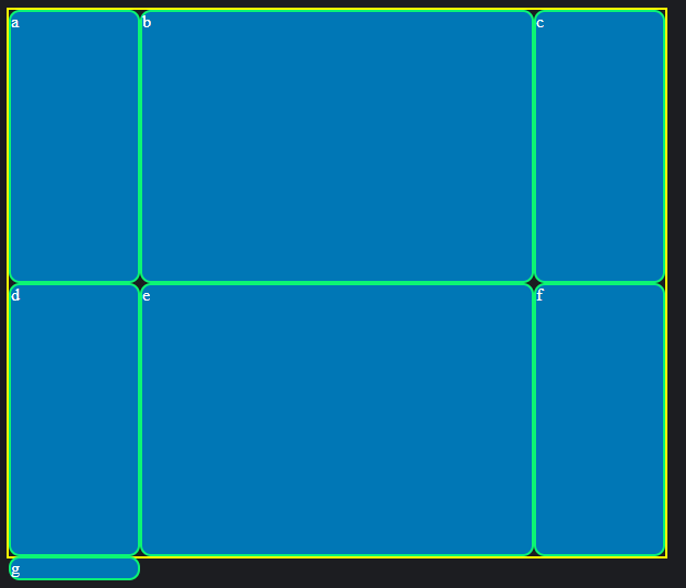
More Than One Space for Columns and Rows
Rows
To have an item in multiple rows or columns there are properties that enable you to do so. In this section, I'm only going to talk about the shorthands for these properties, but I will list the non-shorthand properties below.
- grid-row-start
- grid-row-end
- grid-column-start
- grid-column-end
Aside from these properties, there are ways to easily use them without the struggle of independently using each property causing time consumption resulting in more of a hassle.
There are three shorthands to span across both the rows and columns. The shorthand for just spanning across rows is used by the property grid-row. For columns its grid-column. Lastly, to declare them all in one you use grid-area.
These properties are used on the individual items themselves!
The codepen above shows how to make an item take up two rows using grid-row.
With the grid-row property, the values are simple. The first value before the slash is where the item will start, and then the value after the slash is where the item will stretch and end.
.container{
  border: 2px solid yellow;
  height: 600px;
  width: 600px;
  display: grid;
  grid-template: repeat(4, 1fr) / repeat(4, 1fr);
}
#a{
grid-row: 1 / 3;
}The code snippet shows the code from the CSS in the pen. The bolded sections are our focus, notice that there are 4 rows but inside of the id (a), it takes the grid from 1 to 3 to fill up 2 of 4 spaces inside of the grid.
The reason being is that there is a +1 number offset for the actual number you're trying to reach.
In our case: We want to make the item (a) take up 2 of 4 spaces but we set the item to start from 1 and end at 3 but it's actually 2 of 4 spaces taken and NOT 3 of 4.
To fix this offset error and start from 1 and end at 2 for your values you simply use span after the end value, like so:
#a{
  grid-row: 1 / 2 span;
}
This will give you the same result as grid-row: 1 / 3;
The above shows the span usage.
Columns
The same concepts apply to columns as they do rows. Instead, you are calling the property grid-column on your items instead of grid-row.
Here is a codepen example of grid-column in use WITHOUT span below:
Example of grid-column WITH span:
Both Columns and Rows
Say you're not just setting the columns or rows, but you are going to need to set both.
That's where a useful property called grid-area comes into play.
Order matters when it comes to setting values for this property.
grid-area: 2 / 3 / span 3 / span 4
Above is just an example code of the property. How the order works for the values is that the first value you set is the row start, then your column start, next is your row end, and lastly is your column end value.
Below is the property in use:
Wrap-Up
Following the statements along with the bolded wording should make it much easier to tackle the explanation of the CSS Grid. I set comments inside of the CSS proportion of the codepens for each section I covered, hoping that this helps you understand the property and values set with them more clearly too.
Follow me on Twitter for new posts publishes!
Front-End: CSS Grids For Starters was originally published in Level Up Coding on Medium, where people are continuing the conversation by highlighting and responding to this story.
This content originally appeared on Level Up Coding - Medium and was authored by Isaiah Brown
Isaiah Brown | Sciencx (2022-05-02T00:10:35+00:00) Front-End: CSS Grids For Starters. Retrieved from https://www.scien.cx/2022/05/02/front-end-css-grids-for-starters/
Please log in to upload a file.
There are no updates yet.
Click the Upload button above to add an update.