This content originally appeared on Modern CSS Solutions and was authored by Stephanie Eckles
The user's browsing environment is not predictable. Tell other developers, and for goodness sakes, tell your designers. Let's learn how to coexist with that unpredictability by using adaptive, contextual spacing techniques.
In 2018, Jen Simmons introduced the term "Intrinsic Web Design" in her talk "Everything You Know About Web Design Just Changed." She also shared the principles of intrinsic web design that we'll use as guidance:
- Contracting & Expanding - the way we consider how our design will adapt to a change in available space
- Flexibility - using primarily flexbox and grid in combination with newer units and functions in a way that enables our layouts to adapt at various rates to the available space
- Viewport - the ability to use all four sides of the viewport as well as take advantage of viewport units
Using adaptive layout techniques is a trust exercise between designers, developers, and the browser.
Properties and functions for intrinsic design
#Let's start with a review of the foundational essentials for creating intrinsicly sized elements.
Clamp
#A versatile CSS function that is key to intrinsic web design is clamp(), and it has had stable support since March 2020.
Clamp accepts three values: the minimum, ideal, and maximum values. This effectively lets you provide flexible constraints.
The trick with clamp() is in that ideal value where a dynamic unit such as view width must be used to trigger the transition between the min and max.
You may have encountered clamp() under the umbrella of fluid typography, which relies on viewport units. Here's a set of example values:
font-size: clamp(1rem, 4vw, 3rem);Based on the current computed value of 4vw, the font-size will adjust as the viewport grows and shrinks. But it will never be smaller than 1rem or larger than 3rem.
We'll review more use cases for clamp later on for our spacing techniques.
So how do we go about using clamp() for intrinsic design? My suggestion is:
- designers provide the min and max values
- devs determine dynamic dimensions
The min and max values can be provided by design tokens, which may be a familiar concept if you come from design systems or are using frameworks that provide sizing ramps. I'll continue to call out opportunities for design tokens as we explore more techniques since they are an excellent method to map our constraints back to designs and wireframes.
Min and Max functions
#The min() and max() functions enable us to provide context-dependent options. These have essentially the same level of support as clamp().
Both min() and max() accept two or more values. For the min() function, the browser will use the smallest computed value, and the inverse will happen for max() where the browser will use the largest computed value.
Another feature of min, max, and clamp is that we can perform additional calculations without needing a nested calc() function. So for the following definition, we're asking the browser to choose the smallest value between 100vw - 3rem and 80ch.
min(100vw - 3rem, 80ch)This results in 100vw - 3rem being selected when the viewport is < 80ch, and 80ch being selected when the viewport is > 80ch.
If we take that rule and add the logical property margin-inline set to auto, then we have a really modern container class.
.container {
width: min(100vw - 3rem, 80ch);
margin-inline: auto;
}
We can take our container class a step further and set up an optional custom property of container-max that uses 80ch as a fallback. So now we have a modern, ultra-flexible rule.
.container {
width: min(100vw - 3rem, var(--container-max, 80ch) );
margin-inline: auto;
}
It can be a bit tricky to understand when to use min and max.
Let's consider the following values for max.
max(2rem, 4vh)When the computed value of 4vh becomes less than 2rem, the max function will select 2rem.
So effectively, what's happening is that the selected choice of 2rem is the minimum value you will allow for this rule.
Now let's flip to min():
min(100%, 60ch)This rule for min() means that 60ch is effectively the maximum allowed value for this element.
If you're wondering why we'd use min and max instead of listing out separate corresponding properties, it's because we can use them anywhere a numeric value is allowed, not just for dimensions.
For example, background-size like we reviewed in practical uses of CSS math functions where we explored more about clamp(), min(), and max()
Fit/Min/Max-Content
#Next up, we have fit-content, min-content, and max-content, which allow intrinsic sizing.
Support for these keywords is best when paired with the width property, and you may find the need to use prefixes depending on your audience.
Let's compare how these sizing keywords render for text content when applied to the width property:
CSS for "Intrinsic Keywords Comparison"
.fit-content {
width: fit-content;
}
.min-content {
width: min-content;
}
.max-content {
width: max-content;
}
width set to fit-content
width set to min-content
width set to max-content
fit-contentgrows just large enough to contain its contentsmin-contentonly grows large enough to match the width of the longest word and will apply soft-wrappingmax-contentwill continue growing as large as its contents require
At first look, it can be hard to tell the difference between fit-content and max-content, so let's expand the text values:
fit-content will grow but not overflow
max-content has overflow potential
To be honest, I haven't found many use cases for min-content or max-content. But fit-content is a top-shelf property.
In this demo, the "alert" has width: fit-content. Notice that it is only growing to the equivalent of its max-content, which is narrower than the available inline space.
Lorem ipsum, dolor sit amet.
The magic of fit-content is achieving content-relative width without changing the display value, meaning we can save the display property. And in this flow context, the alert element can continue to use block behavior which means margins continue to work.
Grid Units and Functions
#Folks - we've had CSS grid support since spring 2017.
CSS Grid is the perfect toolset for achieving flexibility within constraints.
Under the topic of intrinsic web design, we will review my top two uses of grid.
The following is the most magical CSS definition because it creates an intrinsically sized layout grid.
grid-template-columns: repeat(auto-fit, minmax(30ch, 1fr));I've written about it in several other Modern CSS articles, but here's the summary. Except for the ch unit, everything in that line is CSS grid-specific.
repeat()defines a recurring pattern to use for the specified grid tracksauto-fitmeans to create as many tracks as will fit, according to the next part of the definitionminmax()is a CSS grid function that defines a range of values that will be used to compute each track size where the first value is the minimum and the second value is the maximum
Here's the rule in action:
CSS for "intrinsic grid layout"
.grid-layout {
display: grid;
grid-template-columns: repeat(auto-fit, minmax(min(100%, var(--grid-min, 20ch)), 1fr));
}
- 1
- 2
- 3
- 4
- 5
At a larger size, three tracks are created, and as the inline space reduces, the track space also reduces. Once track size squeezes elements below the 30ch minimum, elements drop to be added to or create a new row.
In the demo, we also enhanced the rule to include a nested min() function with 100% as one of the options. This reduces the chance of overflow by allowing the element to shrink below 30ch when the space requires being more narrow. We also enabled this rule to scale by adding an optional custom property of --grid-min to control the "breakpoint."
In this next rule, we'll use the grid-only function version of fit-content(). Using the fit-content() function means we can provide our own preferred max value, as seen for the sidebar in the demo, which maxes out at 20ch.
CSS for "fit-content() grid layout"
.sidebar-layout {
display: grid;
grid-template-columns: fit-content(20ch) minmax(50%, 1fr);
}
Altogether, the behavior produced by this rule is that the article element will reduce until it hits its 50% minimum. At this point, the sidebar will finally begin to compress until it reaches the equivalent of min-content.
We can improve the flexibility of this rule by again including a custom property. I love this definition because it can accommodate other content types, like this image.
CSS for "fit-content() grid layout with image"
.sidebar-layout {
display: grid;
grid-template-columns: fit-content(var(--sidebar-max, 20ch)) minmax(50%, 1fr);
}
Just keep in mind that the image doesn't have such a thing as a min-content value, so it will continue to shrink based on the remaining allotment of space.
Intrinsic, contextual spacing
#So far, what we've talked about is how to affect how elements take up space and size themselves. Now it's finally time to talk about affecting the spacing between and around elements which will help us get the most out of intrinsic web design.
Despite the long-time availability of units besides the pixel, we continue to define spacing almost exclusively in pixels, maybe sometimes in rems.
Pixels are the least flexible unit for creating intrinsic layouts. So what if we could provide the browser with a better rubric for determining sizes for spacing? And what if we could do it without being overbearing with media queries?
The first thing to acknowledge regarding spacing is that the properties involved in spacing - gap, padding, and margin - have different purposes. So let's learn how to use more appropriate units and create adaptive methods for handling spacing between and around elements.
Padding
#Padding is for handling individual box spacing. Our upgraded technique will use clamp() with percents and rem.
A reminder that percents used with padding are calculated relative to the element's inline size, so for clamp(), we can use a percentage as an element-relative dynamic value.
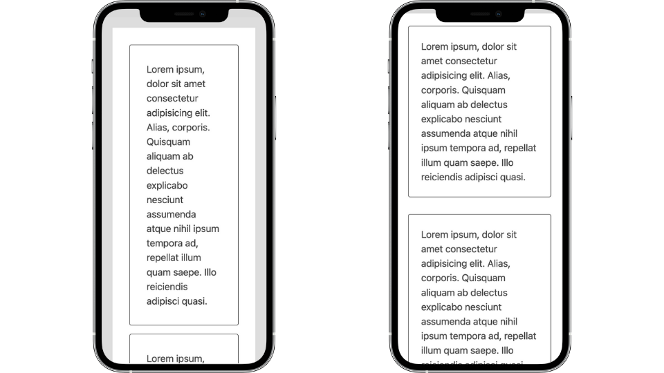
Here's a comparison of two mobile experiences - the left uses pixels to define margin and padding, and the right uses clamp():

For the version using clamp(), notice the gains in inline space, which leads to a more comfortable reading experience.
Pixels are often designed to work for a "desktop" or widescreen environment. And updating their values would mean creating a series of media-query controlled breakpoints. So instead, here's a demo of our improvement using clamp() and min().
We use the same padding rule for both the article element and the cards. The trick on the article is to toggle between 60ch, which applies on large inline spaces, and 100%, which results in no extra outside "gutter" space on narrow inline spaces.
Another context impacted positively by these rules is the Web Content Accessibility Guidelines Success Criterion for reflow, which defines expectations for browser zoom up to 400%. At this point, the computed width of the screen is assumed to be around 320px. Unfortunately, we don't have a zoom media query, but any rules that affect a viewport approaching 320px will impact this context. So, the narrow layout will display at the high zoom and be allowed the more ideal line length for reading.
Learn more about reflow and other modern CSS upgrades to improve accessibility
I recommend trying out creating padding custom properties.
:root {
--padding-sm: clamp(1rem,    3%, 1.5rem);
--padding-md: clamp(1.5rem,  6%,   3rem);
--padding-lg: clamp(3rem,   12%,   6rem);
}
That middle percent value may seem a bit magic - and, well, it is - but I've found a decent starting point is to double the maximum value to use as the percent. And hey, there are some more design token opportunities!
Margin
#Next up is margin, and for our purposes, we'll be explicitly using it for block layout spacing, by which I mean vertical spacing.
We'll use the min() function with viewport units and rem for margin. Viewport units will allow creating contextual spacing.
Here is our baseline rule for margin;
.block-flow {
margin-block-start: min(4rem, 8vh);
}I'm borrowing the term "flow" from Andy Bell's flow rule and "block" because the rule is applied using the logical property of margin-block-start. If you're not yet familiar with logical properties, margin-block-start is the logical companion to margin-top.
Within min(), we've supplied the values of 4rem and 8vh. So you can think of 4rem as the static value and 8vh as the dynamic value.
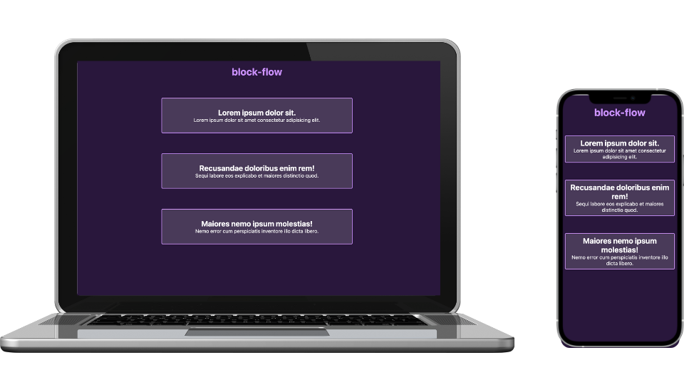
Here's the rule's effect on a large vs. small context. Technically, the computed margin for these values only saves about 13px on the "mobile" version, which may not seem too impactful.

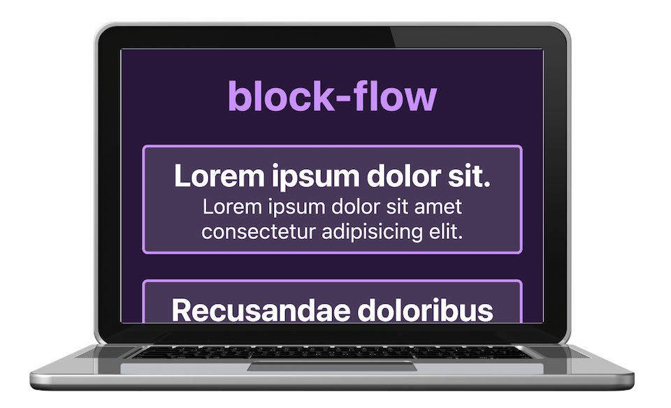
However, once again, in our zoom context, the difference made by enabling the 8vh option is quite positive.

In this context, it's desirable to reduce unnecessary space. This demo also emphasizes the difference between a zoom context and mobile: landscape orientation. In contrast, typically, we're most concerned about designing for portrait orientation in the mobile context.
So here is a starting point for our block-flow custom properties, where once again, simply doubling the static rem value to produce the vh value works out pretty well. And as we explored, both true mobile and desktop zoom are the critical contexts to test out and verify the vh value. The static rem value is another design token opportunity.
Since I need to stay on brand, here’s your ultra modern CSS rule to setup block flow.
:is(body, .block-flow) > * + * {
margin-block-start:
var(- -block-flow, var(- -block-flow-md) );
}
Using :is(), we're defining that direct children of the body and direct children when the block-flow class is applied will default to having our medium top margin. If including body is too overarching for your context, you can certainly reduce this rule to just block-flow.
Here is the starter set of block-flow custom properties:
:root {
--block-flow-sm: min(2rem,  4vh);
--block-flow-md: min(4rem,  8vh);
--block-flow-lg: min(8rem, 16vh);
}
Gap
#Our final spacing property is gap, which we'll consider for layout component spacing, as in providing values for the intrinsic grid we set up earlier. We'll again be using clamp(), but switch it up to use vmax as the dynamic value for this context.
As a reminder, gap is applied between elements, as the shaded area indicates.

And by the way - we've had cross-browser support for gap in flexbox since April 2021!
Here's a baseline rule for layout gap:
gap: clamp(1.5rem, 6vmax, 3rem);The vmax unit request the browser to use whichever is largest: the viewport width or the height.
We're using vmax for the dynamic unit and not percent because percent, as applied to gap, is calculated based on the direction of the gap. So uniformly applying gap like this using percent may yield a smaller value for row gap than for column gap. Instead, using vmax creates dynamic, contextual space that will be evenly applied to both row and column gap.
And - you probably guessed it - our min and max values for clamp() are once again potential design tokens.
I use gap with grid and flex for atomics like form fields. So I wanted to explicitly name this set of custom properties as layout-gap since they rely on vmax and are intended for layout components like grids. Again, you can see the doubling strategy in effect to work out a starting vmax value.
:root {
--layout-gap-sm: clamp(1rem,   3vmax, 1.5rem)
--layout-gap-md: clamp(1.5rem, 6vmax,   3rem);
--layout-gap-lg: clamp(3rem,   8vmax,   4rem);
}
Why not use media queries?
#We've just reviewed more appropriate techniques to ensure context-dependent, intrinsic sizing and spacing of elements. Viewport-relative media queries aren't scalable for every context and are no longer the best tool for the job.
Additionally, we'll soon have full support for container queries. Once we have access to container units, they may become the better option in some places I've still opted for viewport units in these examples.
We are also getting the "parent" selector - :has() - which will open more possibilities for creating contextual spacing based on the actual element configuration.
Start using contextual spacing techniques
#Design systems and frameworks' (necessary) rigidity is at odds with intrinsic web design.
In order to move, I'm asking each of you to try to make adjustments where you can and educate others about the possibilities. Take time to be a little more thoughtful, experiment, and push beyond your current comfort zone. Let me know how you use and improve this starter set of techniques!
Check out this CodePen collection of a few selected methods, including a layout that pulls several techniques together.
Additional resources
#This article is based on my presentation at beyond tellerand 2022, and I'll link the video when its available.
Here are some resources and other viewpoints on intrinsic web design/adaptive layout.
- Jen Simmons' talks
- Rachel Andrew - Making Things Better: Redefining the Technical Possibilities of CSS
- Ethan Marcotte's A Dao of Flexibility - the talk that introduced responsive design
- John Allsopp - A Dao of Web Design
- Jeremy Keith
- Andy Bell and Heydon Pickering - Every Layout
- Andy Bell - BuildExcellentWebsit.es
- Cathy Dutton - Designing For The Unexpected
- Hidde de Vries - Content-based grid tracks and embracing flexibility
- Donnie D'Amato - gridless.design
This content originally appeared on Modern CSS Solutions and was authored by Stephanie Eckles
Stephanie Eckles | Sciencx (2022-05-03T00:00:00+00:00) Contextual Spacing For Intrinsic Web Design. Retrieved from https://www.scien.cx/2022/05/03/contextual-spacing-for-intrinsic-web-design/
Please log in to upload a file.
There are no updates yet.
Click the Upload button above to add an update.

