This content originally appeared on DEV Community and was authored by Julie Cherner
Often I face the problem that I want to start UI development from bottom to top: start with designing buttons, inputs and other small components and only after that create pages and set routing.
This problem is solved with… Storybook!
Storybook is a tool that allows developing components in isolation.
According to official web site of Storybook:
Storybook is an open source tool for building UI components and pages in isolation. It streamlines UI development, testing, and documentation.
Let’s look at basic Storybooks functionality with a simple example of Button component.
In this example we will add Storybook to React App, but here is the list of libraries/frameworks with which you can implement Storybook: React, Vue, Angular, Web Components, Ember, HTML, Svelte, Preact.
First of all let’s install Storybook.
npx create-react-app my-app
cd my-app
npx sb init
Typescript is also supported and it doesn’t require extra configuration. Don’t forget to install types.
npm i @storybook/react
Storybook uses Webpack5 and if you have a previous version so run:
npx sb@next automigrate
To run the application use:
npm run storybook
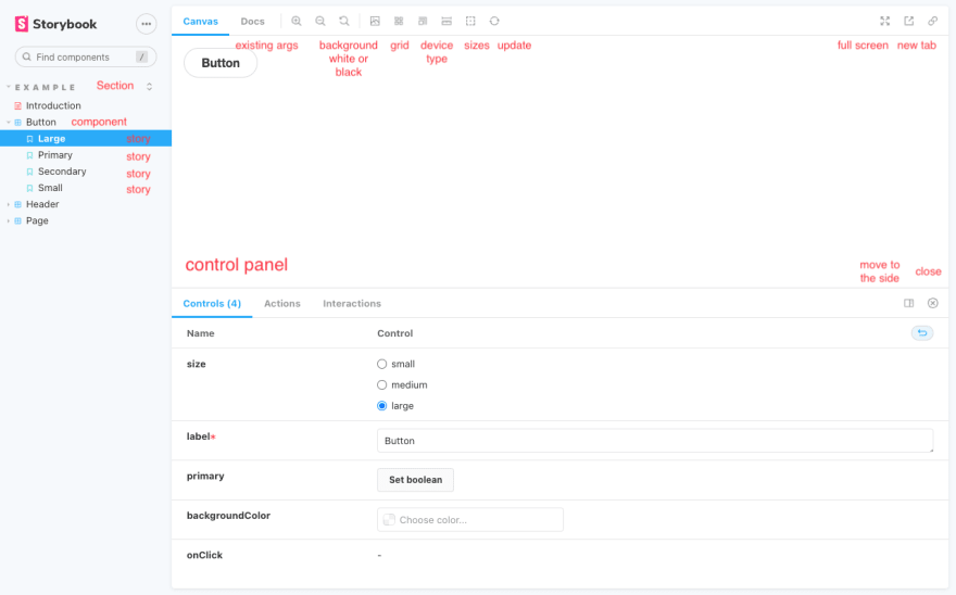
Browser should open localhost on port 6006 and you will see this. If you want to change the port you can do it in package.json file.
In larger projects you can also add folders in sections for convenience. You can do it later inside of your stories.
Current part of the code in Button.stories.js
export default {
 title: 'Example/Button',
...
};
Schema how you can split it into sections and folders:
export default {
 title: 'NameOfSection/NameOfFolder/NameOfComponent',
...
};
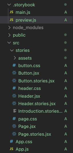
After every package is downloaded we have updates: we see folder .storybook inside the main folder and folder screens inside of src folder with Button.js, Button.stories.js and other files.
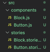
I prefer dividing code logically into separate files so I deleted everything in the src folder and created separate folders for components and stories.
Let’s have a look what we have in Button.js
import PropTypes from "prop-types";

function Button({
 label,
 backgroundColor = "red",
 color = "black",
 size = "md",
 handleClick,
}) {
 let scale = 1;
 if (size === "sm") scale = 0.5;
 if (size === "lg") scale = 2;

 const style = {
   backgroundColor,
   padding: `${scale * 0.5}rem ${scale * 1}rem`,
   border: "2px solid black",
   borderRadius: "25px",
   color,
 };

 return (
   <button onClick={handleClick} style={style}>
     {label}
   </button>
 );
}

Button.propTypes = {
 label: PropTypes.string,
 backgroundColor: PropTypes.string,
 size: PropTypes.oneOf(["sm", "md", "lg"]),
 color: PropTypes.oneOf(["blue", "white", "black"]),
 handleClick: PropTypes.func,
};

export default Button;
Function Button takes parameters by default and inside of object style we add CSS and return the component.
After that we define the type of props of the component by adding or type of props with or without options for choice.
Let’s look through Button.stories.js
import Button from "../components/Button";

export default {
 title: "Components/Controls/Button",
 component: Button,
 argTypes: {
   handleClick: { action: "logging it in action section" },
 }
};

const Template = (args) => <Button {...args} />;

export const Green = Template.bind({});

Green.args = {
 backgroundColor: "green",
 label: "Middle Green button",
 size: "md",
 color: "black",
};


export const Pink = Template.bind({});

Pink.args = {
 backgroundColor: "pink",
 label: "Middle Pink Button",
 color: "blue",
 size: "md",
};


export const Small = Template.bind({});

Small.args = {
 backgroundColor: "blue",
 label: "Small button",
 size: "sm",
 color: "white",
};

export const Large = Template.bind({});

Large.args = {
 label: "Very very very large button",
 size: "lg",
 color: "black",
 backgroundColor: "red",
};
To activate actions we add argTypes and define function handleClick that logs out events.
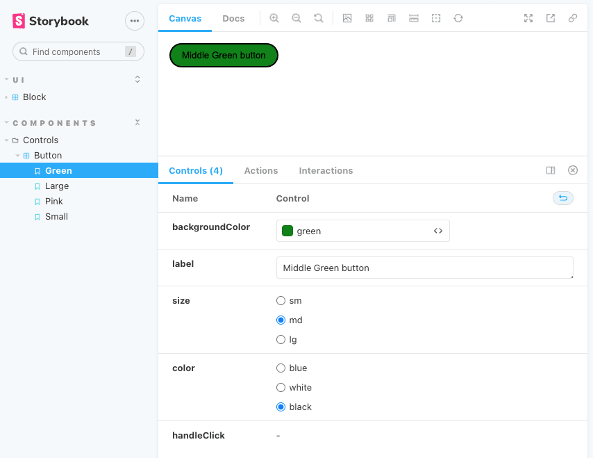
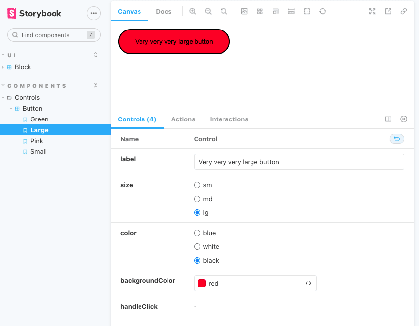
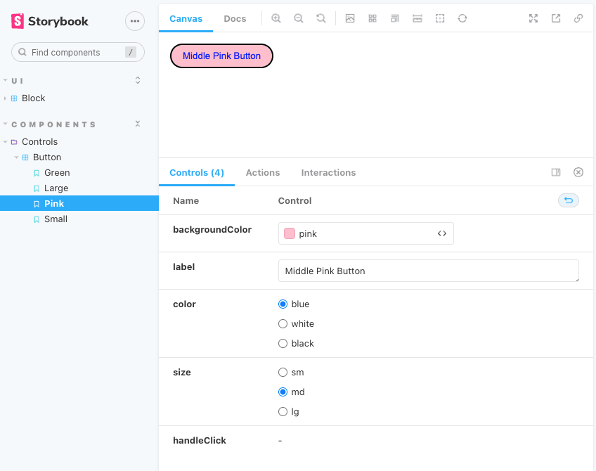
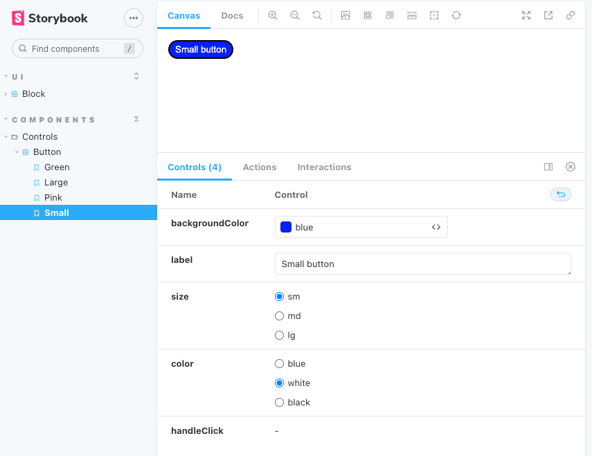
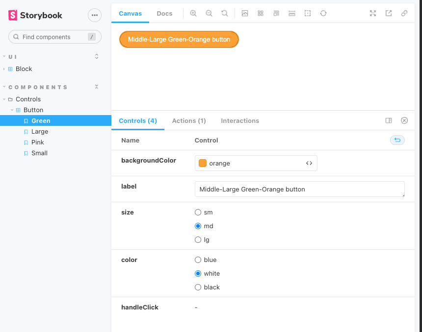
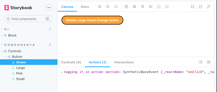
Let's check what happened to our stories on local host.
By hand you can change background color, label, size and color as well as click on the button and get action.
I clicked the undo icon and got this component in the initial state.
Also we can add styling to the stories with the help of a decorator.
For example let’s add margin to story with decorators according to schema
Component.stories.js
export default {
 …..
  decorators: [
    (Story) => (
      <div style={{ margin: '5em' }}>
        <Story />
      </div>
    ),
  ],
};
Button.stories.js
import Button from "../components/Button";

export default {
 title: "Components/Controls/Button",
 component: Button,
 argTypes: {
   handleClick: { action: "logging it in action section" },
 },
   decorators: [
     (Story) => (
       <div style={{ margin: "5rem" }}>
         <Story />
       </div>
     ),
   ],
};

const Template = (args) => <Button {...args} />;

export const Green = Template.bind({});

Green.args = {
 backgroundColor: "green",
 label: "Middle Green button",
 size: "md",
 color: "black",
};


export const Pink = Template.bind({});

Pink.args = {
 backgroundColor: "pink",
 label: "Middle Pink Button",
 color: "blue",
 size: "md",
};


export const Small = Template.bind({});

Small.args = {
 backgroundColor: "blue",
 label: "Small button",
 size: "sm",
 color: "white",
};

export const Large = Template.bind({});

Large.args = {
 label: "Very very very large button",
 size: "lg",
 color: "black",
 backgroundColor: "red",
};
Let's check in the browser if we had any changes of margin.
Yes, it worked :)
It is only a beginning and you can continue with learning advanced Storybook's topic such as Storybook Addons and testing.
Continue enjoying developing UI with Storybook officials docs.
This content originally appeared on DEV Community and was authored by Julie Cherner
Julie Cherner | Sciencx (2022-05-03T20:13:51+00:00) Storybook for React.js. Retrieved from https://www.scien.cx/2022/05/03/storybook-for-react-js/
Please log in to upload a file.
There are no updates yet.
Click the Upload button above to add an update.

