This content originally appeared on DEV Community and was authored by David
CSS Alignment techniques
One common tasks that is requested often in web development is to align elements using CSS, this might sound simple, but since there is not one specific way to do it, it can become confusing.
I have put together a codepen collection to show the different techniques.
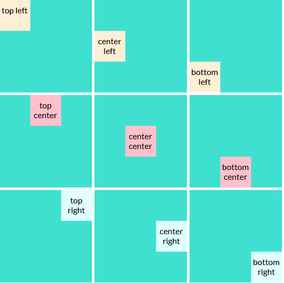
Each codepen in the collection shows a grid that represents a board that contains sticky-notes and the notes are displayed in different places of the board, like the following image:
Alignment techniques:
- Margin
- Line-height
- Table-cell
- Positions
- Flex
Margin
Using the margin attribute it is easy to center the elements horizontally, however, for vertical alignment you would have to calculate the height or use the calc function.
These are the properties needed:
margin-topmargin-rightmargin-bottommargin-left
Or the shorthand property margin.
Here is the codepen.
Line-height
Using line-height will align the elements perfectly, however, if the text takes more than one line of the element it won't fit.
Properties needed:
-
text-align-> For horizontal alignment. -
vertical-align-> For vertical alignment. -
line-height-> defines the size of the line.
Here is the codepen.
Table-cell
Using display: table-cell the vertical alignment is not affected by font size or line height, but as a disadvantage this technique only applies to inline elements.
Properties needed:
display: table-celltext-alignvertical-align
Here is the codepen.
Positions
This is one of the most common techniques used for positioning elements
Properties needed:
position: relativeposition: absolutetoprightbottomlefttransform: translate(x, y)
Here is the codepen.
Flex
The display: flex property was introduced with CSS3 and makes very simple and intuitive to align the elements, additionally this technique is more friendly with different writing forms, this is useful if you are looking to show your page in countries with different writing forms.
Properties needed for containers:
display: flexjustify-contentalign-items
Here is the codepen.
Conclusion
The best technique to apply would depend on your use case and your page's architecture.
Last but no least, the idea for this entry came from the notes I took in the CSS Grid course on Platzi, that I highly recommend if you speak or understand Spanish.
This content originally appeared on DEV Community and was authored by David
David | Sciencx (2022-05-10T03:27:08+00:00) CSS Alignment techniques. Retrieved from https://www.scien.cx/2022/05/10/css-alignment-techniques/
Please log in to upload a file.
There are no updates yet.
Click the Upload button above to add an update.

