This content originally appeared on DEV Community and was authored by Salma Alam-Naylor
I like to dark mode all the things. But I also know lots of people who prefer light mode! To respect personal preferences and consider accessibility from the start, I add support for native light and dark mode as soon as I begin a new web project.
This solution uses no JavaScript, so we're not building a light and dark mode toggle. Instead, it detects the user's system settings with a CSS media query, and uses two custom CSS properties to determine a basic colour scheme. Here's how it's done.
Declare 2 CSS custom properties
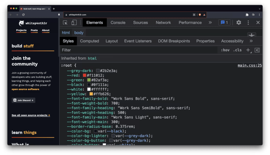
CSS custom properties are also referred to as CSS variables or cascading variables. You can define CSS custom properties anywhere in your CSS files, and they follow the same cascading and specificity patterns as other CSS rules. For example, you can define CSS variables at the document root, and override them in more specific CSS classes. What's great is you can also inspect and debug declared CSS variables in browser dev tools, which appear below the stylesheet rules.
CSS custom properties are declared by words prefixed with two dashes (--), and accessed using the var() function.
:root {
  --my-color-variable: #000000;
}

.element {
  /* This is calculated as #000000! */
  color: var(--my-color-variable);
}
You can also pass a second parameter into the var() function, which acts as a fallback value if the custom property doesn't exist when you try to use it.
.element {
  color: var(--my-new-color, #ff0000);
}
For this light/dark mode solution, define two colour variables at the document root — one for the foreground colour, and one for the background colour. I tend to choose dark mode by default, so I set the background colour to black (--color-bg) and the foreground colour to white (--color-fg).
:root {
  --color-bg: #000000;
  --color-fg: #ffffff;
}
Use the prefers-color-scheme media query
Next, we're going to hook into system settings using the prefers-color-scheme CSS media query and flip the variable declarations for the background and foreground colours. The following code sets the --color-bg to white and the --color-fg to black when a light theme setting is detected.
@media (prefers-color-scheme: light) {
  :root {
    --color-bg: #ffffff;
    --color-fg: #000000;
  }
}
Add body styles
Finally, using the CSS custom properties, set the background-color (for the page colour) and color (for the text) on the HTML body element, which all child elements will inherit if they're not overwritten.
body {
  background-color: var(--color-bg);
  color: var(--color-fg);
}
And that's it — support for native light and dark mode preferences in just 14 lines of CSS!
View the code on CodePen
Here's the full example on CodePen, which will display light or dark mode depending on your system preferences. Toggle your system settings to watch the CodePen switch themes!
How do you implement dark mode and light mode? Let me know on Twitter.
This content originally appeared on DEV Community and was authored by Salma Alam-Naylor
Salma Alam-Naylor | Sciencx (2022-05-12T18:39:47+00:00) Light and dark mode in just 14 lines of CSS. Retrieved from https://www.scien.cx/2022/05/12/light-and-dark-mode-in-just-14-lines-of-css/
Please log in to upload a file.
There are no updates yet.
Click the Upload button above to add an update.

