This content originally appeared on Telerik Blogs and was authored by Kathryn Grayson Nanz
Forms are high risk/high reward, so it’s important for us, as developers, to approach them well prepared. Learn the steps to building great React forms.
Introduction
Forms: can’t live with ’em, can’t live without ’em. It’s nearly impossible to create an application—or even just a website—without eventually needing a way to collect information from your users. This could be as simple as a couple of text inputs to get their name and email address … or it could be a complex, multi-page situation requiring several distinct types of inputs, state management and more.
Forms are infamously difficult to do well because there are so many variables that need to be considered when you’re putting one together; from the design and UX to the actual technical implementation, there’s a lot of places where it’s easy to make a small mistake. And when we’re asking our users to trust us with their (potentially sensitive, personal) information, a small mistake can be a big deal!
The longer the form, the larger the ask we’re making of our users—and if they feel anything less than 100% certain that there’s going to be something worthwhile at the end, there’s a very high risk of them hitting a stumbling block in our form and deciding that it’s simply not worth the effort. For startups, having the wrong forms could mean potential lost crucial customers; for major companies, it can mean the loss of significant revenue.
That being said, a good React form can be a real thing of beauty. It’s one of the few places in our application where we get to have a conversation with our users—where it’s not just a one-way street of us serving them content. It’s a chance for us to build trust, learn about our users and infuse a little bit of personality into our application. We have the opportunity to do this really well and strengthen our bond with the user … but when we fumble it, we run the risk of doing a lot of damage. Forms are high risk/high reward, so it’s important for us, as developers, to approach them with intention and thoughtfulness.
Establishing Trust
When we sit down to create a form, the very first question we should ask ourselves is “Why do I need this information?” Is there a specific thing we’re planning to do with the information we’re collecting, or are we unintentionally asking for things we don’t really have a use for?
With every question we ask of our users, we’re not just asking for their information, we’re also asking for their trust—trust that we won’t abuse or share their data. The more we ask of them, the larger the burden of trust we’re creating. You probably don’t hesitate anymore when an application asks you for your email address … but you might if they ask for your credit card number. One holds a much higher risk, and therefore, comes with a higher burden of trust.
And the more you ask for information that could seem unrelated or unimportant (like a user’s sex or gender, marital status, disability information, etc.) the more you create suspicion in your users: “Why do they want to know this? What are they planning to do with this? Why do they care?”
Guidelines for Form Content
There are several things we can do to help offset this suspicion and reassure our users, but the first and easiest step is to simply not ask for information we don’t have a current, valid need for. And, no, statistics for your marketing team do not count as a need.
Another thing you can do is ensure that you’re asking for the least amount of information you need to solve the problem. For example, if you want to show store locations near them, you could do that with a ZIP code instead of a full address. If you want to personalize an email, you don’t really need their legal first, middle and last names with titles—just the name they prefer to be addressed by. Ask for only as much as you truly need.
Once we have our list, it’s a great idea to provide context for questions that might not seem intuitive. For example, if it’s unclear why we’re asking for their ZIP code, we could add a little bit of text near the input box to explain, “We use your ZIP code to find region-specific discounts for you!” (or whatever your use case is).
It’s also worth remembering that not every question needs to be required for form submission. If there’s information (like the above ZIP code discount example) that could enhance the user experience but isn’t needed to use the application, we can make it optional and allow users to leave it unanswered if they’d prefer not to share. Everyone evaluates privacy differently and you never know what each individual will be comfortable with. This is a great way to meet your users in the middle—after all, wouldn’t you rather have some information vs. no information at all?
Be Cautious With Validation and Selection Options
We, as humans, make a lot of assumptions—in fact, we’re probably not even aware of how much we’re just assuming to be true without having any basis in fact. Our assumptions and biases are based on our lived experiences, which means we all naturally have some things we know less (or possibly nothing at all) about—this is just part of being a human. But as developers, it’s part of our job to make sure those unconscious biases aren’t reflected in the software we build.
One of the areas where this bias can often be seen is in form validation—especially around names. Make sure your form doesn’t reject user input names based on length (no minimum or maximum character counts), symbols (dashes, empty spaces, apostrophes accent marks), or non-native language characters.
Another area where this bias is often visible is in the options we offer in a dropdown or other list of selection options. There’s almost always going to be someone who will need to make a selection you haven’t thought of, no matter the category. In general, it’s best to just provide a text field—but if you need to use a dropdown or other selection input, make sure you include an “Other” or “Not Listed” option for users who don’t fit into any of the boxes you assumed they would.
React Form Design Tips & Tricks
If you’re using the KendoReact Form Component, then a lot of the design work has already been done for you! You don’t have to sweat the small stuff, like styling Text Input boxes or determining the best layout for a DatePicker. However, you will still need to make big-picture design choices about the layout of your form, so that’s what we’ll focus on here.
Stick to a Single Column Layout
It’s always ideal to stick to a single-column layout for your form, instead of putting elements side by side. Most users expect questions to be formatted vertically (with a single question on each line), so using a horizontal layout can be unintuitive and possibly cause people to accidentally overlook questions that were off to the side.
There are a few specific cases when you can get away with stacking form elements side-by-side when the elements are directly related, such as “First Name”/“Last Name”, or “Start Date”/“End Date”. But even then, you’ll almost always need to shift them back into a single-column layout for small screen or mobile viewing. Knowing that, you might as well just start with the vertical layout and skip the technical hassle of resizing and re-flowing your form layout—there’s no benefit to a horizontal element layout and a few potential drawbacks, so why make the design gamble?
Always Use the Most Specific Input Available
It’s helpful for both your users AND your developers when you make use of the most specific input types available for the question you’re asking. It might seem easier to just use text inputs for everything, since they can accept letters, numbers, dates and more via plain text. However, this can create confusion for your users regarding the expected format for your data. For example, if you just ask for a date and don’t make use of a date picker input, your user might not know whether to include the year or not. This also makes it significantly more difficult to validate the form input, and by extension vastly increases the chances of receiving incorrect or improperly formatted information—a frustrating experience for everyone involved.
Group Related Content
If you have a longer form, it can feel overwhelming to your user when they load a huge list of questions. In that case, it’s a smart idea to use white space to break up that big block of input fields and make the form feel more easily digestible. However, anytime you’re putting space between elements, you’re creating and breaking associations—it’s human nature to try and group things to make sense of them, and one of the ways we do so is by assuming that items in close proximity to each other are likely related.
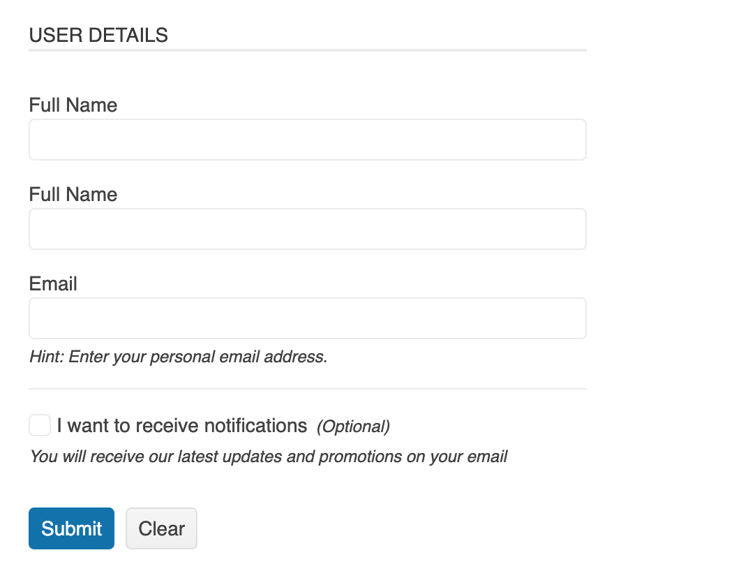
This is something we can use to our benefit, though. By adding space in between sections of questions, we can break our form up into related chunks. For example, we could create a section for personal information (first name, last name, age, job title, etc.) and then put in a bit of white space before our next section about address information (street address, apartment number, state, country, ZIP/postal code, etc.). When we group those related questions together, it makes our form easier to skim and less likely to scare our users away before they even start.
Break Up Long Forms
When you have a really, really long form, you might need more than just grouping your questions—you might need to break up the whole thing into multiple pages. Multi-step forms are an effective way to break up forms that ask for a lot of different information, or information that needs to be input in a specific order (like payment and shipping details).
You can jump down to the section below to read more about the technical implementation of multi-step forms with the KendoReact form component, but there are also a few design best practices you should keep in mind as well:
Always include some kind of stepper or progress bar to give the user an idea of how far they’ve come, as well as how much is left to go. Clicking through an unknown number of pages can feel endless and frustrating—even a simple page number (ex. “Page 3 of 5”) can do a lot to counter that feeling and encourage your users to complete the form.
Group related questions on the same page. Make sure you’re not breaking up related question sections with page breaks.
Be clear about the final submission button vs. the next button. In many multi-page forms, the “Submit” button appears right where the “Next” button does, and often looks visually identical—this could lead to users on autopilot clicking “Submit” thinking they still had another page or two to fill out. Make sure your “Submit” button is visually different and consider adding a review page or confirmation modal to give your users a chance to read over their answers before submission.
Keep Copy Clear & Concise
Microcopy—the short bits of text that appear on buttons, notifications, error messages and form input descriptions, to name a few—can be tricky to master. It’s never easy to communicate things in as few words as possible, but forms are one of the places where we really don’t want to be verbose. Lengthy descriptions can easily turn a one-page form into a four- or five-page form if we’re not careful.
At minimum, each form input needs a label. But you might also want to include some contextual explanations of what you plan to do with certain pieces of information, formatting details (especially for things like phone numbers, credit card numbers, or social security numbers), or other instructional copy. When you’re writing these, make sure to keep them as short and precise as possible.
Using the KendoReact Form Component
As you’re probably gathering, creating a good form is more work than it seems at first glance. Building a good form in React is already hard enough—why reinvent the wheel by building all the components yourself, too? Thankfully, React developers have access to some wonderful options when it comes to form libraries to help speed up this process and remove some of the stumbling blocks. In this next section, let’s take a look at how we can implement forms using the KendoReact Form library, a lightweight form library created to help developers build the best forms possible.
The KendoReact Form component provides a wide and always growing range of built-in features that you can leverage to speed up your form development. And you can rest assured that a form built with KendoReact will always be fully accessible and beautifully designed.
Getting Started
Once you have your app set up, adding a KendoReact Form is easy as installing the package and importing the components!
npm install --save @progress/kendo-react-form @progress/kendo-licensing
 import { Form, Field, FormElement } from '@progress/kendo-react-form';
 import { Error } from '@progress/kendo-react-labels';
 import { Input } from '@progress/kendo-react-inputs';
Note: KendoReact is a commercial UI component library, and as a part of this you will need to provide a license key when you use the components in your React projects. You can snag a license key through a free trial or by owning a commercial license. For more information, you can head over to the KendoReact Licensing page.
Then, in your JSX, you’ll want to use the Form component to wrap your FormElement and Field child components.
<Form onSubmit={handleSubmit} render={formRenderProps =>
<FormElement>
      <fieldset>
        <legend>Please fill in the fields:</legend>
        <Field name={'firstName'} component={Input} label={'First name'} />
        <Field name={'lastName'} component={Input} label={'Last name'} />
        <Field name={"email"} type={"email"} component={EmailInput} label={"Email"}/
      </fieldset>
      <button type={'submit'} disabled={!formRenderProps.allowSubmit}>
        Submit
      </button>
   </FormElement>
}/>;
FormElement enables the creation of form layouts. It’s designed to work with the FieldWrapper component, components from the Labels package and any editor. FieldWrapper enables you to group, align and control form-related content, such as KendoReact components, or HTML input elements. Your Field elements define and control each individual input option—you can add any component from the KendoReact Inputs library by importing it at the top of your page, and then passing it into the component prop in the Field element.
For a deeper dive into this process, check out Getting Started with the KendoReact Form.
State Management
A form isn’t much use, though, if the users can’t interact with it. And anytime we’re talking about updating the UI based on user interactions in React, we’re talking about handling state.
The React Form package provides three components for form state management:
- Form component and FormRenderProps interface
- Field component and FieldRenderProps interface
- FieldArray component and FieldArrayRenderProps interface
These allow you to hook into the current state of the component and take actions or update the interface around it.
You can also control whether a user is able to interact with the components at all! Rendering a component in a read-only state prevents the user from editing it—although it will still be responsive to interaction and validation and
can be focused. You can set read-only via the readonly property of the component.
Rendering the component in a disabled state makes it immutable. These components won’t respond to user interactions or validation. You can set a disabled component by adding the disabled property.
You can dynamically reset/update the Form component’s initial state by setting a key for the component and updating it. This is especially useful if you’d like to dynamically populate the Form with new information.
const [user, setUser] = React.useState({
    firstName: "John",
    lastName: "Smith",
    email: "John.Smith@email.com",
  });

const loadNewUser = () => {
  setUser({
    firstName: "NewFirstName",
    lastName: "NewLastName",
    email: "NewEmails@email.com",
  });
};

...

<Form
  onSubmit={handleSubmit}
  initialValues={user}
  key={JSON.stringify(user)}
  render={(formRenderProps) => (
    <FormElement>
...
Form Validation
You have a couple of different options when it comes to setting up your validation—you can choose to do so at either the form or field level, using the following:
- validator property of the KendoReact Field component
- validator property of the KendoReact FieldArray component
- validator property of the KendoReact Form component
Field-level validation is great for doing quick checks of a single value, like making sure an email is formatted properly or a number is within a set min/max. FieldArray is great for double-checking array structure, like ensuring that your array has at least one record. And finally, Form validation is what you’ll want to use to handle more complex validation, including multiple Fields—like checking to see if all mandatory form fields have been filled out.
When you do find something wrong, then it’s time to talk error messages.
To keep the form UI clean, the error messages of an invalid component are usually not shown until specific user interaction. There are several states of the edited field which can be used to display a validation message:
- The component was edited – modified state
- The component was focused – visited state
- The component was blurred – touched state
- Aways – Show error messages regardless of user interaction
The Field component and its FieldRenderProps enable you to control when and how validation messages are shown.
Making Accessible React Forms
Forms are one of the places in our app where we need to pay special attention to accessibility. As we discussed before, forms are a rare situation where we’re asking for something from our users, not serving them content or information.
And if we’re asking for something, we had better ensure that we’ve given our users the ability to share it with us—without difficulty or barriers. If our form is inaccessible, we’ve put our users in the situation of demanding the impossible from them—asking for something without providing the tools needed for them to give it to us. It can feel unfair and frustrating, and those are not feelings that we want associated with our products.
Thankfully, if you’re using the KendoReact Form library, there’s not too much you need to worry about here: We’ve extensively tested our Form inputs to ensure that they’re all at least AA—if not AAA—accessible, as per the WCAG (Web Content Accessibility Guidelines) standards. But there are still a few things to be aware of, so let’s talk them through:
Keyboard Navigation
Keyboard navigation is a huge part of form accessibility. It’s also something that will be appreciated by all your users, since tabbing through a long form is a common practice—when you’re typing that much, it’s nice to be able to keep your hands on the keyboard. A lot of folks will just do a quick tab through all the questions in their form to check this, but there’s a lot of things to keep in mind. Use the list below as a guide for thoroughly testing your form for keyboard navigability:
- Can I access every question in the form?
- Can I go backward in the form to correct or change an earlier answered question?
- If the form has a lot of questions, how long and how many “clicks” does it take me to tab through the entire thing to get to a specific question at the beginning or end?
- If this is an issue, you can resolve it by either breaking up your form into a multi-page form or breaking up your content into sections with (semantically correct) headers that your users can jump between easily.
- If the form is a multi-page form, can I easily navigate back and forth between the pages without accidentally highlighting a question?
- Can I easily use every single input in my form?
- Pay special attention to complex inputs such as color pickers, multi-selects, date/time selectors and similar. Anything that includes a dropdown should always be tested carefully.
- Can I easily navigate (and exit) any pop-ups or modals that appear as part of my form?
- This often happens in the form of confirmation or error dialogs—make sure your testing includes actual submission of the form.
Color Schemes
If you’re choosing your color scheme from our selection of pre-made swatches, we recommend offering Ocean Blue as an option for your users—it’s a color scheme that we created especially with accessibility in mind. If you’re choosing your own colors, then make sure you’re running all your color combinations through a color contrast checker, like this one from Adobe, to guarantee that your color contrast ratios meet or exceed the WCAG recommendations.
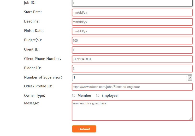
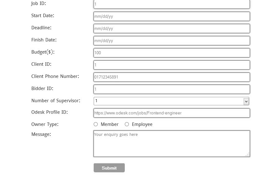
Another thing to keep in mind when setting colors for your forms is the way in which you’re using color to convey information. It’s become a common shorthand to use green to indicate acceptance, yellow or orange for warning, and red for errors or rejection. There’s nothing intrinsically wrong with this—as long as color isn’t the only way that you’re telling the user about that status. Users who are colorblind or otherwise visually impaired may not be able to see the difference in colors accurately enough to understand what’s happening, if your only indication of an error is to change the border on a form input to red, for example. Make sure you’re always using multiple ways of conveying information—whether that’s an icon, a small bit of explanatory text or something else.
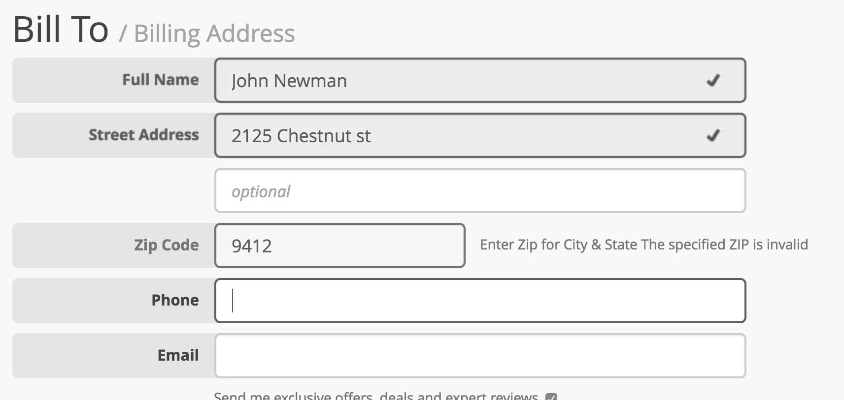
An inaccessible example of error indication in a form. Note how difficult it is to tell the difference between the highlighted and non-highlighted fields in the grayscale version:
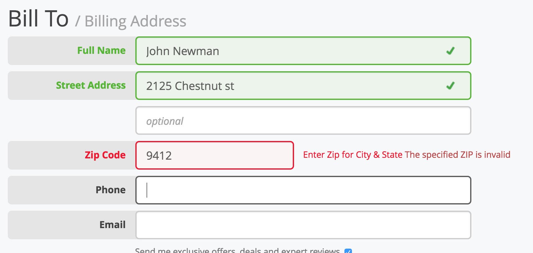
An accessible example of error indication in a form. Note how the valid fields use a checkmark icon to indicate acceptance in combination with the green, while the invalid field includes an explanation of what needs to be corrected in combination with the red. Even in grayscale, the content is understandable, and both the icon (if properly alt tagged) and copy would be read aloud by a screen reader:
Always Include Labels, but Avoid Inline Field Labels
Labels are not just a helpful element when it comes to visually identifying what each form field is for, but programmatically as well. Assistive technologies will read the label content when the form element is focused. Additionally, on label click, the form element will receive focus and click, providing an increased hit area to activate it.
Because of this, it’s important to avoid the placement of field labels inside the input box. When you’re tight on space, it can be tempting to just combine the label and input into a single element that’s pulling
double duty—however this is not only inaccessible, but also confusing for all your users. These kinds of labels don’t make use of the semantic <label> HTML tag, which means screen readers will overlook
them or improperly identify them. The other catch with this kind of labeling is that the labels disappear when the user clicks into the box and starts typing—this can be confusing or frustrating. It’s not uncommon to
get briefly distracted and look back, only to be faced with an empty box. Your neurodiverse users (such as those with ADD or ADHD, for example) will especially appreciate clear labeling of a form.
An inaccessible example of labels within the input box:

An accessible example of labels just above the input box. A great way to make use of the “preview text” inside an input box is to provide an example of the information you expect:
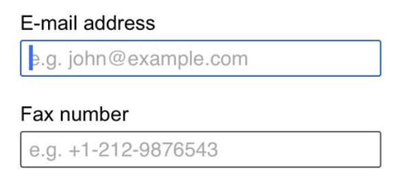
An example of a floating label, which moves the label from inside the element to above when the user clicks into the element—this can be a good compromise:

Related Content
Looking for more information and deeper dives on specific form-related topics? We’ve got you covered! Check out these articles on Telerik blogs for more great reads on perfecting the art of React forms:
- How To Create and Validate a React Form With Hooks
- Up and Running with React Form Validation
- Building a Fully-Featured Form Component in React: KendoReact Form Example
- How To Build Forms with React the Easy Way
- Forms in React
- How To Create React Forms with Great UX
- 5 Reasons To Choose the KendoReact Form Library
Related Videos
Page for React Form Component and the 5 Reasons to Use the KendoReact Form.
Page for How to Build a React Form without the Hassle – KendoReact Library Demo.
This content originally appeared on Telerik Blogs and was authored by Kathryn Grayson Nanz
Kathryn Grayson Nanz | Sciencx (2022-06-02T07:54:03+00:00) How To Create a Form in React: Complete Guide. Retrieved from https://www.scien.cx/2022/06/02/how-to-create-a-form-in-react-complete-guide/
Please log in to upload a file.
There are no updates yet.
Click the Upload button above to add an update.
