How to create a responsive navigation bar with and without JavaScript

Photo by William Bout on Unsplash

Imagine you are building a website containing a lot of pages. Designing each page is always an effort. So, you want to make sure a user is able to access each page without much effort. In order to make it easy for them, you need to implement a navigation bar on your website.

Now, adding a navigation bar makes it easier to use your website on a desktop screen. But what about mobile and tablet screens? Mobiles make up over 50% of internet usage, I have said it before. So, it’s important for your navbar to be responsive.

In this post, I am going to show you how to build a responsive navbar, with and without JavaScript.

Creating the navigation bar

Before starting with the project, first, include the following inside the <head> tag of your HTML file.

<link href="styles.css" rel="stylesheet">
<link rel="stylesheet" href="https://cdnjs.cloudflare.com/ajax/libs/font-awesome/4.7.0/css/font-awesome.min.css">

The first one is the CSS file and the second is the font-awesome CDN which would be used for the menu icon.

The following background color will be used for the navigation bar. This is done for reusability. Read this to understand CSS variables.

:root {
    --bgcolor: #242582;
}

Also, include these styles at the start of your CSS file.

* {
margin: 0;
padding: 0;
}

This removes all the default margins and paddings that exist for certain elements.

Page Header

Create a page header inside which your navigation bar will exist.

<div class="page-header">
    <!-- Your nav-bar comes here -->
</div>

Add the following styles to it:

.page-header {
    background-color: #242582;
    padding: 1.3rem;
    display: flex;
    justify-content: flex-end;
}

The background color has been randomly selected as the designing part is not in the scope of this post.

Navigation Links

Now, add the nav links.

<div id="navigation-bar" class="nav-bar">
    <a class="active"> HOME </a>
    <a> PROFILE </a>
    <a> ABOUT  </a>
    <a> SIGN IN </a>
</div>

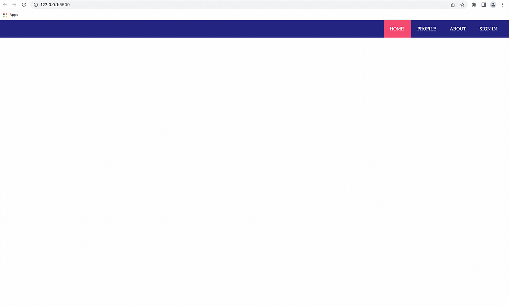
These are the styles for each hyperlink element. Use display: inline to display the elements in one line. Also, add a different color for an active link representing the page you are currently on.

.nav-bar a   {
    color: white;
    padding: 1.3rem;
    cursor: pointer;
}
.nav-bar a.active {
    background-color: #f64c72;
}
Navigation bar for desktop

Responsive behavior

At this point, you have created a navigation bar for desktop screens. For medium and small size screens, we are going to introduce a menu icon in place of the nav links. I have used font-awesome for icons.

<a id="menu-icon" class="menu-icon">
    <i class="fa fa-bars"></i>
</a>

Initially, on a wider screen, the icon is not visible, but it should become visible on smaller screens. I have used media queries to implement this.

.menu-icon {
    color: white;
    cursor: pointer;
    display: none;
}
@media screen and (max-width: 850px) {
    .menu-icon {
        display: block;
   }
}

The nav links would not be visible so add the following styles under the media query.

.nav-bar {
    display: none;
    position: absolute;
    top: 3.7rem;
    left: 0;
    width: 100%;
    background-color: var(--bgcolor);
    text-align: center;
}

The navigation bar would take the full width of the screen. I have defined its position as absolute with the necessary offsets (top and left), so it would be positioned relative to the viewport and not to its parent element (i.e. the header).

Making the menu functional with JavaScript

The navbar should get toggled (on and off) by clicking the menu icon. To implement this, add the property onClick=”onMenuClick()” to the menu icon. So, on clicking the icon, a javascript function would get called. Now, let’s implement that function.

function onMenuClick() {
    var navbar = document.getElementById('navigation-bar');
    var responsive_class_name = 'responsive'
    navbar.classList.toggle(responsive_class_name)
}

First, get the navbar element, and toggle the class responsive to the element. This function adds and removes the class every time it is executed. Add the styles for the responsive class inside the media query.

.nav-bar.responsive {
    display: block;
}

Adding the responsive class overwrites the navbar’s display: none property and replaces it with display: block while removing it brings back the previous property.

Navigation bar on smaller screen

Implementation without JavaScript

Now, let’s see how we can implement the same with just HTML and CSS. The most common method here is using a checkbox and toggling the navigation bar by selecting or de-selecting it.

We’ll be using the same method. Let’s have an input of the type checkbox first.

<input type="checkbox" id="toggle-menu">

By clicking the checkbox, the navigation bar can be toggled. But we don’t want a checkbox, we want a menu icon that opens the navbar. This can be done in the following way.

<label class="menu-icon" for="toggle-menu">
    <a id="menu-icon">
        <i class="fa fa-bars"></i>
    </a>
</label>

The for attribute of the label represents the input to which this label is bound. When a label is bound to an input element, it is able to imitate the behavior of the input element.

In this case, it is bound to the checkbox, so by clicking on the label the checkbox gets toggled. Thus, our menu icon is wrapped inside this label.

Now, make the checkbox invisible.

#toggle-menu {
    display: none;
}

To toggle the navigation bar, we do not need the onClick function or a separate responsive class.

Instead, we use the :checked pseudo-class selector which would apply certain styles if the checkbox is selected and in our case, display the nav links. In addition, we use the tilde symbol to apply those styles to the element’s sibling which is the navigation bar. Read this to understand more about the tilde symbol.

#toggle-menu:checked ~ .nav-bar {
    display: block;
}

So, whenever the checkbox is selected, apply display: block to the navbar.

That’s it! With these steps, you can implement a responsive navigation bar in your application. Of course, there are other implementations, this being one of them. Since I am new to responsive web design, feel free to comment if you find anything incorrect or if there is a better way of implementing certain things.

Find both the implementations on GitHub. The master branch contains the javascript implementation while the feature branch contains the other implementation.

Conclusion

Having a navigation bar helps users navigate through different pages on your website. And it has to be responsive. In this post, I have explained two methods by which you can implement a responsive navigation bar. I hope this helps you in your next project.

If you are unable to understand the content or find the explanation unsatisfactory, comment your thoughts below. New ideas are always appreciated! Give a few claps if you liked this post. Subscribe and follow me for weekly content. Reach out to me on Twitter if you want to discuss anything. Till then, Goodbye!!


How to create a responsive navigation bar with and without JavaScript was originally published in Level Up Coding on Medium, where people are continuing the conversation by highlighting and responding to this story.


This content originally appeared on Level Up Coding - Medium and was authored by Kunal Nalawade

Photo by William Bout on Unsplash

Imagine you are building a website containing a lot of pages. Designing each page is always an effort. So, you want to make sure a user is able to access each page without much effort. In order to make it easy for them, you need to implement a navigation bar on your website.

Now, adding a navigation bar makes it easier to use your website on a desktop screen. But what about mobile and tablet screens? Mobiles make up over 50% of internet usage, I have said it before. So, it’s important for your navbar to be responsive.

In this post, I am going to show you how to build a responsive navbar, with and without JavaScript.

Creating the navigation bar

Before starting with the project, first, include the following inside the <head> tag of your HTML file.

<link href="styles.css" rel="stylesheet">
<link rel="stylesheet" href="https://cdnjs.cloudflare.com/ajax/libs/font-awesome/4.7.0/css/font-awesome.min.css">

The first one is the CSS file and the second is the font-awesome CDN which would be used for the menu icon.

The following background color will be used for the navigation bar. This is done for reusability. Read this to understand CSS variables.

:root {
    --bgcolor: #242582;
}

Also, include these styles at the start of your CSS file.

* {
margin: 0;
padding: 0;
}

This removes all the default margins and paddings that exist for certain elements.

Page Header

Create a page header inside which your navigation bar will exist.

<div class="page-header">
    <!-- Your nav-bar comes here -->
</div>

Add the following styles to it:

.page-header {
    background-color: #242582;
    padding: 1.3rem;
    display: flex;
    justify-content: flex-end;
}

The background color has been randomly selected as the designing part is not in the scope of this post.

Navigation Links

Now, add the nav links.

<div id="navigation-bar" class="nav-bar">
    <a class="active"> HOME </a>
    <a> PROFILE </a>
    <a> ABOUT  </a>
    <a> SIGN IN </a>
</div>

These are the styles for each hyperlink element. Use display: inline to display the elements in one line. Also, add a different color for an active link representing the page you are currently on.

.nav-bar a   {
    color: white;
    padding: 1.3rem;
    cursor: pointer;
}
.nav-bar a.active {
    background-color: #f64c72;
}
Navigation bar for desktop

Responsive behavior

At this point, you have created a navigation bar for desktop screens. For medium and small size screens, we are going to introduce a menu icon in place of the nav links. I have used font-awesome for icons.

<a id="menu-icon" class="menu-icon">
    <i class="fa fa-bars"></i>
</a>

Initially, on a wider screen, the icon is not visible, but it should become visible on smaller screens. I have used media queries to implement this.

.menu-icon {
    color: white;
    cursor: pointer;
    display: none;
}
@media screen and (max-width: 850px) {
    .menu-icon {
        display: block;
   }
}

The nav links would not be visible so add the following styles under the media query.

.nav-bar {
    display: none;
    position: absolute;
    top: 3.7rem;
    left: 0;
    width: 100%;
    background-color: var(--bgcolor);
    text-align: center;
}

The navigation bar would take the full width of the screen. I have defined its position as absolute with the necessary offsets (top and left), so it would be positioned relative to the viewport and not to its parent element (i.e. the header).

Making the menu functional with JavaScript

The navbar should get toggled (on and off) by clicking the menu icon. To implement this, add the property onClick="onMenuClick()" to the menu icon. So, on clicking the icon, a javascript function would get called. Now, let’s implement that function.

function onMenuClick() {
    var navbar = document.getElementById('navigation-bar');
    var responsive_class_name = 'responsive'
    navbar.classList.toggle(responsive_class_name)
}

First, get the navbar element, and toggle the class responsive to the element. This function adds and removes the class every time it is executed. Add the styles for the responsive class inside the media query.

.nav-bar.responsive {
    display: block;
}

Adding the responsive class overwrites the navbar’s display: none property and replaces it with display: block while removing it brings back the previous property.
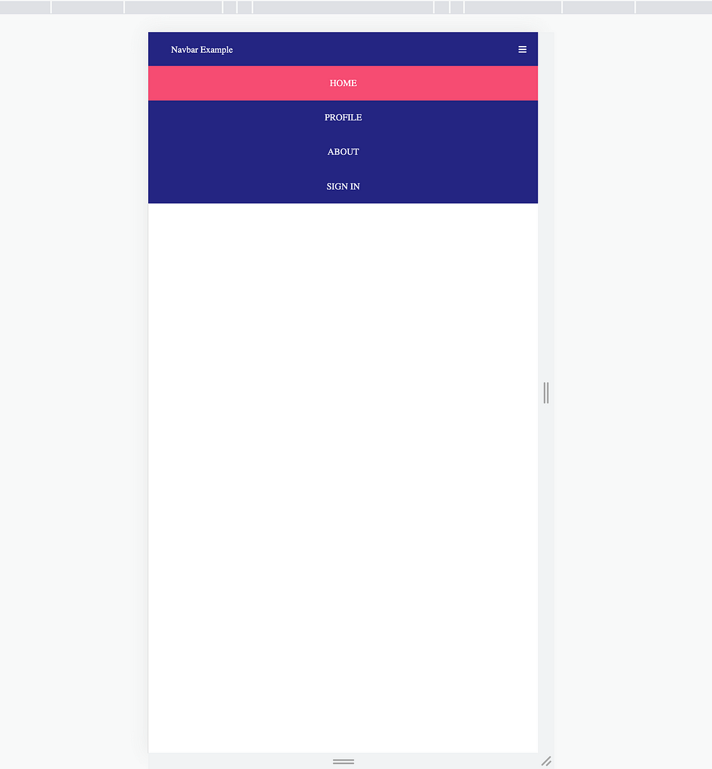
Navigation bar on smaller screen

Implementation without JavaScript

Now, let’s see how we can implement the same with just HTML and CSS. The most common method here is using a checkbox and toggling the navigation bar by selecting or de-selecting it.

We’ll be using the same method. Let’s have an input of the type checkbox first.

<input type="checkbox" id="toggle-menu">

By clicking the checkbox, the navigation bar can be toggled. But we don’t want a checkbox, we want a menu icon that opens the navbar. This can be done in the following way.

<label class="menu-icon" for="toggle-menu">
    <a id="menu-icon">
        <i class="fa fa-bars"></i>
    </a>
</label>

The for attribute of the label represents the input to which this label is bound. When a label is bound to an input element, it is able to imitate the behavior of the input element.

In this case, it is bound to the checkbox, so by clicking on the label the checkbox gets toggled. Thus, our menu icon is wrapped inside this label.

Now, make the checkbox invisible.

#toggle-menu {
    display: none;
}

To toggle the navigation bar, we do not need the onClick function or a separate responsive class.

Instead, we use the :checked pseudo-class selector which would apply certain styles if the checkbox is selected and in our case, display the nav links. In addition, we use the tilde symbol to apply those styles to the element’s sibling which is the navigation bar. Read this to understand more about the tilde symbol.

#toggle-menu:checked ~ .nav-bar {
    display: block;
}

So, whenever the checkbox is selected, apply display: block to the navbar.

That’s it! With these steps, you can implement a responsive navigation bar in your application. Of course, there are other implementations, this being one of them. Since I am new to responsive web design, feel free to comment if you find anything incorrect or if there is a better way of implementing certain things.

Find both the implementations on GitHub. The master branch contains the javascript implementation while the feature branch contains the other implementation.

Conclusion

Having a navigation bar helps users navigate through different pages on your website. And it has to be responsive. In this post, I have explained two methods by which you can implement a responsive navigation bar. I hope this helps you in your next project.

If you are unable to understand the content or find the explanation unsatisfactory, comment your thoughts below. New ideas are always appreciated! Give a few claps if you liked this post. Subscribe and follow me for weekly content. Reach out to me on Twitter if you want to discuss anything. Till then, Goodbye!!


How to create a responsive navigation bar with and without JavaScript was originally published in Level Up Coding on Medium, where people are continuing the conversation by highlighting and responding to this story.


This content originally appeared on Level Up Coding - Medium and was authored by Kunal Nalawade


Print Share Comment Cite Upload Translate Updates
APA

Kunal Nalawade | Sciencx (2022-06-05T12:36:32+00:00) How to create a responsive navigation bar with and without JavaScript. Retrieved from https://www.scien.cx/2022/06/05/how-to-create-a-responsive-navigation-bar-with-and-without-javascript/

MLA
" » How to create a responsive navigation bar with and without JavaScript." Kunal Nalawade | Sciencx - Sunday June 5, 2022, https://www.scien.cx/2022/06/05/how-to-create-a-responsive-navigation-bar-with-and-without-javascript/
HARVARD
Kunal Nalawade | Sciencx Sunday June 5, 2022 » How to create a responsive navigation bar with and without JavaScript., viewed ,<https://www.scien.cx/2022/06/05/how-to-create-a-responsive-navigation-bar-with-and-without-javascript/>
VANCOUVER
Kunal Nalawade | Sciencx - » How to create a responsive navigation bar with and without JavaScript. [Internet]. [Accessed ]. Available from: https://www.scien.cx/2022/06/05/how-to-create-a-responsive-navigation-bar-with-and-without-javascript/
CHICAGO
" » How to create a responsive navigation bar with and without JavaScript." Kunal Nalawade | Sciencx - Accessed . https://www.scien.cx/2022/06/05/how-to-create-a-responsive-navigation-bar-with-and-without-javascript/
IEEE
" » How to create a responsive navigation bar with and without JavaScript." Kunal Nalawade | Sciencx [Online]. Available: https://www.scien.cx/2022/06/05/how-to-create-a-responsive-navigation-bar-with-and-without-javascript/. [Accessed: ]
rf:citation
» How to create a responsive navigation bar with and without JavaScript | Kunal Nalawade | Sciencx | https://www.scien.cx/2022/06/05/how-to-create-a-responsive-navigation-bar-with-and-without-javascript/ |

Please log in to upload a file.


There are no updates yet.
Click the Upload button above to add an update.

You must be logged in to translate posts. Please log in or register.