This content originally appeared on Telerik Blogs and was authored by Suzanne Scacca
Social proof is one of the most valuable tools a business has—testimonials, reviews, ratings, etc. But not all social proof is positive. Let’s look at what can happen when consumers encounter negative social proof and share some examples of it that you should avoid when designing websites.
The psychological phenomenon of social proof is similar to the bandwagon effect. When people see others doing something, they assume that if there’s that many doing it—or enough notable people doing it—that this must be the right course of action.
Social proof is a concept that brands can use to their advantage in marketing and sales … Or, as we’ll see today, to their disadvantage. When it comes to a website, in particular, the way that social proof is designed can also turn it into a negative.
That’s what we’re going to focus on today. We’re going to break down what can turn this powerful sales and marketing tool into a negative for a brand, and what you can do as a designer to help your clients avoid the pitfalls of social proof.
The Cost of Negative Social Proof
I went out to eat recently with a friend. As we walked into the restaurant, I noticed a sign that said “Best Burger in Tampa Bay,” which immediately had me jonesing for a burger.
I pointed it out to my friend and he just laughed at me. “You actually believe that?” he asked. The truth was, I wanted to believe it. After all, why would a restaurant so blatantly lie like that? They wanted my business, didn’t they?
That’s the power of social proof. If I had sat down for the first time in the restaurant and the server told me their burgers were the “best,” I probably would’ve been like, “That’s cool,” and then ordered something else. But seeing a big bold sign out front, I assumed they had won the majority of votes in a contest run by a popular Tampa newspaper or magazine.
But here’s the thing about social proof: The proof comes from society. And if the brand doesn’t have the receipts to back up the proof they’ve provided, that could spell trouble for them. In this case, I did find the proof—and it came from a single local food blogger who’d given them the title in 2020. And the burger wasn’t that good.
So yeah, that was my recent brush with negative social proof. On the web, it’s a bit of a different story because it’s not just a misleading claim or falsified social proof that can sour customer sentiment. The way social proof is presented in digital UX can also turn it into a bad thing.
Positive social proof can help brands widen their reach, build trust with prospects, improve shopper confidence, increase sales and more. Negative social proof can have far-reaching effects, too:
- Increase website bounce rates
- Damage the brand’s reputation
- Undo the trust of existing customers
What’s more, if social proof drives more and more people away, marketing and sales costs are going to become wildly expensive. Think about it from the design perspective alone. When a site doesn’t generate leads or sales, you have to go back to the drawing board—more user research, A/B testing, redesigns and so on. Poorly implemented social proof can greatly expand costs while simultaneously making it more expensive to acquire and retain customers.
How To Avoid Using Negative Social Proof in Web Design
That said, there are certain things you can do to prevent social proof from destroying users’ confidence in your client’s brand. Here are some things to be wary of when adding social proof features to a product:
1. Make Sure There Are Active and Relevant Links to Sources
The best way to demonstrate that social proof is legit is to link back to the original source. While it’s not usually ideal to point users away from your site, this is an exception to that rule.
There are various types of social proof where an external link should be included:
Social media logos
Every website these days has a row of social media logos in the header or footer, encouraging visitors to “connect with us.” Asana,
for instance, stores its social media logos at the very bottom of the page:
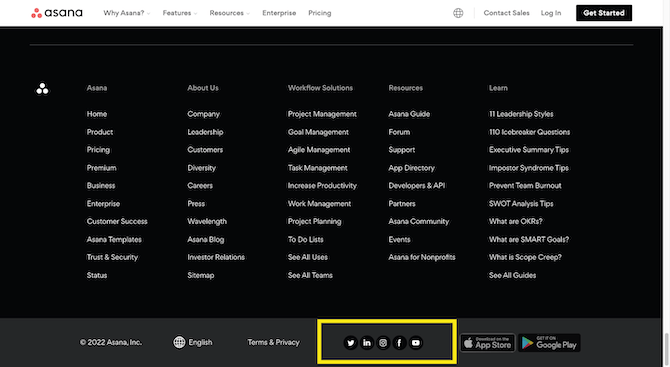
The presence of these logos isn’t social proof. It’s what visitors find when they click on those links that is social proof.
So, there are a couple of ways to mess this up. The first is to forget to program the links into the logos. That’s easy enough to remedy.
The second is to embed dead links. Usually a dead link is one that’s broken—pointing users to deactivated accounts or the wrong page altogether. However, I also consider a dead link one that points to an account that no one manages.
The whole point in putting these logos on a site is so the brand can grow its following, share content and announcements, and stay top-of-mind with its audience. This isn’t a numbers game. Visitors aren’t going to see a row of 10 social media logos and be convinced that the company is totally legit and trustworthy. Those logos need to point somewhere and the effort required to click each link and explore the page should be worth it.
Press mentions
For some companies, getting good PR is a top priority. So they prioritize activities like getting their products reviewed, getting write-ups in local publications, or scheduling talks with podcast or radio hosts. They
also apply for awards, when possible.
Obviously, no one is going to go chasing all of these opportunities without showing off the results. That’s what that restaurant did by putting a sign outside heralding its victory as the best burger in Tampa. However, when you make a claim like that on a website, a sign or logo alone won’t suffice.
Sections or pages dedicated to media mentions or accolades should come with links. Here’s an example from the Brand24 home page with linked logos:
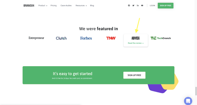
While it’s great if you can brag about being featured in high-profile publications, wouldn’t it be more powerful if you could point visitors to the source content? I get why some companies might not want to share your run-of-the-mill product roundups where the competition is featured. But if that’s the case, then perhaps that logo shouldn’t be featured on the home page.
As a general rule, if you don’t have a source link to connect to your press or media logos, then the mention doesn’t deserve to be there.
2. Include Social Proof That’s Meaningful and Useful for Your Target Audience
One of the most effective types of social proof comes in the form of micro-storytelling—through client testimonials, customer reviews and case studies.
That said, website visitors aren’t impressed by the sheer presence of these accolades or messages of gratitude. It’s the actual story they tell that matters.
As a web designer, you can flesh out this “story” a number of ways so that it works in your client’s favor and not against them:
Be careful with sharing too few or too many
When it comes to something like testimonials and case studies, you’ll want to find a good sweet spot in terms of how many to put on the site—on the home page as well as the
pages dedicated to them.
Too few testimonials or personal accounts could suggest to visitors a number of things:
- The company hasn’t had very good results with their clients.
- The company is brand-new and it might be better to wait and see how it works out for others.
Either way, too few testimonials may push visitors away.
Too many, on the other hand, could be a good thing. Then again, if there are so many testimonials or case studies available, it could make visitors feel overwhelmed.
Just as we’ve seen with analysis paralysis in UX design, prospective customers may worry that they’re missing something when there’s that much information to comb through. And it could keep them from moving forward if they haven’t gotten an accurate sense of how others feel.
Choose testimonials with substance
I used to write product listicles based on Amazon customer reviews. I did this for years and it became quite obvious which testimonials I could trust and which ones I couldn’t.
For instance, I’d immediately discard reviews that:
- Contained no more than a sentence or two
- Described the product as “good” or “great” but provided no further details
- Used the same specific wording as other users around the same time period
If a product had enough of these, I knew there was a good chance they were fake reviews posted by employees and friends of the company or they were paid reviewers.
Now, I would review about a hundred products for every roundup I wrote, and I wrote one of these every week. So I spent a lot of time on Amazon and knew what to look for. But I don’t think I’m the only one who’s internal warning system goes off when they encounter brief, vague or copycat reviews.
For example, here’s the testimonials section on the Penn Dental Family Practice home page:
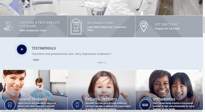
There are four customer reviews in this slider and they’re all just as short and vague. While it’s nice to see these four customers so positively respond to their dental appointments, they don’t sound very realistic.
Now contrast the above testimonials with the ones on the Main Street Dental Center City home page:
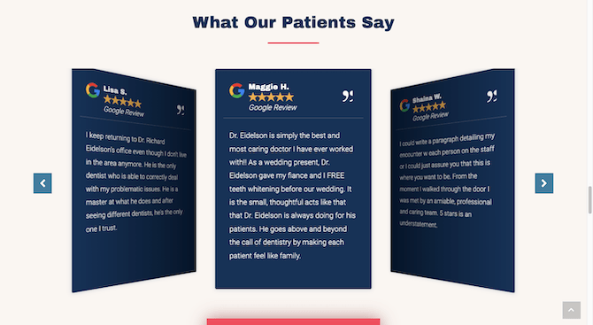
As a general rule of thumb, you should include testimonials and case studies on a website that have real substance. And if they were sourced externally, include that information and the corresponding link, too. The emotion and the detail is what makes this kind of social proof so effective.
Use ones that are relevant to the target audience
The most meaningful recommendations come from people that we know—friends, family, and other personal or professional connections. However, brands can’t always depend
on customers to become their advocates on social media. Not in the early days of the company, anyway.
This is why many brands will leverage testimonials from well-known public figures and case studies from big brands. This can be an effective and positive form of social proof, but only if those endorsements come from figures that the audience can relate to.
For example, let’s say you’re building an ecommerce site for a brand like Ann Taylor—a retailer that makes clothes for middle-class, professional women.
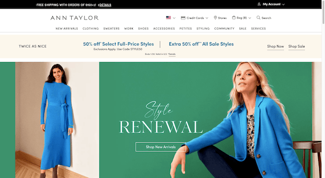
Your client gives you a testimonial from Olivia Culpo to put on the home page. Here she is on Instagram if you’re not sure who she is:

Sure, she’s a former Miss USA and Miss Universe and is now a social media influencer. But would her endorsement actually drive up sales for Ann Taylor? My guess is it wouldn’t.
Customer stories need to come from people your audience can relate to. Otherwise, you’ll leave people scratching their heads as to who the endorser is, why a model would promote clothes for working class women or, worse, wonder how much the brand paid the model to make the endorsement.
3. Only Add Social Proof Features if Your Client Is Going To Use Them
There are certain kinds of social proof that become more meaningful and valuable to a brand the more they use them. That said, if you put these types of social media features on a website and the client doesn’t do anything with them, it could backfire on them.
For instance:
Embedded social feeds
Business owners understand the importance of social media marketing. Not only can they use it to grow an audience and connect with customers, but it’s useful in driving traffic back to their website.
Here’s the Instagram feed at the bottom of Danielle LaPorte’s website. The post on the far left was just shared to Instagram six hours ago:
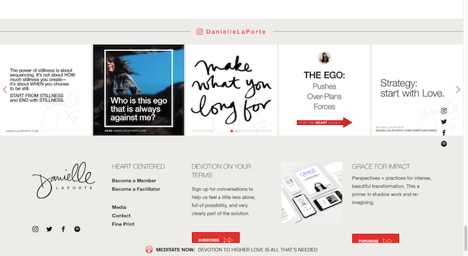
That said, some people don’t realize how much work is needed in order to have major success on social media. As such, many social media profiles become neglected. Or they become a place for a brand to mindlessly promote their latest blog post or sale.
Just as you don’t want to include social media logos that point your visitors to poorly managed accounts, you don’t want to embed those kinds of social media feeds on the site either.
Unless your client is on social media every day, posting original content and thoughts and actively engaging with others, that feed could easily become something that drives people away from the site and brand. After all, if they haven’t posted since April 2020, what does that tell people about how they manage and maintain the internal workings of their business?
Social share counters
Social share and engagement counters can be a great way to visually communicate to ecommerce customers or blog readers how popular an item or piece of content is.
When a site or company first launches, those counters aren’t going to have much to say. That’s completely understandable. However, once things are rocking and rolling, those counters need to be working on behalf of the brand, not against it.
If the counter sits on the pages without any change from day to day, then you’ll need to make a judgment call as to whether it should stay there. Because the presence of a zeroed-out social media counter might keep website visitors from even scrolling, not to mention converting.
If your client insists on adding social share icons to your site and you’re worried about a lack of engagement, you can always remove that element from the design. That’s what the Moz blog does:
![]()
Visitors see quick-access sharing links, but no counters.
Blog comments
This is another one where you may hear crickets immediately after the site and blog launches. And that’s okay. Until the site has steady traffic, you can’t reasonably expect much activity in the blog comments
section.
That said, if your client doesn’t share their content, isn’t actively growing a following on social media or over email, or doesn’t participate in what few comments the blog gets, that could be the reason for inactivity. If no one is talking about the content, then it might not be a good idea to keep that graveyard hanging out at the bottom of the page.
This kind of social proof is only going to be useful when a brand makes every effort to generate activity and foster engagement there themselves. If your client can’t do that, then you shouldn’t include it in the page design.
4. Make Customer Reviews and Ratings Sections Usable
One of the best things about online shopping is the access we get as shoppers to reviews and ratings from other customers. When you’re at the store, you might be lucky enough to have a fellow shopper nudge you and say, “I absolutely love that coffee maker!” But that’s it. Online, you get to read a plethora of customer experiences.
However, the reviews section can become negative social proof if it’s designed poorly. Here are some observations I’ve made with regard to usability issues found in the reviews and ratings section:
Linked ratings bar
At the top of each product page, shoppers expect to see information related to customer ratings and number of reviews. It gives them a quick idea of how other customers felt about the product.
The Home Depot includes one just beneath the product and manufacturer name:
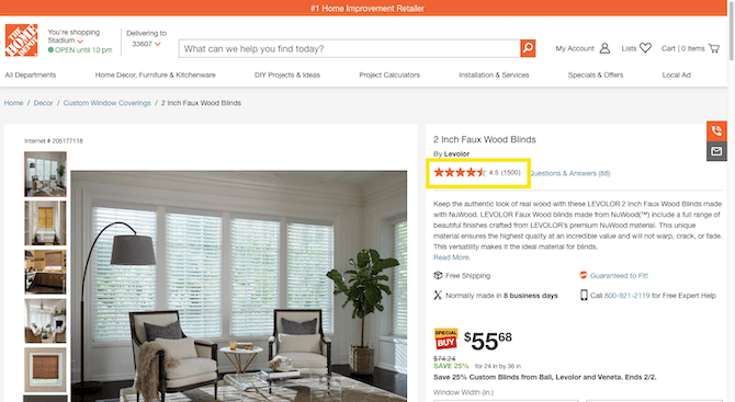
This bar should also provide a shortcut to the reviews section that enables them to bypass all of the product info, related product recommendations and so on that litter the middle of the page. That’s what The Home Depot’s bar does and that’s what yours should, too.
When the ratings bar doesn’t provide a link or the link takes them to the wrong part of the page, this can create undue frustration.
Review sorting, filtering and searching controls
Another issue shoppers may encounter in the customer reviews section relates to what controls are available to them.
Typically, these sections display a ratings overview where shoppers can see a breakdown of how many ratings there were for 1 star, 2 stars and so on. Beneath that is where they find the customer reviews and associated ratings.
One way this section may elicit a negative reaction from shoppers is if they can’t see the results that interest them most.
For instance, I often start with all of the 1-star reviews to see if there’s a consensus on what the bad qualities are about a product. Sometimes it’s a random collection of complaints that don’t matter much to me. However, if they’re all complaining about the same thing and it’s a major issue, then that’s enough to make me back out of there.
That said, some reviews sections don’t allow users to sort by “Lowest to Highest Rating.” Or to click on the 1-star bar in the overview section to look solely at those reviews.
The Home Depot, again, gets it right:
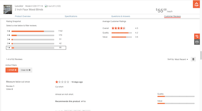
This is what the reviews section looks like when I click on the 1-star row. It highlights what I’m looking at, displays “Active Filters” buttons, and then shares the relevant results below.
Bad reviews aren’t always a bad thing for brands. What’s more, many customers will wait and see if a brand responds to negative reviews before writing them off completely. If the company apologizes and tries to resolve the complaint, that is enough for some people to ignore the social proof and put their trust in the brand.
By designing this section to make it difficult for users to find negative reviews, it could end up backfiring on the company. Transparency is always best, even if it means losing some sales because you allowed unhappy customers to air their grievances and others to easily find them.
Wrap-up
Social proof can be a valuable component in web design, helping brands generate more customer trust, sales and loyalty. But that’s only if your design includes positive social proof elements.
If you know what can turn social proof negative in the minds of consumers, you can actively avoid including these features in websites. It’ll also make it easier for you to talk your clients out of trying to include social proof that’ll do their brands more harm than it will good.
This content originally appeared on Telerik Blogs and was authored by Suzanne Scacca
Suzanne Scacca | Sciencx (2022-06-30T18:10:04+00:00) How To Avoid Using Negative Social Proof When Designing Websites. Retrieved from https://www.scien.cx/2022/06/30/how-to-avoid-using-negative-social-proof-when-designing-websites/
Please log in to upload a file.
There are no updates yet.
Click the Upload button above to add an update.
