This content originally appeared on DEV Community and was authored by Hanna (she/her)
Websites have come a long way since HTML and CSS were the only tools available to build them. So has design sense-- companies want to express their brand's identity using the latest technologies to create dynamic content that catches and maintains their users' attention.
To ensure everyone is able to use your website, it is important to make sure the underlying structure of each page is set up in a way that works with the different devices and tools people may be using to interact with them.
Navigating a Modern Website with Accessibility Tools
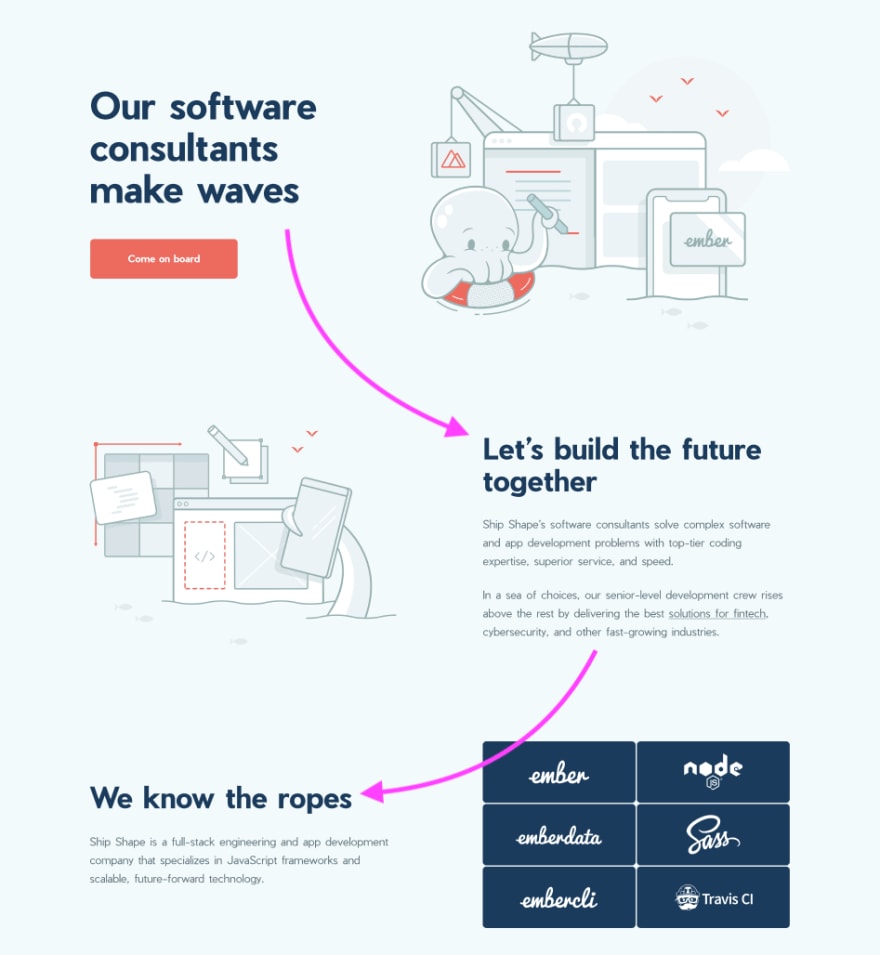
How do you process the content on this landing page?A visual flow that may instantly make sense for those of us with normal vision and the ability to navigate the GUI with a mouse or trackpad can be a vastly different experience for someone without those abilities.
Some folks may rely on tools like a screen reader or keyboard to be able to access the digital world. These tools rely on software engineers to create apps with proper DOM structure so their users can to get to the information they need quickly and efficiently.
Generate the DOM Structure First
If you are not visually impaired, chances are likely that your eyes jumped to scan each header on the page, starting at the top left. You might have next read a section of body copy, if the header caught your interest. Though your focus may have been on the text, your eyes concurrently processed the two images of our mascot at work "building" apps, which are opposite each segment of copy. You could likely skim through the buttons made up of tech logos on the bottom right-hand corner of the page.
Someone without those same abilities could have a fairly similar experience if the page is built with their experience in mind. Based on our abilities as developers without a visual disability, our instinct may be to add elements as we see them on a design spec.
When building with accessibility in mind, a good rule of thumb is to start by thinking of what elements should be on the page without any of the design in place. Create the scaffolding for the content first, then add in the creative touches that differentiate your page.
Basic Considerations for A11y
Here are some basics to pay attention to so you can jump-start accessibility for your web application:
Order Elements in Each Section Properly:
Let's take a closer look at this section of our page. Because most languages read left to right, we start our attention on the left side of the page, which this time, is an image and might start coding like so:
<img />
<h1>Title</h1>
<p>some body copy</p>
A header should be the leading element in its section; otherwise it can create confusion for non-GUI users. On shipshape.io, we've used tailwindCSS to help us style something like this easily, using the order utility. order-last forces the div with the header and text to come after the image, like so:
<section class="flex">
  <div class="order-last">
    <h1>Title</h1>
    <p>some body copy</p>
  </div>
  <div>
    <img />
  </div>
</section>
Use Proper H-Tags
Accessibility tools rely on well-organized DOM and content to direct their users to where they want to get on a page. Screen reader users are given the option to listen to a list of headings on a page so they can skip around and get to their desired section for further interaction without going through every single element on the page, line by line.
An anti-pattern for using h-tag's is to set each header level to a certain set of styles and sizes and using them for different text styles through the page. This promotes using headers out of order. Instead, first make sure your content is organized in proper order, then create the CSS styles to meet your design needs.
🚫 Don't do this! 🚫

|
h1 {
  color: blue;
  font-size: 48px;
}

h2 {
  color: white;
  font-size: 48px;
}

h3 {
  color: white;
  font-size: 20px;
  font-weight: bold;
}

h4 {
  color: blue;
  font-size: 20px;
}

h5 {
  color: white;
  font-size: 20px;
}
|
In the example above, the intention was not to nest each section within each other, therefore we should not be using multiple levels of h-tags to style these elements of text, and instead create the right classes for each set of styles.
Use Semantic HTML
Is your website suffering from "divitis"? Look for segments of your page that can be converted to semantic HTML, which helps accessibilty tool users differentiate the parts of your page they can navigate. For example, use <button> instead of <div role="button">, which explicitly describes the element's intended interaction.
Use Descriptive Language for Interactive Elements
Generic text like "click this" or "link 1" can negatively impact accessibility - think about how a user would be able to know what clicking "this" does, or to what page a user will be directed to by a link. You can alternatively use aria-label to describe the link with a short descriptor.
Bonus: Using language that clearly communicates what interactive elements like links and buttons do also helps boost your page's SEO rankings. This helps sesarch engines create context for how your content is organized.
Tools to Help You Develop an Accessible App
Depending where you are on your journey with accessibility, it may feel like a lot of additional work to incorporate. Here are also some tools that can help you break things down into more manageable steps:
Lighthouse Chrome Extension
Google Lighthouse is a good starting place to get a general idea of how your current web app scores for accessibility. This developer tool is available for Chrome-based browsers as well as Firefox.
Lighthouse scans through your web app and offers a rundown of what is and isn't considered accessible. It can also measure your app's quality for load speed and search engine optimization. Keep in mind scoring 100% does not necessarily mean your site is perfectly accessible. Manual tests are recommended to fix any gaps the tool may have missed.
Color Contrast Checkers
Lighhouse will let you know about sections of your website that pass/fail color contrast. You can quickly determine at what colors and sizes of text have enough contrast with their background color by using contrast checkers like WCAG Color contrast checker or Colour Contrast Checker.
Your primary text should have enough contrast to be readable by folks with different types of color blindness. Additional text states like hover or active don’t necessarily need to pass the contrast test as long as you have other cues that someone is over a link for example (i.e.: by using semantic html 😉).
HeadingsMap Browser Extension
HeadingsMap is a quick and easy way to check if your headers are following the correct hierarchy for page navigation.
Hands-on Testing Your Web App
Last but not least, try accessing your website in different ways to make sure things are working how you intended. Try going through each of your pages using only your keyboard. Next try with your device’s built-in assistive technology.
Some common unintended scenarios are skipping over elements you can normally click on, or opening a modal and getting sent back to the top of the page when you close it instead of where you last were.
Having accessibility in mind while developing helps keep the web a better experience for a greater set of users online as well as you and your engineering team. Following some basic rules while building new features means less technical debt to fix these important issues down the line.
This content originally appeared on DEV Community and was authored by Hanna (she/her)
Hanna (she/her) | Sciencx (2022-07-11T20:07:29+00:00) Building (or Rebuilding) a Website with Accessibility in Mind. Retrieved from https://www.scien.cx/2022/07/11/building-or-rebuilding-a-website-with-accessibility-in-mind/
Please log in to upload a file.
There are no updates yet.
Click the Upload button above to add an update.


