This content originally appeared on Level Up Coding - Medium and was authored by Nidhin kumar
CSS — Layout Patterns #4

If you don’t have time to read but want to know what’s there in this post. Find the quick read 👇

On this Series
We are going to look at the commonly used CSS layout patterns. Most of the patterns which we are going to see use CSS grid and flexbox to achieve the common UI patterns such as cards, dynamic grid areas, and full-page layouts supported on all modern browsers.
The patterns which we are going to see in this series are
- Aspect ratio Image Card
- Clamping Card
- Deconstructed Pancake
- Holy grail layout
- Line up
- Pancake Stack
- RAM (Repeat, Auto, Minmax)
- Sidebar says something
- Super centered
- 12-span grid
If you are new to this series check out the Part 3👇

On this Post
In this post, we are going to see the following patterns that are
- RAM (Repeat, Auto, Minmax)
- Sidebar says something
1. RAM(Repeat, Auto, Minmax)
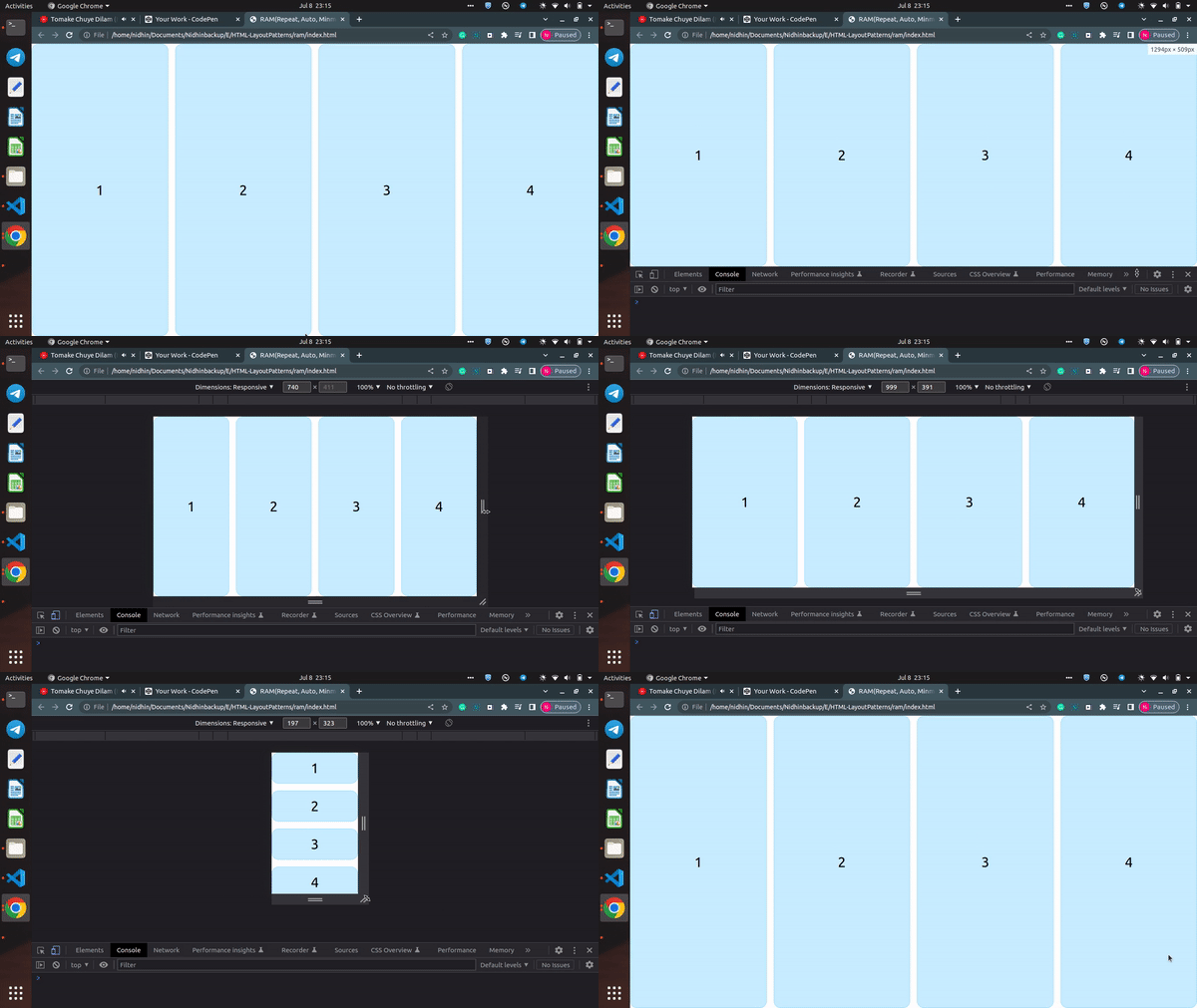
A responsive layout with automatically-placed and flexible children.
To create a responsive layout with automatically-placed and flexible children we will use the concepts that we learned earlier. The key terms to remember here are repeat, auto-(fit|fill), and minmax(), which you remember by the acronym RAM.
All together it looks like
.parent {
  display: grid;
  grid-template-columns: repeat(auto-fit, minmax(150px, 1fr));
}
Here we are using repeat() again, but this time, using the auto-fit keyword instead of an explicit numeric value. This enables auto-placement of these child elements. These children have a base minimum value of 150px with a maximum value of 1fr, meaning on smaller screens, they will take up the full 1fr width, and as they reach 150px wide each, they will start to flow onto the same line.
With auto-fit, any completely empty tracks will collapse to 0 and the filled tracks will grow to take up their space. However, if you change this to auto-fill, empty tracks will take up the same amount of space they would do if filled
.parent {
  display: grid;
  grid-template-columns: repeat(auto-fill, minmax(150px, 1fr));
}2. Sidebar says something
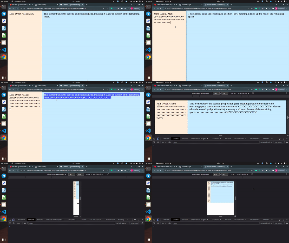
A layout where the sidebar is given a minimum and maximum safe area size, and the rest of the content fills the available space.

Here we are using minmax() function for grid layouts. In the demo, minmax() is used to set the minimum sidebar size to 100px, but on larger screens, letting that stretch out to 25%. The sidebar will always take up 25% of its parent’s horizontal space until that 25% becomes smaller than 100px.
By using the property grid-template-columns with minmax(100px, 25%) 1fr. The item in the first column (the sidebar in this case) gets a minmax of 100px at 25%, and the second item (the main section here) takes up the rest of the space as a single 1fr track.
.parent {
  display: grid;
  grid-template-columns: minmax(100px, 25%) 1fr;
  height: 100%;
}Congratulations!

Level Up Coding
Thanks for being a part of our community! More content in the Level Up Coding publication.
Follow: Twitter, LinkedIn, Newsletter
Level Up is transforming tech recruiting 👉 Join our talent collective
CSS — Layout Patterns #4 was originally published in Level Up Coding on Medium, where people are continuing the conversation by highlighting and responding to this story.
This content originally appeared on Level Up Coding - Medium and was authored by Nidhin kumar
Nidhin kumar | Sciencx (2022-07-14T02:17:27+00:00) CSS — Layout Patterns #4. Retrieved from https://www.scien.cx/2022/07/14/css-layout-patterns-4/
Please log in to upload a file.
There are no updates yet.
Click the Upload button above to add an update.
