This content originally appeared on DEV Community and was authored by Zoltán Szőgyényi
Hey devs 👋
Me and my friends from Flowbite built a collection of animated and accessible skeleton loaders for Tailwind CSS that you can use as a placeholder when fetching data for the server.
We built variants for text content, images, video, application widgets (charts), testimonials, lists, and more.
We made sure that they are responsive and can be easily adjusted in size based on the size of the content that will be loaded.
For example: if you have a smaller or larger widget element you can adjust the size yourself using the w-* and h-* utility classes from Tailwind CSS.
These components are all open-source under the MIT license of the Flowbite Library.
👉 Tailwind CSS Skeleton - Flowbite
Tailwind CSS Skeleton - Flowbite
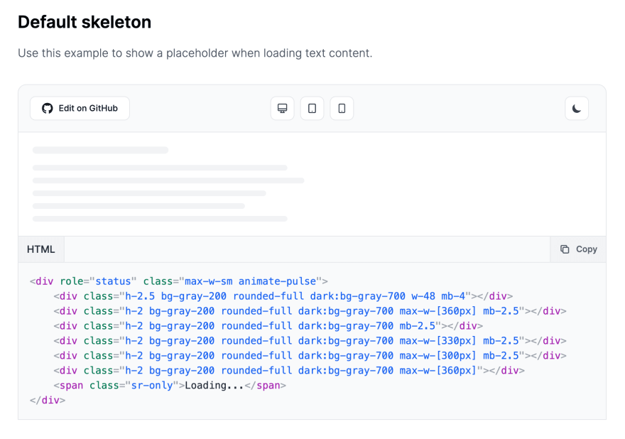
Here's one that you can use for simple text content:
HTML code:
<div role="status" class="max-w-sm animate-pulse">
    <div class="h-2.5 bg-gray-200 rounded-full dark:bg-gray-700 w-48 mb-4"></div>
    <div class="h-2 bg-gray-200 rounded-full dark:bg-gray-700 max-w-[360px] mb-2.5"></div>
    <div class="h-2 bg-gray-200 rounded-full dark:bg-gray-700 mb-2.5"></div>
    <div class="h-2 bg-gray-200 rounded-full dark:bg-gray-700 max-w-[330px] mb-2.5"></div>
    <div class="h-2 bg-gray-200 rounded-full dark:bg-gray-700 max-w-[300px] mb-2.5"></div>
    <div class="h-2 bg-gray-200 rounded-full dark:bg-gray-700 max-w-[360px]"></div>
    <span class="sr-only">Loading...</span>
</div>
This one you can use for images:
HTML code:
<div role="status" class="space-y-8 animate-pulse md:space-y-0 md:space-x-8 md:flex md:items-center">
    <div class="flex justify-center items-center w-full h-48 bg-gray-300 rounded sm:w-96 dark:bg-gray-700">
        <svg class="w-12 h-12 text-gray-200" xmlns="http://www.w3.org/2000/svg" aria-hidden="true" fill="currentColor" viewBox="0 0 640 512"><path d="M480 80C480 35.82 515.8 0 560 0C604.2 0 640 35.82 640 80C640 124.2 604.2 160 560 160C515.8 160 480 124.2 480 80zM0 456.1C0 445.6 2.964 435.3 8.551 426.4L225.3 81.01C231.9 70.42 243.5 64 256 64C268.5 64 280.1 70.42 286.8 81.01L412.7 281.7L460.9 202.7C464.1 196.1 472.2 192 480 192C487.8 192 495 196.1 499.1 202.7L631.1 419.1C636.9 428.6 640 439.7 640 450.9C640 484.6 612.6 512 578.9 512H55.91C25.03 512 .0006 486.1 .0006 456.1L0 456.1z"></path></svg>
    </div>
    <div class="w-full">
        <div class="h-2.5 bg-gray-200 rounded-full dark:bg-gray-700 w-48 mb-4"></div>
        <div class="h-2 bg-gray-200 rounded-full dark:bg-gray-700 max-w-[480px] mb-2.5"></div>
        <div class="h-2 bg-gray-200 rounded-full dark:bg-gray-700 mb-2.5"></div>
        <div class="h-2 bg-gray-200 rounded-full dark:bg-gray-700 max-w-[440px] mb-2.5"></div>
        <div class="h-2 bg-gray-200 rounded-full dark:bg-gray-700 max-w-[460px] mb-2.5"></div>
        <div class="h-2 bg-gray-200 rounded-full dark:bg-gray-700 max-w-[360px]"></div>
    </div>
    <span class="sr-only">Loading...</span>
</div>
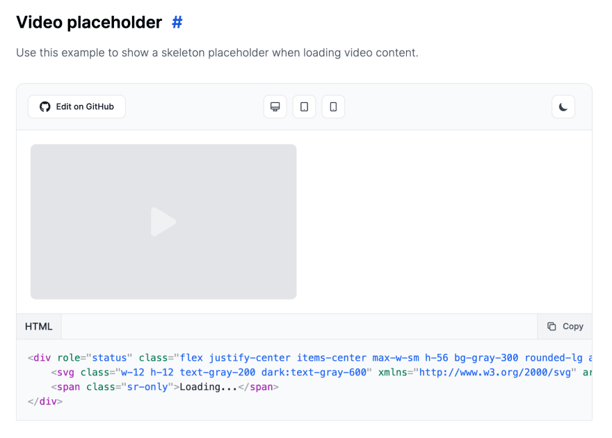
This example you can use for videos:
HTML code:
<div role="status" class="flex justify-center items-center max-w-sm h-56 bg-gray-300 rounded-lg animate-pulse dark:bg-gray-700">
    <svg class="w-12 h-12 text-gray-200 dark:text-gray-600" xmlns="http://www.w3.org/2000/svg" aria-hidden="true" fill="currentColor" viewBox="0 0 384 512"><path d="M361 215C375.3 223.8 384 239.3 384 256C384 272.7 375.3 288.2 361 296.1L73.03 472.1C58.21 482 39.66 482.4 24.52 473.9C9.377 465.4 0 449.4 0 432V80C0 62.64 9.377 46.63 24.52 38.13C39.66 29.64 58.21 29.99 73.03 39.04L361 215z"></path></svg>
    <span class="sr-only">Loading...</span>
</div>
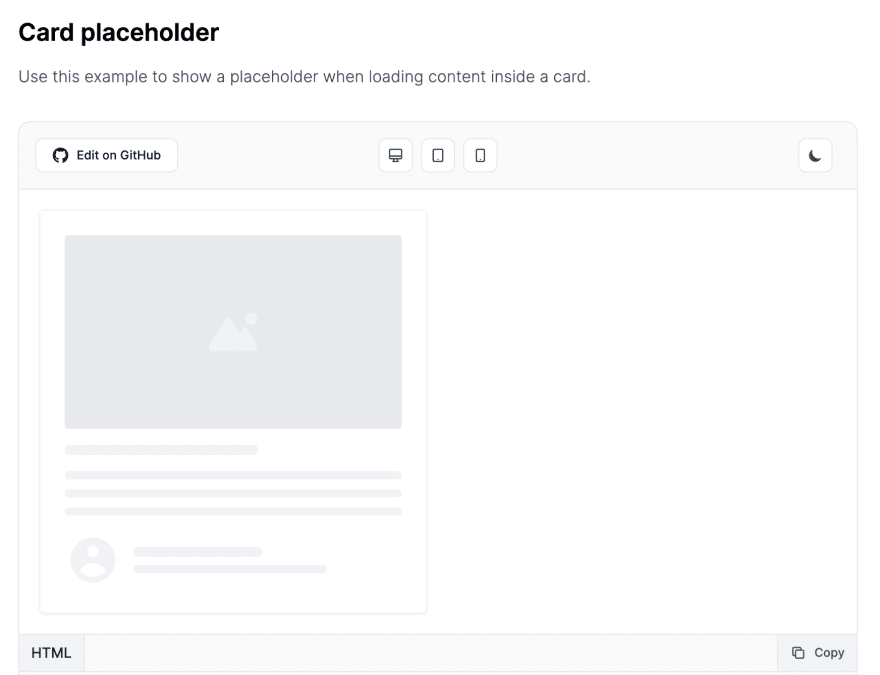
Use this example for cards:
HTML code:
<div role="status" class="p-4 max-w-sm rounded border border-gray-200 shadow animate-pulse md:p-6 dark:border-gray-700">
    <div class="flex justify-center items-center mb-4 h-48 bg-gray-300 rounded dark:bg-gray-700">
        <svg class="w-12 h-12 text-gray-200 dark:text-gray-600" xmlns="http://www.w3.org/2000/svg" aria-hidden="true" fill="currentColor" viewBox="0 0 640 512"><path d="M480 80C480 35.82 515.8 0 560 0C604.2 0 640 35.82 640 80C640 124.2 604.2 160 560 160C515.8 160 480 124.2 480 80zM0 456.1C0 445.6 2.964 435.3 8.551 426.4L225.3 81.01C231.9 70.42 243.5 64 256 64C268.5 64 280.1 70.42 286.8 81.01L412.7 281.7L460.9 202.7C464.1 196.1 472.2 192 480 192C487.8 192 495 196.1 499.1 202.7L631.1 419.1C636.9 428.6 640 439.7 640 450.9C640 484.6 612.6 512 578.9 512H55.91C25.03 512 .0006 486.1 .0006 456.1L0 456.1z"></path></svg>
    </div>
    <div class="h-2.5 bg-gray-200 rounded-full dark:bg-gray-700 w-48 mb-4"></div>
    <div class="h-2 bg-gray-200 rounded-full dark:bg-gray-700 mb-2.5"></div>
    <div class="h-2 bg-gray-200 rounded-full dark:bg-gray-700 mb-2.5"></div>
    <div class="h-2 bg-gray-200 rounded-full dark:bg-gray-700"></div>
    <div class="flex items-center mt-4 space-x-3">
        <svg class="w-14 h-14 text-gray-200 dark:text-gray-700" aria-hidden="true" fill="currentColor" viewBox="0 0 20 20" xmlns="http://www.w3.org/2000/svg"><path fill-rule="evenodd" d="M18 10a8 8 0 11-16 0 8 8 0 0116 0zm-6-3a2 2 0 11-4 0 2 2 0 014 0zm-2 4a5 5 0 00-4.546 2.916A5.986 5.986 0 0010 16a5.986 5.986 0 004.546-2.084A5 5 0 0010 11z" clip-rule="evenodd"></path></svg>
        <div>
            <div class="h-2.5 bg-gray-200 rounded-full dark:bg-gray-700 w-32 mb-2"></div>
            <div class="w-48 h-2 bg-gray-200 rounded-full dark:bg-gray-700"></div>
        </div>
    </div>
    <span class="sr-only">Loading...</span>
</div>
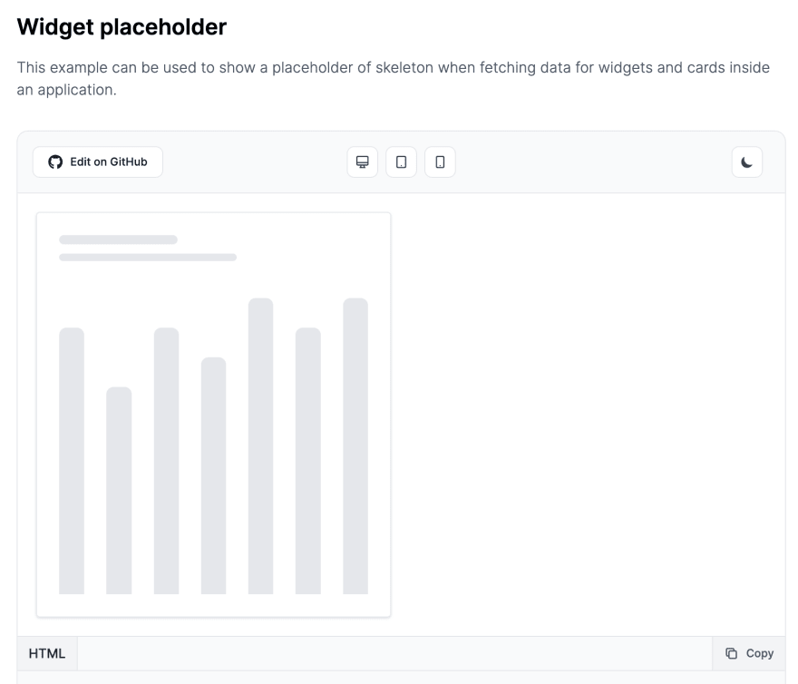
This example can be used when fetching data for charts inside an application widget:
HTML code:
<div role="status" class="p-4 max-w-sm rounded border border-gray-200 shadow animate-pulse md:p-6 dark:border-gray-700">
    <div class="h-2.5 bg-gray-200 rounded-full dark:bg-gray-700 w-32 mb-2.5"></div>
    <div class="mb-10 w-48 h-2 bg-gray-200 rounded-full dark:bg-gray-700"></div>
    <div class="flex items-baseline mt-4 space-x-6">
        <div class="w-full h-72 bg-gray-200 rounded-t-lg dark:bg-gray-700"></div>
        <div class="w-full h-56 bg-gray-200 rounded-t-lg dark:bg-gray-700"></div>
        <div class="w-full h-72 bg-gray-200 rounded-t-lg dark:bg-gray-700"></div>
        <div class="w-full h-64 bg-gray-200 rounded-t-lg dark:bg-gray-700"></div>
        <div class="w-full h-80 bg-gray-200 rounded-t-lg dark:bg-gray-700"></div>
        <div class="w-full h-72 bg-gray-200 rounded-t-lg dark:bg-gray-700"></div>
        <div class="w-full h-80 bg-gray-200 rounded-t-lg dark:bg-gray-700"></div>
    </div>
    <span class="sr-only">Loading...</span>
</div>
Use this one for lists:
HTML code:
<div role="status" class="p-4 space-y-4 max-w-md rounded border border-gray-200 divide-y divide-gray-200 shadow animate-pulse dark:divide-gray-700 md:p-6 dark:border-gray-700">
    <div class="flex justify-between items-center">
        <div>
            <div class="h-2.5 bg-gray-300 rounded-full dark:bg-gray-600 w-24 mb-2.5"></div>
            <div class="w-32 h-2 bg-gray-200 rounded-full dark:bg-gray-700"></div>
        </div>
        <div class="h-2.5 bg-gray-300 rounded-full dark:bg-gray-700 w-12"></div>
    </div>
    <div class="flex justify-between items-center pt-4">
        <div>
            <div class="h-2.5 bg-gray-300 rounded-full dark:bg-gray-600 w-24 mb-2.5"></div>
            <div class="w-32 h-2 bg-gray-200 rounded-full dark:bg-gray-700"></div>
        </div>
        <div class="h-2.5 bg-gray-300 rounded-full dark:bg-gray-700 w-12"></div>
    </div>
    <div class="flex justify-between items-center pt-4">
        <div>
            <div class="h-2.5 bg-gray-300 rounded-full dark:bg-gray-600 w-24 mb-2.5"></div>
            <div class="w-32 h-2 bg-gray-200 rounded-full dark:bg-gray-700"></div>
        </div>
        <div class="h-2.5 bg-gray-300 rounded-full dark:bg-gray-700 w-12"></div>
    </div>
    <div class="flex justify-between items-center pt-4">
        <div>
            <div class="h-2.5 bg-gray-300 rounded-full dark:bg-gray-600 w-24 mb-2.5"></div>
            <div class="w-32 h-2 bg-gray-200 rounded-full dark:bg-gray-700"></div>
        </div>
        <div class="h-2.5 bg-gray-300 rounded-full dark:bg-gray-700 w-12"></div>
    </div>
    <div class="flex justify-between items-center pt-4">
        <div>
            <div class="h-2.5 bg-gray-300 rounded-full dark:bg-gray-600 w-24 mb-2.5"></div>
            <div class="w-32 h-2 bg-gray-200 rounded-full dark:bg-gray-700"></div>
        </div>
        <div class="h-2.5 bg-gray-300 rounded-full dark:bg-gray-700 w-12"></div>
    </div>
    <span class="sr-only">Loading...</span>
</div>
Dark mode
The good news is that if you activate dark mode with Tailwind CSS they will work with different dark colors:
I hope that these components will help you with your Tailwind CSS and Flowbite journey.
Made with big ❤️ by the Flowbite devs and community.
Related links:
This content originally appeared on DEV Community and was authored by Zoltán Szőgyényi
Zoltán Szőgyényi | Sciencx (2022-07-15T14:17:19+00:00) Show dev: I built a free collection of skeleton loaders using Tailwind CSS. Retrieved from https://www.scien.cx/2022/07/15/show-dev-i-built-a-free-collection-of-skeleton-loaders-using-tailwind-css/
Please log in to upload a file.
There are no updates yet.
Click the Upload button above to add an update.


