This content originally appeared on DEV Community and was authored by Chuck Meyer
While I was at Algolia's Paris office last week, Dhaya Benmessaoud from our Front-end Experience team showed me a nifty trick for styling Algolia's React widgets in your UI. Out-of-the-box, Algolia provides a couple of pre-built themes for search experiences (Algolia and Satellite) and the ability to create custom themes. Recently, the front-end experience team has added a third way to style your UI by injecting custom CSS classes into your Algolia React components.
This is excellent news for people who use class-based CSS frameworks like Bootstrap and Tailwind! In my case, I was working with the Algolia Ecommerce UI Template, which relies on Tailwind for styling. I wanted to add a <TrendingFacets> widget from the Algolia Recommend UI library to my homepage, but I wanted to style it using Tailwind classes to match the rest of my front-end.
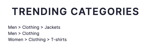
Here's how it looks before styling:
I can definitely do better! To accomplish this, I need to use the classNames attribute for my component. It's available for all of Algolia's React widgets (including Recommend) and allows you to override styling on component-specific elements. Some of our other front-end APIs like Vanilla JavaScript (cssClasses) and Vue (class-names) have had this functionality for years, and now it's available in React thanks to the recent refresh that added React hooks.
The documentation lists the elements I can override for each Algolia widget. For instance, here are the elements for a <SearchBox> widget:
- root: The root element of the widget.
- form: The form element.
- input: The input element.
- submit: The submit button.
- reset: The reset button.
- loadingIndicator: The loading indicator element.
- submitIcon: The submit icon.
- resetIcon: The reset icon.
- loadingIcon: The loading icon.
For my <TrendingFacets> widget, I want the list in a horizontal line to conserve space, so I add a flex class to its list element. I'll also add a new facetItem class to give each item a clean capsule shape with some simple hover styling. Here's how my component looks after styling.
And here's the code:
<TrendingFacets
  classNames={{ list: 'flex', item: 'facetItem' }}
  recommendClient={recommendClient}
  indexName={indexName}
  maxRecommendations={3}
  itemComponent={({ item }) => (
    <a href={item.facetValue}>{item.facetValue}</a>
  )}
  facetName={facetName}
/>
Adding classNames to customize the style of Algolia widgets makes so much sense, especially for people like me who are addicted to Tailwind CSS for styling front-ends. You can read more about adding custom CSS classes to widgets in the Algolia documentation. If you're new to Algolia, you can try it out by signing up for a free tier account.
I'd love to see other examples of well-styled search experiences in the comments!
This content originally appeared on DEV Community and was authored by Chuck Meyer
Chuck Meyer | Sciencx (2022-07-19T19:46:45+00:00) Customize Algolia React components with Tailwind classes. Retrieved from https://www.scien.cx/2022/07/19/customize-algolia-react-components-with-tailwind-classes/
Please log in to upload a file.
There are no updates yet.
Click the Upload button above to add an update.


