This content originally appeared on Bits and Pieces - Medium and was authored by L Javier Tovar

We have all experienced that moment when we don’t know if the website we are accessing is doing something in the background or if it has simply crashed and left us waiting for a response.
That uncertainty of not knowing what is happening causes a terrible user experience, which today, we must pay close attention to as web developers.
Whenever we make a request to our back-end or some other external service, there is a time in which our application waits to receive the requested information. It is at this point that we must inform the user that something is happening.
To solve this problem, we will use Skeleton Loaders, which are a modern form of what have been the traditional Spinners and Loaders. Spinners and Loaders fulfill their function of informing users that content will take time to load, but for modern web development, they are becoming obsolete.
What are Skeleton Loaders?
A loading skeleton is a version of the user interface that does not include the actual content but instead mimics the page layout by displaying its elements similar to the actual content as it loads and becomes available.
A skeleton display is essentially a wireframe structure of the page, with placeholder boxes for text and images.
A skeleton UI resembles the actual UI of the page, so users will understand how quickly the web or mobile application will load even before the content is displayed.
Here are a couple of reasons why you might want to consider using skeleton screens in your next project:
- Mimicking a page layout is easier with a skeleton screen,
- Content loads progressively (not all at once).
Skeleton Loading is also known as:
- skeleton screens
- ghost elements
- content placeholders
- content loaders
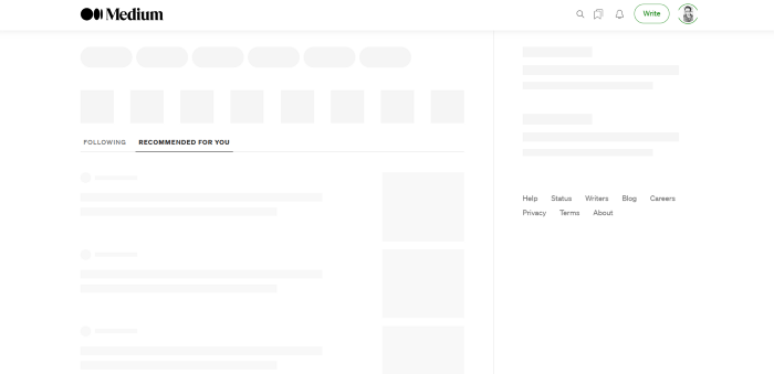
There are different types of skeleton Screens and libraries that help us to implement them. In this tutorial, we will work with React Loading Skeleton.
React Skeleton Loading
Pros
- It is API-based, and it has one component with props for all customization.
- It can be used as a separate skeleton component and also inside any component directly, so it’s flexible.
- It supports theming and Pulse animation.
Cons
- It’s easy to implement for a simple Skeleton UI but complicated for more complex skeletons.
- Having a separate skeleton component will make it harder to maintain when the UI and styles change.
Building a Skeleton Loader for an eCommerce Product Gallery page
In this tutorial, we will create a product gallery explaining the main properties offered by the library.
Here is what we will develop:
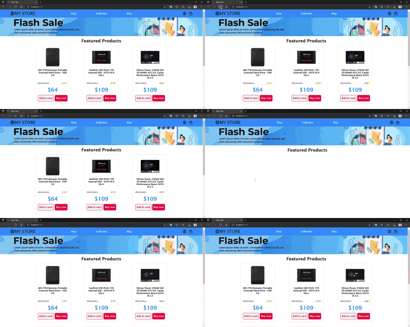
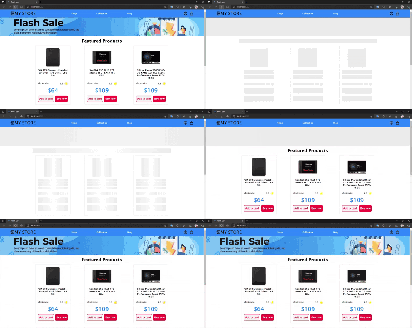
Let’s start by creating a new project with:
npx create-react-app my-app
The next thing is to install the libraries we will use. In this case, we will use styled-components for the styles, react-icons for the icons, axios for the data fetching, and of course, react-loading-skeleton.
npm i styled-components react-icons axios react-loading-skeleton
After that, we create the following structure for the project:
src/
├── assets/
│   └── banner.jpg
├── components/
│   ├── Banner.js
│   ├── Gallery.js
│   └── Header.js
├── pages/
│   └── Plp.js
├── styles/
│   └── GlobalStyles.js
├── App.js
└── index.js
As you can see, it is a very simple project where the only components that interest us are Banner.js and Gallery.js, where we have implemented the Skeleton Loading.
The rest of the components are just to shape the project and simulate an e-commerce product page. I will leave the repository at the end of the post.
Now let’s start explaining what interests us about the project. First, we are going to add some dummy products to show them in our gallery. For this, we will use fakeStoreAPI, which is a free online REST API that you can use whenever you need
axios.get('https://fakestoreapi.com/products/category/electronics/')            .then(({ data }) => {
  setProducts(data)
  setLoading(false)
})
With this endpoint, what we get is a JSON with dummy products from the electronics category and, we get a response like this:
[
  {
    "id": 9,
    "title": "WD 2TB Elements Portable External Hard Drive - USB 3.0 ",
    "price": 64,
    "description": "USB 3.0 and USB 2.0 ...",
    "image": "https://fakestoreapi.com/img/61IBBVJvSDL._AC_SY879_.jpg",
    "rating": {
      "rate": 3.3,
      "count": 203
    }
  },
  {
    "id": 10,
    "title": "SanDisk SSD PLUS 1TB Internal SSD - SATA III 6 Gb/s",
    "price": 109,
    "description": "Easy upgrade for ...",
    "category": "electronics",
    "image": "https://fakestoreapi.com/img/61U7T1koQqL._AC_SX679_.jpg",
    "rating": {
      "rate": 2.9,
      "count": 470
    }
  },
  ...
]
The next step is to misuse the data received from the API and create a product card for each item.
<GalleryStyles>
  <h2 className='gallery__title'>Featured Products</h2>
  <div className='gallery__grid'>
    {products &&
      products.map(product => {
        return (
          <section key={product.id}>
            <article className='item'>
              <div className='item-img'>
                <img src={product.image} alt=''/>
              </div>
              <h3 className='item-title'>{product.title}</h3>
              <div className='item-info'>
                <span>{product.category}</span>
                <div className='item-rating'>
                  <span>{product.rating.rate}</span>
                  <span className='item-start'>
                    <FaStar fill='yellow' /></span>
                </div>
              </div>
              <h3 className='item-price'>${product.price}</h3>
              <div className='item__btns'>
                <button className='item__btnadd'>
                  Add to card
                </button>
                <button className='item__btnbuy'>
                  Buy now
                </button>
              </div>
            </article>
          </section>
        )
      })
    }
  </div>
</GalleryStyles>
Now that we have our gallery created, we move on to create the Skeleton Loading of each product card.
The first thing to do is import the library and the CSS styles.
import Skeleton, { SkeletonTheme } from 'react-loading-skeleton'
import 'react-loading-skeleton/dist/skeleton.css'
As we saw previously, the Skeleton Loading is mainly based on making a layout as close as possible to the component we want to represent. So, we will copy as such the structure of the component that is inside the <Section> tag which is the product card we want to represent.
To keep the structure as similar as possible, we will try to respect all the HTML tags that we have used to layout the component as well as the classes. The magic of the Skeleton Loading consists of replacing the content of each element with its component <Skeleton/>.
<section>
  <article className='item'>
    <div className='item-img'>
      <Skeleton width={140} height={140} />
    </div>
      <h3 className='item-title'><Skeleton count={4} /></h3>
    <div className='item-info'>
      <Skeleton width={160} height={20} />
      <Skeleton width={30} height={20} />
      <Skeleton width={22} height={22} circle={true} />
    </div>
    <Skeleton height={48} count={2} className='skeleton' />
  </article>
</section>
While we can leave the default <Skeleton/> component without modifying any properties, it works correctly but we might notice that our Skeleton doesn’t look much like our final component, so we will use some of its properties to make it more similar.
Skeleton react loading provides us with several properties to style our Skeleton.
- With width and height we add the width and height of the Skeleton in px.
- With a circle we make a Skeleton a circular figure and this property is a boolean.
- We also have a count which replicates n quantity of Skeletons or rows of Skeletons as we indicate it.
- In the same way, we can change the speed of the animation that brings us by default that is 0.2, and we do it with the duration property.
- In addition, the library offers us the option to change the colors of the Skeleton, we do it with its <SkeletonTheme> component where we can change the base color and the color of the animation.
<SkeletonTheme color='#F5F5F5' highlightColor='#ffffff'></SkeletonTheme>
There are more properties but in this tutorial, We only use the most used ones. Now we can see that our Skeleton already looks much more like our product sheet.
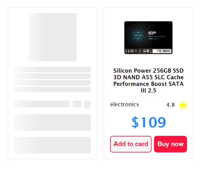
Finally, we have the problem that We don’t know how many elements the fetching will return to us at the data we use. Therefore, we do not know how many Skeletons we should paint.
That is solved if we have defined pagination in the gallery, then we already know that for each page, We will show n amount of elements.
If we do not have any pagination implemented, what we could do, is to define a specific number of skeletons we want to display or check how many elements are visible in the viewport to display the necessary skeletons.
Project Repo:
GitHub - ljaviertovar/react-skeleton-ecommerce: React loading Skeleton for a product gallery
Conclusion
As we can see, it is not difficult to create Skeletons Loadings for our websites and add a great user experience.
However, there are points to consider when implementing Skeletons, for example, if we need a fast development, it is not a good idea to use them because they add another layer of logic to our components, besides if we are still in the development of the components these can change several times and, we will have to do the same with our Skeletons every time we modify the design of our component.
My recommendation would be to implement Skeleton Loading at the end of our project, when we have the final design of each component, or keep a simple Skeleton representing only the component container and at the end of the development give the final structure of our design to the Skeleton.
Undoubtedly they are an excellent alternative to avoid seeing blank screens.
Read more:
- Create Instagram Filters with React and CSS
- Why Should You Use Cleanup Functions in React’s useEffect Hook?
Want to Connect With Author?
Love connecting with friends all around the world on Twitter.
Bit: Feel the power of component-driven dev
Say hey to Bit. It’s the #1 tool for component-driven app development.
With Bit, you can create any part of your app as a “component” that’s composable and reusable. You and your team can share a toolbox of components to build more apps faster and consistently together.
- Create and compose “app building blocks”: UI elements, full features, pages, applications, serverless, or micro-services. With any JS stack.
- Easily share, and reuse components as a team.
- Quickly update components across projects.
- Make hard things simple: Monorepos, design systems & micro-frontends.
Learn more
- How We Build Micro Frontends
- How we Build a Component Design System
- How to reuse React components across your projects
- Painless monorepo dependency management with Bit
How to Build a Skeleton Loader with React was originally published in Bits and Pieces on Medium, where people are continuing the conversation by highlighting and responding to this story.
This content originally appeared on Bits and Pieces - Medium and was authored by L Javier Tovar
L Javier Tovar | Sciencx (2022-07-19T12:11:03+00:00) How to Build a Skeleton Loader with React. Retrieved from https://www.scien.cx/2022/07/19/how-to-build-a-skeleton-loader-with-react/
Please log in to upload a file.
There are no updates yet.
Click the Upload button above to add an update.
