This content originally appeared on Telerik Blogs and was authored by Kathryn Grayson Nanz
In this article, we’re going to compare the React Calendar component available in the KendoReact UI library with the default HTML calendar, looking at all the unique features and UX decisions that go into a robust and full-featured commercial library calendar component.
There are a lot of UI components that we take for granted—building blocks we see and use all the time without really thinking about. They’ve become such an inconspicuous part of our web browsing experience that, even as developers, we never actually consider their importance—until we need to build something that includes one of these components, that is.
The React Calendar is one of these deceptively simple components: we never consider how much thought and design goes into it. However, if you ever need to code one from scratch, you learn just how much time and effort it really takes. In these situations, sometimes we’re told: “Just use the default HTML element!”
It’s true that these days there are significantly more default UI components that we get in HTML than there used to be … but sometimes they just don’t do everything we need them to do. There are perks to using these defaults (usually in the areas of accessibility and development speed), but there are also significant drawbacks in terms of customization and feature options.
In this article, we’re going to compare the React Calendar component available in the KendoReact UI library with the default HTML calendar, looking at all the unique features and UX decisions that go into a robust and full featured commercial library calendar component. Because sure, you could just use the default, un-stylable HTML calendar … but why, when you could have a smoother UX, a set of beautiful pre-made themes, globalization and so much more—without sacrificing accessibility or ease of development!
Consistency
Let’s start with the obvious—the way the component looks to your users. One of the major downsides to using the default HTML calendar component is that the design has not been standardized across the browsers.
Here, I’ve taken screenshots of the HTML calendar as it renders in Chrome, Firefox and Safari. You can see that not only the look and feel, but also the user experience is quite different for each one—and this isn’t even considering the mobile experience! Ideally, your users should always have the same experience, regardless of their browser choice, so this is a serious drawback.
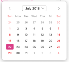
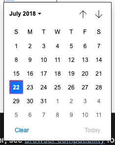
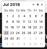
Screenshots of the default HTML Calendar component in Firefox, Chrome, and Safari (left to right).
When you use a commercial component such as the KendoReact Calendar, you can guarantee a consistent experience for your users, no matter how they’re accessing your application. Our components have been thoroughly cross-browser tested and are guaranteed to render the same way in all modern browsers.
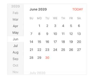
Screenshot of the KendoReact Calendar component, as it appears consistently in Firefox, Chrome and Safari.
Customization
The other notable downside to using the default HTML components is how you have no control over the UX. You get what you get, and if you need additional functionality (or want to limit the experience to be only exactly what’s relevant for your users), then you’re unfortunately out of luck.
Not to mention, the functionality is a little bit different depending on the browser you’re using. Note how the Chrome calendar includes “Clear” and “Today” buttons while the others don’t, and how Chrome and Firefox will allow the user to choose a month from a dropdown menu, but Safari doesn’t.
The KendoReact Calendar, on the other hand, has a wide variety of options when it comes to customization and features. Remove the fast navigation bar along the left-hand side, add week numbers along the edge of the calendar view—or get ambitious and customize all of it. For example, an emoji could be added to a particular day to indicate a special holiday or a birthday.
Every part of the KendoReact Calendar, from the individual day cell, week cells, navigational items or the title of the Calendar can all be overridden with a custom renderer. And however you customize the component, it will appear the same way across every browser.
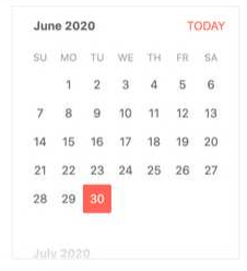
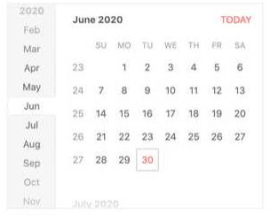
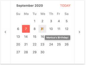
The KendoReact Calendar with the fast navigation bar removed, the week numbers added, and customized to display an emoji (left to right).
Style & Theming
When you use a default component, you can’t be too surprised when it looks … well, default. The native components, of course, won’t match the theme and styles that you’ve chosen for your application—they take their theming cues from the browser and user operating system settings.
They’re also notoriously difficult (if not impossible) to overwrite the styles on. So, when it’s important for your component to match the look and feel of the rest of your page, that means it’s time for something that offers you a little more control.
In addition to all the customization that you can do for the actual functionality of the KendoReact Calendar, you can also have complete control over the styling. Choose one of multiple pre-existing themes and swatches or use the Figma Kits to dive deep into the design of the calendar in all its various states.
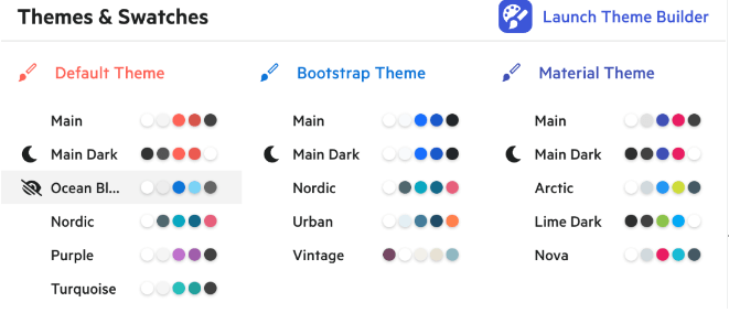
The 16 available KendoReact pre-made themes.
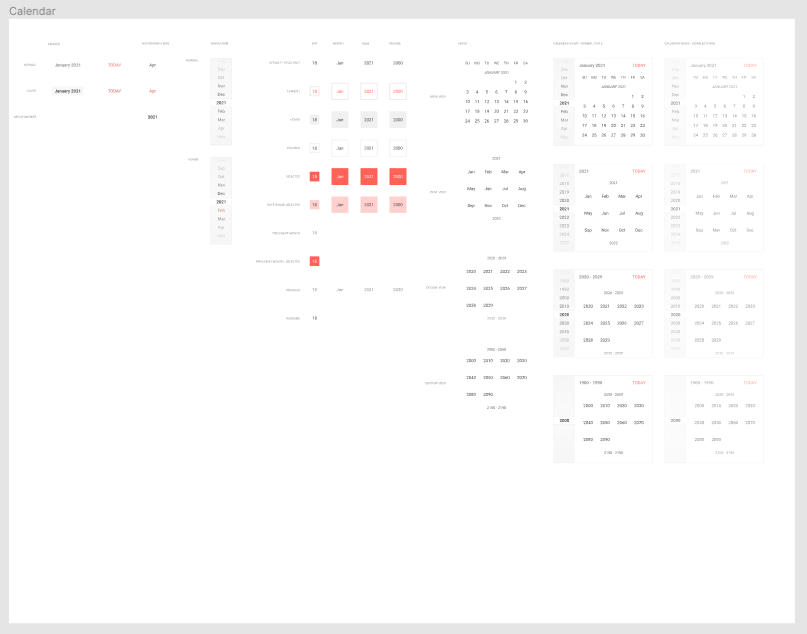
The Calendar component in the Kendo UI Figma Kits, showing every piece of the UI broken down for complete design customization.
Accessibility
One of the few places where the default calendar usually wins is accessibility. Because the default HTML calendar is innately fully accessible, that often trumps the alternatives—no matter how much more beautiful or consistent they might be.
But what if you could have both: a React Calendar that’s not just easy to use and completely customizable, but also accessible: entirely accessible to screen-readers, with full WAI-ARIA support and Section 508 compliance?
Well, you can have your (fully accessible) cake and eat it, too! The KendoReact Calendar uses the aria-selected, aria-disabled and aria-activedescendant properties on the nested elements depending on
the current state of the component and its options. It also supports the grid role—each cell from the Calendar has a gridcell role. One of the perks of using KendoReact is across-the-board accessibility support—not
just on the Calendar, but on every single one of the 100+ components in the library.
Ease of Development
Another category where the default calendar takes the win is developer ease. There’s just no two ways about it, using something that’s built right into the HTML is inevitably faster and easier than having to add any kind of external library to your application. It also makes future maintenance and upgrades easy, since there’s no dependency to manage. Finally, you won’t need to worry about package size or additional load time, since (again) you’re not adding anything new, just making use of the defaults already available to you.
Ultimately, it’s a question that you’ll have to answer as the developer: Do the additional features, styles and consistency of using a commercial component outweigh the ease of just going with the default—taking the path of least resistance?
The answer to that depends on your team, your budget, your application and so much more. I can’t tell you which is the right choice for your specific circumstances … but I can tell you a little bit more about how KendoReact has tried to minimize the extra work of using an external library.
One of the biggest things you can do is to take advantage of the KendoReact CRA (Create React App) template to start your project. There are shortcuts to allow you to quickly spin up a new React project with KendoReact, along with some of your other favorite libraries—TypeScript and Sass. You can skip the setup pains and get right to the code!
KendoReact is also intentionally split into several sub-libraries, so you can add only what you need for the components that you’re using. This helps manage package size and load time—no need to install everything needed for the Data Grid component if you just want to use the Calendar!
Conclusion
It probably wasn’t a huge shock to hear that the default Calendar component doesn’t quite cut it when it comes to modern application development—but rather than having to build a replacement yourself or try to cobble together different components from various third-party libraries, give KendoReact a shot! See just how easy it can be to build a high-quality, accessible UI for your React app.
This content originally appeared on Telerik Blogs and was authored by Kathryn Grayson Nanz
Kathryn Grayson Nanz | Sciencx (2022-07-26T13:00:03+00:00) Differences Using the Default HTML Calendar vs. a Commercial React Calendar. Retrieved from https://www.scien.cx/2022/07/26/differences-using-the-default-html-calendar-vs-a-commercial-react-calendar/
Please log in to upload a file.
There are no updates yet.
Click the Upload button above to add an update.
