This content originally appeared on DEV Community 👩💻👨💻 and was authored by Stas Melnikov
Hey folks!
I'd like to talk about where we should move the focus after clicking on the show password button, which a virtual keyboard should be displayed when typing a digital code and why forcing users to fill in an email again is bad.
But before embarking on reading I leave the link on my Substack newsletter about UX and a11y tips. You know what to make 😎
Also, thank you so much, my sponsors: Ben Rinehart, Tanya Ten, Konstantinos Kapenekakis. I didn't write this article without their support.
Let's go!
Where we should move the focus after clicking on the show password button
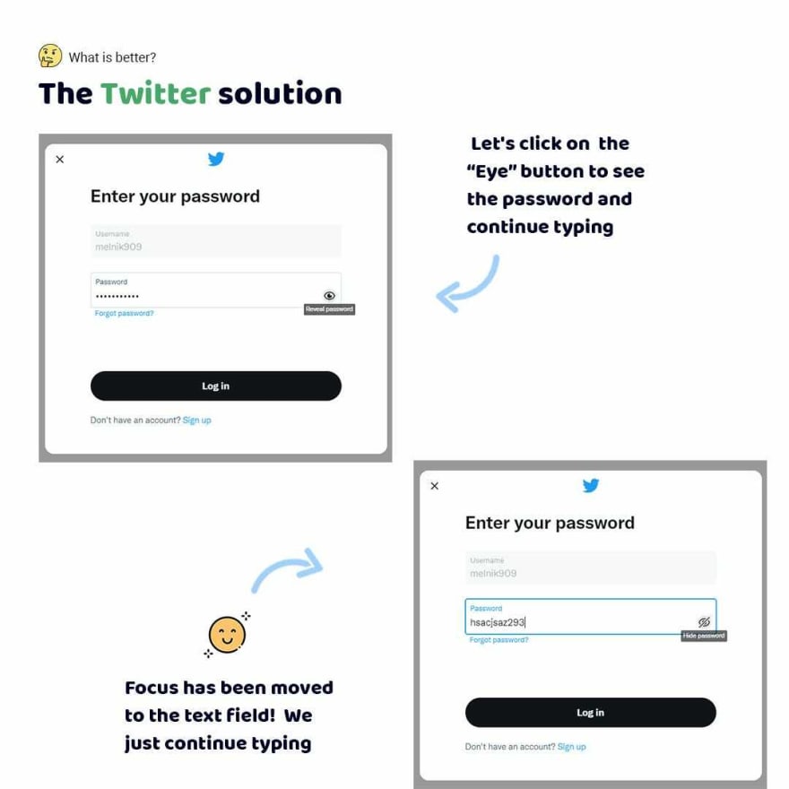
There is untidiness of forgetting by apps to move focus on the text field after clicking on the button to show a password. I meet it on Booking.
I just click on the button the app doesn't move focus. Oh... So I have to click myself 😡
In contrast, Twitter makes it! Just try to click on the button. You'll see focus will be moved to the text field 😉
Leave just the numbers!
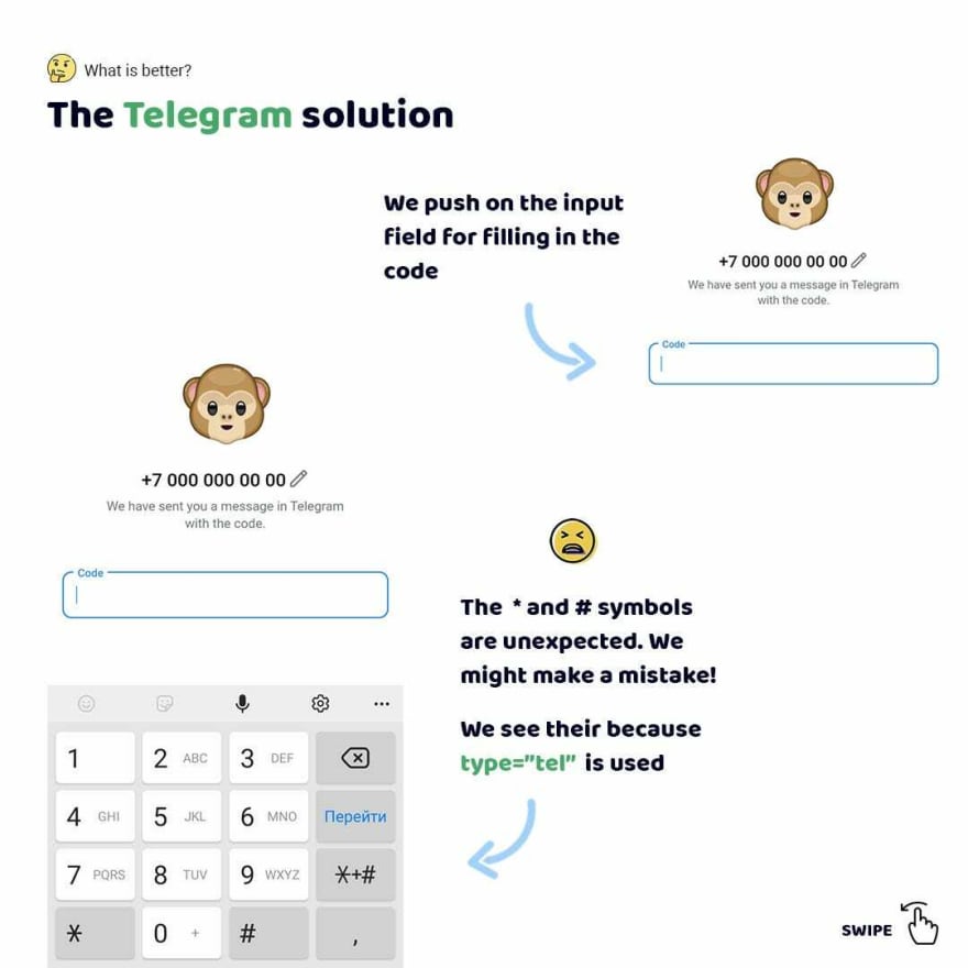
Folks, will you confused by # or * symbols when entering digital code when logging in on Telegram website? 🤔
Personally, I'm yes because I automatically tap without looking at a keyboard. So sometimes I was entering * instead of digits 😁
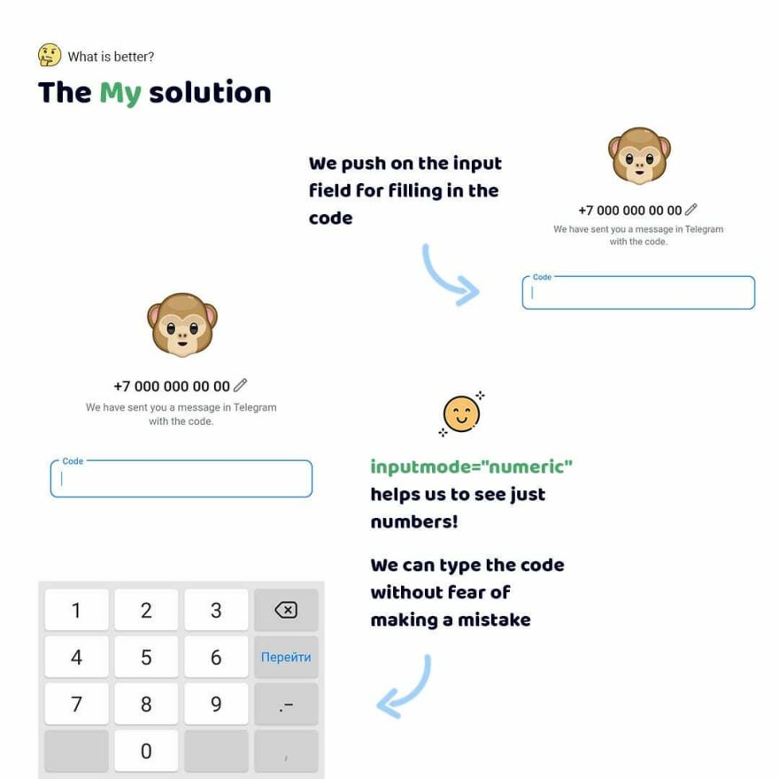
Therefore I love when apps shows a keyboard with the digits without special symbols. Especially it can be done really easy. Just using the inputmode HTML attribute ☝️
Forcing users to fill in an email again is bad UX
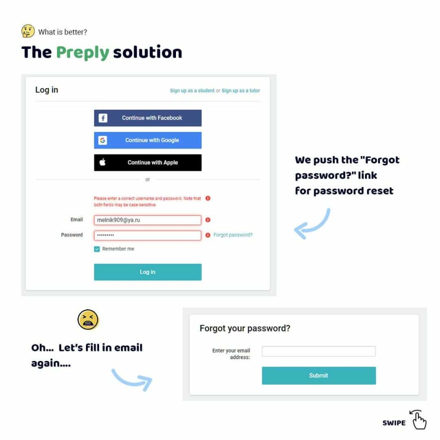
Folks, let's consider the password reset feature on the Preply website. I click on the "Forgot password" link after unsuccessful validation.
Did you think the app probably added my email so that I don't have to fill it out again? Nope... Why? We can fill it indefinitely 🤦♂️
Praise God! Booking adds email without additional actions if users failed validation. As a result, we just can push Enter and a password will be reset 👍
This content originally appeared on DEV Community 👩💻👨💻 and was authored by Stas Melnikov
Stas Melnikov | Sciencx (2022-09-19T18:08:45+00:00) The 3 Short September dev tips about UX&A11y. Retrieved from https://www.scien.cx/2022/09/19/the-3-short-september-dev-tips-about-uxa11y/
Please log in to upload a file.
There are no updates yet.
Click the Upload button above to add an update.


