This content originally appeared on Telerik Blogs and was authored by Kathryn Grayson Nanz
Whether you’re just swapping out the primary color to more closely reflect your brand or completely re-skinning the whole library with a custom design, KendoReact makes it easy to change up the look and feel of our components with four different ways to style and theme.
Look, we get it—there’s a lot to like about the Default KendoReact style, but sometimes you just want to switch it up a little! KendoReact makes it easy to change up the look and feel of our components.
In fact, there are four different ways to do so. Which one you should choose depends on a few factors, such as how much you like writing CSS, how extensive your changes are, and more. Let this handy flowchart guide you through the decision-making process, and then read on for more details into each approach!
.jpg?sfvrsn=df5644b8_1)
Sass Variables
Customizing the Sass variables is our recommended approach for teams with a dedicated frontend specialist.
When you have the CSS knowledge, sometimes it can feel faster to just pop open the file and start making those adjustments yourself. Or, maybe you (like me!) just really love to write CSS! Regardless, we make sure that’s not just possible, but easy to do when you’re using KendoReact.
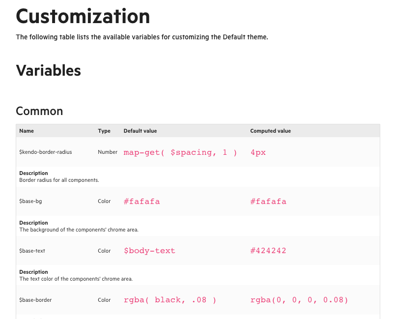
We use Sass for our theming and we’ve been intentional about exposing those variables for your usage, so you can customize using the same approach that we do—if that’s your jam.
Each KendoReact theme package includes the source files of the theme, which provides options for you to modify and rebuild the theme as part of your build process. For example, you can change the theme colors, remove the CSS of unused components, or use
specific theme colors to style your application. The theme source files are located in the scss folder of the theme package.
We also have all those variables listed in our documentation, if you’re trying to find what’s responsible for that one specific thing you’re trying to change. Here are those links for our Default, Bootstrap and Material themes.

Figma Kits
The Figma UI Kits are our recommended approach for teams that include a designer.
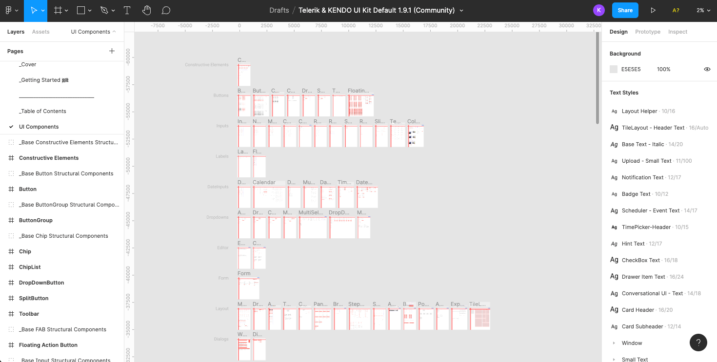
If you’re not familiar with the concept of a UI kit, it’s a collection of all the elements of your UI design, including (but not limited to) fonts, colors, icons, component design files and documentation. These are useful on their own, both as a form of documentation and to speed up the design process by providing a set of base elements that can be re-used in new designs, but are especially powerful when combined with an existing component library—such as the Kendo UI Kits for Figma.
In this situation, you have a perfect 1-to-1 correlation between the components that the developers are using and the components that the designers are using. Think of it like the Rosetta Stone of UI: the exact same elements, translated into different “languages.”
With our Figma Kits, we offer designers an inside look at how all of our 100+ components are designed, including all their various user interaction states and the atomic design principles we’ve used to build our library. This gives designers an innate understanding of how the components work, and how visual styles are carried through from our smallest tokens all the way up to our most complex components.
Our UI Kits make use of Figma components, allowing designers to make changes at the base component or token level and see the edits immediately across the entire suite of KendoReact components. Explore, customize and build—all from one incredible resource.
Not to mention—all those design tokens in Figma match up exactly with (you guessed it) those Sass variables we just mentioned, making implementation straightforward and naming conflicts/misunderstandings a thing of the past.

Swatches
Swatches are our recommended approach for teams looking to make minimal, color-based changes to an existing theme, or match an existing design system (such as Bootstrap, Material or Fluent).
When you just need to mix up the color palette and aren’t looking to do a full overhaul of the design, Swatches have got your back. A Swatch is a set of variables which customizes the appearance of the theme—you can create your own, or choose one of the 14 different swatches created by the Kendo UI design team.
Swatches are useful for creating multiple, persistent theme variations. The .css output file can be shared across projects and requires no further processing. If you choose to create your own, you can find more information and a step-by-step guide in our documentation. But, in my opinion, the pre-made Swatches are where this approach really shines—offering teams the ability to choose a well-designed, tested, beautiful color
palette, without worrying about the design choices. This is especially useful if you’re on a team that doesn’t include a designer.
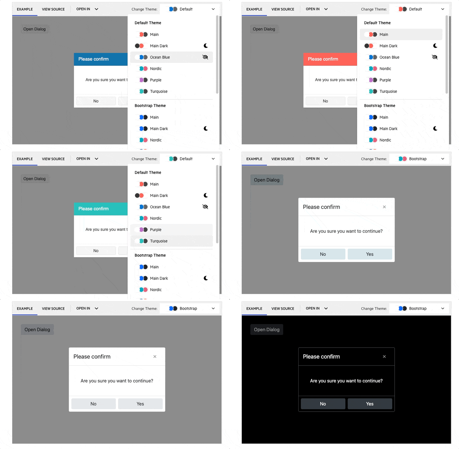
When you’re looking at any of our components in the documentation, you can use the dropdown in the top right corner to preview the different pre-made Swatches, categorized by theme. We have themes for three major design systems—Material, Bootstrap and Fluent—so if you’re using one of those, then this is definitely the approach for you!

ThemeBuilder Pro
The ThemeBuilder Pro is our recommended approach for teams who want to make design changes using a WYSIWYG interface and export the code directly.
If you’ve used our components before, you might already be familiar with the existing version of the ThemeBuilder—a web application that allows developers to quickly customize and style the components found in any of our libraries. It was an effective way to make surface-level changes across the entire library and then export that code to use in your applications.
However, this early version of the ThemeBuilder was limited to just updating the basic colors and exporting CSS or Sass variables—useful for teams that just needed to update KendoReact components to use their own brand colors, but not really enough for the users who needed fully custom styles.
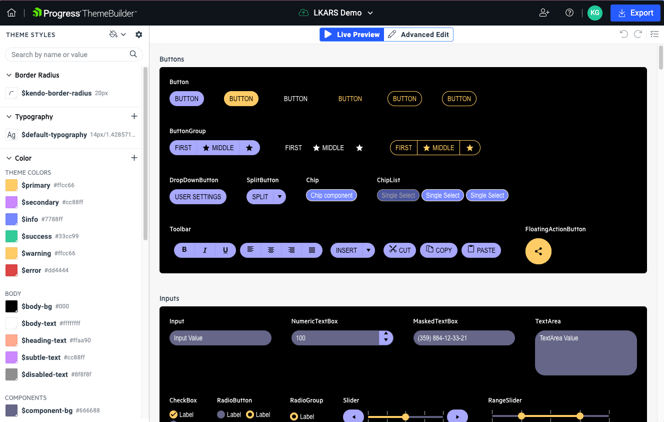
This is what makes the new ThemeBuilder Pro so exciting. It’s also a web application, but it functions as a full WYSIWYG editor for all our components, allowing developers or designers to dive deep and customize the details of each component—without touching any CSS or Sass. Not to mention, it’s also been complete re-built and optimized from the ground up, making it significantly faster than the previous version.
Users of the new ThemeBuilder Pro can still make the same quick and easy color updates as before, in the left-hand sidebar. You can also update your typography and border radius settings in this panel, which will apply immediately across the entire library.
Once you’ve set those values, you can start to explore the way those settings look across all the components. If you see anything that doesn’t look quite right, or just something not included in that list that you’d like to adjust (like padding or margin, more granular text settings, justification and alignment, outline, effects and more), then the new Advanced Edit panel will walk you through those options. And because of the atomic design approach, changes you make to the button (for example) will automatically be reflected in every component that uses or includes a button—toolbars, button groups, inputs, dropdowns, etc.
We know that many hands make light work, which is why you can also share your ThemeBuilder Pro theme and work together on it with another teammate. Collaborate by editing components together in real time, or share across product teams so everyone can export the same CSS and Sass files to achieve a truly consistent look and feel across your suite of applications.
The ThemeBuilder Pro is available for KendoReact, Kendo UI for Angular, Kendo UI for Vue and Telerik UI for Blazor. The support for Kendo UI for jQuery, Telerik UI for ASP.NET MVC, Telerik UI for ASP.NET Core, Telerik UI for PHP and Telerik UI for JSP is launching early next year. You can use the new ThemeBuilder on the free tier (which closely matches the feature set of the previous ThemeBuilder)—or for full functionality, try out the Pro version with a free 7-day trial!

Which Approach Is Best for Your Team?
With this wide variety of approaches, KendoReact empowers you to style and theme our components no matter which roles your team does (or doesn’t) include!
If you have a designer, they’ll love the depth and resources of our Figma Kits, allowing them access to every component in their native design software. If you have a specialized frontend or UX engineer, they’ll appreciate just how easy it is to access and customize our Sass variables across the entire component suite. If you just need a quick way to match our components to an existing design system (like Bootstrap, Material or Fluent) or change up the colors, then Swatches are the way to go. And for teams of all shapes and sizes, ThemeBuilder Pro is here to make editing, previewing, sharing and implementing design changes easier than ever before!
Give them all a shot, and see which one best suits the needs of your team and project.
This content originally appeared on Telerik Blogs and was authored by Kathryn Grayson Nanz
Kathryn Grayson Nanz | Sciencx (2022-11-01T07:31:01+00:00) 4 Ways To Style Your KendoReact Components. Retrieved from https://www.scien.cx/2022/11/01/4-ways-to-style-your-kendoreact-components/
Please log in to upload a file.
There are no updates yet.
Click the Upload button above to add an update.
