
This content originally appeared on DEV Community 👩💻👨💻 and was authored by devkoustav
We all hate it when our page loads this slow right! 😔

Infact website conversion rates drop by an average of 4.42% with each additional second of load time (between seconds 0–5). The first five seconds of page-load time have the highest impact on conversion rates. (Portent, 2019)

But you can increase the Page Load Speed of your website by making changes in your HTML and CSS Files without needing the best hosting services in the most hard way! Read along…

(For this article we will be concerned about making the page speed faster using our HTML and CSS files only.)
1. Lazy Loading
Lazy loading is a strategy to shorten the length of the critical rendering path, which translates into reduced page load times.
a) Splitting CSS File
CSS must be thin, delivered as quickly as possible, and the usage media types and queries are advised to unblock rendering. What do I mean by thin? -Split your CSS File so that the whole CSS is not executed at all screens.
<!-- Loading and parsing styles.css is render-blocking -->
<link rel="stylesheet" href="styles.css" />
📌 For Print media use-
<!-- Loading and parsing print.css is not render-blocking -->
<link rel="stylesheet" href="print.css" media="print" />
📌 For Mobile Screens use-
<!-- Loading and parsing mobile.css is not render-blocking on large screens -->
<link
  rel="stylesheet"
  href="mobile.css"
  media="screen and (max-width: 480px)" />
📌 For Tablet Screens use-
<!-- Loading and parsing tablet.css is not render-blocking on large screens -->
<link
  rel="stylesheet"
  href="tablet.css"
  media="screen and (max-width: 1080px)" />
📌 For mobile screens in different orientation use different CSS Files
<!-- Loading and parsing portrait.css is not render-blocking on landscape screens -->
<link href="portrait.css" rel="stylesheet" media="(orientation:portrait)" />
By separating out the CSS into multiple files, the main render-blocking file, in this case styles.css, is much smaller, reducing the time that rendering is blocked thereby increasing the page load speed by a lot.
b) font-display property of CSS
Applied to the @font-face rule, the font-display property defines how font files are loaded and displayed by the browser, allowing text to appear with a fallback font while a font loads, or fails to load. This improves performance by making the text visible instead of having a blank screen, with a trade-off being a flash of unstyled text.
@font-face {
  font-family: "nunito", sans-serif;
  font-weight: 400;
  font-style: normal;
  font-display: fallback;
}
c) Images in the HTML File
The user can see(needs to see) only the images at the top at the first second. Then why to make them wait for the image at the end to load? Use loading="lazy" so that the image only loads when it is needed. This decreases the Page Loading Speed to a lot.
<img src="my-logo.png" alt="KOUSTAV" loading="lazy" />
2. Choosing the right Image Format
Make your images in .webp format. It is recommended as the image format standard for the web.
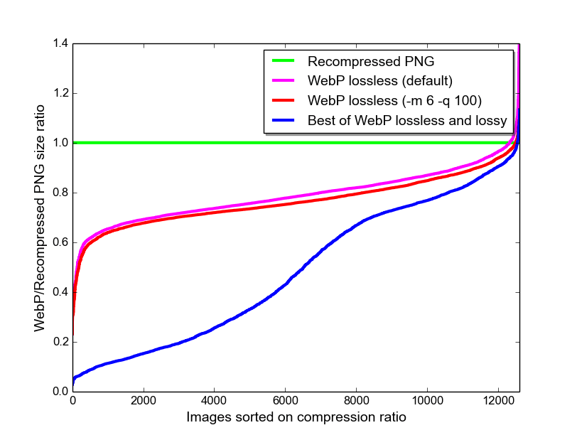
WebP lossless images are 26% smaller in size compared to PNGs. WebP lossy images are 25–34% smaller than comparable JPEG images at equivalent SSIM quality index. Lossy, lossless and transparency are all supported in animated WebP images, which can provide reduced sizes compared to GIF and APNG.
WebP vs PNG Image Format
WebP vs JPEG Image Format

With all this tests it is proved that webp images are much more compressed even after being lossy therefore decreasing the page load speed by a lot!
You can also check image format .avif which in few cases is better than .webp but it is new to the market (released on 2019) so not many browsers supports the .avif format yet!
📌 Use <picture> element for the images
a) For cropping or modifying images for different media conditions (for example, loading a simpler version of an image which has too many details, on smaller displays).
b) Offering alternative image formats, for cases where webp format is not supported.
c) Saving bandwidth and speeding page load times by loading the most appropriate image for the viewer's display.
If providing higher-density versions of an image for high-DPI (Retina) display, use srcset on the <img> element instead. This lets browsers opt for lower-density versions in data-saving modes, and you don't have to write explicit media conditions.
<picture>
  <source srcset="my-logo-wide.webp" type="image/webp" media="(min-width: 600px)" />
  <source srcset="my-logo-wide.jpeg" type="image/jpeg" type="image/jpeg" media="(min-width: 600px)" />
  <source srcset="my-logo-narrow.webp" type="image/webp" />
  <img src="my-logo-narrow.png" alt="KOUSTAV" loading="la" />
</picture>
3. Rendering Images
As images are loaded asynchronously and continue to load after the first paint, if their dimensions aren't defined before load, they can cause reflows to the page content. For example, when text gets pushed down the page by images loading. For this reason, it's critical that you set width and height attributes so that the browser can reserve space for them in the layout.
For any background-image, it's important you set a background-color value so any content overlaid is still readable before the image has downloaded.
4. Minifying HTML and CSS Files
Minification is removal of all unnecessary characters from code so as to reduce the size. Unneeded white space characters like space, newline, tab, etc. and comments are removed.
Use minifying tools like CodeBeautify, CSS Minifier, and many more to minify your HTML and CSS Files. These will help giving your website a better page load speed.
And we are -

This changes will definitely give your website a10x faster page loading speed now!
Share this with someone would need it! 💚
Follow for more ⚡
This content originally appeared on DEV Community 👩💻👨💻 and was authored by devkoustav
devkoustav | Sciencx (2022-11-02T05:19:02+00:00) HTML & CSS Features, Tips For a 10x fast Page Loading Speed. Retrieved from https://www.scien.cx/2022/11/02/html-css-features-tips-for-a-10x-fast-page-loading-speed/
Please log in to upload a file.
There are no updates yet.
Click the Upload button above to add an update.