
This content originally appeared on Bits and Pieces - Medium and was authored by Thomas Sentre

With the release of React v16, we’re seeing more and more articles about how to master React. It’s great that the ecosystem is maturing and there are now lots of high-quality blog posts, courses, books, and videos on the topic. However, most resources covering advanced topics in React still leave something to be desired.
This article covers some advanced concepts in React that you probably don’t know about. These are things like fragments, portals, context, fragments inside fragments inside fragments… You get the idea! If you want to level up your skills as a frontend developer working with React or just want to learn more about this popular framework before taking a job working with it — then read on.
1. React Fragments
React 16 introduced the concept of JSX fragments. Fragments are a way to group together chunks of markup without having to add unnecessary structure to your page. For example, a common approach is to have a React component return content wrapped in a <div> element. This element serves no real purpose and adds clutter to the DOM.
Let’s look at an example. Here are two versions of a component. One uses a wrapper element, and one uses the new fragment feature:
import * as React from "react";
import * as ReactDOM from "react-dom";
import WithoutFragments from "./WithoutFragments";
import WithFragments from "./WithFragments";
const root =
 ReactDOM.createRoot(document.getElementById("root"));
root.render(
 <div>
 <WithoutFragments />
 <WithFragments />
 </div>
);
The two elements rendered are <WithoutFragments /> and <WithFragments />. Here’s what they look like when rendered:
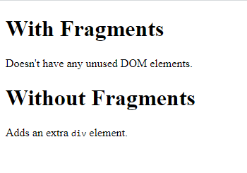
Let’s compare the two approaches now.
A. With wrapper elements
The first approach is to wrap sibling elements in <div> . Here’s what the code source looks like:
import * as React from "react";
class WithoutFragments extends React.Component {
 render() {
 return (
 <div>
 <h1>Without Fragments</h1>
 <p>
 Adds an extra <code>div</code> element.
 </p>
 </div>
 );
 }
}
export default WithoutFragments;
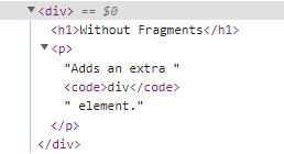
The essence of this component is the <h1> and <p> tags. Yet, in order to return them from render(), you have to wrap them with <div>. Indeed, inspecting the DOM using your browser dev tools reveals that <div> does nothing but add another level of structure:
Now, imagine an app with lots of these components — that’s a lot of pointless elements! Let’s see how to use fragments to avoid unnecessary tags.
B. With fragments
Let’s take a look at the WithFragments component, where we have avoided using unnecessary tags:
import * as React from "react";
class WithFragments extends React.Component {
 render() {
 return (
 <>
 <h1>With Fragments</h1>
 <p>Doesn't have any unused DOM elements.</p>
 </>
 );
 }
}
export default WithFragments;
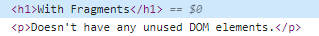
Instead of wrapping the component content in <div> , the <> element is used. This is a special type of element that indicates that only its children need to be rendered. You can see the difference compared to the WithoutFragments component if you inspect the DOM:
With the advent of fragments in JSX markup, we have less HTML rendered on the page because we don’t have to use tags such as <div> for the sole purpose of grouping elements together. Instead, when a component renders a fragment, React knows to render the fragment’s child element wherever the component is used. So, fragments enable React components to render only the essential elements; no more elements that serve no purpose will appear on the rendered page.
2. Error Boundaries
Error boundaries are React components that catch JavaScript errors anywhere in their child component tree, log those errors, and display a fallback UI instead of the component tree that crashed. Error boundaries catch errors during rendering, in lifecycle methods, and in constructors of the whole tree below them.
Reason to Use: Suppose there is an error in JavaScript inside component then it used to corrupt React’s internal state and cause it to emit cryptic errors. Error boundaries help in removing these errors and display a Fallback UI instead(Which means a display of an error that something broke in the code).
class ErrorBoundary extends React.Component {
  constructor(props) {
    super(props);
    this.state = { hasError: false };
  }

  static getDerivedStateFromError(error) {
    // Update state so the next render will show the fallback UI.
    return { hasError: true };
  }

  componentDidCatch(error, errorInfo) {
    // You can also log the error to an error reporting service
    logErrorToMyService(error, errorInfo);
  }

  render() {
    if (this.state.hasError) {
      // You can render any custom fallback UI
      return <h1>Something went wrong.</h1>;
    }

    return this.props.children;
  }
}
Then you can use it as a regular component:
<ErrorBoundary>
  <MyWidget />
</ErrorBoundary>
3 .Static Type Checking
JavaScript is not a typed language and many of the problems arise due to wrong types.
we can use various type checkers available in the market But one famous and beginner-friendly tool is Flow. It is developed at Facebook and is often used with React. It lets you annotate the variables, functions, and React components with a special type syntax, and catch mistakes early. You can read an introduction to Flow to learn its basics.
4. Portals
React Portals are an advanced concept that allows developers to render their elements outside the React hierarchy tree without comprising the parent-child relationship between components.
Usually, typical React components are located within the DOM. This means that it might be tricky for you to render modals or pop-up windows.
const Modal = ({ title, content }) => {
  const containerDiv = document.getElementById('containerDiv');

  return ReactDOM.createPortal(
    <>
      <h1>{title}</h1>
    <>,
    containerDiv
  );
}

const App = () => {
  const [loggedIn] = useUser();

  return (
    <>
      <Article />
      {!loggedIn && <Modal title="login">...</Modal>}
    </>
  );
}
5. Higher Order Components
A higher-order component (HOC) is an advanced technique in React for reusing component logic. HOCs are not part of the React API, per se. They are a pattern that emerges from React’s compositional nature.
Concretely, a higher-order component is a function that takes a component and returns a new component.
const EnhancedComponent = higherOrderComponent(WrappedComponent);
Whereas a component transforms props into UI, a higher-order component transforms a component into another component.
HOCs are common in third-party React libraries, such as Redux’s connect and Relay’s createFragmentContainer.
6. Suspense
Suspense is the first feature released by the Facebook React team that takes advantage of the new concurrent rendering engine built into React 18. It allows you to manage asynchronous operations in a React App. It lets your components communicate to React that they’re waiting for some data.
It is important to note that Suspense is not a data fetching library like react-async, nor is it a way to manage state like Redux. It simply lets you render a declarative fallback while a component waits for some asynchronous operation (i.e., a network request) to be completed.
import { lazy, Suspense, useState } from 'react';

const MarkdownPreview = lazy(() => import('./MarkdownPreview.js'));

function MarkdownEditor() {
 const [showPreview, setShowPreview] = useState(false);
 // ...
 return (
   <>
     ...
     {showPreview && (
       <Suspense fallback={<Loading />}>
         <h2>Preview</h2>
         <MarkdownPreview />
       </Suspense>
     )}
   </>
 );
}
7. Context
React Context is a way to manage state globally. It provides a way to pass props from parent to child component(s), by storing the props in a store(similar in Redux) and using these props from the store by child component(s) without actually passing them manually at each level of the component tree.
one example to set theme from the official docs,
theme-context.js
export const themes = {
  light: {
    foreground: '#000000',
    background: '#eeeeee',
  },
  dark: {
    foreground: '#ffffff',
    background: '#222222',
  },
};

export const ThemeContext = React.createContext(
  themes.dark // default value
);
themed-button.js
import {ThemeContext} from './theme-context';

class ThemedButton extends React.Component {
  render() {
    let props = this.props;
    let theme = this.context;
    return (
      <button
        {...props}
        style={{backgroundColor: theme.background}}
      />
    );
  }
}
ThemedButton.contextType = ThemeContext;

export default ThemedButton;
app.js
import {ThemeContext, themes} from './theme-context';
import ThemedButton from './themed-button';

// An intermediate component that uses the ThemedButton
function Toolbar(props) {
  return (
    <ThemedButton onClick={props.changeTheme}>
      Change Theme
    </ThemedButton>
  );
}

class App extends React.Component {
  constructor(props) {
    super(props);
    this.state = {
      theme: themes.light,
    };

    this.toggleTheme = () => {
      this.setState(state => ({
        theme:
          state.theme === themes.dark
            ? themes.light
            : themes.dark,
      }));
    };
  }

  render() {
    // The ThemedButton button inside the ThemeProvider
    // uses the theme from state while the one outside uses
    // the default dark theme
    return (
      <Page>
        <ThemeContext.Provider value={this.state.theme}>
          <Toolbar changeTheme={this.toggleTheme} />
        </ThemeContext.Provider>
        <Section>
          <ThemedButton />
        </Section>
      </Page>
    );
  }
}

const root = ReactDOM.createRoot(
  document.getElementById('root')
);
root.render(<App />);
Summary
In this post, we have explored some advanced concepts of React you probably don’t know. These are generally useful and applicable to any codebase built on top of React. These concepts will not only help you write more concise code but also save time and effort when writing large applications in the future.
Thanks for reading! If you know React advanced concepts that should have a place in this article, please put them in the comments.
Build apps with reusable components like Lego

Bit’s open-source tool help 250,000+ devs to build apps with components.
Turn any UI, feature, or page into a reusable component — and share it across your applications. It’s easier to collaborate and build faster.
Split apps into components to make app development easier, and enjoy the best experience for the workflows you want:
→ Micro-Frontends
→ Design System
→ Code-Sharing and reuse
→ Monorepo
Learn more
- How We Build Micro Frontends
- How we Build a Component Design System
- The Bit Blog
- 5 Ways to Build a React Monorepo
- How to Create a Composable React App with Bit
7 Advanced React Concepts You Probably Don’t Know was originally published in Bits and Pieces on Medium, where people are continuing the conversation by highlighting and responding to this story.
This content originally appeared on Bits and Pieces - Medium and was authored by Thomas Sentre
Thomas Sentre | Sciencx (2022-11-29T12:44:57+00:00) 7 Advanced React Concepts You Probably Don’t Know. Retrieved from https://www.scien.cx/2022/11/29/7-advanced-react-concepts-you-probably-dont-know/
Please log in to upload a file.
There are no updates yet.
Click the Upload button above to add an update.