This content originally appeared on DEV Community 👩💻👨💻 and was authored by Méschac Irung
<input> elements with type="file" let the user choose one or more files from their device storage. Once chosen, the files can be uploaded to a server using form submission, or manipulated using JavaScript code and the File API. //MDN
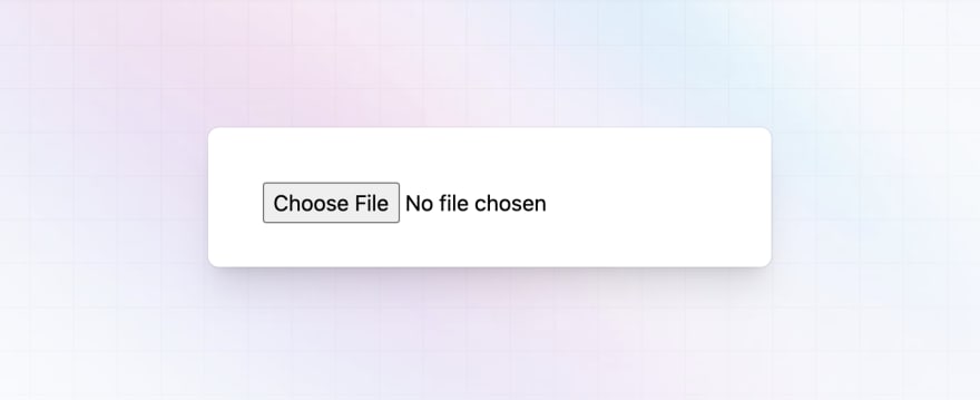
And looks like this by default :
Let's be honest, no one will appreciate seeing a component looking like this in a modern UI.
Styling the file input is easier than it seems to be, actually you can't really design a modern looking file input by applying utilities directly to the input:file element itself (If exists any way, let me know in the comments).
But is still easy to do, here my way of doing :
Nesting the input into the label tag
You can use label and input tags as peer elements into a div but I prefer nesting the input tag into the label to avoid using a div tag, you have the same result for both ways of doing.
<label for="doc">
   <input type="file" id="doc" name="doc" hidden/>
</label>
The for attribute of the label tag have to have the same content as the id attribute of the input tag so that the input action can be trigged by pressing the label element.
We need to hide the input element using hidden attribute or the "hidden" tailwind css class as we don't need it to appear on the screen.
Adding other content
Right here we don't have anything on our screen, we need to add an illustration icon, a title and a description or something like that.
<label for="doc">
   <img src="https://demo.tailus.io/images/icons/upload.webp" alt="upload icon" width="512" height="512" />
   <div>
      <h4>Upload a file</h4>
      <span>Max 2 MO </span>
   </div>
   <input type="file" id="doc" name="doc" hidden/>
</label>
It should look like this now :
Right now we only wrote html, let's add some tailwind css utilities to style the component.
Adding tailwind css utilities
We need to add border, rounded corners and a background to the label tag, the illustration is bigger than it should be, we need to align the image and the div tag containing the title and the description in the same row...
Let's add some tailwind css utilities to the elements to have the needed result :
<label for="doc" class="flex items-center p-4 gap-3 rounded-3xl border border-gray-300 border-dashed bg-gray-50 cursor-pointer">
   <img class="h-16 w-auto" src="https://demo.tailus.io/images/icons/upload.webp" alt="">.
   <div class="space-y-2">
      <h4 class="text-base font-semibold text-gray-700">Upload a file</h4>
      <span class="text-sm text-gray-500">Max 2 MO</span>
   </div>
   <input type="file" id="doc" name="doc" accept="png, jpg" hidden/>
</label>
And voila, you should have the file input component looking like in the article cover.
Conclusion
This how I create a custom file input with tailwind css, there is still different ways of doing to have the same result, you can go even far with JavaScript by adding more behaviors.
This content originally appeared on DEV Community 👩💻👨💻 and was authored by Méschac Irung
Méschac Irung | Sciencx (2022-12-02T18:21:47+00:00) How to build a custom file input with tailwind css. Retrieved from https://www.scien.cx/2022/12/02/how-to-build-a-custom-file-input-with-tailwind-css/
Please log in to upload a file.
There are no updates yet.
Click the Upload button above to add an update.


