This content originally appeared on Web Performance Calendar and was authored by Dmitry Rodnikov
Chrome Performance recorder is a great tool for finding bottlenecks in your app, but when you read the results literally, they can confuse or mislead.
Consider following JavaScript code with a simple function call inside a loop:
function main() {
  for (let i = 0; i < 1000; i++) {
    foo(i);
  }
}

function foo(i) {
  Math.pow(i, 2); // just to do some work, doesn't really matter.
}

main();
After recording it inside a Chrome Performance tab I expect to see a chart with a main function that calls foo 1000 times. Something like this:

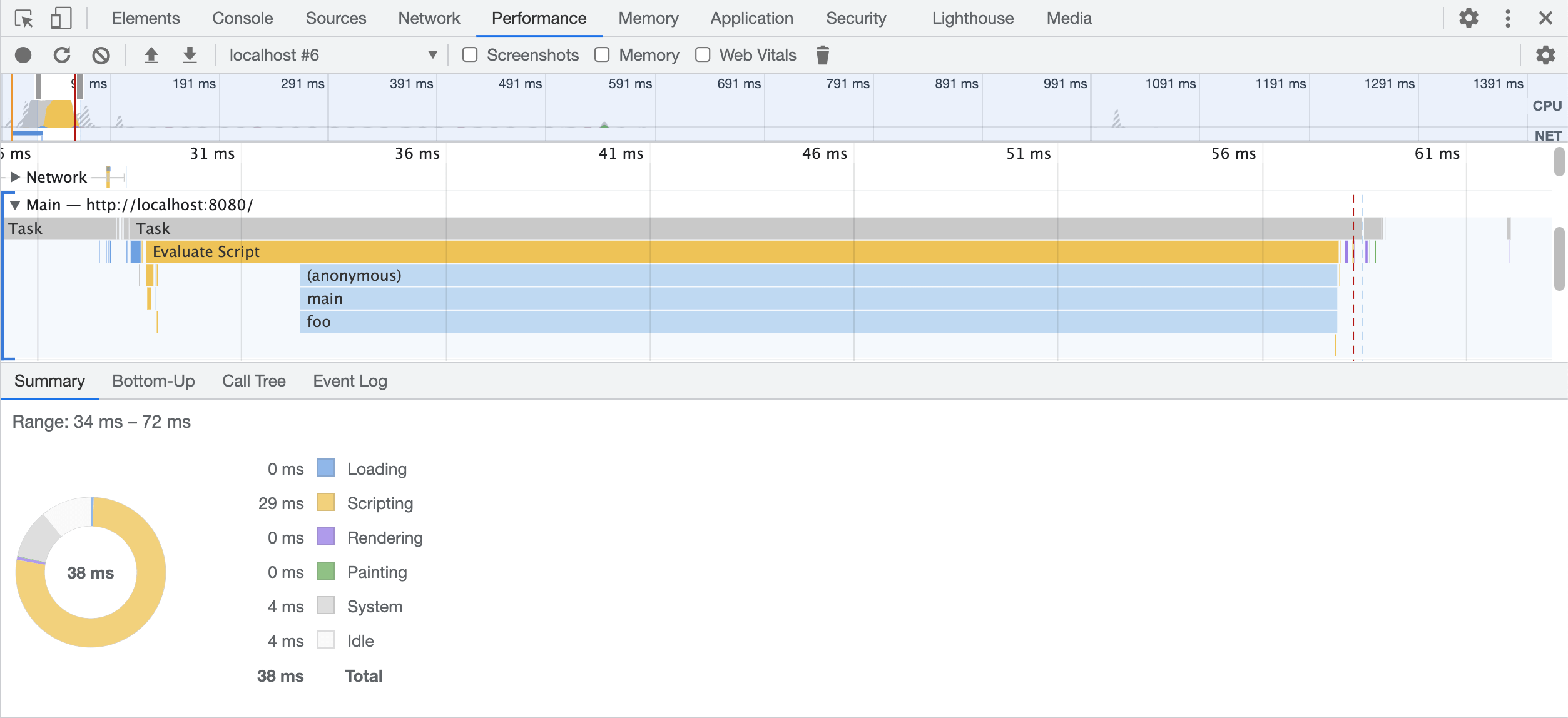
But what I see is this:

More specifically I’m looking at this part:

Why on the chart there is only 1 call of foo , while clearly, it should fire 1000 times?
I’ll tell you more, If you record it one more time you may end up with different result:

Now foo appears 3 times instead of 1000.
If you don’t see charts at all, make sure that checkbox
Disable JavaScript samplesis NOT checked. If that didn’t help take a look at the Compiler optimizations section below.
Why I don’t see every function call in the Performance Tab?
Of course, foo was called 1000 times, we just don’t see it on a CPU flame chart. Let’s figure out why.
To get information about how your code is running, browsers are using a technique called Sampling Profiling.
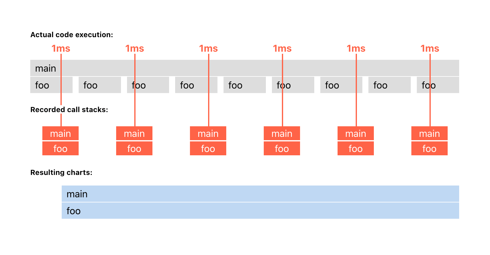
Your code is run by a JavaScript engine (like V8, Gecko or Webkit). And during sampling profiling, a browser forces an engine to stop every 1 ms, and record the call stack at that moment. Then DevTools aggregate these call stacks into a flame chart that you see in the Performance tab.
For our simple loop example it looks something like that:

In this example, the profiler got exactly the same call stack on each lookup main => foo. That’s all information it got, just a series of call stacks. The profiler doesn’t know what happened in between samples, so it assumes that foo was running the whole time without interruption.
So the reason why we have a single foo call in charts is that we missed all the idle gaps in between foo calls.
Throttling can help a bit
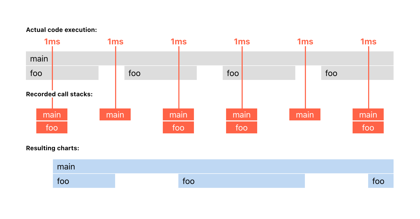
Let’s increase our chances to spot those gaps by enabling CPU throttling in Chrome DevTools.

When we throttle a CPU, the execution will become slower, as well as idle time in between function calls. But the sampling time will remain the same – about every 1 ms. So as the gaps between function calls become larger, sampling has more chances to happen inside them.

As you can see, with CPU throttling enabled, we were able to spot at least some gaps between function calls and get a more accurate picture of what is happening. So use throttling not only to simulate slow devices, but to get more data from sampling.
Where does sampling fail?
Due to the very nature of the sampling strategy, it doesn’t answer the question of how many times your function was called. And also the order of execution is not guaranteed, because you can miss some function calls if their execution is less than 1 ms and sampling went out of sync with them. As a logical consequence of two previous points, the time of execution is also not precise.
As already mentioned, recording the same code multiple times is most likely to produce slightly different results. So the right way to think about Sampling Profiling is as an approximation of how the code is running. Or as an X-ray of JS execution.
If you care about functions call count and order, consider using structural profiling.
Structural profiling
The principle is simple: record time at the beginning and the end of every function call, and then join them together. It’s called instrumentation. For our example we used Performance API to instrument our code:
function main() {
  performance.mark('mainStart'); // ADDED
  for (let i = 0; i < 1000; i++) {
    foo(i);
  }
  performance.mark('mainEnd'); // ADDED
  performance.measure('main', 'mainStart', 'mainEnd'); // ADDED
}

function foo(i) {
  performance.mark(`foo${i}Start`); // ADDED
  Math.pow(i);
  performance.mark(`foo${i}End`); // ADDED
  performance.measure(`foo${i}`, `foo${i}Start`, `foo${i}End`); // ADDED
}

main();
After that, you will see all 1000 calls of foo in the Timings section of the Performance tab:

Well, manual instrumentation like this only practical for small parts of your code. If you want to see the whole picture you can use chrome://tracing recorder. But this tool can be quite intimidating and deserves a separate article.
Observer effect
As you probably noticed, we added quite a lot of instrumentation code, even for our simple example. And it can be a big deal because measurement functions affect code performance.
First, their own time of execution is not zero. Adding a lot of instrumentation can become noticeable. And we will get an “observer effect” when the code is slow only when we are recording it.
Second, instrumentation can change some performance optimizations done by a compiler.
Compiler optimizations
JavaScript engines use Just-In-Time compilation (JIT), which compiles your code during execution. For our example, you can see it as Compile Script right before the actual execution of main and foo.

During compilation, JIT may apply some optimizations to speed up your code. But if you add measurement calls, the compiler may no longer apply those optimizations or at least some of them. So be aware that the performance of instrumented code is not the same as the original.
One particular optimization that is good to be aware of is Inlining. In order to make our code faster, the compiler would remove main and foo calls from our example completely, leaving only parts that do the work:
for (let i = 0; i < 1000; i++) {
  Math.pow(i, 2);
}
And since the actual code that is being run doesn’t have main or foo functions, the sampling profiler won’t see them in the call stack and won’t show them in the resulting charts. So keep in mind that it could also be the reason why you don’t see your function calls in flame charts.
JIT compiler won’t necessarily do this all the time. Only when it thinks it is worth doing so (More on how JIT compiler works here).
Summary
Sampling profiling is good because it’s a lightweight technique that works on actual code that is being run. It is a great tool if you want to find performance bottlenecks. Because who cares about small functions that were lost during sampling when you have a big function that consumes a lot of time? You won’t miss it, and it’s always a good idea to start your performance improvements with the most expensive functions.
After you find the bottleneck, you can manually instrument it with Performance API to understand what functions were called, how many times and in what order.
More on profiling:
JS Self-Profiling API In Practice
Introducing JSC’s New Sampling Profiler
Structural and Sampling (JavaScript) Profiling in Google Chrome
This content originally appeared on Web Performance Calendar and was authored by Dmitry Rodnikov
Dmitry Rodnikov | Sciencx (2022-12-02T07:37:00+00:00) Make sense of flame charts in Performance Tab by example. Retrieved from https://www.scien.cx/2022/12/02/make-sense-of-flame-charts-in-performance-tab-by-example/
Please log in to upload a file.
There are no updates yet.
Click the Upload button above to add an update.
