
This content originally appeared on DEV Community 👩💻👨💻 and was authored by Maxim Nosov ✪
Hi,
Progress on logo
This week I've made some progress regarding the tasks, that I've been assigned to.
First of all, I created a logo for the new project, it looks like that:

I created it with the help of Adobe photoshop. Here I needed to come up with the main colors for the logo. I went for blue color, which is usually represents calmness and trust.
Psychology of colors
Choosing the right color, and learning how to combine it correctly with another, is a hurdle that many designers struggle with, especially when starting out.
Why is that so?
As every color has a meaning. Colors help us to feel our emotions, they enable us to make quick associations, they dictate our reaction to things. Knowing how this works is a
powerful tool to have in your toolkit when taking on the world of branding and design.
My favourite quote about colors:
Colors are power and designers are the artists that blend them to perfection. They create a story without words and build a connection in one glance.
Waiting for approval
After creating a logo, I'm waiting for approval from project maintainers. Once they approve I will go and create different sizes of the logo.
Improving UI
For another project, I have been enhancing the UI and made minor accessibility modifications.
Remove useless action
For the following project, if user wants to create a post but he is not logged in, he will see an alert saying "You need to log in to create a post".
I think this is not necessary, as most of the applications just redirect you to log in page without alert. Though, UX could be improved by saying you need to log in first in the sign in form.
Improve UI with CSS
Also, I have improved the UI by including CSS animations, hover effects, and overall content readability.
For example:

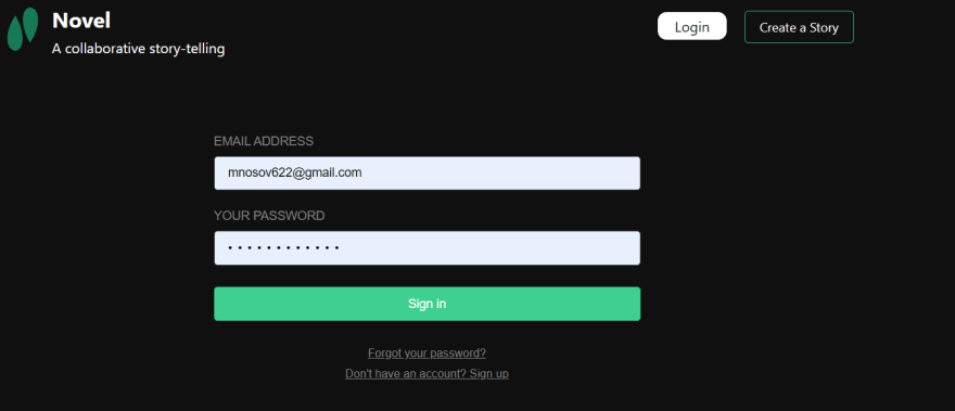
Putting sign in form in the center is a great approach, I think:
There are so many things that could be improved on the website in terms of design. I would work on it next week.
Have a wonderful and productive week !
This content originally appeared on DEV Community 👩💻👨💻 and was authored by Maxim Nosov ✪
Maxim Nosov ✪ | Sciencx (2022-12-04T18:42:14+00:00) Progress on contribution. Retrieved from https://www.scien.cx/2022/12/04/progress-on-contribution/
Please log in to upload a file.
There are no updates yet.
Click the Upload button above to add an update.