This content originally appeared on Manuel Matuzović - Web development blog and was authored by Manuel Matuzović
The color-scheme property allows you to indicate which color schemes an element can be rendered in.
This post is inspired by Sara Wallén’s article “Do you know color-scheme?” in the HTMHell advent calendar 2022. Read it to learn more about the feature and other ways of using it.
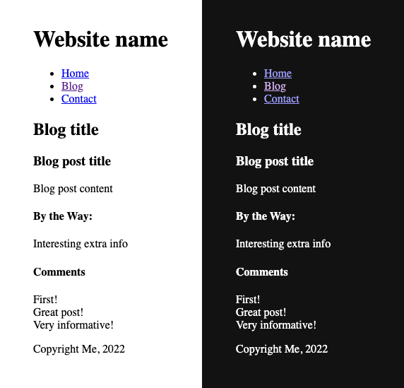
If you create an HTML document, it comes with default styles that are more or less the same in most browsers. A serif font, transparent (white) background, black text color, etc. You could say that the default theme for any HTML document is a light theme because it uses a light background color. Now here comes the big revelation (at least to me) Sara writes about: There's also a dark theme.
The thing is, if you change the color mode in your operating system from dark to light, the colors in the browser’s viewport stay the same (If you know of an operating system (OS)/browser where that's different, please tell me). You have to instruct the browser first about what to do. You can do that by using the color-scheme property.
html {
  /* Indicates that the element can be rendered using the
  operating system dark color scheme. */
  color-scheme: dark;
}
Note: the following results are only based on tests on macOS 13.0.1 and Android 12.
If you set color-scheme: dark, the whole document will be rendered in a dark scheme, even if the color mode of the OS is light. The same goes for using color-scheme: light in dark mode, the document will be rendered in a light scheme.
If you want to take advantage of this feature, but you still want to respect user preference, you have to provide two values.
html {
  color-scheme: dark light;
}
If the color mode in the OS is light, the color scheme of the document will be light. If the color mode is dark, the scheme will be dark. If you don't have a preference, dark might be used first because it comes first in the list, but I can't confirm that. On macOS at least, the document is always rendered in light mode when the color mode is “auto” in the OS, no matter the order of the values. It only changes when the operating system changes the mode automatically, as well.
You can try it yourself on this page by changing the value from “normal” to light, dark, light dark, or dark light in this editable style element and adjusting the preference in your OS or in your Dev Tools settings.
The property is not limited to the root element, you can also apply it to parts of your page.
light default
<fieldset>
  <legend>Pick a language</legend>
  <input type="checkbox" name="lang" id="css">
  <label for="css">CSS</label><br>

  <input type="checkbox" name="lang" id="html">
  <label for="html">HTML</label><br>

  <input type="checkbox" name="lang" id="js">
  <label for="js">JS</label><br>
</fieldset>light default with dark background
fieldset {
  background-color: #000;
  color: #fff;
}dark with dark background
fieldset {
  color-scheme: dark;
  background-color: #000;
  color: #fff;
}I had to apply the background color manually, but you can see how the form elements look differently, optimized for dark mode.
dark on a form element
You can also apply the property to a form element directly.
select {
  color-scheme: dark;
}<label for="color2">Favorite color</label>
<select id="color2">
<option>Aqua</option>
<option>Fuchsia</option>
</select>
This content originally appeared on Manuel Matuzović - Web development blog and was authored by Manuel Matuzović
Manuel Matuzović | Sciencx (2022-12-19T09:38:54+00:00) Day 61: color-scheme. Retrieved from https://www.scien.cx/2022/12/19/day-61-color-scheme/
Please log in to upload a file.
There are no updates yet.
Click the Upload button above to add an update.
