
This content originally appeared on Manuel Matuzović - Blog and was authored by Manuel Matuzović
Style queries may change the way we write CSS significantly.
Caution: If you’re a fan of Tailwind or similar utility frameworks, you might find this post offensive because it suggests using fewer classes instead of more.
On day 80 I’ve introduced you to container style queries. I’ve showed you a practical example from a project I was working on where style queries would’ve been really useful: When the following component has a dark background color, I set a light text color on all children.
<div class="card">
  <h2>light</h2>
</div>

<div class="card" style="--bg: var(--dark)">
  <h2>dark</h2>
</div>
:root {
--dark: #000;
--light: aqua;
}
.card {
--bg: var(--light);
background-color: var(--bg);
color: #000;
}
@container style(--bg: var(--dark)) {
* {
color: #fff;
}
}Yeah, I know, not the best example in the world, but you get the point.
What’s even more interesting than querying custom properties, we’ve applied to a property of a container, is querying custom properties whose sole purpose it is to tell us something about the container. Doesn’t make sense? Okay, here’s an example.
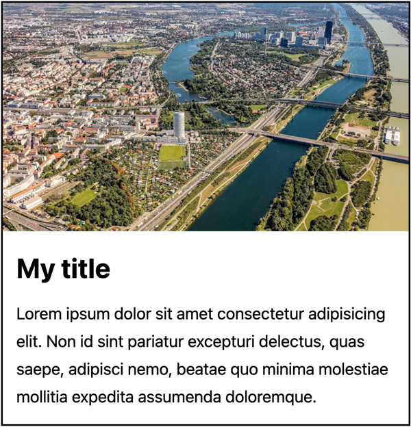
Let's say we have a basic card component.
My title
Lorem ipsum dolor sit amet consectetur adipisicing elit. Non id sint pariatur excepturi delectus, quas saepe, adipisci nemo, beatae quo minima molestiae mollitia expedita assumenda doloremque.

If I want a larger variation of this component, I do this:
<div class="card" style="--card-size: large">
  …
</div>
You can also create a separate class, if you're not a fan of inline styles.
.card-large {
  --card-size: large;
}
<div class="card card-large">
…
</div>My title
Lorem ipsum dolor sit amet consectetur adipisicing elit. Non id sint pariatur excepturi delectus, quas saepe, adipisci nemo, beatae quo minima molestiae mollitia expedita assumenda doloremque.
Note: Container style queries are still only supported in Chrome behind a flag.
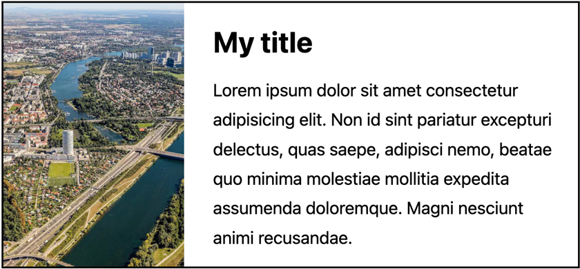
Or if I want a vertical layout for the large card, I do this:
<div class="card" style="--card-size: large; --card-style: vertical">
  …
</div>
My title
Lorem ipsum dolor sit amet consectetur adipisicing elit. Non id sint pariatur excepturi delectus, quas saepe, adipisci nemo, beatae quo minima molestiae mollitia expedita assumenda doloremque. Magni nesciunt animi recusandae.
Here are the style queries that make this possible:
@container style(--card-size: large) {
  .card-wrapper {
    --width: 30rem;
  }

  h2 {
    font-size: 2rem;
  }
}

@container style(--card-style: vertical) {
  .card-wrapper {
    --width: 40rem;
    --direction: row;
    gap: 1rem;
  }

  h2 {
    margin-top: 0.5em;
  }

  .card-image {
    aspect-ratio: 1;
  }
}
Okay, cool, but can't we just use a class for that? Yes, but…
-
Instead of applying conditional styling using a class, we can now do something we've been used to doing for a while already: adding conditions through queries. It's just style queries instead of media queries.
-
We don't need modifier classes anymore. The style query already scopes the styles in that block to a specific condition.
-
We can create variations of elements that don't have or don't need classes.
<blockquote style="--type: pull-quote"> </blockquote> -
custom properties are inhertiable, which means that we can control the styling of all cards within an element by setting the property on the parent element.
<section style="--card-size: large">
  <div class="card">…</div>
  <div class="card">…</div>
  <div class="card">…</div>
</section>
or even
<body style="--card-size: large">
  <div class="card">…</div>
  <div class="card">…</div>
  <div class="card">…</div>
</body>
Container style queries are so brand new they aren’t even there yet. I can’t wait for browsers to support them to see if and how they will change the way we write CSS.
My blog doesn't support comments yet, but you can reply via blog@matuzo.at.
This content originally appeared on Manuel Matuzović - Blog and was authored by Manuel Matuzović
Manuel Matuzović | Sciencx (2023-01-26T00:00:00+00:00) Day 89: higher-order custom properties. Retrieved from https://www.scien.cx/2023/01/26/day-89-higher-order-custom-properties-2/
Please log in to upload a file.
There are no updates yet.
Click the Upload button above to add an update.