
This content originally appeared on Level Up Coding - Medium and was authored by George Argyrousis
Build a Tab Panel Component with React and Typescript.
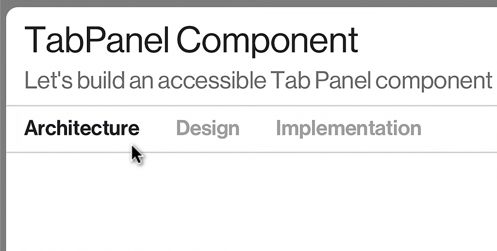
Let’s build an accessible Tab Panel component with automatic panel activation for your React project using TypeScript and SCSS.
Architecture
During the ideation process, we should create requirements that help us understand how the component will be consumed. We will use these requirements to formalise the component’s API.
Requirements
The <TabPanel /> component should be able to render a collection of tabs with their respected panels. Each tab can be generated within the component itself using a string[]. The panels are more complicated since they will need to be coupled with each tab. Some prevalent approaches can be seen below:
const tabs = ['tab 1', 'tab 2', 'tab 3'];

// ‼️ Option 1: good;
<TabPanel tabs={tabs}>
  <div>Content 1</div>
  <div>Content 2</div>
  <div>Content 3</div>
</TabPanel>


// ✅ Option 2: better;
<TabPanel tabs={tabs}>
  {tab => {
    switch(tab) {
      case tabs[0]:
        return <div>Content 1</div>;
      case tabs[1]:
        return <div>Content 2</div>;
      default:
        return <div>Content 3</div>;
    }
  }}
</TabPanel>
- Option 1: This implementation is concise and closely resembles how the underlying HTML will be structured. However, the component will need to track which child entry to render and handle array mismatches between the passed tab array and component children.
- Option 2: Slightly bigger implementation using the Render props React pattern. There’s a good balance between the encapsulating component logic and the passed properties.
Both versions of the component require tracking the active tab. With the first option, we can infer the correct child to render by the corresponding index of the selected tab. The second option is preferable due to its direct relation between the tabs property and the rendered child.
The parent component might require context of which tab is currently active. We will need to sync (conditionally) our parent after every internal state change takes place. This process can be easily achieved by using a class based component and passing a callback function to a setState.
useEffect could also be used, although, we would have to ensure that our callback does not get trigger during the initial mount.
Structure
We proceed by generating a diagram describing the static and dynamic aspects of our component. Our structure should be catering towards accessibility compliance defined by w3.org.
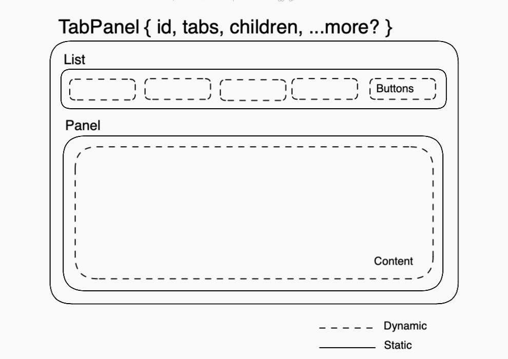
We do not have any complex data flows or transformation. Our component interface can be as simple as:
interface TabPanelProperties {
    onChange?: (tab: string) => void;

    children: (tab: string) => ReactElement;

    tabs: Readonly<string[]>;

    id: string;
}
Implementation
Our class implementation will require a few setter methods and one getter:
state = { selectedTab: this.props.tabs[0] };

get contentId() {
    return `${this.state.selectedTab}-content`;
}

setSelectedTab = (selectedTab: string) => {
    this.setState({ selectedTab }, () => {
        (document.querySelector(`#${this.props.id} #${selectedTab}`) as HTMLButtonElement)?.focus();
        if (this.props.onChange) this.props.onChange(selectedTab);
    });
}

onTabChange = (event: SyntheticEvent) => {
    event.preventDefault();

    const tabId: string = (event.target as HTMLButtonElement).id;

    this.setSelectedTab(tabId);
}
We are using each props.tabs array entry as a unique id for each tab. this.contentId resembles the content area that is controlled by the active tab.
After each setSelectedTab takes place, we are programmatically moving focus to the next active tab and triggering props.onChange to sync state with the parent (if applicable).
Accessibility
Since we have opted for automatic panel activation, the user can shift focus by pressing the left and right arrow keys. To achieve this effect, we will apply an onKeyDown listener on each tab and toggle the tabIndex of each button to prevent focus shifts to non active buttons.
onArrowKeyChange = (event: KeyboardEvent<HTMLButtonElement>) => {
    const { tabs } = this.props;
    const { selectedTab } = this.state;

    const keys = ['ArrowLeft', 'ArrowRight'];

    if (!keys.includes(event.key)) return;

    const tabIndex = tabs.indexOf(selectedTab);

    const firstTab = tabs[0];
    const lastTab = tabs[tabs.length - 1];

    switch (event.key) {
        case keys[0]:
            this.setSelectedTab(selectedTab === firstTab
                ? lastTab
                : tabs[tabIndex - 1]
            );
            break;

        case keys[1]:
        default:
            this.setSelectedTab(selectedTab === lastTab
                ? firstTab
                : tabs[tabIndex + 1]
            );
            break;
    }
};

renderList = () => (
    <div className="tabs-list" role="tablist">
        {this.props.tabs.map(tab => {
            const isSelectedTab = tab === this.state.selectedTab;
            const className = `tab ${isSelectedTab ? 'tab-selected' : ''}`;

            return (
                <button
                    id={tab}
                    key={tab}
                    type="button"
                    role="tab"
                    onClick={this.onTabChange}
                    tabIndex={isSelectedTab ? 0 : -1}
                    onKeyDown={this.onArrowKeyChange}
                    className={className}
                    aria-controls={this.contentId}
                    aria-selected={isSelectedTab}
                >
                    {tab}
                </button>
            )
        })}
    </div>
);
We finalise our component with its renderContent and render methods:
renderPanel = () => (
    <div
        id={this.contentId}
        role="tabpanel"
        tabIndex={0}
        className="tabs-content"
        aria-labelledby={this.state.selectedTab}
    >
        {this.props.children(this.state.selectedTab)}
    </div>
);

render() {
    return (
        <div id={this.props.id} className="tabs">
            {this.renderList()}
            {this.renderPanel()}
        </div>
    );
}
Result
We can put everything together in one unified class component along with a few lines of SCSS to get your started:
import { PureComponent,
         ReactElement, SyntheticEvent, KeyboardEvent } from 'react';

import './TabPanel.scss';

interface TabPanelProperties {
    onChange?: (tab: string) => void;

    children: (tab: string) => ReactElement;

    tabs: Readonly<string[]>;

    id: string;
}

export default class TabPanel extends PureComponent<TabPanelProperties> {

    state = { selectedTab: this.props.tabs[0] };

    get contentId() {
        return `${this.state.selectedTab}-content`;
    }

    setSelectedTab = (selectedTab: string) => {
        this.setState({ selectedTab }, () => {
            const selector = `#${this.props.id} #${selectedTab}`;
            (document.querySelector(selector) as HTMLButtonElement)?.focus();
            if (this.props.onChange) this.props.onChange(selectedTab);
        });
    }

    onTabChange = (event: SyntheticEvent) => {
        event.preventDefault();

        const tabId: string = (event.target as HTMLButtonElement).id;

        this.setSelectedTab(tabId);
    }

    onArrowKeyChange = (event: KeyboardEvent<HTMLButtonElement>) => {
        const { tabs } = this.props;
        const { selectedTab } = this.state;

        const keys = ['ArrowLeft', 'ArrowRight'];

        if (!keys.includes(event.key)) return;

        const tabIndex = tabs.indexOf(selectedTab);

        const firstTab = tabs[0];
        const lastTab = tabs[tabs.length - 1];

        switch (event.key) {
            case keys[0]:
                this.setSelectedTab(selectedTab === firstTab
                    ? lastTab
                    : tabs[tabIndex - 1]
                );
                break;

            case keys[1]:
            default:
                this.setSelectedTab(selectedTab === lastTab
                    ? firstTab
                    : tabs[tabIndex + 1]
                );
                break;
        }
    };

    renderList = () => (
        <div className="tabs-list" role="tablist">
            {this.props.tabs.map(tab => {
                const isSelectedTab = tab === this.state.selectedTab;
                const className = `tab ${isSelectedTab ? 'tab-selected' : ''}`;

                return (
                    <button
                        id={tab}
                        key={tab}
                        type="button"
                        role="tab"
                        onClick={this.onTabChange}
                        tabIndex={isSelectedTab ? 0 : -1}
                        onKeyDown={this.onArrowKeyChange}
                        className={className}
                        aria-controls={this.contentId}
                        aria-selected={isSelectedTab}
                    >
                        {tab}
                    </button>
                )
            })}
        </div>
    );

    renderPanel = () => (
        <div
            id={this.contentId}
            role="tabpanel"
            tabIndex={0}
            className="tabs-content"
            aria-labelledby={this.state.selectedTab}
        >
            {this.props.children(this.state.selectedTab)}
        </div>
    );

    render() {
        return (
            <div id={this.props.id} className="tabs">
                {this.renderList()}
                {this.renderPanel()}
            </div>
        );
    }
}
.tabs-list {
border-bottom: 1px solid #D5D5D5;
.tab {
text-transform: capitalize;
font-size: 0.875rem;
color: #A1A1A1;
font-weight: 700;
transition: color 0.3s;
&:hover {
color: #555555;
}
&-selected:hover,
&-selected {
color: #222222;
}
}
}Conclusion
Our implementation is complete and covers our specified requirements.
Please alter any part of the component and introduce better accessibility labelling or handling disabled tabs. All references in the article are available below.
Hope you find this article helpful for your own React project!
References
- Render Props - React
- Example of Tabs with Automatic Activation
- Excalidraw - Collaborative whiteboarding made easy
Level Up Coding
Thanks for being a part of our community! Before you go:
- 👏 Clap for the story and follow the author 👉
- 📰 View more content in the Level Up Coding publication
- 🔔 Follow us: Twitter | LinkedIn | Newsletter
🚀👉 Join the Level Up talent collective and find an amazing job
Build a Tab Panel component with React & Typescript was originally published in Level Up Coding on Medium, where people are continuing the conversation by highlighting and responding to this story.
This content originally appeared on Level Up Coding - Medium and was authored by George Argyrousis
George Argyrousis | Sciencx (2023-01-30T01:55:38+00:00) Build a Tab Panel component with React & Typescript. Retrieved from https://www.scien.cx/2023/01/30/build-a-tab-panel-component-with-react-typescript/
Please log in to upload a file.
There are no updates yet.
Click the Upload button above to add an update.