This content originally appeared on Bits and Pieces - Medium and was authored by Victor Yakubu
Leveraging Microfrontend Architecture using Bit Components
The benefits of using Micro-frontend architecture for building your application — and how this process is made easy using Bit.
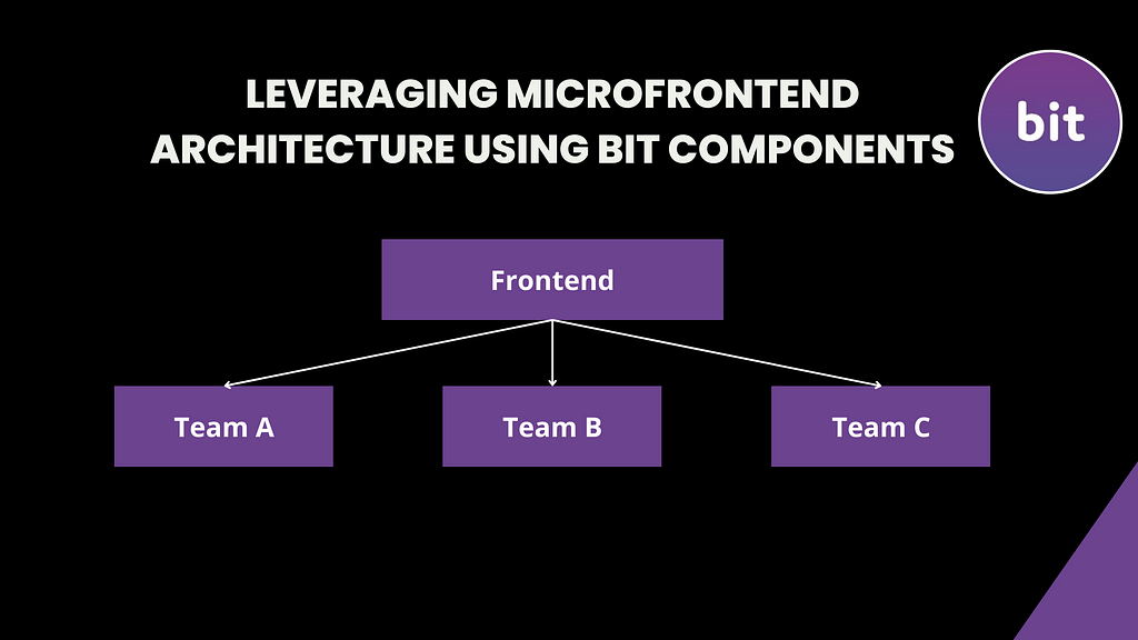
Micro-frontend architecture is a revolutionary new way to develop and deploy web applications. It offers a more modular and efficient approach to developing and managing web applications and has the potential to revolutionize the way we think about web application development.
While Bit is a platform that is used for component-driven development, with Bit, every part of your application is an independent component. So what is the relationship between Microfrontend and Bit? This article will answer this question using a project-based approach to show you how, with Bit, you can leverage the micro-frontend architecture.
What is Microfrontend?
Micro-frontend extends the concept of microservices to the front-end. It is a way of better organising your development process by dividing the front-end into much smaller and more manageable parts, which results in a smoother process for each micro-frontend team because they get to work independently of each other.
This architecture improves and solves the monolithic model of single-page applications by organizing them into independent models. It entails viewing your website as a project or page composed of features, with each feature managed and owned by various teams; this helps to keep your front-end code under control.
This makes it possible to draw the line of responsibility and define the contextual architecture, and it gives teams the ability to work independently and push code into production.
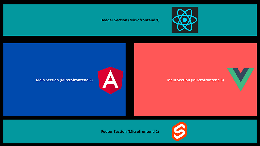
From the image above, you can see that the web page is divided into four different sections, each standing alone as a micro-frontend. Different teams can work on this webpage simultaneously without stepping on each other's toes, whether they are using the same or different web technologies.
What are the advantages of Microfrontend?
- Team scalability: Because your web page is divided into different portions and each portion is independently deployed, you can have different teams working on them at the same time without conflict.
- Faster development: By creating micro-frontend components, the development process will become faster and more efficient. This will help developers to quickly work on each component and make the necessary changes faster.
- Improved maintainability: By separating the application into distinct micro-frontend components, the application can be more easily maintained. This will help developers to quickly identify the issue and make the necessary changes faster.
- Component Reusability: As long as your host page conforms to the micro-frontend standard, it is easy to take any component and use them on any page in your application.
- Technology Agnosticism: This means that you can have different web technologies on a particular project. One page can be written with React, while another with Vue or Angular on the same application, same thing with the various micro-frontend component on the application as long as your host page conforms to the MFEs standards.
Challenges of Microfrontend Architecture
Let’s also quickly talk about the challenges faced by developers when using the architecture; after that, I will tell you how Bit helps in solving these issues.
- The complexity of integration: This is one of the primary disadvantages of using Microfrontend (not anymore because of Bit). When you opt for using Microfrontend, you are deciding to have many small projects instead of one big project. And with that comes lots of stuff to manage, which can get much more complex as the project scales.
- Debugging: Debugging micro-frontends can be difficult, as components may be spread out across multiple repositories and it may not be immediately apparent which component is causing an issue.
- Testing: Testing can be one of the biggest disadvantages of micro-frontends. Testing micro-frontends can be a difficult and time-consuming process, as each frontend needs to be tested individually. Additionally, if a micro-frontend is dependent on another micro-frontend, testing can become even more complicated.
Due to the complexity of the micro-frontend architecture, it can be difficult to identify the source of any issues that arise, leading to a lengthy debugging process. This can be further compounded by the fact that micro-frontends are often written in different languages and frameworks, making it difficult to apply a unified testing strategy.
All of these development issues are what Bit helps you solve, and the best way to convince you is by showing you.
Implementation of Microfrontend Architecture with Bit
To demonstrate how you and your team can leverage the micro-frontend architecture using Bit, we will be building a simple landing page. For this, let’s assume we have three teams: one in charge of the header, another in charge of the main section, and lastly, a team for the footer.
So let’s see how we can achieve this using Bit in a few minutes.
Requirements
To properly gain from this article, you should have or know the following:
- Basic knowledge of React and Typescript
- Have a bit.cloud account
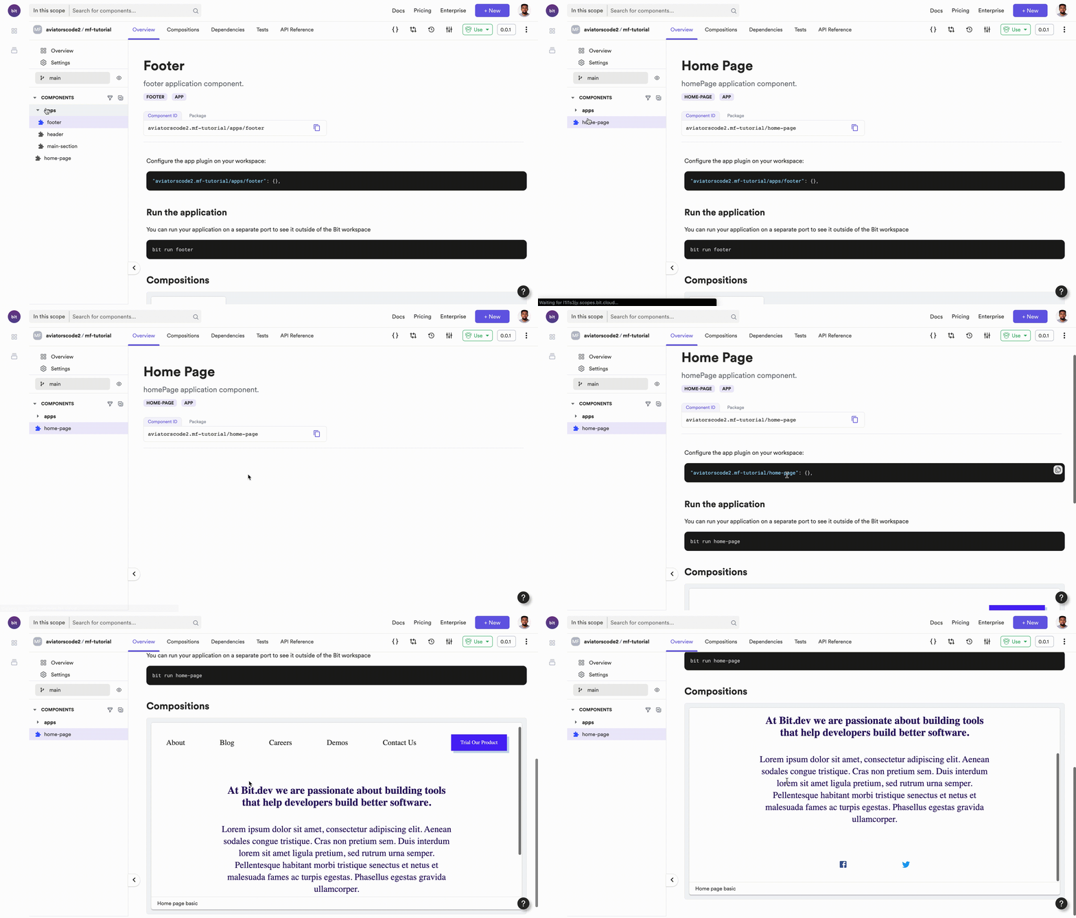
The scope used and the micro-frontend created in this tutorial can be accessed below:
- mf-tutorial scope
- Footer App component
- Header App Component
- Main-section app component
- Home page App component
Creating a Bit Workspace
First thing first when using Bit is to ensure that you have Bit installed on your device using the command below:
npx @teambit/bvm install
After that, you need a Bit workspace to be able to manage and work on your components. You can create a Bit workspace in one of two ways, either by running the command below
bit new react [workspace-name] --default-scope [Bit.cloud username].[scope-name]
OR
You can also create a Bit workspace following these steps
- Create a new folder
- cd into the folder
- Run the command below
bit init
Either of the two steps above can be used to create a Bit workspace for your project. For this tutorial, I used the second step. This is how your folder should look after running the bit init command.

Now that we have our workspace setup, we can now proceed to create our components.
In your workspace.jsonc file, change the defaultScope from:
"defaultScope": "my-scope"
to your [bit.cloud username].[scope.name], like the one below:
"defaultScope": "aviatorscode2.mf-tutorial"
Creating Bit Components
For the simple landing page we will be creating, we will need to have four components. Note that how you divide your applications depends on you; you can have a team handle a whole section or just a feature in your application.
But for the purpose of the tutorial, we will have 3 teams (for the header, main section, and footer components) and also a final component that composes all other components together to form the landing page.
Creating the Header component
So let's start by creating the header component, and like we established prior, in the micro-frontend architecture, each part of the frontend is an application on its own. So it means that after creating the header component, it can be deployed separately as its own application.
To create the header app component, run the code below in your Bit workspace.
bit create react-app apps/header
If that runs successfully, this is what you should see in your terminal

That shows that a new component has been created, you will also notice a new folder
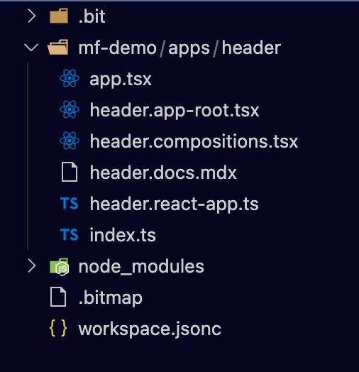
Before you go into writing the code for the header, you will need to do something quickly, to make your header component loadable by your workspace, by running this command
bit use aviatorscode2.mf-tutorial/apps/header
After the command runs successfully, when you check your workspace configuration in the workspace.jsonc file, you should see a syntax similar to this
Syntax:
"[bit.cloud-username].[scope-name]/component": {}Command:
"aviatorscode2.mf-tutorial/apps/header": {}Which now means that your component can be rendered on your browser on localhost. You can also convert an existing component into an app component; check how to do this in the Bit documentation.
Now, run the command below to see the list of applications in your workspace. Presently, you only have one application for the header, so you should expect to see just one.
bit app list
If that runs successfully, you should get a response in your terminal
Now, you can proceed to implement the code for the header in your app.tsx file in your header folder.
import React from 'react';
import { Button } from '@material-ui/core';
import { withStyles } from '@material-ui/core/styles';
import { Toolbar, Typography } from '@material-ui/core';
import { makeStyles } from '@material-ui/core/styles';
import { Routes, Route } from 'react-router-dom';

export function HeaderApp() {

  const StyledButton: any = withStyles({
    root: {
      display: 'flex',
      alignItems: 'center',
      justifyContent: 'center',
      height: '44px',
      padding: '0 25px',
      boxSizing: 'border-box',
      borderRadius: 0,
      background: '#4f25f7',
      color: '#fff',
      transform: 'none',
      boxShadow: '6px 6px 0 0 #c7d8ed',
      transition: 'background .3s,border-color .3s,color .3s',
      '&:hover': {
        backgroundColor: '#4f25f7',
      },
    },
    label: {
      textTransform: 'capitalize',
    },
  })(Button);

  const styles = makeStyles({
    bar: {
      paddingTop: '1.15rem',
      backgroundColor: '#fff',
      ['@media (max-width:780px)']: {
        flexDirection: 'column',
      },
    },
    menuItem: {
      cursor: 'pointer',
      flexGrow: 1,
      '&:hover': {
        color: '#4f25c8',
      },
      ['@media (max-width:780px)']: {
        paddingBottom: '1rem',
      },
    },
  });

  function CustomBtn(props: any): JSX.Element {
    return (
      <StyledButton variant="contained" color="primary">
        {props.txt}
      </StyledButton>
    );
  }

  const classes: any = styles();
  return (
    <>
      {/* header component */}
      <Routes>
        <Route
          path="/"
          element={
            <Toolbar className={classes.bar}>
              <Typography variant="h6" className={classes.menuItem}>
                About
              </Typography>
              <Typography variant="h6" className={classes.menuItem}>
                Blog
              </Typography>
              <Typography variant="h6" className={classes.menuItem}>
                Careers
              </Typography>
              <Typography variant="h6" className={classes.menuItem}>
                Demos
              </Typography>
              <Typography variant="h6" className={classes.menuItem}>
                Contact Us
              </Typography>
              <CustomBtn txt="Trial Our Product" />
            </Toolbar>
          }
        >
          {/* home page component */}
        </Route>
      </Routes>
    </>
  );
}
You can run your header application on the browser by running the command below
bit run header
If that command runs successfully, your header will be served on localhost.
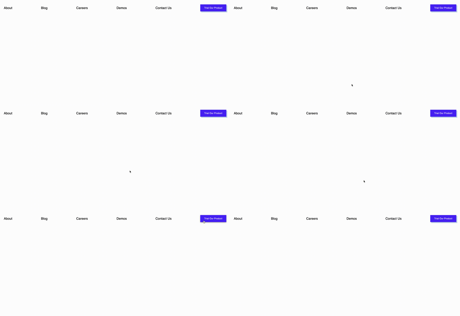
Now that you have your app running and everything is working fine, you can then proceed to export your app component to Bit Cloud.
But before exporting, you will need to build and tag the app component.
To build your component run this command below.
Syntax:
bit build [bit cloud username].[scope-name]/[commponent-ID]
Command:
bit build aviatorscodes.mf-tutorial/apps/header
After the build runs successfully, you can now tag your component
bit tag aviatorscodes.mf-tutorial/apps/header

You can now proceed to export the component using the command below:
bit export
Creating the Footer component
A workspace can contain one or more app components, so for this next component, you can either create a new workspace or use the current workspace to create a new component for the footer.
Following the same steps as you did earlier in creating the header component, you will first create a component using the command below:
bit create react-app apps/footer
When the component has been created, to make the app component loadable by your workspace, you will need to run the command below
Syntax:
bit use [Bit cloud username].[Scope-name]/[Component-ID]
Command:
bit use aviatorscodes2.mf-tutorial/apps/footer
Now, go to app.tsx in the footer folder and write your code for the footer section
import React from 'react';
import {BottomNavigation, BottomNavigationAction} from '@material-ui/core'
import FacebookIcon from '@material-ui/icons/Facebook';
import TwitterIcon from '@material-ui/icons/Twitter';
import InstagramIcon from '@material-ui/icons/Instagram';
import YouTubeIcon from '@material-ui/icons/YouTube';
import { Routes, Route } from 'react-router-dom';

export function FooterApp() {
  return (
    <>
      {/* header component */}
      <Routes>
        <Route
          path="/"
          element={
            <BottomNavigation>
              <BottomNavigationAction
                color="red"
                label="Facebook"
                value="recents"
                icon={<FacebookIcon style={{ fill: '#3b5998' }} />}
              />
              <BottomNavigationAction
                label="Twitter"
                value="favorites"
                icon={<TwitterIcon style={{ fill: '#1DA1F2' }} />}
              />
            </BottomNavigation>
          }
        >
        </Route>
      </Routes>
    </>
  );
}
You can now run the component on the browser to see how it appears

You can now proceed to build this footer component using the build component; after the build runs successfully, the last steps are to tag and finally export your component to Bit.
Creating the main section component
Now that you have your header and footer components, it’s time to create the main section component. Like always, you will first create a new bit app component using the command below. By now you should be familiar with these syntaxes:
bit create react-app apps/main-section
To make the component loadable by your workspace run the command below:
bit use aviatorscode2.mf-tutorial/apps/main-section
Note: for every app component you either create or fork to your workspace, you will have to run the command above to make it loadable by your workspace.
In the main-section folder, go to app.tsx and implement your code for the main section.
For the purpose of this tutorial, I created a simple main section with data just to pass home the message, the code I used can be seen below:
import React from 'react';
import { Typography } from '@material-ui/core';
import { makeStyles } from '@material-ui/core/styles';
import { Routes, Route } from 'react-router-dom';

export function MainSectionApp() {
  const styles = makeStyles({
    wrapper: {
      width: '65%',
      margin: 'auto',
      textAlign: 'center',
    },
    bigSpace: {
      marginTop: '5rem',
    },
    littleSpace: {
      marginTop: '2.5rem',
    },
    grid: {
      display: 'flex',
      justifyContent: 'center',
      alignItems: 'center',
      flexWrap: 'wrap',
    },
  });

  const classes = styles();
  return (
    <>
      {/* header component */}
      <Routes>
        <Route
          path="/"
          element={
            <div className={classes.wrapper}>
              <Typography
                variant="h4"
                className={classes.bigSpace}
                color="primary"
              >
                At Bit.dev we are passionate about building tools that help
                developers build better software.
              </Typography>
              <Typography
                variant="h5"
                className={classes.littleSpace}
                color="primary"
              >
                Lorem ipsum dolor sit amet, consectetur adipiscing elit. Aenean
                sodales congue tristique. Cras non pretium sem. Duis interdum
                lorem sit amet ligula pretium, sed rutrum urna semper.
                Pellentesque habitant morbi tristique senectus et netus et
                malesuada fames ac turpis egestas. Phasellus egestas gravida
                ullamcorper.
              </Typography>
            </div>
          }
        >
        </Route>
      </Routes>
    </>
  );
}
Run the main-section app component on your browser to see how it looks.

You can now build, tag and export your component to bit cloud.
Composing the Microfrontends in a new app component
Now that you have your three micro-frontends that are independent of each other, it is now time to compose them together and see how well they come together.
For this, you will need to create a new app component. In a company, this new app component can be handled by a different team depending on the team structure.
Using the same syntax, create a new component called “home-page”.
bit create react-app home-page
After successfully creating your home page component, run the command below to make the component loadable by your workspace (Don’t forget to do this anytime you create an app component).
bit use avaitorscode2.mf-tutorial/home-page
In the app.tsx, compose the three micro frontends created initially. By "composing," what it simply means is to import the component as a package. That’s one of the beauties of using Bit, it automatically generates a package for each component, and that component can then be used anywhere.
You can check out the Bit documentation for more explanation on composing components.
So in the app.tsx file, implement your code.
import React from 'react';
import {
  createMuiTheme,
  ThemeProvider,
  makeStyles,
} from '@material-ui/core/styles';
import { FooterApp } from '@aviatorscode2/mf-tutorial.apps.footer';
import { HeaderApp } from '@aviatorscode2/mf-tutorial.apps.header';
import { MainSectionApp } from '@aviatorscode2/mf-tutorial.apps.main-section';
import { Routes, Route } from 'react-router-dom';

export function HomePageApp() {
  const theme = createMuiTheme({
    palette: {
      primary: {
        main: '#2e1667',
      },
      secondary: {
        main: '#c7d8ed',
      },
    },
    typography: {
      fontFamily: 'Roboto',
      h4: {
        fontWeight: 600,
        fontSize: 28,
        lineHeight: '2rem',
      },
      h5: {
        fontWeight: 100,
        lineHeight: '2rem',
      },
    },
  });

  const styles = makeStyles({
    bigSpace: {
      marginTop: '5rem',
    },
  });
  const classes = styles();
  return (
    <div className="app">
      <ThemeProvider theme={theme}>
        <HeaderApp />
        <Routes>
          <Route path="/" element={<MainSectionApp/>}>
            {/* home page component */}
          </Route>

          <Route path="/about">{/* about page component */}</Route>
        </Routes>
        <div className={classes.bigSpace}>
          <FooterApp />
        </div>
      </ThemeProvider>
    </div>
  );
}
When you run this app component, this is what you should get in your browser on localhost.
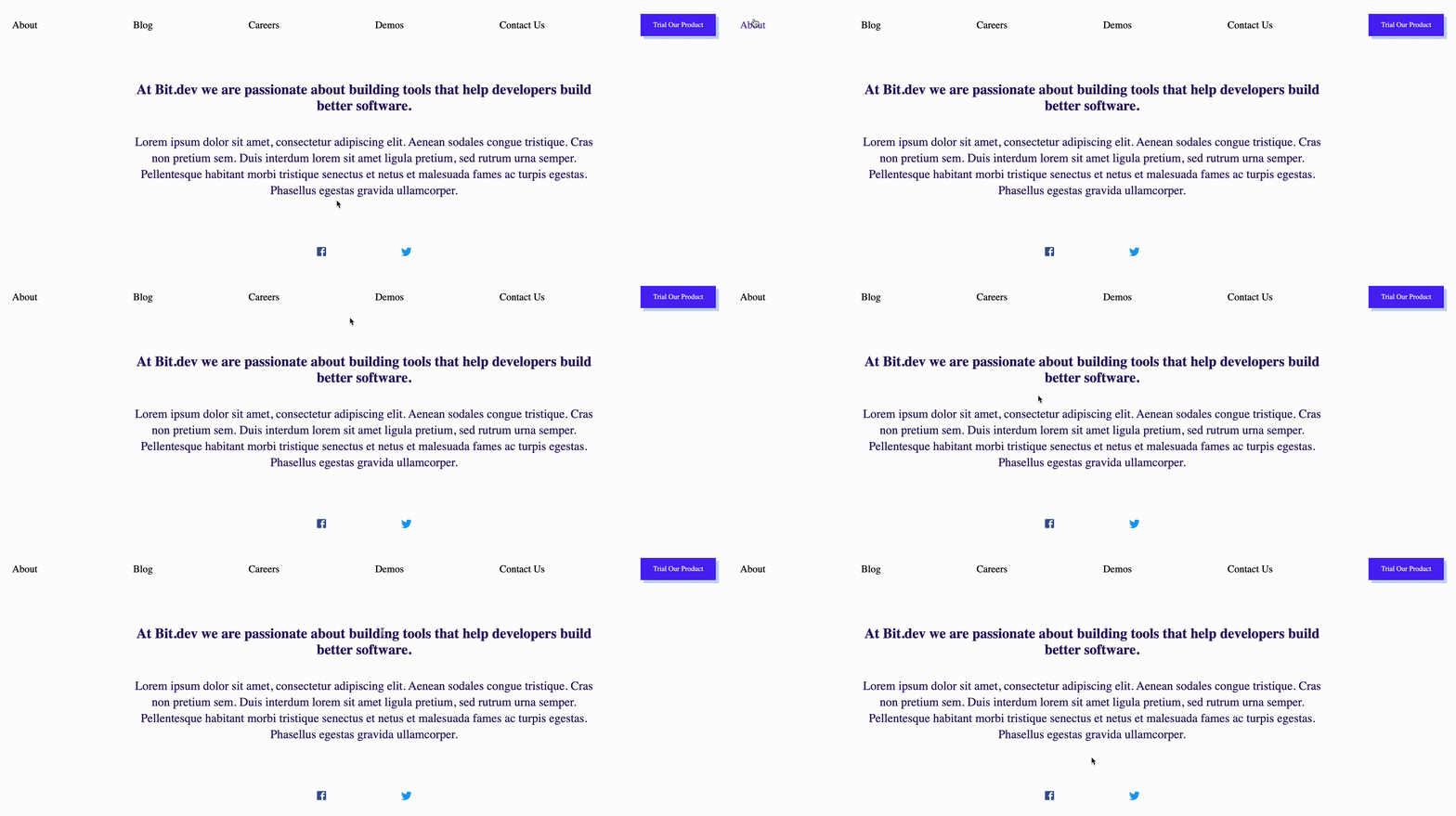
So as you can see, your home page component has three different micro-frontends composed in it. In a much larger application, this home page can be seen as a micro-frontend in its essence. This home page can be deployed or hosted.
You can now go ahead and build this home page component the same way you did the other components. Can you still remember the command for this?
bit build aviatorscode2.mf-tutorial/home-page
After successfully building your home page component, the next time to do is to tag and finally export your component to your scope on bit cloud.
After exporting your component, when you check the dependency graph of your home page component, you will see that the three components are dependencies of your home page component, also notice the app version for each of the components.
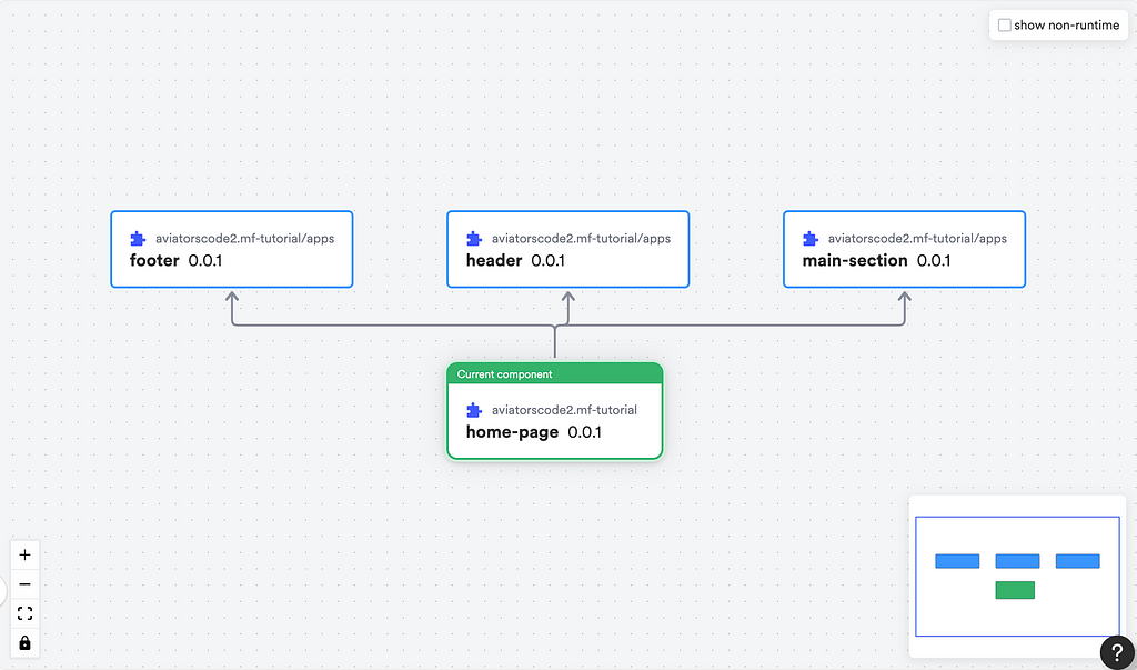
What happens if the ‘footer team’ decide to update their component?
Remember from the beginning of this tutorial that we have been working with the assumption that each of the components is handled by different teams; if any of the teams update their component, how will the home page component that is dependent on these components get the new update?
Let’s see how that will work. In your footer component, add some new social media links to the ones already there. in the app.tsx in the footer folder.
import React from 'react';
import {BottomNavigation, BottomNavigationAction} from '@material-ui/core'
import FacebookIcon from '@material-ui/icons/Facebook';
import TwitterIcon from '@material-ui/icons/Twitter';
import InstagramIcon from '@material-ui/icons/Instagram';
import YouTubeIcon from '@material-ui/icons/YouTube';
import { Routes, Route } from 'react-router-dom';

export function FooterApp() {
  return (
    <>
      {/* header component */}
      <Routes>
        <Route
          path="/"
          element={
            <BottomNavigation>
              <BottomNavigationAction
                color="red"
                label="Facebook"
                value="recents"
                icon={<FacebookIcon style={{ fill: '#3b5998' }} />}
              />
              <BottomNavigationAction
                label="Twitter"
                value="favorites"
                icon={<TwitterIcon style={{ fill: '#1DA1F2' }} />}
              />
              <BottomNavigationAction
                label="Instagram"
                value="nearby"
                icon={<InstagramIcon style={{ fill: ' #C13584' }} />}
              />
              <BottomNavigationAction
                label="YouTube"
                value="folder"
                icon={<YouTubeIcon style={{ fill: '#c4302b' }} />}
              />
            </BottomNavigation>
          }
        >
        </Route>
      </Routes>
    </>
  );
}
Save your changes and run the footer component in your browser to see the new changes that you made.

Okay, now that the changes have been made locally, it’s time to build your footer component again, using the build command.
bit build aviatorscode2.mf-tutorial/apps/footer
After that runs successfully, you can then tag your component.
bit tag aviatorscode2.mf-tutorial/apps/footer

Now the new version of the footer component is ready to be exported to bit cloud, When tagging your component, you can manually set the release version yourself, if you don’t bit automatically assigns a release version to it
To export, run the export command:
bit export
Since a new version of the footer component has been released, what happens to the home page component? Let’s find out.
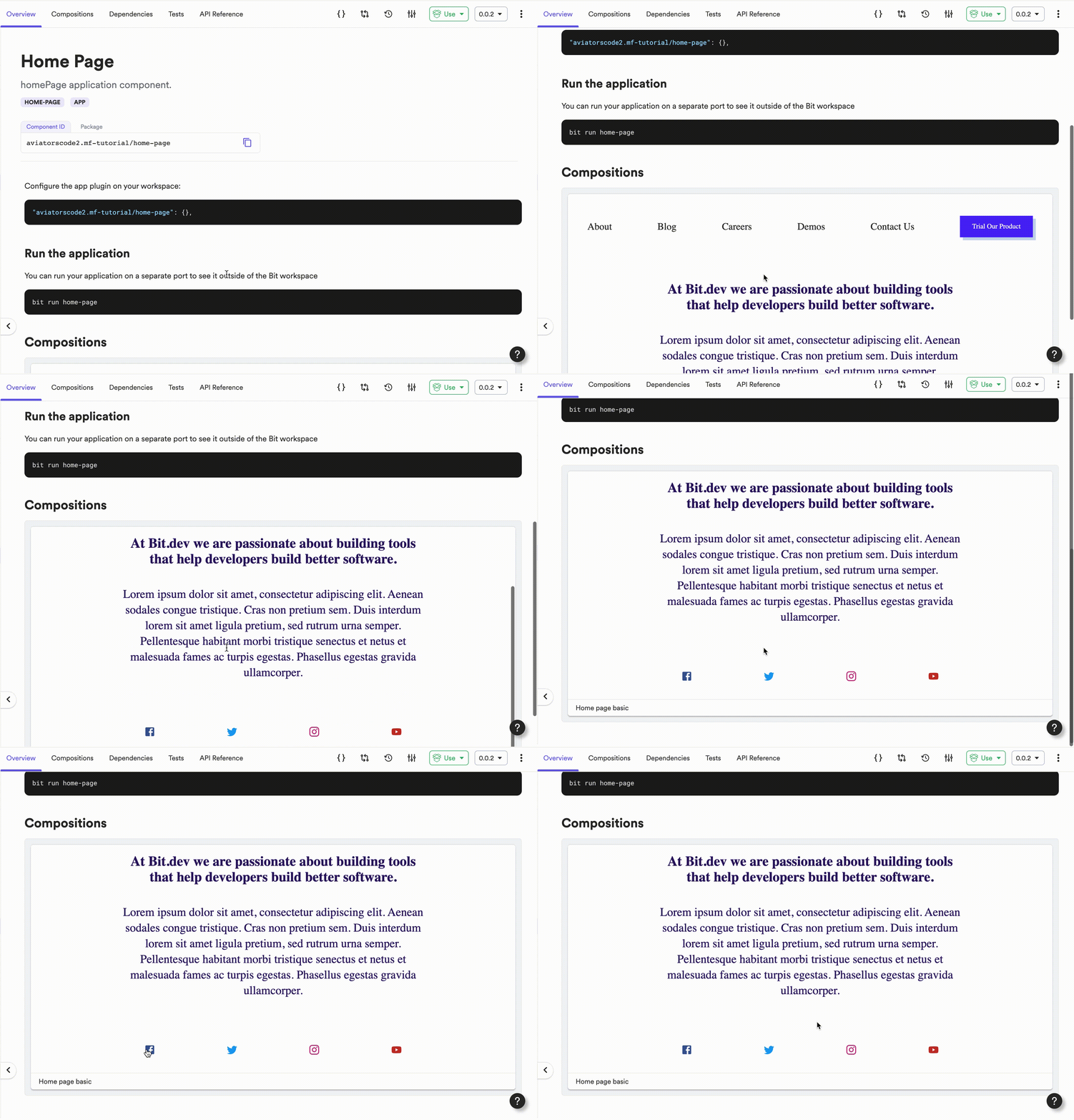
When you check the home page component on Bit Cloud, you will notice that it has been bumped up, it is now working with the new release version of the footer component. To confirm, check the dependency graph of the home page component
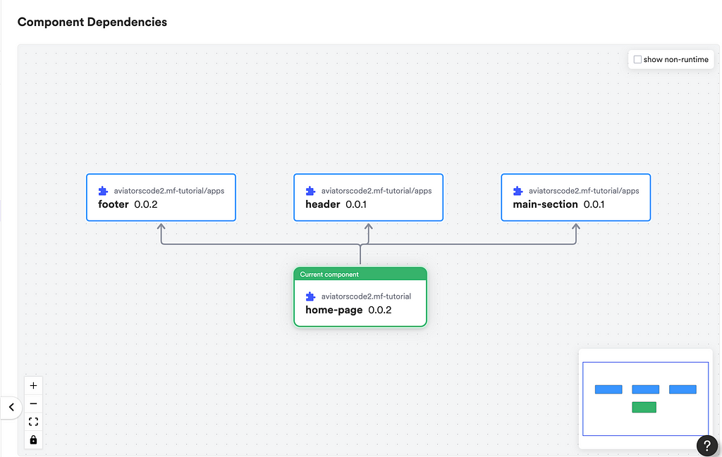
Notice that the footer and the home page component now have a new release version. When you also check the home page overview you will see the newly added social media icons on the home page.
If you ask me, I will say Bit has made using the micro-frontend architecture a lot easier and straightforward.
Conclusion
Through the course of this tutorial, you learnt the importance of going the micro-frontend route, and the benefits it has in your overall project performance. With the help of an example, you have also seen how Bit makes the process of leveraging this micro-frontend architecture easy for you.
You can also check out this video on composing micro-frontends to get more insight into this topic. To learn more about how Bit components can be leveraged in composing micro-frontends, here is a video:
Thank you for sticking to the end of this tutorial, if you find this useful you can leave a comment or perhaps if you have questions you can ask them also.
Leveraging Microfrontend Architecture Using Bit Components was originally published in Bits and Pieces on Medium, where people are continuing the conversation by highlighting and responding to this story.
This content originally appeared on Bits and Pieces - Medium and was authored by Victor Yakubu
Victor Yakubu | Sciencx (2023-02-01T08:02:29+00:00) Leveraging Microfrontend Architecture Using Bit Components. Retrieved from https://www.scien.cx/2023/02/01/leveraging-microfrontend-architecture-using-bit-components/
Please log in to upload a file.
There are no updates yet.
Click the Upload button above to add an update.
