This content originally appeared on Bits and Pieces - Medium and was authored by Poorna Theekshana
EM vs. PX vs. PT vs. CM vs. IN vs. REM
CSS (Cascading Style Sheets) is a well-known styling language used to style web pages written in markup languages. It allows developers to design gorgeous web pages by including colors, margins, fonts, and many other styles.
One of the most challenging parts of using CSS is defining the lengths, heights, and sizes of HTML elements and CSS properties since many units (EM, PX, PT, CM, IN, REM) are available. Unfortunately, most developers do not properly understand the differences between these units and often end up using the wrong unit for the wrong place.
So, in this article, I will compare and contrast some of the most used CSS length units to give you a better understanding.
Categories of CSS Length Units
CSS length units are used to set the size of a property for an element or its content. For example, if you wanted to change a paragraph’s property margin, you would give it a specific value.
p {
  margin: 50px;
}
Here, the margin is the property, 50 is the value, and px is the unit. Similarly, different length units are available to suit each purpose.
These length units can be classified into two categories.
- Absolute units
- Relative units
Absolute Length Units
The parent element or window size does not impact the size of “absolute” units. This means a property set with an absolute unit value will have that size, whether viewed on a small screen or a large one.
Absolute units can be useful while working on a project where responsiveness is not considered. For example, you can use absolute units for desktop applications that cannot be resized.
Relative Length Units
Relative length units are relative to another value, such as the font size of the parent element or the viewport size. Using relative units, you can resize the elements or properties according to other elements on the page.
Relative units can typically be set as the default for responsive websites. By doing this, you can avoid having to update styles to adapt to various screen sizes. However, relative units can be trickier when deciding which to use than absolute ones.
Have you considered how use of different units throughout your application can impact on the consistency of your designs? Building a theme for your application can be a great way to consolidate all of your CSS properties into a single component that you can theme your application with.
Theming in Components with React and Bit
Different Types of CSS Length Units
The most useful length units (from both unit categories) for web development are explained below.
1. EM
The em is a relative length unit widely used to define font sizes. When you define a font size using em, it will be relative to the font size of the parent element.
For example, assume you have 3 nested elements, and font sizes are defined using em. There, you will notice that after the length sizes are given to the parent (most outer) element, the font sizes of other elements change relative to the first element.
<!--em.html-->
<!DOCTYPE html>
<html lang="en">
<head>
  <meta charset="UTF-8">
  <meta http-equiv="X-UA-Compatible" content="IE=edge">
  <meta name="viewport" content="width=device-width, initial-scale=1.0">
  <title>em Example</title>
  <link rel="stylesheet" href="em.css">
</head>
<body
  <div id="parent" class="parent">
    Parent
    <div id="outerChild" class="child">
      Outer child
      <div id="innerChild" class="child">
        Inner child
      </div>
    </div>
  </div>
</body>
</html>

/*em.css*/
.parent {
  font-size: 5em;
}

.child {
  font-size: 2em;
}
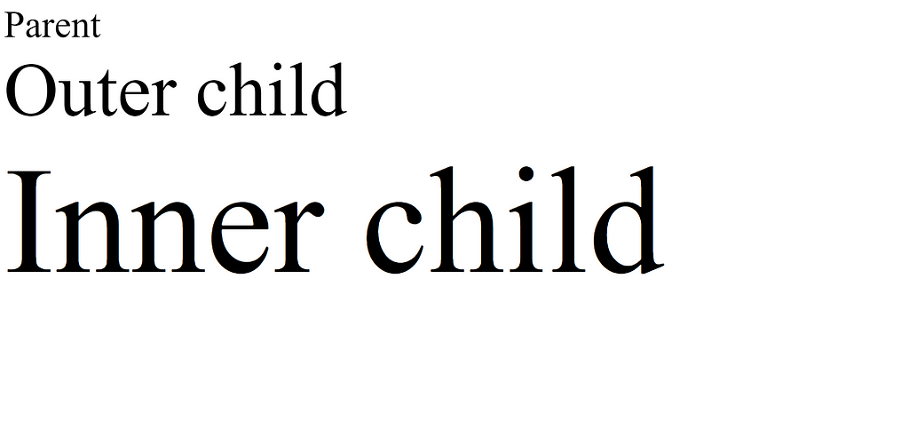
In the above example, the parent font value is set as 5em and both child font values are set as 2em. But in the sample output, you can see the inner child and outer child sizes are different even if the same values are applied. The reason for this behavior is the relative nature of the em length unit.
You can test the above example with different configurations using StackBlitz.
2. PX (Pixels)
px is the most used CSS length unit. All the other absolute length units are defined using pixels. For example, a 1-inch length unit is equal to 96 pixels. Furthermore, most modern displays operate using pixel length values. So, the pixel length values can be used when some content needs to be adjusted according to a specific display size.
The most common usage of pixels is to set the width and height of HTML elements like images.
<!--px.html-->
<!DOCTYPE html>
<html lang="en">
<head>
    <meta charset="UTF-8">
    <meta http-equiv="X-UA-Compatible" content="IE=edge">
    <meta name="viewport" content="width=device-width, initial-scale=1.0">
    <title>px Example</title>
    <link rel="stylesheet" href="px.css">
</head>
<body class="body"><div class="box"></div>
</body>
</html>

/*px.css*/
.body {
  border-radius: 1pt;
  border-color: black;
  border-style: solid;
  height: 400px;
}

.box {
  height: 200px;
  width: 200px;
  background: #000000;
}
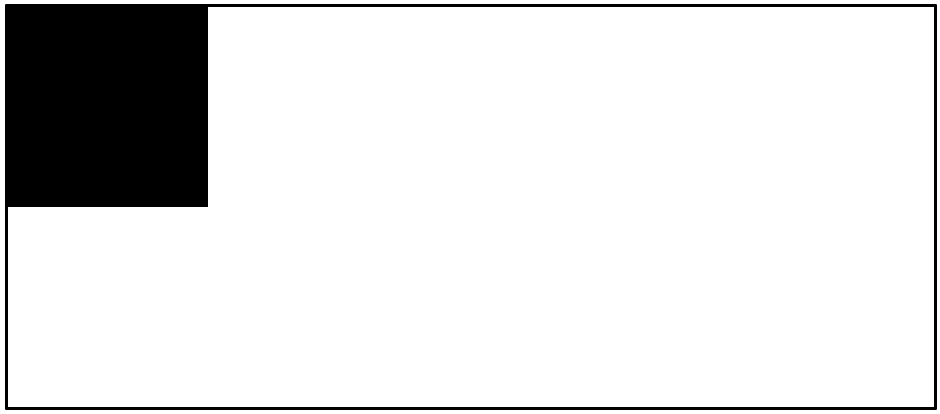
The above example shows a box set up using pixel values. This box is not changing according to the type of display because this box was created using fixed lengths.
3. PT (Points)
pt is an absolute length unit. However, it is not recommended for display screens and is widely used in printing materials to precisely define the sizes you need.
<!--pt.html-->
<!DOCTYPE html>
<html lang="en">
<head>
    <meta charset="UTF-8">
    <meta http-equiv="X-UA-Compatible" content="IE=edge">
    <meta name="viewport" content="width=device-width, initial-scale=1.0">
    <title>pt Example</title>
    <link rel="stylesheet" href="pt.css">
</head>
<body class="body">
    <div class="box"></span><span></div>
</body>
</html>

/*pt.css*/
.body {
  border-radius: 1px;
  border-color: black;
  border-style: solid;
  height: 400px;
}

.box {
  height: 200pt;
  width: 200pt;
  background: #000000;
}

4. CM (Centimeters)
Centimeter is another absolute length unit, similar to the pt. Although it is commonly used in real life, it is less often used in web development. Similar to points, the centimeter length unit is not recommended for display screens but also for printing equipment like printers.
<!--cm.html-->
<!DOCTYPE html>
<html lang="en">
<head>
    <meta charset="UTF-8">
    <meta http-equiv="X-UA-Compatible" content="IE=edge">
    <meta name="viewport" content="width=device-width, initial-scale=1.0">
    <title>cm Example</title>
    <link rel="stylesheet" href="cm.css">
</head>
<body>
    <div class="box"></span><span></div>
</body>
</html>

/*cm.css*/
.body {
  border-radius: 1px;
  border-color: black;
  border-style: solid;
  height: 400px;
}

.box {
  height: 15cm;
  width: 15cm;
  background: #000000;
}

As you can see, the box height exceeded the body height since it is not relative to the height of the body element.
5. IN (Inches)
Inches are also an absolute length unit, and it has the same behavior as cm. 1 inch is equivalent to 96 pixels, and these units can be used together.
1in = 96px
1in = 2.54cm
You can use in to define sizes like the below:
<!--in.html-->
<!DOCTYPE html>
<html lang="en">
<head>
    <meta charset="UTF-8">
    <meta http-equiv="X-UA-Compatible" content="IE=edge">
    <meta name="viewport" content="width=device-width, initial-scale=1.0">
    <title>in Example</title>
    <link rel="stylesheet" href="in.css">
</head>
<body>
    <div class="box"></span><span></div>
</body>
</html>

/*in.css*/
.body {
  border-radius: 1px;
  border-color: black;
  border-style: solid;
  height: 400px;
}

.box {
  height: 5in;
  width: 5in;
  background: #000000;
}

6. REM
rem is a relative length unit the same as em. It is based on the root element's font size. Usually, the default font size in most browsers is 16px. So, if you do not define a root element font size, the default browser font size will be considered the root elements font size. Hence, 16px is equal to 1rem in most cases.
The following example shows how to change the font size of a child element relative to its parent’s font size with rem.
<!--rem.html-->
<!DOCTYPE html>
<html lang="en">
<head>
  <meta charset="UTF-8">
  <meta http-equiv="X-UA-Compatible" content="IE=edge">
  <meta name="viewport" content="width=device-width, initial-scale=1.0">
  <title>rem Example</title>
  <link rel="stylesheet" href="rem.css">
</head>
<body
  <div id="parent" class="parent">
    Parent
    <div id="outerChild" class="child">
      Outer child
      <div id="innerChild" class="child">
        Inner child
      </div>
    </div>
  </div>
</body>
</html>

/*rem.css*/
.parent {
  font-size: 5rem;
}

.child {
  font-size: 2rem;
}

As you can see, the font size of both inner elements is the same since they are only relative to the root element’s font size.
You can find a working example of the above code in StackBlitz.
Conclusion
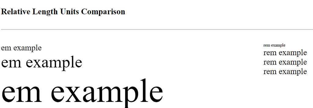
In this article, I discussed 6 different relative and absolute length units used in CSS with their specific use cases. The below image shows a general comparison of all the length units discussed, and you can find the working code in StackBlitz to do your own experiments.

I hope this article will help you to select the most suitable length unit for your project. Thank you for reading.
Build apps with reusable components like Lego

Bit’s open-source tool help 250,000+ devs to build apps with components.
Turn any UI, feature, or page into a reusable component — and share it across your applications. It’s easier to collaborate and build faster.
Split apps into components to make app development easier, and enjoy the best experience for the workflows you want:
→ Micro-Frontends
→ Design System
→ Code-Sharing and reuse
→ Monorepo
Learn more
- How We Build Micro Frontends
- How we Build a Component Design System
- Bit - Component driven development
- 5 Ways to Build a React Monorepo
- How to Create a Composable React App with Bit
Different CSS Units for Expressing Length: EM, PX, PT, CM, IN, REM was originally published in Bits and Pieces on Medium, where people are continuing the conversation by highlighting and responding to this story.
This content originally appeared on Bits and Pieces - Medium and was authored by Poorna Theekshana
Poorna Theekshana | Sciencx (2023-02-07T07:32:29+00:00) Different CSS Units for Expressing Length: EM, PX, PT, CM, IN, REM. Retrieved from https://www.scien.cx/2023/02/07/different-css-units-for-expressing-length-em-px-pt-cm-in-rem/
Please log in to upload a file.
There are no updates yet.
Click the Upload button above to add an update.
