Build a Landing Page Using the Most Used Pseudo-classes and Pseudo-elements in CSS

Why and how you should use Pseudo-classes and Pseudo-elements in CSS

Photo by Simon Berger on Unsplash

CSS styling is an essential part of creating an attractive and user-friendly website. One of the most powerful tools we have at our disposal are pseudo-classes and pseudo-elements.

This time, we are going to explore the importance of using these tools in CSS to improve the interaction and accessibility of our websites, as well as to give them a more sophisticated and professional look.

Pseudo-elements

These are elements that can be added to an HTML element to give it additional style or functionality.

They are called “pseudo” because they are not actual HTML elements, but are “simulated” by special syntax in CSS.

Here you can learn all about pseudo-elements.

Peseudo-classes

These are keywords added to selectors that specify a special state of the selected element. These special states can include user actions such as hovering over an element or having an active element.

Here you can learn all about pseudo-classes.

Why use pseudo-elements and pseudo-classes?

In some cases, you might be tempted to create new HTML elements to add additional styles or functionality to your page. However, there are several reasons why you should consider using pseudo elements instead of creating new elements.

Here are some reasons why you should consider using pseudo-elements and pseudo-classes in your projects:

  • They allow you to add styles to specific parts of an HTML element, such as the first or last paragraph of a div, or the first or last child of an element. This can be useful to give a distinctive style to specific elements of your page.
  • Allow you to add additional elements: Pseudo elements allow you to add additional elements to your page, such as a custom list marker or a separator line. This allows you to expand the design possibilities of your page.
  • You avoid increasing the complexity of the HTML: By using pseudo elements, you don’t have to add new elements to the HTML of your page. This allows you to keep the HTML cleaner and simpler, which makes it easier to maintain and debug the page.
  • By using CSS pseudo-classes in conjunction with media queries, you can create React components with adaptive styles and dynamic behavior, which can be easily reused (with an open-source toolchain like Bit) to meet the needs of different projects and users.
  • Using CSS pseudo-classes and media queries, you can create modular, responsive components for more consistent and reusable user experience across devices and contexts. You can then use a tool like Bit to extract these components, version them, and use them in any other project with a simple npm install.

The most used Pseudo-classes in CSS

  • :active It is applied to an element while the user is pressing the mouse button or finger on it.
<ul>
<li><a href="#">Home</a></li>
<li><a href="#">About Us</a></li>
<li><a href="#">Contact Us</a></li>
</ul>
nav a:active {
background-color: #6a82fb;
}
  • :hover It is applied to an element when the user hovers over it with the mouse cursor.
<ul>
<li><a href="#">Home</a></li>
<li><a href="#">About Us</a></li>
<li><a href="#">Contact Us</a></li>
</ul>
nav a:hover {
color: #333;
background-color: #fc5c7d;
}
  • :focus It is applied to an element when it has the focus, that is, when the user is interacting with it using the keyboard.
<input type="email" id="email" required placeholder="Email" />
input:focus {
background-color: #111;
}
  • :visited It is applied to a visited link.
<footer>
<ul>
<li><a href="/" class="link">Link 1</a></li>
<li><a href="#" class="link">Link 2</a></li>
<li><a href="/" class="link">Link 3</a></li>
</ul>
</footer>
footer .link:visited {
color: #444;
}
  • :first-child and :last-child It applies to the first and last child element respectively of a specific element.
<ol>
<li>Lorem ipsum dolor sit amet, consectetur adipiscing.</li>
</ol>
ol li:first-child {
font-weight: bold;
}
ol li:last-child {
text-decoration: underline;
}
  • :not(selector) It applies to all items that do not match the specified selector.
<footer>
<ul>
<li><a href="/" class="link">Link 1</a></li>
<li><a href="#" class="link">Link 2</a></li>
<li><a href="/" class="link">Link 3</a></li>
</ul>
</footer>
footer ul li:not(:nth-child(3)) {
font-weight: normal;
}
  • :enabled and :disabled It applies to the input type element that is enabled and to an element that is disabled respectively.
<form>
<button type="submit" disabled>Subscribe</button>h
</form>
<form>
<button type="submit" enabled>Subscribe</button>h
</form>
form button:enabled {
background-color: #6a82fb;
color: white;
padding: 10px 20px;
border: none;
}
form button:disabled {
background-color: #ccc;
color: #666;
padding: 10px 20px;
border: none;
}
  • :checked It applies to a selected form element.
<form>
<div id="radio-group">
<input type="radio" class="radio" id="radio1" />
<label for="radio1">I agree</label>
  <input type="radio" class="radio" id="radio2" />
<label for="radio2">I desagree</label>
</div>
</form>
.radio:checked {
accent-color: #6a82fb;
}
  • :valid and :invalid It applies to the input type element when the value entered is valid or invalid respectively.
<form>
<input type="email" id="email" required placeholder="Email" />
</form>
input:valid {
border: 2px solid green;
}
input:invalid {
border: 2px solid red;
}

The most used Pseudo-elements in CSS

  • :before and :after to insert content before and after an element respectively.
<section id="about-us">
<h2>About Us</h2>
<section>
<section id="services">
<h2>Services</h2>
</section>
#about-us h2::before {
content: "😀";
}
#services h2::after {
content: "👀";
}

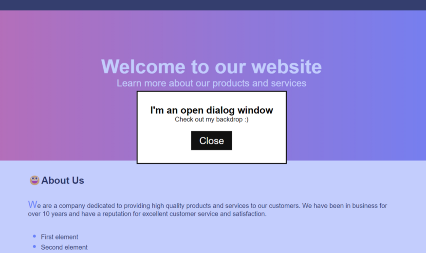
2 — ::backdrop It applies styles to a background behind a specific element to give it more importance or emphasis.

<dialog>
<h2>I'm an open dialog window</h2>
<p>Check out my backdrop :)</p>
<button class="btn" onclick="closeDialog()">Close</button>
</dialog>
dialog::backdrop {
background-color: rgba(106, 130, 251, 0.4);
}

3 — ::first-letter It applies styles to the first letter of a paragraph.

<section id="about-us">
<h2>About Us</h2>
<p>
We are a company dedicated to providing high quality products and services to our customers. We have been in
business for over 10 years and have a reputation for excellent customer service and satisfaction.
</p>
</section>
#about-us p::first-letter {
font-size: 150%;
color: #6a82fb;
}

4 — ::placeholder It applies styles to temporary text in an input element.

<form>
<input type="email" id="email" required placeholder="Email" />
</form>
input#email::placeholder {
color: #fc5c7d;
}

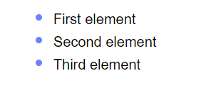
5 — ::marker It applies styles to the markers of a list item.

<section id="about-us">
<li>First element</li>
<li>Second element</li>
<li>Third element</li>
</ul>
</section>
#about-us ul li::marker {
color: #6a82fb;
font-size: 1.5em;
}

Putting it all together

https://medium.com/media/3a57f59cc5fa4ce19cf476e030e385df/href

Conclusion

In summary, pseudoclasses are an essential tool for web developers, as they allow us to create interactions and dynamic visual effects on web pages, improving the user experience and making the page more attractive and easy to use.

It is important to keep in mind that some pseudoclasses are more compatible in specific browsers, so it is always advisable to check compatibility before using them in a project.

Read more:

Add Artistic Effects to Your Images with React and the CSS Filter Property

Build Apps with reusable components, just like Lego

Bit’s open-source tool help 250,000+ devs to build apps with components.

Turn any UI, feature, or page into a reusable component — and share it across your applications. It’s easier to collaborate and build faster.

Learn more

Split apps into components to make app development easier, and enjoy the best experience for the workflows you want:

Micro-Frontends

Design System

Code-Sharing and reuse

Monorepo

Learn more


Build a Landing Page Using the Most Used Pseudo-classes and Pseudo-elements in CSS was originally published in Bits and Pieces on Medium, where people are continuing the conversation by highlighting and responding to this story.


This content originally appeared on Bits and Pieces - Medium and was authored by L Javier Tovar

Why and how you should use Pseudo-classes and Pseudo-elements in CSS

Photo by Simon Berger on Unsplash

CSS styling is an essential part of creating an attractive and user-friendly website. One of the most powerful tools we have at our disposal are pseudo-classes and pseudo-elements.

This time, we are going to explore the importance of using these tools in CSS to improve the interaction and accessibility of our websites, as well as to give them a more sophisticated and professional look.

Pseudo-elements

These are elements that can be added to an HTML element to give it additional style or functionality.

They are called “pseudo” because they are not actual HTML elements, but are “simulated” by special syntax in CSS.

Here you can learn all about pseudo-elements.

Peseudo-classes

These are keywords added to selectors that specify a special state of the selected element. These special states can include user actions such as hovering over an element or having an active element.

Here you can learn all about pseudo-classes.

Why use pseudo-elements and pseudo-classes?

In some cases, you might be tempted to create new HTML elements to add additional styles or functionality to your page. However, there are several reasons why you should consider using pseudo elements instead of creating new elements.

Here are some reasons why you should consider using pseudo-elements and pseudo-classes in your projects:

  • They allow you to add styles to specific parts of an HTML element, such as the first or last paragraph of a div, or the first or last child of an element. This can be useful to give a distinctive style to specific elements of your page.
  • Allow you to add additional elements: Pseudo elements allow you to add additional elements to your page, such as a custom list marker or a separator line. This allows you to expand the design possibilities of your page.
  • You avoid increasing the complexity of the HTML: By using pseudo elements, you don’t have to add new elements to the HTML of your page. This allows you to keep the HTML cleaner and simpler, which makes it easier to maintain and debug the page.
  • By using CSS pseudo-classes in conjunction with media queries, you can create React components with adaptive styles and dynamic behavior, which can be easily reused (with an open-source toolchain like Bit) to meet the needs of different projects and users.
  • Using CSS pseudo-classes and media queries, you can create modular, responsive components for more consistent and reusable user experience across devices and contexts. You can then use a tool like Bit to extract these components, version them, and use them in any other project with a simple npm install.

The most used Pseudo-classes in CSS

  • :active It is applied to an element while the user is pressing the mouse button or finger on it.
<ul>
<li><a href="#">Home</a></li>
<li><a href="#">About Us</a></li>
<li><a href="#">Contact Us</a></li>
</ul>
nav a:active {
background-color: #6a82fb;
}
  • :hover It is applied to an element when the user hovers over it with the mouse cursor.
<ul>
<li><a href="#">Home</a></li>
<li><a href="#">About Us</a></li>
<li><a href="#">Contact Us</a></li>
</ul>
nav a:hover {
color: #333;
background-color: #fc5c7d;
}
  • :focus It is applied to an element when it has the focus, that is, when the user is interacting with it using the keyboard.
<input type="email" id="email" required placeholder="Email" />
input:focus {
background-color: #111;
}
  • :visited It is applied to a visited link.
<footer>
<ul>
<li><a href="/" class="link">Link 1</a></li>
<li><a href="#" class="link">Link 2</a></li>
<li><a href="/" class="link">Link 3</a></li>
</ul>
</footer>
footer .link:visited {
color: #444;
}
  • :first-child and :last-child It applies to the first and last child element respectively of a specific element.
<ol>
<li>Lorem ipsum dolor sit amet, consectetur adipiscing.</li>
</ol>
ol li:first-child {
font-weight: bold;
}
ol li:last-child {
text-decoration: underline;
}
  • :not(selector) It applies to all items that do not match the specified selector.
<footer>
<ul>
<li><a href="/" class="link">Link 1</a></li>
<li><a href="#" class="link">Link 2</a></li>
<li><a href="/" class="link">Link 3</a></li>
</ul>
</footer>
footer ul li:not(:nth-child(3)) {
font-weight: normal;
}
  • :enabled and :disabled It applies to the input type element that is enabled and to an element that is disabled respectively.
<form>
<button type="submit" disabled>Subscribe</button>h
</form>
<form>
<button type="submit" enabled>Subscribe</button>h
</form>
form button:enabled {
background-color: #6a82fb;
color: white;
padding: 10px 20px;
border: none;
}
form button:disabled {
background-color: #ccc;
color: #666;
padding: 10px 20px;
border: none;
}
  • :checked It applies to a selected form element.
<form>
<div id="radio-group">
<input type="radio" class="radio" id="radio1" />
<label for="radio1">I agree</label>
  <input type="radio" class="radio" id="radio2" />
<label for="radio2">I desagree</label>
</div>
</form>
.radio:checked {
accent-color: #6a82fb;
}
  • :valid and :invalid It applies to the input type element when the value entered is valid or invalid respectively.
<form>
<input type="email" id="email" required placeholder="Email" />
</form>
input:valid {
border: 2px solid green;
}
input:invalid {
border: 2px solid red;
}

The most used Pseudo-elements in CSS

  • :before and :after to insert content before and after an element respectively.
<section id="about-us">
<h2>About Us</h2>
<section>
<section id="services">
<h2>Services</h2>
</section>
#about-us h2::before {
content: "😀";
}
#services h2::after {
content: "👀";
}

2 — ::backdrop It applies styles to a background behind a specific element to give it more importance or emphasis.

<dialog>
<h2>I'm an open dialog window</h2>
<p>Check out my backdrop :)</p>
<button class="btn" onclick="closeDialog()">Close</button>
</dialog>
dialog::backdrop {
background-color: rgba(106, 130, 251, 0.4);
}
3 — ::first-letter It applies styles to the first letter of a paragraph.

<section id="about-us">
<h2>About Us</h2>
<p>
We are a company dedicated to providing high quality products and services to our customers. We have been in
business for over 10 years and have a reputation for excellent customer service and satisfaction.
</p>
</section>
#about-us p::first-letter {
font-size: 150%;
color: #6a82fb;
}

4 — ::placeholder It applies styles to temporary text in an input element.

<form>
<input type="email" id="email" required placeholder="Email" />
</form>
input#email::placeholder {
color: #fc5c7d;
}

5 — ::marker It applies styles to the markers of a list item.

<section id="about-us">
<li>First element</li>
<li>Second element</li>
<li>Third element</li>
</ul>
</section>
#about-us ul li::marker {
color: #6a82fb;
font-size: 1.5em;
}
Putting it all together

Conclusion

In summary, pseudoclasses are an essential tool for web developers, as they allow us to create interactions and dynamic visual effects on web pages, improving the user experience and making the page more attractive and easy to use.

It is important to keep in mind that some pseudoclasses are more compatible in specific browsers, so it is always advisable to check compatibility before using them in a project.

Read more:

Add Artistic Effects to Your Images with React and the CSS Filter Property

Build Apps with reusable components, just like Lego
Bit’s open-source tool help 250,000+ devs to build apps with components.

Turn any UI, feature, or page into a reusable component — and share it across your applications. It’s easier to collaborate and build faster.

Learn more

Split apps into components to make app development easier, and enjoy the best experience for the workflows you want:

Micro-Frontends

Design System

Code-Sharing and reuse

Monorepo

Learn more


Build a Landing Page Using the Most Used Pseudo-classes and Pseudo-elements in CSS was originally published in Bits and Pieces on Medium, where people are continuing the conversation by highlighting and responding to this story.


This content originally appeared on Bits and Pieces - Medium and was authored by L Javier Tovar


Print Share Comment Cite Upload Translate Updates
APA

L Javier Tovar | Sciencx (2023-02-12T08:01:27+00:00) Build a Landing Page Using the Most Used Pseudo-classes and Pseudo-elements in CSS. Retrieved from https://www.scien.cx/2023/02/12/build-a-landing-page-using-the-most-used-pseudo-classes-and-pseudo-elements-in-css/

MLA
" » Build a Landing Page Using the Most Used Pseudo-classes and Pseudo-elements in CSS." L Javier Tovar | Sciencx - Sunday February 12, 2023, https://www.scien.cx/2023/02/12/build-a-landing-page-using-the-most-used-pseudo-classes-and-pseudo-elements-in-css/
HARVARD
L Javier Tovar | Sciencx Sunday February 12, 2023 » Build a Landing Page Using the Most Used Pseudo-classes and Pseudo-elements in CSS., viewed ,<https://www.scien.cx/2023/02/12/build-a-landing-page-using-the-most-used-pseudo-classes-and-pseudo-elements-in-css/>
VANCOUVER
L Javier Tovar | Sciencx - » Build a Landing Page Using the Most Used Pseudo-classes and Pseudo-elements in CSS. [Internet]. [Accessed ]. Available from: https://www.scien.cx/2023/02/12/build-a-landing-page-using-the-most-used-pseudo-classes-and-pseudo-elements-in-css/
CHICAGO
" » Build a Landing Page Using the Most Used Pseudo-classes and Pseudo-elements in CSS." L Javier Tovar | Sciencx - Accessed . https://www.scien.cx/2023/02/12/build-a-landing-page-using-the-most-used-pseudo-classes-and-pseudo-elements-in-css/
IEEE
" » Build a Landing Page Using the Most Used Pseudo-classes and Pseudo-elements in CSS." L Javier Tovar | Sciencx [Online]. Available: https://www.scien.cx/2023/02/12/build-a-landing-page-using-the-most-used-pseudo-classes-and-pseudo-elements-in-css/. [Accessed: ]
rf:citation
» Build a Landing Page Using the Most Used Pseudo-classes and Pseudo-elements in CSS | L Javier Tovar | Sciencx | https://www.scien.cx/2023/02/12/build-a-landing-page-using-the-most-used-pseudo-classes-and-pseudo-elements-in-css/ |

Please log in to upload a file.


There are no updates yet.
Click the Upload button above to add an update.

You must be logged in to translate posts. Please log in or register.