This content originally appeared on Telerik Blogs and was authored by Peter Vogel
When it comes to filtering data, the Telerik UI for ASP.NET MVC Grid gives the user tremendous power—it can, in fact, be a little intimidating. Here’s how to configure the grid to meet your user’s needs.
With a grid of any length, if users don’t have the ability to filter the items down to the one they’re actually interested in … well, then, your page is going to fail. A grid displaying more than a half dozen items is only useful if it lets users find the items they need.
The thing is, if the Progress Telerik UI for ASP.NET MVC Grid has any failing, it’s that its filtering options provide so much functionality that it’s a little intimidating to users.
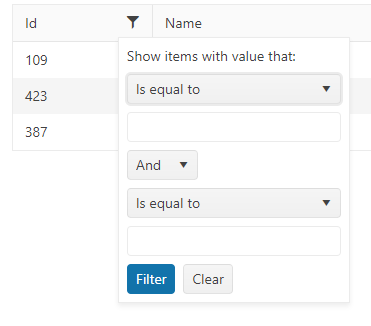
More specifically, while providing every filtering option your user’s might need, the default settings don’t focus on what your users need in this UI. Fortunately, the Grid comes with all the options you need to create a filtering experience focused on your users’ actual needs.
By the way, calling this component the “ASP.NET MVC Grid” is a bit of a misnomer—the Grid works as well in Razor Pages as it does in MVC Views. Here’s the markup for a grid added to an application’s default Index.cshtml Razor Page, for example (and it’s almost identical to what you’d use in an MVC View):
<kendo-grid name="products">
    <datasource name="productsDS" type="DataSourceTagHelperType.Ajax">
        <transport>
            <read url='@Url.Page("/Index","Read")' data="dataFunction" />
        </transport>
        <schema>
            <model>
                <fields>
                    <field name="TotalQuantity" type="number"></field>
                    <field name="LastDelivery" type="date"></field>
                    <field name="InStock" type="boolean"></field>
                </fields>
            </model>
        </schema>
    </datasource>
    <columns>
        <column field="ProductId" title="Id" width="100" />
        <column field="ProductName" title="Name" width="240"/>
        <column field="LastDelivery" format="{0:MMM-dd}" title="Last Delivery" width="150" />
        <column field="InStock" title="In Stock" width="150" />
        <column field="TotalQuantity" title="Quantity on Hand" width="150" />
    </columns>
    <filterable enabled="true" mode="row" />
</kendo-grid>
From the filtering point of view, the interesting element in that markup is the last one: The filterable element which configures all the column’s filter menus into something a little more user friendly by setting the Grid’s filter mode to “row.”
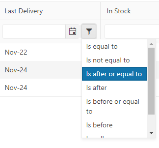
While the filterable element is your first step in customizing the Grid’s filtering functionality, the other sections in the Grid’s markup are also important when customizing the Grid’s filtering capabilities.
datasource
The read element inside the transport element specifies where the data is to be fetched from after the Grid is downloaded to the browser. The transport element also supports update/delete/insert requests so all its calls are sent to the data source as POST requests.
This is also the only area that reflects that the Grid is on a Razor Page. I’m setting the read option to a URL that points to a handler method in a Razor Page, using Url.Page (I just have to pass the page name and the handler name).
schema
This element lets you specify the data type for the properties of the complex object that your grid is listing (in my case, that’s a Product object). By default, all of the object’s properties are assumed to be of type string so I only have to provide types for those properties that aren’t string: TotalQuantity (a number), LastDelivery (a date) and InStock (a Boolean).
columns
This element defines the columns in the Grid, specifying the property on the object to be displayed and some additional options (e.g., the title for the column, a format string for the data, and so on). While your Grid is displaying an object, filtering is organized around the Grid’s columns.
Code
For the record, here’s the C# code from my page’s code-behind file. The OnGet method is automatically called when the page is first requested and loads a collection of Product objects named ps.
The OnPostRead method called when the grid is displayed in the browser, using that URL I set up in the grid’s transport section. Since the Grid’s calls are always POST requests and I specified my handler name as “Read,” my method has to be called OnPostRead.
The example returns the JSON result of converting my ps List into something the grid can use:
public class IndexModel : PageModel
{
   public static IList<Product> ps;

   public async void OnGet()
   {
      if ( ps == null)
      {
          ProductRepo pr = new ProductRepo();
          ps = await pr.GetAllAsync();
      }
   }

   public JsonResult OnPostRead([DataSourceRequest] DataSourceRequest request)
   {
          return new JsonResult(ps.ToDataSourceResult(request));
   }
}
By the way, I could have set my grid up to call any web service I wanted, but I like the way Razor Pages bundles everything up into a single package. I could also just as easily be using an Entity Framework context and table to build my grid’s list of objects.
Configuring Filtering
If the first step in customizing filtering is adding the filterable element, the second step is specifying the data types in the schema section.
Because I’ve declared my LastDelivery property as a date in my schema section, the Grid provides a calendar control on the LastDelivery column to let the user select the data to filter on. Similarly, by declaring my InStock property as a Boolean, the user gets two radio buttons at the top of the InStock column to use to filter rows. And, finally, because my TotalQuantity is flagged as a number, that column gets a spinner for selecting numeric values.

Thanks to my schema settings, even the filter menus on each column that pick the comparison operators are configured to match the data type of the property the column is displaying:

By default, the grid does all its filtering on the server. That can be great if you want to ensure you’re your users are always looking at the most recent data or if you want to take advantage of faster processing on your server. However, in my example, because I’m caching data after my initial get and have only a small number of products to display, I don’t need the additional power of server-side filtering.
It makes sense, then, in this example to turn off server-side filtering (other than the initial data fetch) and eliminate repeated trips to the server when the user filters the grid rows. That will not only give my user a better/faster experience, it also reduces demand on my server-side resources. To implement client-side filtering, I just need to add the server-operation attribute to my grid’s datasource tag and set it to false:
<datasource type="DataSourceTagHelperType.Ajax" server-operation="false">
Focusing on the User’s Needs
Even with these changes, you may be giving your users more filtering power they need or want. Often all the user wants to do is find the rows whose columns match specific values (this is especially true with columns containing string values). If that’s the case, this UI may make more sense:
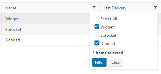
Implementing that filtering UI just requires two steps. First, you need to update the filterable element on your grid to use menu (rather than row) filtering:
<filterable enabled="true" mode="menu">
Second, you need to expand the column elements where you want to provide this simplified experience and give those columns their own filterable element. In those column’s filterable elements, you just need to set the filterable element’s multi property to true, like this:
<column field="ProductName" title="Name" width="240">
     <filterable multi="true"/>
</column>
Now, for most columns containing string data you’ve probably given the user the filtering experience they want. This does assume the column has a reasonable number of unique values so the list of options doesn’t, itself, become overwhelming. Making this change is also a good choice for Boolean column where the user will get, at most, a choice between three values (true, false, “is empty”) and will never have an overwhelming list of options.
Dealing with Dates and Numbers
For date and numeric columns, however, users probably want more options—they’ll want to not only filter by exact matches but also for rows with dates before or after some specific date, or for numbers greater than or less than some value.
You can configure the Grid to give this experience which is probably a better match to users’ needs:

To do that globally, you just need to set the grid’s filterable element’s extra attribute to false:
<filterable enabled="true" extra="false"/>
If doing that globally seems a little extreme to you, you can use each column’s filterable element to configure columns individually. This configuration, for example, turns back on the full, default filtering option for the LastDelivery column alone:
<column field="LastDelivery" format="{0:MMM-dd}" title="Last Delivery" width="150" >
     <filterable enabled="true" extra="true"/>
</column>
There’s a middle ground here, though, between the focused and the full filtering experience: By using the operators element, you can give the user just the comparison operators they need (and also configure the text displayed for each operator).
This example defines the LastDelivery date column as having three comparison operators—“Deliveries on” (equals), “Deliveries before” (less than) and “Deliveries after” (greater than):
<column field="LastDelivery" format="{0:MMM-dd}" title="Last Delivery" width="150" >
            <filterable extra="false" >
                <operators>
                    <date eq="Deliveries on"
                                gt="Deliveries after"
                                 lt="Deliveries before" />
                </operators>
            </filterable>
        </column>
Now the user gets a focused set of filtering options that reflect their needs:
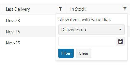
You also can configure comparison operators globally using the Grid’s filterable element instead of the column filterable element. This would allow you to configure the comparison operators for all your date columns, for example. You can also configure comparison operators for strings, numbers and enums using the corresponding elements inside the operators element. You could then use the column’s filterable element to override those settings on individual columns where necessary.
Configuring the Options List
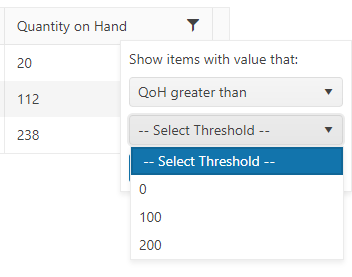
There’s one more step available to you to provide a more focused experience for your users: You can provide a customized list of options for the user to compare to. For example, in the Total Quantity column, users are probably just interested in comparing the quantity on hand (QoH) to specific thresholds. The typical question is probably something like: “Is the QoH greater than/less than 0, 100 or 200 items?”
The first step in providing a list of comparison values is to add the filter-ui-handler attribute to the column’s filterable element. This attribute needs to point to a JavaScript function in your page that will load your filter’s options list with values.
This example, in addition to specifying just the two comparison operators the user needs, references a function named quantityOptions that will build the list of QoH thresholds:
<column field="TotalQuantity" title="Quantity on Hand" width="150">
         <filterable enabled="true" extra="false" filter-ui-handler="quantityOptions">
                <operators>
                    <number gt="QoH greater than"
                                      lt="Qoh less than" />
                </operators>
          </filterable>
</column>
Your next step is to write that function. The function needs to accept a parameter (I’ve called it columnFilter) and I’ve added a Kendo UI dropdown list to that parameter. In that dropdown list’s transport section, I’ve set up a read operation, this time pointing at a handler method in my Razor Page named “Quantity.” Finally, using the dropdown lists’s optionLabel, I’ve specified an initial selection to display in the dropdown list:
function quantityOptions(columnFilter) {
        columnFilter.kendoDropDownList({
            dataSource: {
                transport: {
                    read: "@Url.Page("/Index","Quantity")"
                }
            },
            optionLabel: "-- Select Threshold --"
        });
    }
The last step is to create the corresponding method in my Razor Page’s code-behind file. The dropdown list only issues GET requests so I need to set up a method named “OnGet” + the handler name (“OnGetQuantity,” in my case). In that method, I just need to return a JSON formatted list of values to populate the dropdown list. As a result, my code looks like this:
public JsonResult OnGetQuantity([DataSourceRequest] DataSourceRequest request)
{
   List<int> qtys = new List<int> {0, 100, 200 };
   return new JsonResult(qtys.Select(e => e).Distinct());
}
And, now, the user gets this very customized (and focused) UI for filtering products based on their quantity on hand:
We measure a UI’s effectiveness by how well it supports your users’ needs. The Telerik UI for ASP.NET MVC Grid gives you all the tools you need to create a UI that really does work for your users.
Try Telerik UI for ASP.NET MVC Now
Deliver high-quality apps in the quickest timeframe using the 110+ ASP.NET MVC UI controls that cover any use-case scenario. Try it now free for 30 days.
This content originally appeared on Telerik Blogs and was authored by Peter Vogel
Peter Vogel | Sciencx (2023-02-15T15:12:17+00:00) Customizing Filtering in the Telerik UI for ASP.NET MVC Grid. Retrieved from https://www.scien.cx/2023/02/15/customizing-filtering-in-the-telerik-ui-for-asp-net-mvc-grid/
Please log in to upload a file.
There are no updates yet.
Click the Upload button above to add an update.
