This content originally appeared on DEV Community 👩💻👨💻 and was authored by Nicolas Frizzarin
Introduction
The way to think about the design of an application has never been simple.
How to correctly represent the information to the user? How to make the design pleasant and easy to use? How to adapt the interface to different sizes? are recurrent questions to ask when creating a user interface.
Over the years, technology has continued to progress, and the Desktop First design approach has been quickly replaced by a Mobile First approach.
In September 2020 Samsung released the very first foldable device: the Galaxy Fold. This release of a brand new type of screen once again upsets the design approach we had until then. Mobile First approach is not enough anymore, developers and designers will have to take into account a new type of screen.
The era of responsive design has evolved again.
So how to make our application responsive to this type of screen? How to take into account the different foldable screen layouts?
This article aims to answer these questions and give you the necessary information to create responsive design on foldable device.
Warning: the features described in this article are still experimental, may change in the future and are only available behind the flag: Experimental Web Platform features of chrome.
Posture of foldable device
There are several possible postures with foldable devices. These postures depend mainly on the angle of inclination.
Some examples to better understand:
- an angle of 0 corresponds to a closed device
- an angle of 140 corresponds to a laptop or book shaped device
- an angle of 185 corresponds to a fully open device
The javascript and css API's must therefore take all these variations but also future scenarios.
It's not to be neglected that tomorrow a device can be foldable on the horizontal axis and at the same time on the vertical axis.
Viewport segments
By default, if we don't take into account the possibility of having a device with two or more screens, the design of our application may be "broken".
But what does broken mean? Well, it can be broken like the site you are reading this article on.
This image illustrates very well the fact of having a broken design. This emulation was done on a duo surface. The fold of this device hides some words, letters etc.
To solve this problem and tell to the browser where to placed the elements, a new media query is available: viewport-segments
This media query is declined in two ways:
- horizontal-viewport-segments
- vertical-viewport-segments
Why two varieties? Well, simply because your device can be oriented in two different ways:
- portrait
- landscape
If the device is oriented in landscape mode, this naturally means that the device have 1 or more screens on the horizontal axis. The media query to use will be the one associated with the horizontal axis.
@media(horizontal-viewports-segments /**number of screen**/){}
If the device is oriented in portrait mode, as opposed to landscape mode, the device have 1 or more screens on the vertical axis. The media query to use will be the one associated to the vertical axis.
@media(vertical-viewports-segments /**number of screen**/){}
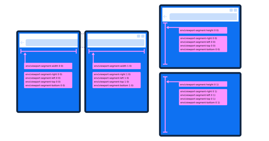
An example in image will be more telling.
In the case of a duo surface, if the device is oriented in landscape mode, the media query will be written as follows:
@media(horizontal-viewport-segments 2) {}
Conversely, if the duo surface is oriented in portrait mode, then the media query will be written in this way:
@media(vertical-viewport-segments 2) {}
In itself the media query viewport-segments does not help to design the application. This media is used to identify the number of screens on which the application will be displayed.
To be able to correctly place the different design elements of our application around the "fold", six new environment variables have been created.
Environments variable
Environment variables in CSS allow you to factor awkward device intrusions into your styles.
Let's take the example of iphones from version X. All these phones have a notch which can break the design of your application.
To place correctly the elements around this notch, environment variables have been created. This is the case for example of the environment variable safe-area-inset-top.
In the case of foldables devices 6 new environment variables appear:
- viewport-segment-width
- viewport-segment-height
- viewport-segment-top
- viewport-segment-right
- viewport-segment-bottom
- viewport-segment-left
These keywords are to be used in the env() function. The css environment variables behave like custom properties, which means that an additional value can be passed to the env function as a callback value in case the environment variable does not exist.
The environment variables are mainly based on the viewport. It is therefore necessary to add a meta tag in the main HTML page.
<meta name="viewport" content="width=device-width, initial-scale=1, viewport-fit=cover">
To use a foldable device environment variable, the syntax is as follows:
env(viewport-segment-width x y, /** fallback value **/)
x is the index of the screen on the horizontal axis and y is the index of the screen on the vertical axis.
For example, if we want to retrieve the size of the second screen on the horizontal axis, the syntax will be the following
width: env(viewport-segment-width 1 0)
A diagram is always more representative than a long speech
With these environmental variables, a multitude of design possibilities are available to us.
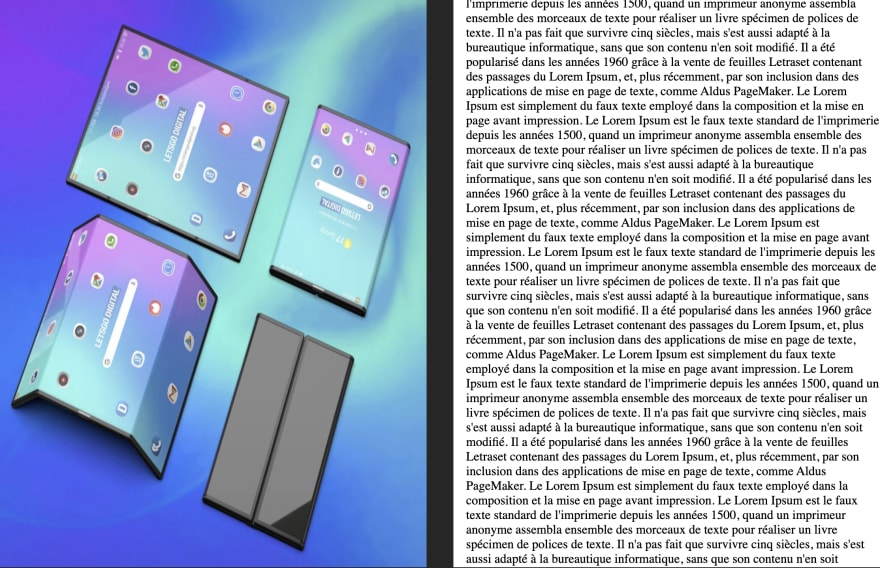
We could for example put on a screen a fixed image and on another one a long scrollable text.
Let's code it :)
<!DOCTYPE html>
<html lang="en">

  <head>
    <meta charset="UTF-8">
    <meta http-equiv="X-UA-Compatible" content="IE=edge">
    <meta name="viewport" content="width=device-width, initial-scale=1.0">
    <link rel="stylesheet" href="index.css">
    <title>Document</title>
  </head>

  <body>
    <main>
      <aside>
        <img alt="foldable device image" src="./foldable_screen.jpeg" />
      </aside>
      <article>
        Long scrollable text ...
      </article>
  </body>
</html>
html {
  height: 100%;
  width: 100%;
  margin: 0;
  padding: 0;
  overflow: hidden;
}

body {
  margin: 0;
  padding: 0;
}

main {
  display: flex;
  height: 100%;
  width: 100%;
}

@media (horizontal-viewport-segments: 2) and (vertical-viewport-segments: 1) {
  aside img  {
    position: absolute;
    height: 100%;
    width: env(viewport-segment-width 0 0);
    top: env(viewport-segment-top 0 0);
  }
  main article {
    position: absolute;
    box-sizing: border-box;
    padding-left: 1rem;
    height: 100%;
    overflow: auto;
    left: env(viewport-segment-left 1 0);
  }
}
The two lines
- width: env(viewport-segment-width 0 0)
- top: env(viewport-segment-top 0 0) allow you to specify the position of the image and its size. In our case I want to place the image on the whole first screen.
The line left: env(viewport-segment-left 1 0) allow to place the text on the whole second screen. For visual aesthetics, the padding-left property allows to shift the text from the fold.
The result is the following:
Reacting to resize or posture change events
Sometimes we may want to realize some Javascript logic depending on the different posture of the device, or want to react to the resize.
For this javascipt allows us to easily retrieve the number of screen of the device
window.addEventListener(() => {
 console.log(window.visualViewport.segments);
/**
If no segments this seems that the foldable device is closed.
If one or more segements window.visualViewport.segments is an array
**/
})
Want to play with these amazing API's
First activate in the chrome flags
- Experimental JavaScript
- Experimental Web Platform features
- Device Posture API
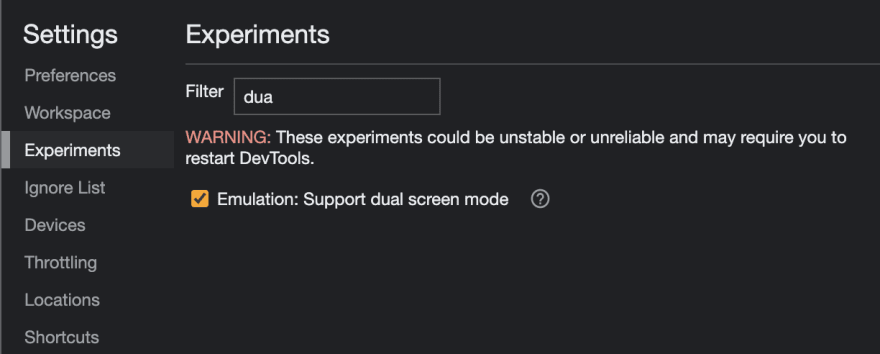
In the chrome devtools console, go to the settings section then go in the experiments panel and activate the option Emulation: Support dual screen mode
You are ready to go, now its possible to select suface duo or galexy fold device when you emulate a mobile device ;)
Conclusion
Are foldable screens the next generation of mobile? It's still way too early to tell; so it's very important for a web developer to keep an open mind and code the design of his application so that it is adaptable to whatever the future may bring. This is what responsive design offers.
The responsive design offers you a set of practical techniques but also an open mind that will allow you to adapt your applications for the web of tomorrow.
Ressource
- https://github.com/MicrosoftEdge/MSEdgeExplainers/blob/main/Foldables/explainer.md
- https://web.dev/learn/design/screen-configurations/
- https://www.w3.org/TR/device-posture/
This content originally appeared on DEV Community 👩💻👨💻 and was authored by Nicolas Frizzarin
Nicolas Frizzarin | Sciencx (2023-02-16T14:42:57+00:00) Make your design compatible with foldable device. Retrieved from https://www.scien.cx/2023/02/16/make-your-design-compatible-with-foldable-device/
Please log in to upload a file.
There are no updates yet.
Click the Upload button above to add an update.


