This content originally appeared on DEV Community and was authored by Adam Nathaniel Davis
[NOTE: The live web app that encompasses this functionality can be found here: https://www.paintmap.studio. All of the underlying code for that site can be found here: https://github.com/bytebodger/color-map.]
In the last article, I illustrated how we can mix paints virtually. We can take two colors and "mix" them together to see what the resulting paint will look like. Although this can be useful in theory (e.g., to determine what two paints will look like if we mix them together in the real world), this also has practical applications for the live app that I've built at https://paintmap.studio.
The limitations of color depth
In the previous articles, I showed how to pixelate an image so we're not dealing with millions of colors. I then showed how to find the closest match between a given color and a reference palette of colors. Finally, I showed how to use dithering to ensure that those "closest" matches were not all bunched together in specific bands of colors.
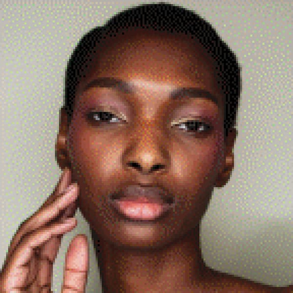
For reference, this was the original image that we'd pixelated, using a basic RGB algorithm:
This image isn't bad. We don't have any annoying color bands (because we've employed dithering). And the colors on the transformed image are... acceptable. Granted, there are a lot of pinks/reds on her face - a fact that seems a bit odd, considering that she's a woman of color. And overall, you could argue that the image is a bit "noisy". But if you step back and blur your eyes a bit, the coloring on her face doesn't look entirely unnatural.
But I'm not entirely satisfied with this image. As previously mentioned, there's a lot of red/pink in her face where maybe it shouldn't be. Given that I started with an original palette of 200+ paints, why is it that the transformed image has many colors that still don't seem to properly "map" to the source image??
The answer lies in color depth.
Paints are inherently dark
There's a reason why it's inherently difficult to perform color matching when your source image contains a subject like a human face - but your reference palette consists of "stock" paints. The reason is that: Paints, especially "professional grade" paints, are fairly dark in nature.
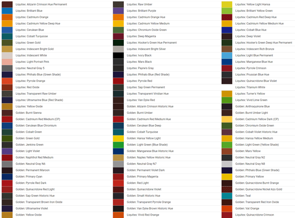
For example: Even though I have 200+ paints in my inventory, here is the color key for all of those paints:
If you look carefully at that selection, you'll see that we have all of the "normal" colors one would expect to find in a palette of paints. There's black-and-white (and numerous shades of grey). But there's also reds, and oranges, and yellows, and greens, and blues, and purples, and browns.
So why does our algorithm still fall short when trying to match the digital image to those paints?
Well... for starters, take a look at that palette. Although we have a broad spectrum of colors, nearly all of those colors are exceedingly dark. FWIW, this is by design. You see, when you buy "professional-grade" paints, those paints come with a very high pigment load. The idea is that you can mix them with other paints and they won't immediately lose their core qualities - because the original paints are chock full of pigment. But what this means, in a practical sense, is that all of the off-the-shelf colors are really quite dark.
And of course, some images are chock-full of dark colors. So if you match those images against our palette of heavy body acrylic paints, you may find that the color matching performs quite well. But with something as nuanced as a human face?? Well... it causes problems.
For example, this was the original image we were working from:
Clearly, this is a Black woman. But just as "white" people are not truly white (they're mostly a mix of yellow / pinks / tans), most Black people aren't truly black (they're mostly a mix of browns / yellows / tans). Furthermore, the skin tone of most Black people isn't really all that... dark. They're "dark" - compared to white people. But in the image above you can see that many areas of her face are actually quite... light. When you add in additional factors (such as lighting and makeup), their skin can, in certain regions, be incredibly light.
So although we have a fairly "workable" transformation of the image, matching the pixels in her face to the colors in our paint inventory, there are still areas where this transformation falls short. The answer is... to extend our palette of colors.
Making darker colors lighter
If we wanted to, we could use the color-mixing algorithms from the previous article to create a whole list of new colors based upon mixing all of the original colors together in different proportions. But remember, as I stated above, our core palette of paints already gives us a pretty solid representation of every "base" color that we'd expect to find in an image.
The problem isn't that we're missing any base colors. The problem is that all of those colors are simply too... dark. But how do we "find" those lighter colors??
If you read the first article in this series, you know that I found all of the RGB equivalents for every paint in my inventory by physically squeezing some of the paint onto sheets of paper. Then I photographed those sheets and grabbed the best-possible RGB value that I could find from every blob.
If we wanted to find the lighter equivalents of our base colors, I could repeat that entire process. I could mix - in the real-world - bits of white paint with the original paints. Then I could set the mixed bits out on paper, wait for them to dry, photograph them all, and then grab the appropriate RGB values from each lightened blob.
But that would be, quite frankly, a real pain the backside. Based on the previous article, we already know how to "mix" paints - virtually. So there's no need to create a massive set of test paint swatches and then manually grab all the RGB images from those swatches. Instead, we can mix the core colors with white - virtually - and then use the virtually-mixed values to enhance our color matching.
Using code to find lighter colors
Since we already have all of the "core" colors in our base inventory of paints, and since those colors are inherently dark, we can find many more variants of those colors by merely adding white to them. In different proportions.
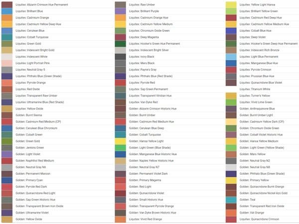
Specifically, in my Paint Map Studio app, I've created five additional color palettes, on top of the original palette that represents all of the base heavy body acrylic paints. Those additional palettes are as follows:
1/4 Whites
This consists of 3 parts of every heavy body acrylic paint, mixed with 1 part of white. This is what they look like:
1/3 Whites
These consist of 2 parts of every heavy body acrylic paint, mixed with 1 part of white. This is what they look like:
1/2 Whites
These consist of 1 part of every heavy body acrylic paint, mixed with 1 part of white. This is what they look like:
2/3 Whites
These consists of 1 part of every heavy body acrylic paint, mixed with 2 parts of white. This is what they look like:
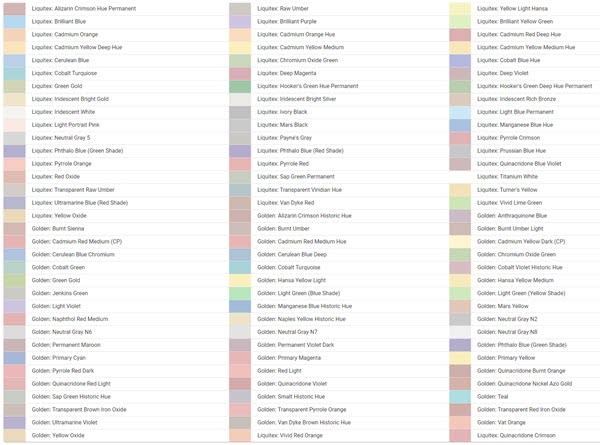
3/4 Whites
These consist of 1 part of every heavy body acrylic paint, mixed with 3 parts of white. This is what they look like:
The beautiful part of all this is that, to create all of these other potential colors, I didn't have to actually mix any paints at all. I merely allowed the algorithm to tell me what these colors would look like if I were to mix the paints in these proportions.
Obviously, you could continue to expand these virtual palettes ad infinitum. You could create a 99/100 Whites palette that consists of 1 part of every heavy body acrylic paint, mixed with 99 parts of white. But at a certain point, you're just creating an ever-increasing number of virtual paints that have little distinction from the other palettes.
Also, if you somehow found yourself with an incredibly pale set of reference colors, you could then create a series of virtual palettes based on what would happen if you mixed them with varying degrees of black. But since our base palette is already so dark, this approach has little value in Paint Map Studio.
Visualizing additional palettes
So what effect does it have on our transformed image if we use a deeper set of colors? Well, let's remember that this was our originally-transformed image:
This results from performing color matching against only the base set of heavy body acrylic paints.
Now this is the same transformation, except that we're matching against the base set of heavy body acrylic paints and the set of "1/4 Whites":
Notice that, merely by adding one more set of colors, we've already reduced the noise in the image by a great deal, and we've eliminated most of those jarring red dots on her face.
Here's the same transformation, with "1/3 Whites" also added to the mix:
The improvement isn't nearly so dramatic. But it's still "smoother" than the previous image.
Here's the same transformation, with "1/2 Whites" also added to the mix:
Honestly, at this point, we're already reaching a degree of color depth where it's hard to see the difference between this image and the previous one. But let's keep going, at least for the sake of illustration:
Here's the same transformation, with "2/3 Whites" also added to the mix:
And finally, here's the same transformation, with "3/4 Whites" also added to the mix:
Now that we've added all of these extra palettes, our color-matched, fully-transformed image looks incredibly similar to the original. By adding many different (lighter) shades of our original "base" paints, we've managed to create a transformed image that's incredibly true to the original. And we've done this without creating a whole series of "funky" custom color mixes.
Every block in the pixelated image is represented either by one of our base paints, or a variation of those base paints that "only" entails mixing it with varying degrees of white. I find this to be incredibly useful because I really don't want to bother with a painting where this block requires 2 parts of Golden: Cerulean Blue Deep, 1 part of Liquitex: Green Gold, and 3 parts of Liquitex: Cadmium Yellow Light, but the next block requires 1 part of Golden: Cobalt Turquoise, 3 parts of Golden: Burnt Sienna, and 1 part of Liquitex: Deep Magenta. It's far easier to know that every block in the transformed image either maps to an original paint color - or some proportion of that original color mixed simply with... white.
In the next installment...
We're coming close to concluding this series, but... we're not done yet! In the next installment, I'll show you how to restrict the resulting color depth so that you're not faced with having to mix hundreds of paints to produce a given image.
This content originally appeared on DEV Community and was authored by Adam Nathaniel Davis
Adam Nathaniel Davis | Sciencx (2023-02-28T23:38:46+00:00) Using Virtual Color Mixing to Extend Your Palette in React/JavaScript. Retrieved from https://www.scien.cx/2023/02/28/using-virtual-color-mixing-to-extend-your-palette-in-react-javascript/
Please log in to upload a file.
There are no updates yet.
Click the Upload button above to add an update.


