This content originally appeared on Bits and Pieces - Medium and was authored by Jun Tsunokawa
Component reusability is one of the advantages that React can take. There are various ways to create a reusable component, and I learned one of them using the npm Classnames package, so I’ll go over how to utilize it briefly.
1. What we’re going to build

We are going to build a variety of buttons with single <Button/> component, by passing props to components. You can change the background color, border radius and so on.
In this project, I use tailwind css for styling.
2. Install npm “Classnames” package
This package basically enables us to join className together conditionally. Here is the install command.
npm install classnames
3. Making a Button component.
The initial Button component and App.jsx file looks like the below. It’s just simple React components with tailwind css.
// App.jsx
import Button from "./components/Button";

const App = () => {
 return (
  <>
   <Button className="flex flex-col gap-2 my-4">Click Here!</Button>
  </>
 );
};

export default App;
// Button.jsx
const Button = ({ children }) => {
 return <button>{children}</button>;
};

export default Button;
First thing first, let’s add classnames function to the Button component. Make sure you import import classNames from "classnames" first. And notice that the function name from this package is “classNames”, not “className”!
//Button.jsx
import classNames from "classnames";  // "classNames"!! NOT "className"

const Button = ({ children }) => {
 const classes = classNames("mx-auto px-3 py-1.5 border");

 return <button className={classes}>{children}</button>;
};

export default Button;
When we write tailwind to a JSX tag, we write something like <button className=" // styling ... "> ... But with classNames , you’ll declare a variable which contains styling. In this case, I declared a variable called classes (the name is your preference!)
const classes = classNames(" // tailwind styling here ... ")
To use this set of classes, just put classes as the value of <button> tag. So far, nothing special to normal className use. The output should look like this.

4. Add Custom Button Styling
We want to make various kinds of buttons from this single Button component, so let’s add another button styling.
//Button.jsx
const Button = ({ children, primary }) => {
 const classes = classNames("mx-auto px-3 py-1.5 border", {
  "border-blue-500 bg-blue-500 text-white": primary,
 });

 return <button className={classes}>{children}</button>;
};

export default Button;
I added another style for “primary button” in the classes , surrounded by {} after the style we write before. This means "mx-auto..." is the basic style that is applied all the time, and {"border-blue-500...} is conditionally applied based on the keystate. ( = primary ). If the value associated with a given key is truthy , the value is included in the output. In this case, "border-blue-500 ..." is applied if the primary is truthy .
classNames( "//base style", { "//conditional style": key } )
The key primary is a props that is passed from the parent component. So if primary = trueis passed from a parent component as a prop, the condition is set to be true, and the associated style is applied.
This makes more sense with the parent component.
//App.tsx
import Button from "./components/Button";

const App = () => {
 return (
  <div className="flex flex-col gap-2 my-4">
   <Button>Click Here!</Button>
   <Button primary={true}>Click Here!</Button>
  </div>
 );
};

export default App;
//Button.jsx
const Button = ({ children, primary }) => {
 const classes = classNames("mx-auto px-3 py-1.5 border", {
  "border-blue-500 bg-blue-500 text-white": primary,
 });

 return <button className={classes}>{children}</button>;
};

export default Button;
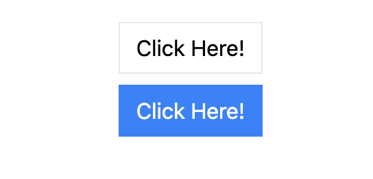
I added another button component down below the former one. The second one takes props primary = {true} , so the key value in the classNames() primary takes true , then the left style is applied. The output should look like this.

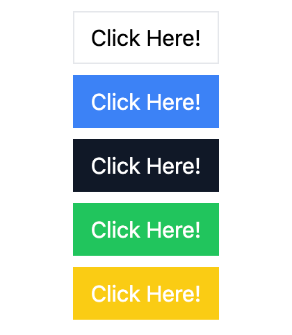
By the way, you can shorthand primary = {true} to primary . So let’s rewrite the code and add more buttons.
//App.jsx
const App = () => {
 return (
  <div className="flex flex-col gap-2 my-4">
   <Button>Click Here!</Button>
   <Button primary>Click Here!</Button>
   <Button secondary>Click Here!</Button>
   <Button success>Click Here!</Button>
   <Button warning>Click Here!</Button>
  </div>
 );
};

export default App;
//Button.jsx

const Button = ({ children, primary, secondary, success, warning }) => {
 const classes = classNames("mx-auto px-3 py-1.5 border", {
  "border-blue-500 bg-blue-500 text-white": primary,
  "border-gray-900 bg-gray-900 text-white": secondary,
  "border-green-500 bg-green-500 text-white": success,
  "border-yellow-400 bg-yellow-400 text-white": warning,
 });

 return <button className={classes}>{children}</button>;
};

export default Button;

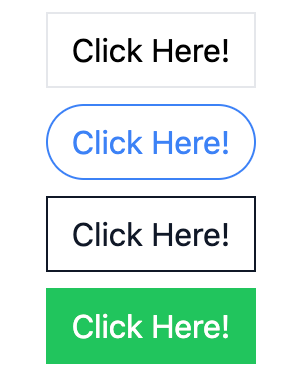
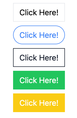
You can also play around different styling and combination of props like below.
//App.jsx
   <Button primary rounded outline>
    Click Here!
   </Button>
   <Button secondary outline>
    Click Here!
   </Button>
//Button.jsx
const Button = ({
 children,
 primary,
 secondary,
 success,
 warning,
 rounded,
 outline,
}) => {
 const classes = classNames("mx-auto px-3 py-1.5 border", {
  "border-blue-500 bg-blue-500 text-white": primary,
  "border-gray-900 bg-gray-900 text-white": secondary,
  "border-green-500 bg-green-500 text-white": success,
  "border-yellow-400 bg-yellow-400 text-white": warning,
  "rounded-full": rounded,
  "bg-white": outline,
  "text-blue-500": outline && primary,
  "text-gray-900": outline && secondary,
 });

 return <button className={classes}>{children}</button>;
};

export default Button;

There’s a more detailed description of the usage in the document, so you should check it out.
You can also take advantage of JavaScript rest parameter here. Let’s add onClick event to a button component.
//App.jsx
<Button onClick={() => console.log("clicked")}>Click Here!</Button>
const Button = ({
 children,
// ~
 ...rest
}) => {

// ~

 return (
  <button className={classes} {...rest}>
   {children}
  </button>
 );
};

export default Button;
By passing onClick() event, and take that as a ...rest prop in a button component, you can also control events for each component.
Another way to take component reusability to the next level is by using a tool like Bit. With Bit, you can easily build and test your components, then version and share them with other developers. This makes it much easier to collaborate on larger React projects and maintain a consistent UI across all your applications. This guide can show you how.
Find out more about reusing components here:
Extracting and Reusing Pre-existing Components using bit add
I hope this article helps your coding!
Build React Apps with reusable components, just like Lego

Bit’s open-source tool help 250,000+ devs to build apps with components.
Turn any UI, feature, or page into a reusable component — and share it across your applications. It’s easier to collaborate and build faster.
Split apps into components to make app development easier, and enjoy the best experience for the workflows you want:
→ Micro-Frontends
→ Design System
→ Code-Sharing and reuse
→ Monorepo
Learn more:
- How We Build Micro Frontends
- How we Build a Component Design System
- How to reuse React components across your projects
- 5 Ways to Build a React Monorepo
- How to Create a Composable React App with Bit
How to Make a Reusable Component with React and Classnames Package was originally published in Bits and Pieces on Medium, where people are continuing the conversation by highlighting and responding to this story.
This content originally appeared on Bits and Pieces - Medium and was authored by Jun Tsunokawa
Jun Tsunokawa | Sciencx (2023-03-01T05:56:13+00:00) How to Make a Reusable Component with React and Classnames Package. Retrieved from https://www.scien.cx/2023/03/01/how-to-make-a-reusable-component-with-react-and-classnames-package/
Please log in to upload a file.
There are no updates yet.
Click the Upload button above to add an update.
