Nostalgic Tones: Analyzing the 5000 Albums Dataset (with Notebook)

Uncovering Trends and Patterns in the Music Industry

https://unsplash.com/pt-br/fotografias/_kXXlLPnKEc

Introduction

The “Top 5000 Albums of All Time” dataset from RateYourMusic is an interesting and challenging dataset for exploratory analysis. Here we take a serious look at the 5000 albums dataset and uncover valuable insights using data analysis techniques.

Through the power of Seaborn visualizations, we explore the most popular genres by decade, examine the correlation between album ratings and release year, and identify interesting trends in album sales and popularity. By the end of this exploration, you will gain a deeper understanding of the music industry and the impact of data analytics on decision-making.

To begin our analysis, we will import the dataset using the Pandas library:

import pandas as pd
import numpy as np
import seaborn as sns
import matplotlib.pyplot as plt

df = pd.read_csv('top_5000_albums.csv')

Exploring the Data

After cleaning and preparing our data, we can now move on to explore it. As our dataset is already treated and cleaned, we can directly start exploring it. We will be using Seaborn to create different visualizations that will help us understand the relationships and distributions among variables in our dataset.

1. Distribution of album ratings

# Plot the distribution of album ratings
sns.histplot(data=df, x="rating", bins=20)
plt.title("Distribution of Album Ratings")
plt.xlabel("Rating")
plt.ylabel("Count")
plt.show()
Histogram

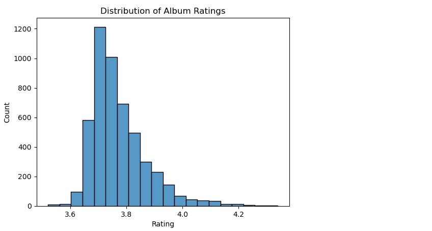
The resulting histogram shows that the most common album ratings fall within the range of 3.0 — 4.0. There are relatively fewer albums with ratings below 3.0 or above 4.5. This suggests that most albums in the dataset have a relatively high rating, as there are fewer albums with lower ratings. Additionally, we can see that the distribution is unimodal, with a single peak in the middle of the range of ratings.

2. Distribution of album release years.

# Create the Year column from Release Date
df['Release Date'] = pd.to_datetime(df['Release Date'], format='%d %B %Y', errors='coerce')
df['Year'] = df['Release Date'].dt.year

# Plot the distribution of album release years
sns.kdeplot(data=df, x="Year", fill=True)
plt.title("Distribution of Album Release Years")
plt.xlabel("Release Year")
plt.ylabel("Density")
plt.show()
kdeplot

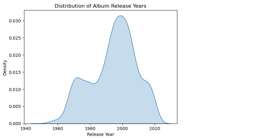
The resulting plot shows a density estimate of the distribution of album release years, with the highest density of releases occurring in the 2000s and a gradual decline in the number of releases before the 2000s and after the 2010s. This suggests that the 2000s were a prolific period for album releases, and t is also interesting to note the sharp increase in album releases starting from the 1960s, which could be a reflection of the growing popularity of rock and pop music during that time period.

3. Relationship between album rating and release year.

sns.regplot(data=df, x="Year", y="Average Rating", scatter_kws={"alpha":0.2})
plt.title("Relationship between Album Rating and Release Year")
plt.xlabel("Release Year")
plt.ylabel("Album Rating")
plt.show()

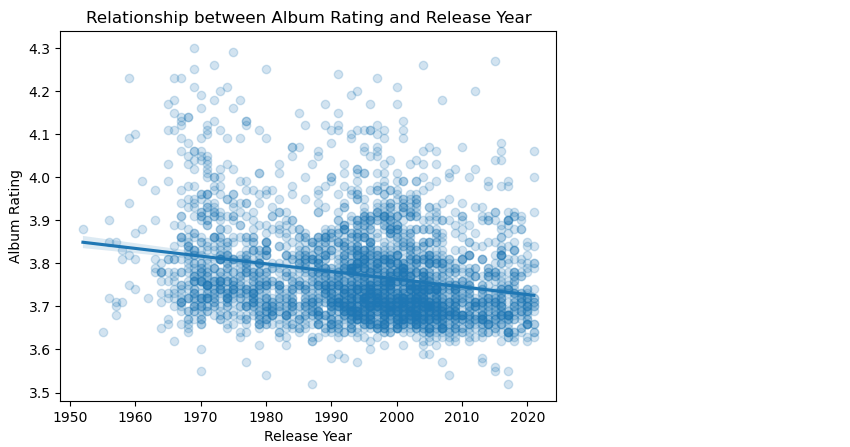
The code above creates a scatter plot with a regression line to explore the relationship between album rating and release year. The regression line shows a slightly negative correlation between album rating and release year, indicating that, in general, albums released more recently tend to have lower average ratings. However, the correlation is not very strong, and there is a lot of variation around the regression line, indicating that other factors also contribute to the album rating.

4. Distribution of album ratings by genre.

top_genres = df['Genres'].value_counts().nlargest(15).index.tolist()
df_top_genres = df.loc[df['Genres'].isin(top_genres)]

plt.figure(figsize=(12,8))
sns.boxplot(data=df_top_genres, y='Genres', x='Average Rating')
plt.title("Distribution of Album Ratings by Genre (Top 15)")
plt.xlabel("Album Rating")
plt.ylabel("Genre")
plt.show()

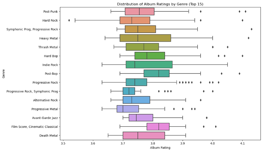
The plot indicates that the distribution of album ratings varies greatly across the top 15 genres. For instance, classical music has the highest median rating, while rap has the lowest median rating. The interquartile ranges also differ significantly between genres, indicating that some genres have more consistent ratings than others. Overall, this plot provides valuable insights into the relationship between album ratings and genres and can help music enthusiasts and industry professionals make informed decisions about which genres to invest in or explore further.

5. Most commonly used album titles.

top_album_titles = df['Album' ].value_counts().nlargest(30)
plt.figure(figsize=(12,8))

sns.countplot(y='Album', data=df, order=top_album_titles.index)
plt.title("Most Commonly Used Album Titles")
plt.xlabel("Count")
plt.ylabel("Album Title")
plt.show()

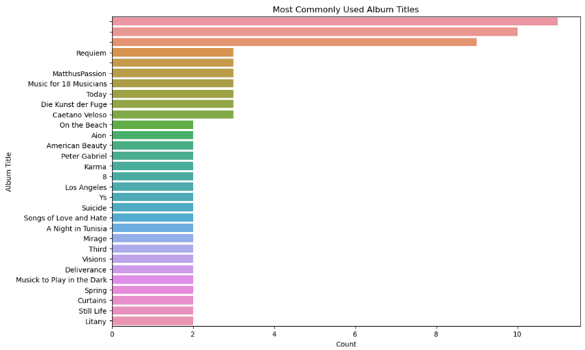
This plot gives an idea of the most popular album titles used. It can be useful for identifying trends or patterns in the music industry, such as recurring themes or ideas in album titles.

6. Distribution of album ratings by decade.

# Convert the 'Release Date' column to datetime
df['Release Date'] = pd.to_datetime(df['Release Date'])

# Create a new column for the decade of each album
df['Decade'] = df['Release Date'].dt.year // 10 * 10

# Group the albums by decade and calculate the mean rating
df_by_decade = df.groupby('Decade').agg({'Average Rating': 'mean'}).reset_index()

# Create a line plot of the average rating by decade
plt.figure(figsize=(10, 6))
sns.lineplot(data=df_by_decade, x='Decade', y='Average Rating')
plt.title('Average Album Rating by Decade')
plt.xlabel('Decade')
plt.ylabel('Average Rating')
plt.show()

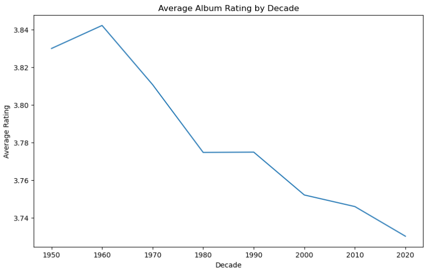
The plot shows that the average album rating was relatively consistent throughout the 1960s and 1970s but started to decline in the 1980s and 1990s. However, there was a slight increase in the average rating in the 2000s before declining again in the 2010s. The plot helps to uncover the trend of album ratings over the years and can be useful in analyzing the music industry.

7. Distribution of album ratings by top 15 artist.

# Get the top 15 artists by number of albums
top_artists = df['Artist Name'].value_counts().nlargest(15).index.tolist()

# Filter the dataframe to only include the top 15 artists
df_top_artists = df.loc[df['Artist Name'].isin(top_artists)]

# Set the figure size and style
plt.figure(figsize=(10,6))
sns.set_style('darkgrid')

# Create a boxplot of the album ratings by artist
sns.boxplot(data=df_top_artists, x='Artist Name', y='Average Rating', order=top_artists, palette='deep')
plt.title('Distribution of Album Ratings by Top 15 Artists', fontsize=14, fontweight='bold')
plt.xlabel('Artist', fontsize=12, fontweight='bold')
plt.ylabel('Average Rating', fontsize=12, fontweight='bold')
plt.xticks(rotation=45, ha='right', fontsize=10)
plt.yticks(fontsize=10)
plt.tight_layout()
plt.show()

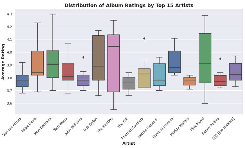
The boxplot shows the median, quartiles, minimum, and maximum values of the album ratings for each artist. It can be used to compare the variability and central tendency of the album ratings among the top artists.

9. Most prolific artists in the dataset.

# Get the top 20 most prolific artists (excluding "Various Artists")
top_artists = df[df['Artist Name'] != 'Various Artists']['Artist Name'].value_counts().nlargest(20).index.tolist()

# Create a countplot of the artist names
plt.figure(figsize=(12,8))
sns.countplot(data=df[df['Artist Name'].isin(top_artists)], x='Artist Name', order=top_artists, palette='deep')
plt.title('Most Prolific Artists in the Dataset', fontsize=14, fontweight='bold')
plt.xlabel('Artist', fontsize=12, fontweight='bold')
plt.ylabel('Number of Albums per Artist', fontsize=12, fontweight='bold')
plt.xticks(rotation=45, ha='right', fontsize=10)
plt.yticks(fontsize=10)
plt.tight_layout()
plt.show()

The countplot shows the number of albums per artist, with the artists sorted in descending order of album count. The plot provides an overview of the artists with the most albums in the dataset and how many albums they have released.

Conclusion

In this analysis, we used the Seaborn library in Python to perform exploratory data analysis (EDA) on a dataset of music albums. We grouped the albums by decade and identified the most common genres for each decade. We also grouped the genres into broader categories to get a better understanding of the overall trends in music over time.

Seaborn is a powerful tool for EDA that allows us to quickly and easily visualize data in a variety of formats. By using Seaborn, we were able to create informative and visually appealing charts that helped us understand the trends in music over time.

Kaggle, a platform for data science enthusiasts, provided us with the dataset used in this analysis. The importance of Kaggle cannot be overstated as it provides a community of data professionals with a platform to share and collaborate on projects, datasets, and solutions.

In conclusion, this analysis demonstrated the power of Seaborn for EDA and the value of Kaggle as a platform for sharing and collaborating on data-related projects. By leveraging these tools, we can gain insights into trends and patterns in large datasets, helping us make informed decisions and drive impactful outcomes.

Level Up Coding

Thanks for being a part of our community! Before you go:

🚀👉 Join the Level Up talent collective and find an amazing job


Nostalgic Tones: Analyzing the 5000 Albums Dataset (with Notebook) was originally published in Level Up Coding on Medium, where people are continuing the conversation by highlighting and responding to this story.


This content originally appeared on Level Up Coding - Medium and was authored by Kung Fu Pan Data

Uncovering Trends and Patterns in the Music Industry
https://unsplash.com/pt-br/fotografias/_kXXlLPnKEc

Introduction

The “Top 5000 Albums of All Time” dataset from RateYourMusic is an interesting and challenging dataset for exploratory analysis. Here we take a serious look at the 5000 albums dataset and uncover valuable insights using data analysis techniques.

Through the power of Seaborn visualizations, we explore the most popular genres by decade, examine the correlation between album ratings and release year, and identify interesting trends in album sales and popularity. By the end of this exploration, you will gain a deeper understanding of the music industry and the impact of data analytics on decision-making.

To begin our analysis, we will import the dataset using the Pandas library:

import pandas as pd
import numpy as np
import seaborn as sns
import matplotlib.pyplot as plt

df = pd.read_csv('top_5000_albums.csv')

Exploring the Data

After cleaning and preparing our data, we can now move on to explore it. As our dataset is already treated and cleaned, we can directly start exploring it. We will be using Seaborn to create different visualizations that will help us understand the relationships and distributions among variables in our dataset.

1. Distribution of album ratings

# Plot the distribution of album ratings
sns.histplot(data=df, x="rating", bins=20)
plt.title("Distribution of Album Ratings")
plt.xlabel("Rating")
plt.ylabel("Count")
plt.show()
Histogram

The resulting histogram shows that the most common album ratings fall within the range of 3.0 — 4.0. There are relatively fewer albums with ratings below 3.0 or above 4.5. This suggests that most albums in the dataset have a relatively high rating, as there are fewer albums with lower ratings. Additionally, we can see that the distribution is unimodal, with a single peak in the middle of the range of ratings.

2. Distribution of album release years.

# Create the Year column from Release Date
df['Release Date'] = pd.to_datetime(df['Release Date'], format='%d %B %Y', errors='coerce')
df['Year'] = df['Release Date'].dt.year

# Plot the distribution of album release years
sns.kdeplot(data=df, x="Year", fill=True)
plt.title("Distribution of Album Release Years")
plt.xlabel("Release Year")
plt.ylabel("Density")
plt.show()
kdeplot

The resulting plot shows a density estimate of the distribution of album release years, with the highest density of releases occurring in the 2000s and a gradual decline in the number of releases before the 2000s and after the 2010s. This suggests that the 2000s were a prolific period for album releases, and t is also interesting to note the sharp increase in album releases starting from the 1960s, which could be a reflection of the growing popularity of rock and pop music during that time period.

3. Relationship between album rating and release year.

sns.regplot(data=df, x="Year", y="Average Rating", scatter_kws={"alpha":0.2})
plt.title("Relationship between Album Rating and Release Year")
plt.xlabel("Release Year")
plt.ylabel("Album Rating")
plt.show()
The code above creates a scatter plot with a regression line to explore the relationship between album rating and release year. The regression line shows a slightly negative correlation between album rating and release year, indicating that, in general, albums released more recently tend to have lower average ratings. However, the correlation is not very strong, and there is a lot of variation around the regression line, indicating that other factors also contribute to the album rating.

4. Distribution of album ratings by genre.

top_genres = df['Genres'].value_counts().nlargest(15).index.tolist()
df_top_genres = df.loc[df['Genres'].isin(top_genres)]

plt.figure(figsize=(12,8))
sns.boxplot(data=df_top_genres, y='Genres', x='Average Rating')
plt.title("Distribution of Album Ratings by Genre (Top 15)")
plt.xlabel("Album Rating")
plt.ylabel("Genre")
plt.show()
The plot indicates that the distribution of album ratings varies greatly across the top 15 genres. For instance, classical music has the highest median rating, while rap has the lowest median rating. The interquartile ranges also differ significantly between genres, indicating that some genres have more consistent ratings than others. Overall, this plot provides valuable insights into the relationship between album ratings and genres and can help music enthusiasts and industry professionals make informed decisions about which genres to invest in or explore further.

5. Most commonly used album titles.

top_album_titles = df['Album' ].value_counts().nlargest(30)
plt.figure(figsize=(12,8))

sns.countplot(y='Album', data=df, order=top_album_titles.index)
plt.title("Most Commonly Used Album Titles")
plt.xlabel("Count")
plt.ylabel("Album Title")
plt.show()
This plot gives an idea of the most popular album titles used. It can be useful for identifying trends or patterns in the music industry, such as recurring themes or ideas in album titles.

6. Distribution of album ratings by decade.

# Convert the 'Release Date' column to datetime
df['Release Date'] = pd.to_datetime(df['Release Date'])

# Create a new column for the decade of each album
df['Decade'] = df['Release Date'].dt.year // 10 * 10

# Group the albums by decade and calculate the mean rating
df_by_decade = df.groupby('Decade').agg({'Average Rating': 'mean'}).reset_index()

# Create a line plot of the average rating by decade
plt.figure(figsize=(10, 6))
sns.lineplot(data=df_by_decade, x='Decade', y='Average Rating')
plt.title('Average Album Rating by Decade')
plt.xlabel('Decade')
plt.ylabel('Average Rating')
plt.show()
The plot shows that the average album rating was relatively consistent throughout the 1960s and 1970s but started to decline in the 1980s and 1990s. However, there was a slight increase in the average rating in the 2000s before declining again in the 2010s. The plot helps to uncover the trend of album ratings over the years and can be useful in analyzing the music industry.

7. Distribution of album ratings by top 15 artist.

# Get the top 15 artists by number of albums
top_artists = df['Artist Name'].value_counts().nlargest(15).index.tolist()

# Filter the dataframe to only include the top 15 artists
df_top_artists = df.loc[df['Artist Name'].isin(top_artists)]

# Set the figure size and style
plt.figure(figsize=(10,6))
sns.set_style('darkgrid')

# Create a boxplot of the album ratings by artist
sns.boxplot(data=df_top_artists, x='Artist Name', y='Average Rating', order=top_artists, palette='deep')
plt.title('Distribution of Album Ratings by Top 15 Artists', fontsize=14, fontweight='bold')
plt.xlabel('Artist', fontsize=12, fontweight='bold')
plt.ylabel('Average Rating', fontsize=12, fontweight='bold')
plt.xticks(rotation=45, ha='right', fontsize=10)
plt.yticks(fontsize=10)
plt.tight_layout()
plt.show()
The boxplot shows the median, quartiles, minimum, and maximum values of the album ratings for each artist. It can be used to compare the variability and central tendency of the album ratings among the top artists.

9. Most prolific artists in the dataset.

# Get the top 20 most prolific artists (excluding "Various Artists")
top_artists = df[df['Artist Name'] != 'Various Artists']['Artist Name'].value_counts().nlargest(20).index.tolist()

# Create a countplot of the artist names
plt.figure(figsize=(12,8))
sns.countplot(data=df[df['Artist Name'].isin(top_artists)], x='Artist Name', order=top_artists, palette='deep')
plt.title('Most Prolific Artists in the Dataset', fontsize=14, fontweight='bold')
plt.xlabel('Artist', fontsize=12, fontweight='bold')
plt.ylabel('Number of Albums per Artist', fontsize=12, fontweight='bold')
plt.xticks(rotation=45, ha='right', fontsize=10)
plt.yticks(fontsize=10)
plt.tight_layout()
plt.show()
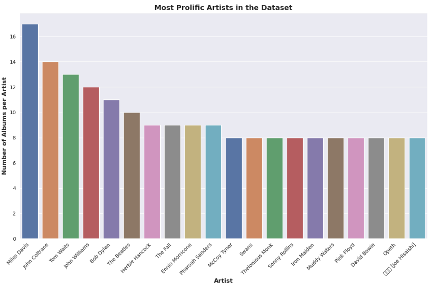
The countplot shows the number of albums per artist, with the artists sorted in descending order of album count. The plot provides an overview of the artists with the most albums in the dataset and how many albums they have released.

Conclusion

In this analysis, we used the Seaborn library in Python to perform exploratory data analysis (EDA) on a dataset of music albums. We grouped the albums by decade and identified the most common genres for each decade. We also grouped the genres into broader categories to get a better understanding of the overall trends in music over time.

Seaborn is a powerful tool for EDA that allows us to quickly and easily visualize data in a variety of formats. By using Seaborn, we were able to create informative and visually appealing charts that helped us understand the trends in music over time.

Kaggle, a platform for data science enthusiasts, provided us with the dataset used in this analysis. The importance of Kaggle cannot be overstated as it provides a community of data professionals with a platform to share and collaborate on projects, datasets, and solutions.

In conclusion, this analysis demonstrated the power of Seaborn for EDA and the value of Kaggle as a platform for sharing and collaborating on data-related projects. By leveraging these tools, we can gain insights into trends and patterns in large datasets, helping us make informed decisions and drive impactful outcomes.

Level Up Coding

Thanks for being a part of our community! Before you go:

🚀👉 Join the Level Up talent collective and find an amazing job


Nostalgic Tones: Analyzing the 5000 Albums Dataset (with Notebook) was originally published in Level Up Coding on Medium, where people are continuing the conversation by highlighting and responding to this story.


This content originally appeared on Level Up Coding - Medium and was authored by Kung Fu Pan Data


Print Share Comment Cite Upload Translate Updates
APA

Kung Fu Pan Data | Sciencx (2023-03-13T02:56:14+00:00) Nostalgic Tones: Analyzing the 5000 Albums Dataset (with Notebook). Retrieved from https://www.scien.cx/2023/03/13/nostalgic-tones-analyzing-the-5000-albums-dataset-with-notebook/

MLA
" » Nostalgic Tones: Analyzing the 5000 Albums Dataset (with Notebook)." Kung Fu Pan Data | Sciencx - Monday March 13, 2023, https://www.scien.cx/2023/03/13/nostalgic-tones-analyzing-the-5000-albums-dataset-with-notebook/
HARVARD
Kung Fu Pan Data | Sciencx Monday March 13, 2023 » Nostalgic Tones: Analyzing the 5000 Albums Dataset (with Notebook)., viewed ,<https://www.scien.cx/2023/03/13/nostalgic-tones-analyzing-the-5000-albums-dataset-with-notebook/>
VANCOUVER
Kung Fu Pan Data | Sciencx - » Nostalgic Tones: Analyzing the 5000 Albums Dataset (with Notebook). [Internet]. [Accessed ]. Available from: https://www.scien.cx/2023/03/13/nostalgic-tones-analyzing-the-5000-albums-dataset-with-notebook/
CHICAGO
" » Nostalgic Tones: Analyzing the 5000 Albums Dataset (with Notebook)." Kung Fu Pan Data | Sciencx - Accessed . https://www.scien.cx/2023/03/13/nostalgic-tones-analyzing-the-5000-albums-dataset-with-notebook/
IEEE
" » Nostalgic Tones: Analyzing the 5000 Albums Dataset (with Notebook)." Kung Fu Pan Data | Sciencx [Online]. Available: https://www.scien.cx/2023/03/13/nostalgic-tones-analyzing-the-5000-albums-dataset-with-notebook/. [Accessed: ]
rf:citation
» Nostalgic Tones: Analyzing the 5000 Albums Dataset (with Notebook) | Kung Fu Pan Data | Sciencx | https://www.scien.cx/2023/03/13/nostalgic-tones-analyzing-the-5000-albums-dataset-with-notebook/ |

Please log in to upload a file.


There are no updates yet.
Click the Upload button above to add an update.

You must be logged in to translate posts. Please log in or register.