Small Multiple Charts: The Sky Has A Million Stars, and Their Glow Weaves A Poem of Light

What are small multiple charts, When to Use Them, and How to Build Them in ggplot

Photo by Vincentiu Solomon on Unsplash

Table of Contents

Prelude

A young man is at a crossroad,

Left of the way is all darkness,

with a glimmer of light dancing with the wind

too fragile that it will fall in the next minute

Right of the way is endless brightness

yet at the far end, a hole is opening its big mouth

its eyes are dark, deep, and ready to attack

The young man is hesitating

He fears the dangers and craves hopes

He sits down and his sights meet the sky

The night beats his heart

The storm hurts his skin,

but the glow of stars makes him stand up from tears and blood time after times

The stars are uttering

“Son, just go,

packing up your bravery and sincerity,

never looking back”

Small multiple charts created by AUTHOR

Introduction — What Is A Small Multiples

It wasn’t until last year in my data visualization class that I heard about the word “small multiple charts” but I have seen this type of chart many times before. Small multiples, coined by Edward Tufte in the 90s, refers to a series of graphs that “use the same basic graphic or chart to display different slices of a data set”. The chart type is one of the best examples of what influential data visualization theorist Tufte believes in:

At the heart of quantitative reasoning is a single question: Compared to what?

As a frequent R user, I was more familiar with its another name — faceted chart —, which comes from the highly usable and convenient functions facet_wrap() and facet_grid(). Regardless of the name, the idea is consistent: starting from one base chart and ‘extending’ to more by grouping by one categorical variable so that each small chart showcases information about each category of that variable.

The base chart of the large small-multiple graph can take on a variety of forms. Some of the most common ones are maps, line charts, and area charts. Given what small multiple means, the base graph should be in principle as simple as possible to add clarity to the whole picture. This article by JuiceAnalytics gives many good examples of small multiple charts.

Small multiples are a popular choice adopted by New York Times, Urban Insitute, the Brookings Institute, and many other influential news outlets and think tanks. For example, with a quick browse of the NYT’s What’s Going On in This Graph? page, anyone can easily spot many examples.

For me, the name ‘small multiples’ always reminds me of a view of thousands of stars shining on the gorgeous canvas of sky as well as a picture of a young man, at a critical point of his life, hearing the whispers of winds and stars and getting energies from them. This is where the subtitle and the prelude of this post come from.

Passage — Why Small Multiples?

An Anatomy of Small Multiple Charts

As we introduced in the last section, small multiple charts could be simply regarded as a base chart faceted on another variable that is composed of numerous categories. The base chart is commonly a line chart or a map but can be any simple chart in principle, although, for each type of choice, there are costs associated with it (more on the limitation later). The faceting variable should be a categorical variable. If the faceting variable of interest is numeric, we should manually create groups through cut() , cut_width() , cut_number() , or another function in this category (if_else() and case_when() could also be useful if you want to reuse this new categorical variable later).

Graphically, a polished small-multiple chart should be composed of the following (partially borrowing ggplot’s framework and from the outmost elements to the innermost elements):

  • panel elements. A panel includes the spaces between the boundary and the graph area. (grid, panel background…)
  • Axis elements (axis ticks, axis lines, axis labels,…)
  • Plot elements (titles, subtitles, captions, plot background)
  • Facet-related elements. This is called strip in ggplots (strip box, strip text, panel spacing)

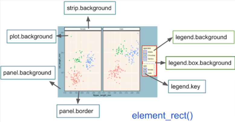
To put these parts on a graph, this dissection diagram below provided by the coding learning website Python and R Tips offers a visual and easy-to-understand solution.

ggplot layout diagram

Note a small-multiple chart will not have a legend. I do see some authors add legends to their small multiples in the past experience, but doing so is completely unnecessary and may increase visual fatigue

Consistency in Small Multiples

On a separate matter, all the small charts on a small-multiple chart should employ the same scale (eg labels, tick breaks) on both axes. This means that if one plot has an x-axis between 2000 to 2020 with every 5 years as a major break (this is a numerical scale), all the other plots should have this scale. Likewise, if the x scale is on a log scale (a popular choice for population metrics), all the other graphs should also employ a log scale. This is for two purposes: consistency and graph ethics (using different axes scales could distort the proportion of data with respect to their true population, hereby lying on the information communicated to readers).

I personally wouldn’t go as far as to say using different scales would make the chart lose all its advantages and usefulness. It depends on the context, the base chart type, and the audience. For me, employing different axes is acceptable if there is a huge contrast in numbers. Data scientist Tim Bock, PhD. also added that “… such as with density plots and histograms, where it is often useful to instead scale the visualizations to have an equal height.”

The following illustrates what Tim means. The graph below is one of the many charts I created last year for my Fostering Criminal Justice with Data Science series. It shows the age-wide arrest distribution faceted by gender. The graph itself is actually not created through any of the facet_*() functions but the effects are similar.

Here we see because the female arrest number in either age group is roughly three times smaller than the number of male arrestees in the same age group, keeping the axis scale may make female bar heights extremely short so that the numbers and overall distributions would be unreadable and undetectable. Given this, I decided to use two scales.

However, the scales should be clearly labeled so that the readers can see the numbers (at major tick breaks). If possible, the two charts should also be vertically displayed.

The same is for colors. Normally, all the small charts should utilize the same color palette across each other for the same reasons we would use the same axis scales. However, in special situations, for example, when color uses carry particular meanings (In the chart above, male and female are represented with steel blue and purple-red), such decisions could be justified.

Chart Created by AUTHOR

When To Use Small Multiples (Over Others)?

Small multiple graphs are a viable choice when the number of groups in our grouping/faceting variable is large. Although the threshold is not formally established and clearly defined, I would personally say 5 is the cutting point because, with fewer than five groups, proportional stacked bar charts and other chart types would also be optimal. That is not to say small multiple bar charts can not be used with fewer than five groups. It can, and it can still be very useful (see the graph below where I use the technique to showcase weapon possession information about violent arrestees in NY in 2021 by race/ethnicity of the arrestee. Readers can easily compare information across racial groups). However, with more than five groups, the chart could be messy and data labels hard to be seen, which increases the time the reader may spend on the chart and enhance the level of difficulty for them to understand so that it’s likely the message is not understood by the viewer.

All in all, it depends on the context, the reader, the objective, and the message, aka the storytelling elements. Data storytelling is indifferent to writing a technical, policy, or research document. Communicating a message through visualization successfully requires both science (hard knowledge on eg chart choice) and art (eg how to write the message, color considerations).

Image created by AUTHOR using D3.js, HTML, CSS frameworks/tools

I am not a visualization theorist like Edward Tufte, but as someone who specializes in data storytelling and who has produced many explorative analysis reports for different clients, I would personally recommend using the following chart types in each scenario:

When the group is lower than 5 and the purpose is to compare:

  • line chart/proportional area chart
  • stacked bar chart, grouped column chart
  • dot chart (highly recommend)
  • slope chart
  • treemap (only when the intention is to show the size of one group as compared to the whole)
  • Other (eg small multiple)

When the group is larger than five and the purpose is to compare/show broken-down information:

  • Small-Multiple line/area/map/bar/pie… charts
  • Line charts with highlights (color a few lines while making other lines grey. When this is used, the line group should position as annotations above or below the line to replace legends. Don’t use legends!!)
  • Small multiple waffle plots (where each waffle plot represents one group and is only made of two colors representing if or not the subject is in/belongs to the group. The two colors are ideally grey and another contrastable color)
  • Stacked bar charts (be cautious! Too many groups may confuse people)

Climax — The Art of Building and Customizing Small Multiples in R

Producing small multiple charts

Building small-multiple charts is not an easy task in most languages from Excel and Tableau to Python. I believe that python’s matplotlib does allow you to create faceted graphs easily through what it calls subplots. However, customization could be a pain (I am not an expert on matplotlib, so don’t quote me on this. My favorite Python-based graph-making library is Altair). There is literally no language like R that offers robust and diverse features for small-multiple charts. In fact, although not as well-known as ggplot, R’s lattice package is specifically built for small multiples, which its developers describe as “A powerful and elegant high-level data visualization system inspired by Trellis graphics, with an emphasis on multivariate data” (Trellis is another name for small multiples).

In ggplot, making small multiples is a one-liner. The simplicity makes it possible for people with a little programming background to pick up the task with some training, which is unachievable for matplotlib, which is more suitable for programmers. This credit goes to Hadley Wickham, the person behind the tidyverse universe and who is a follower of Edward Tufte and a firm believer that simplicity does more than less.

In R, two functions perform the magic of faceting:

  • facet_wrap()
  • facet_grid()

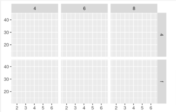
Between this twofacet_wrap() facets on one variable, whereas facet_grid() allows a second faceting variable. That is to say, with the former, we will see a set of small graphs that are horizontally or vertically spread with group names on top of each graph. Under the effect of the latter, categories of two groups will spread both row-wise and column-wise. Using the words of Hadley Wickham, “facet_wrap() makes a long ribbon of panels (generated by any number of variables) and wraps it into 2d” and “facet_grid() lays out plots in a 2d grid”.

Illustrations of facet_wrap() (Left) and facet_grid (Right) from the open-source book ggplot2: Elegant Graphics for Data Analysis. Open Copyright.

The two functions respectively have the syntax of:

  • facet_wrap(~var, nrow=, ncol= , scales = , labeller = , dir, strip.position = )
  • facet_grid(var1 ~ var2, nrow=, ncol= , scales = , space = , dir, labeller = , strip.position =)

The parameters in the above two lines do the following:

  • parameters nrow and ncol specify the number of rows or columns (usually supplying one of them is needed).
  • Scales controls if all subplots should share the same scales with four constraints: “fixed” (default), “free_x” (each x-axis has its own scale), “free_y” (each y-axis has its own scale), and “free” (both axes can vary across plots).
  • Labeller allows you to modify facet labels with a variety of syntaxes includinglabeller = labeller(c(old_group_name = new_group_name)) (this changes the old group name to the new group name). In practice, however, recoding your variables with recode()or fct_recode()before visualization has more utility than modifying the labeller parameter (see example two in Appendix).
  • Strip.position controls the position of your strip box and could be one of the “top”, “bottom”, “left”, or “right”.
  • dir refers to the direction of the strip layout. By default, it is “h” but can also take “v” as an input (vertical). This is only specific to facet_wrap() .
  • Last but not least, space is a parameter only pertaining to facet_grid()that takes the same values as scales and can make “each column (or row) have width (or height) proportional to the range of the scale for that column (or row).”

There are other parameters but are rarely used. You can also use facet_grid()to structure your plots like facet_wrap() by writing facet_grid(.~var1) or facet_grid(var2~.), but this is discouraged. In fact, as Wickham puts “ facet_wrap() generally more useful than facet_grid().” For me, two-way faceting just adds unnecessary complexity to the plots as readers have to recognize labels on both axes and understand that each plot is the crossover of two variables and needs to be interpreted as “when var 1 = and var 2 =, the situation for… is…”.

Customization

Here comes my favorite part. I have been knowing both facet functions for nearly four years but I only used them a handful of times. The most important reason is the default layout looks ugly to me, and I was not equipped with the knowledge to customize the small multiple charts. It wasn’t until recently one year that I realized that there exist theme functions for small multiples, in which it’s called “strip”. Specifically, the rectangle box outside the facet label is called strip.backgroud, and the facet label is called strip.text.

Author Annotated image from the open-source and public access book R Gallery Book. Public Copyright

Below is a solution guide to some common customization needs (p is an already created ggplot with facet):

  1. Change facet color:
p + theme(strip.text = element_text(color = "red"))

2. Left align facet label

p + theme(strip.text = element_text(hjust = 0)) #0: left-aligned, 0.5: center, 1: right-aligned

3. Bold text:

p + theme(strip.text = element_text(face = "bold")) # face could be bold, italic, bold.italic

4. Increase/decrease the label text size

p + theme(strip.text = element_text(size = 12)) 

5. Change label text family (note: usually there is no point to give the label a different family than other texts)

p + theme(strip.text = element_text(family = "serif")) 

6. Modify label texts:

For example, if the old group names are “a, b, c” and we want to change them to “A, B, C”:

There are two ways to do this: the first is using labeller (labeller parameter itself is complicated and easy to go wrong, and I personally would not recommend this approach):

p +
facet_wrap(~group_name, labeller = labeller(c("a" = "A",
"b" = "B",
"c" = "C")))

Or we can just use recode (or fct_recode):

p %>%
mutate(group_name = forcats::fct_recode(group_name,
"A"= "a", # the syntax may be different for
"B" = "b", # dplyr::recode()
"C" = "c"
)

7. Reorder label groups:

The best way to do this is to make the facet variable a factor, which preserves order (compared to characters). However, should you do that and later you want to change the order again, you will need to again use forcats::fct_level() to relevel the groups.

p %>%
mutate(group_var = factor(group_var,
levels = c("xx", "xx", "xx")) # xx refers to the actual group name

8. In facet_grid() , make the vertical label horizontally oriented:

p + theme(strip.text.y = element_text(angle = 90))  # specify y. This is only with respect to facet_grid()
# notice the y here # try out different angles!

9. Remove box color and border color:

p + theme(strip.background = element_rect(fill = "white",
color = "white") # or background color
# note this is element_rect(), which applies for objects that have a shape

10. Change the space (distance) between different small plots:

p+ theme(panel.spacing = unit(1, "lines")) # units() must supply a unit

11. Give small plots different fill colors or colors:

This can be achieved by adding color/fill aesthetics to the ggplot and modifying the color/fill by specifying scale_color_*() or scale_fill_*() . I personally prefer to apply a manually defined color palette, so it’s scale_fill_manual(colors= c()) but there are many wonderful predefined palettes in ggplot (and more provided by the RColorBrewer package)

To sum it up, in order to get the graph below, I did a few things (code in the Appendix code chunk #1):

  1. Make the faceting variable a factor and specify the level
  2. Recode the faceting variable
  3. Apply facet_wrap to the ggplot
  4. Change strip box background to grey and the box border to white
  5. Left-align, bold, and modify the size of strip text
Small multiple charts created by AUTHOR

Cooling Down — Two Sides of A Coin

As aforementioned, small multiples may not be the right choice in all circumstances. Using small multiples to communicate a story will be successful only if it meets the project goals and the needs of our target audience. Many people believe that the hard part of data visualization is coding. It is not. The most challenging yet most interesting part of data viz is designing graphics in a way that best conveys the message to the readers. This is exactly why data storytelling attracts me.

If you ever did some googling, most professionals would say that the ability to compare across groups easily is the biggest strength of small multiples. This is by no means wrong, but I think before that, we should note that small multiples allow us to peak into what’s happening in each group. This is like you are doing an interview, and you grasp a little bit of information from each interviewee. People in a group often share many commonalities, however, each person is also a special gift to the world. This is similar to making friends. There must have some special points about an individual that make you two get along. The art of data storytelling comes from life and this point matters.

Then comes what all the articles are talking about — “By setting these multiple small charts adjacent to each other and ensuring uniformity in how each data series is presented, you naturally create a structure that is well-tuned for comparison. The changes pop out, creating paths deeper into particular stories.” (Forum One). Small multiples are born for better comparisons when the group number is large so that other solutions may not work well.

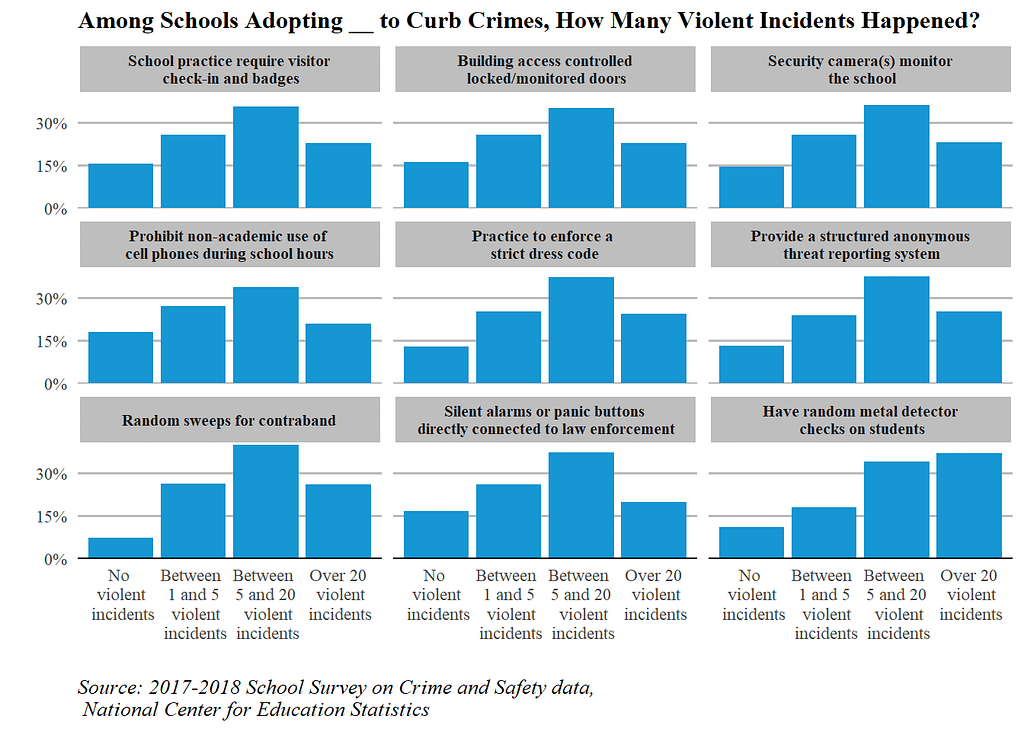
Small multiple charts created by AUTHOR

The above chart is created using the 2018 School Survey on Crime and Safety data, which collects information, such as public schools’ anti-crime policies, crisis awareness, and violent incident levels at the schools. To make the chart, I first built a few helper functions to ease the data-cleaning process and utilized facet_wrap to create the chart.

So what can we read from it? First of all, it allows us to see the specific information in schools with certain violent incident levels. For example, for schools with no violent incidents at all in 2018 (the chart at the top), over 80 percent of them adopted visitor check-in, ground-controlled locked/monitored doors, and security cameras in the hallway to ensure students’ safety. Comparatively, most of them did not conduct contraband sweeps and metal detector checks.

Moreover, we are able to do comparisons. After creating this chart, I noted “… Schools where a lot of violent incidents (>5) occurred had a higher proportion of enforcing a strict dress code, doing sweeps for contraband searches, and conducting metal detect checks than schools where fewer than 5 violent incidents happened. Surprisingly, the same pattern is not reflected in the method of installing alarms or panic buttons directly corrected to law enforcement, for which schools that had over 20 violent incidents happened seemed to be the group that was the least likely to do so”.

Ending Notes — Data Storytelling

In this post, I talked about one special form of data visualization — small multiple charts. However, I hope you have grappled with more than knowledge about the chart but also a few takeaways on data storytelling and applied data science. As a practitioner of data science in the policy and criminal justice domain, I hope that you, my reader, could understand that storytelling is a chemical of audience, objective, format (content), data, and domain knowledge. As I articulated, the most difficult part of creating effective and compelling visualizations is not the “how” but the parts before “how”, i.e. “what” and “why”. Loving your data, caring about your impacts, and knowing the subject matter. Your heart decides if your visualization could make its end meet. Small multiple is a beautiful chart but it is the most beautiful when it is used at the right place. Remember:

Words have power. Visualizations have power.

Appendix — Full Codes

The following codes render the first graph (see the beginning of this article for the two graphs):

t %>%
ggplot(aes(x = `Violent Incident Group`, y = Percent)) +
geom_col(position = 'dodge', fill = "#1696d2") +
theme_classic()+
scale_y_continuous(expand = c(0,0),
labels = scales::percent,
breaks = c(0,.15,.3)) +
facet_wrap(~Strategy,
nrow=3) +
labs(title = "Among Schools Adopting __ to Curb Crimes, How Many Violent Incidents Happened?",
caption = "Source: 2017-2018 School Survey on Crime and Safety data,\n National Center for Education Statistics",
x = "",
y = "") +
theme(legend.position = "none",
axis.line.y = element_blank(),
panel.grid.major.y = element_line(linetype="solid", # add grid line
color = "grey",
size =0.6),
axis.ticks = element_blank(),
axis.ticks.x = element_blank(),
text = element_text(family = "serif"), # format texts
plot.title = element_text(size = 12,
face="bold",
hjust= 0),
plot.caption = element_text(size = 10,
face = "italic",
hjust=0),
strip.background = element_rect(fill = "grey", # facet label background fill
color = "white"), # facet label background border color
strip.text.x = element_text(hjust=0.5,
face = "bold",
size = 8)) # center facet label)

The following renders the second:

v %>%
mutate(Strategy = fct_recode(Strategy,
`Visitor \ncheck-in` = "School practice require visitor\n check-in and badges",
`Controlled \nlocked/monitored\n doors` = "Building access controlled\n locked/monitored doors",
`Security\n camera(s)`="Security camera(s) monitor\n the school",
`Cell-phone\n ban(s)`= "Prohibit non-academic use of \ncell phones during school hours",
`Strict \ndress code`= "Practice to enforce a \nstrict dress code",
`Anonymous \nthreat \nreporting \nsystem`="Provide a structured anonymous\n threat reporting system",
`Sweeps \nfor\n contraband`="Random sweeps for contraband",
`Alarms or panic \nbuttons directly \nconnected to\n law enforcement`="Silent alarms or panic buttons\n directly connected to law enforcement",
`Metal \ndetector \nchecks"`="Have random metal detector\n checks on students"
)) %>%
ggplot(aes(x = Strategy, y = Percent)) +
geom_col(position = 'dodge', fill = "#1696d2", width = .8) +
theme_classic()+
facet_wrap(~`Violent Incident Group`,
nrow=4) + # note: we could add parameter as_labeller(c(old_label = new_label)) # can change label name
scale_y_continuous(expand = c(0,0),
labels = scales::percent,
breaks = c(0,.4, .8)) +
labs(title = "Among Schools that Had __ Violent Incidents in 2018, Were They more Likely to Use__?",
caption = "Source: 2017-2018 School Survey on Crime and Safety data,\n National Center for Education Statistics",
x = "",
y = "") +
theme(legend.position = "none",
axis.line = element_blank(),
axis.ticks = element_blank(),
panel.grid.major.y = element_line(linetype="solid", # add grid line
color = "grey",
size =0.4),
text = element_text(family = "serif"), # format texts
plot.title = element_text(size = 12,
face="bold",
hjust= 0),
plot.caption = element_text(size = 10,
face = "italic",
hjust= 0),
strip.background = element_rect(fill = "grey", # facet label box background
color = "white"), # facet label box contour/border color
strip.text.x = element_text(hjust=0,
face = "bold",
size = 9.5)) # center facet label)

The full codes can be found on my project GitHub page.

Below are some other resources that may be helpful:

Please follow me if you wish to see more interesting content!

Read My Other Works:

Level Up Coding

Thanks for being a part of our community! Before you go:

🚀👉 Join the Level Up talent collective and find an amazing job


Small Multiple Charts: The Sky Has A Million Stars, and Their Glow Weaves A Poem of Light was originally published in Level Up Coding on Medium, where people are continuing the conversation by highlighting and responding to this story.


This content originally appeared on Level Up Coding - Medium and was authored by Vincent Liu

What are small multiple charts, When to Use Them, and How to Build Them in ggplot

Photo by Vincentiu Solomon on Unsplash

Table of Contents

Prelude

A young man is at a crossroad,

Left of the way is all darkness,

with a glimmer of light dancing with the wind

too fragile that it will fall in the next minute

Right of the way is endless brightness

yet at the far end, a hole is opening its big mouth

its eyes are dark, deep, and ready to attack

The young man is hesitating

He fears the dangers and craves hopes

He sits down and his sights meet the sky

The night beats his heart

The storm hurts his skin,

but the glow of stars makes him stand up from tears and blood time after times

The stars are uttering

“Son, just go,

packing up your bravery and sincerity,

never looking back”
Small multiple charts created by AUTHOR

Introduction — What Is A Small Multiples

It wasn’t until last year in my data visualization class that I heard about the word “small multiple charts” but I have seen this type of chart many times before. Small multiples, coined by Edward Tufte in the 90s, refers to a series of graphs that “use the same basic graphic or chart to display different slices of a data set”. The chart type is one of the best examples of what influential data visualization theorist Tufte believes in:

At the heart of quantitative reasoning is a single question: Compared to what?

As a frequent R user, I was more familiar with its another name — faceted chart —, which comes from the highly usable and convenient functions facet_wrap() and facet_grid(). Regardless of the name, the idea is consistent: starting from one base chart and ‘extending’ to more by grouping by one categorical variable so that each small chart showcases information about each category of that variable.

The base chart of the large small-multiple graph can take on a variety of forms. Some of the most common ones are maps, line charts, and area charts. Given what small multiple means, the base graph should be in principle as simple as possible to add clarity to the whole picture. This article by JuiceAnalytics gives many good examples of small multiple charts.

Small multiples are a popular choice adopted by New York Times, Urban Insitute, the Brookings Institute, and many other influential news outlets and think tanks. For example, with a quick browse of the NYT’s What’s Going On in This Graph? page, anyone can easily spot many examples.

For me, the name ‘small multiples’ always reminds me of a view of thousands of stars shining on the gorgeous canvas of sky as well as a picture of a young man, at a critical point of his life, hearing the whispers of winds and stars and getting energies from them. This is where the subtitle and the prelude of this post come from.

Passage — Why Small Multiples?

An Anatomy of Small Multiple Charts

As we introduced in the last section, small multiple charts could be simply regarded as a base chart faceted on another variable that is composed of numerous categories. The base chart is commonly a line chart or a map but can be any simple chart in principle, although, for each type of choice, there are costs associated with it (more on the limitation later). The faceting variable should be a categorical variable. If the faceting variable of interest is numeric, we should manually create groups through cut() , cut_width() , cut_number() , or another function in this category (if_else() and case_when() could also be useful if you want to reuse this new categorical variable later).

Graphically, a polished small-multiple chart should be composed of the following (partially borrowing ggplot’s framework and from the outmost elements to the innermost elements):

  • panel elements. A panel includes the spaces between the boundary and the graph area. (grid, panel background…)
  • Axis elements (axis ticks, axis lines, axis labels,...)
  • Plot elements (titles, subtitles, captions, plot background)
  • Facet-related elements. This is called strip in ggplots (strip box, strip text, panel spacing)

To put these parts on a graph, this dissection diagram below provided by the coding learning website Python and R Tips offers a visual and easy-to-understand solution.
ggplot layout diagram

Note a small-multiple chart will not have a legend. I do see some authors add legends to their small multiples in the past experience, but doing so is completely unnecessary and may increase visual fatigue

Consistency in Small Multiples

On a separate matter, all the small charts on a small-multiple chart should employ the same scale (eg labels, tick breaks) on both axes. This means that if one plot has an x-axis between 2000 to 2020 with every 5 years as a major break (this is a numerical scale), all the other plots should have this scale. Likewise, if the x scale is on a log scale (a popular choice for population metrics), all the other graphs should also employ a log scale. This is for two purposes: consistency and graph ethics (using different axes scales could distort the proportion of data with respect to their true population, hereby lying on the information communicated to readers).

I personally wouldn’t go as far as to say using different scales would make the chart lose all its advantages and usefulness. It depends on the context, the base chart type, and the audience. For me, employing different axes is acceptable if there is a huge contrast in numbers. Data scientist Tim Bock, PhD. also added that “… such as with density plots and histograms, where it is often useful to instead scale the visualizations to have an equal height.”

The following illustrates what Tim means. The graph below is one of the many charts I created last year for my Fostering Criminal Justice with Data Science series. It shows the age-wide arrest distribution faceted by gender. The graph itself is actually not created through any of the facet_*() functions but the effects are similar.

Here we see because the female arrest number in either age group is roughly three times smaller than the number of male arrestees in the same age group, keeping the axis scale may make female bar heights extremely short so that the numbers and overall distributions would be unreadable and undetectable. Given this, I decided to use two scales.

However, the scales should be clearly labeled so that the readers can see the numbers (at major tick breaks). If possible, the two charts should also be vertically displayed.

The same is for colors. Normally, all the small charts should utilize the same color palette across each other for the same reasons we would use the same axis scales. However, in special situations, for example, when color uses carry particular meanings (In the chart above, male and female are represented with steel blue and purple-red), such decisions could be justified.
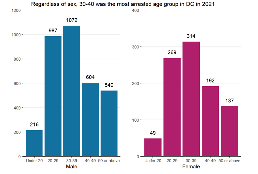
Chart Created by AUTHOR

When To Use Small Multiples (Over Others)?

Small multiple graphs are a viable choice when the number of groups in our grouping/faceting variable is large. Although the threshold is not formally established and clearly defined, I would personally say 5 is the cutting point because, with fewer than five groups, proportional stacked bar charts and other chart types would also be optimal. That is not to say small multiple bar charts can not be used with fewer than five groups. It can, and it can still be very useful (see the graph below where I use the technique to showcase weapon possession information about violent arrestees in NY in 2021 by race/ethnicity of the arrestee. Readers can easily compare information across racial groups). However, with more than five groups, the chart could be messy and data labels hard to be seen, which increases the time the reader may spend on the chart and enhance the level of difficulty for them to understand so that it’s likely the message is not understood by the viewer.

All in all, it depends on the context, the reader, the objective, and the message, aka the storytelling elements. Data storytelling is indifferent to writing a technical, policy, or research document. Communicating a message through visualization successfully requires both science (hard knowledge on eg chart choice) and art (eg how to write the message, color considerations).
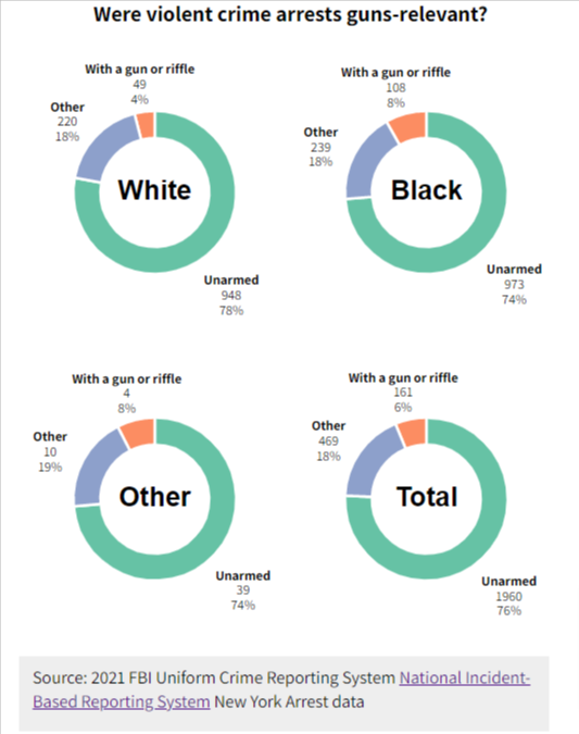
Image created by AUTHOR using D3.js, HTML, CSS frameworks/tools

I am not a visualization theorist like Edward Tufte, but as someone who specializes in data storytelling and who has produced many explorative analysis reports for different clients, I would personally recommend using the following chart types in each scenario:

When the group is lower than 5 and the purpose is to compare:

  • line chart/proportional area chart
  • stacked bar chart, grouped column chart
  • dot chart (highly recommend)
  • slope chart
  • treemap (only when the intention is to show the size of one group as compared to the whole)
  • Other (eg small multiple)

When the group is larger than five and the purpose is to compare/show broken-down information:

  • Small-Multiple line/area/map/bar/pie… charts
  • Line charts with highlights (color a few lines while making other lines grey. When this is used, the line group should position as annotations above or below the line to replace legends. Don’t use legends!!)
  • Small multiple waffle plots (where each waffle plot represents one group and is only made of two colors representing if or not the subject is in/belongs to the group. The two colors are ideally grey and another contrastable color)
  • Stacked bar charts (be cautious! Too many groups may confuse people)

Climax — The Art of Building and Customizing Small Multiples in R

Producing small multiple charts

Building small-multiple charts is not an easy task in most languages from Excel and Tableau to Python. I believe that python’s matplotlib does allow you to create faceted graphs easily through what it calls subplots. However, customization could be a pain (I am not an expert on matplotlib, so don’t quote me on this. My favorite Python-based graph-making library is Altair). There is literally no language like R that offers robust and diverse features for small-multiple charts. In fact, although not as well-known as ggplot, R’s lattice package is specifically built for small multiples, which its developers describe as “A powerful and elegant high-level data visualization system inspired by Trellis graphics, with an emphasis on multivariate data” (Trellis is another name for small multiples).

In ggplot, making small multiples is a one-liner. The simplicity makes it possible for people with a little programming background to pick up the task with some training, which is unachievable for matplotlib, which is more suitable for programmers. This credit goes to Hadley Wickham, the person behind the tidyverse universe and who is a follower of Edward Tufte and a firm believer that simplicity does more than less.

In R, two functions perform the magic of faceting:

  • facet_wrap()
  • facet_grid()

Between this twofacet_wrap() facets on one variable, whereas facet_grid() allows a second faceting variable. That is to say, with the former, we will see a set of small graphs that are horizontally or vertically spread with group names on top of each graph. Under the effect of the latter, categories of two groups will spread both row-wise and column-wise. Using the words of Hadley Wickham, “facet_wrap() makes a long ribbon of panels (generated by any number of variables) and wraps it into 2d” and “facet_grid() lays out plots in a 2d grid”.
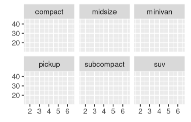
Illustrations of facet_wrap() (Left) and facet_grid (Right) from the open-source book ggplot2: Elegant Graphics for Data Analysis. Open Copyright.

The two functions respectively have the syntax of:

  • facet_wrap(~var, nrow=, ncol= , scales = , labeller = , dir, strip.position = )
  • facet_grid(var1 ~ var2, nrow=, ncol= , scales = , space = , dir, labeller = , strip.position =)

The parameters in the above two lines do the following:

  • parameters nrow and ncol specify the number of rows or columns (usually supplying one of them is needed).
  • Scales controls if all subplots should share the same scales with four constraints: “fixed” (default), “free_x” (each x-axis has its own scale), “free_y” (each y-axis has its own scale), and “free” (both axes can vary across plots).
  • Labeller allows you to modify facet labels with a variety of syntaxes includinglabeller = labeller(c(old_group_name = new_group_name)) (this changes the old group name to the new group name). In practice, however, recoding your variables with recode()or fct_recode()before visualization has more utility than modifying the labeller parameter (see example two in Appendix).
  • Strip.position controls the position of your strip box and could be one of the “top”, “bottom”, “left”, or “right”.
  • dir refers to the direction of the strip layout. By default, it is “h” but can also take “v” as an input (vertical). This is only specific to facet_wrap() .
  • Last but not least, space is a parameter only pertaining to facet_grid()that takes the same values as scales and can make “each column (or row) have width (or height) proportional to the range of the scale for that column (or row).”

There are other parameters but are rarely used. You can also use facet_grid()to structure your plots like facet_wrap() by writing facet_grid(.~var1) or facet_grid(var2~.), but this is discouraged. In fact, as Wickham puts “ facet_wrap() generally more useful than facet_grid().” For me, two-way faceting just adds unnecessary complexity to the plots as readers have to recognize labels on both axes and understand that each plot is the crossover of two variables and needs to be interpreted as “when var 1 = and var 2 =, the situation for… is…”.

Customization

Here comes my favorite part. I have been knowing both facet functions for nearly four years but I only used them a handful of times. The most important reason is the default layout looks ugly to me, and I was not equipped with the knowledge to customize the small multiple charts. It wasn’t until recently one year that I realized that there exist theme functions for small multiples, in which it’s called “strip”. Specifically, the rectangle box outside the facet label is called strip.backgroud, and the facet label is called strip.text.
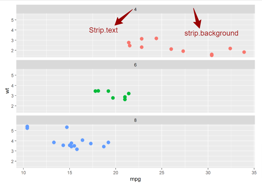
Author Annotated image from the open-source and public access book R Gallery Book. Public Copyright

Below is a solution guide to some common customization needs (p is an already created ggplot with facet):

  1. Change facet color:
p + theme(strip.text = element_text(color = "red"))

2. Left align facet label

p + theme(strip.text = element_text(hjust = 0)) #0: left-aligned, 0.5: center, 1: right-aligned

3. Bold text:

p + theme(strip.text = element_text(face = "bold")) # face could be bold, italic, bold.italic

4. Increase/decrease the label text size

p + theme(strip.text = element_text(size = 12)) 

5. Change label text family (note: usually there is no point to give the label a different family than other texts)

p + theme(strip.text = element_text(family = "serif")) 

6. Modify label texts:

For example, if the old group names are “a, b, c” and we want to change them to “A, B, C”:

There are two ways to do this: the first is using labeller (labeller parameter itself is complicated and easy to go wrong, and I personally would not recommend this approach):

p +
facet_wrap(~group_name, labeller = labeller(c("a" = "A",
"b" = "B",
"c" = "C")))

Or we can just use recode (or fct_recode):

p %>%
mutate(group_name = forcats::fct_recode(group_name,
"A"= "a", # the syntax may be different for
"B" = "b", # dplyr::recode()
"C" = "c"
)

7. Reorder label groups:

The best way to do this is to make the facet variable a factor, which preserves order (compared to characters). However, should you do that and later you want to change the order again, you will need to again use forcats::fct_level() to relevel the groups.

p %>%
mutate(group_var = factor(group_var,
levels = c("xx", "xx", "xx")) # xx refers to the actual group name

8. In facet_grid() , make the vertical label horizontally oriented:

p + theme(strip.text.y = element_text(angle = 90))  # specify y. This is only with respect to facet_grid()
# notice the y here # try out different angles!

9. Remove box color and border color:

p + theme(strip.background = element_rect(fill = "white",
color = "white") # or background color
# note this is element_rect(), which applies for objects that have a shape

10. Change the space (distance) between different small plots:

p+ theme(panel.spacing = unit(1, "lines")) # units() must supply a unit

11. Give small plots different fill colors or colors:

This can be achieved by adding color/fill aesthetics to the ggplot and modifying the color/fill by specifying scale_color_*() or scale_fill_*() . I personally prefer to apply a manually defined color palette, so it’s scale_fill_manual(colors= c()) but there are many wonderful predefined palettes in ggplot (and more provided by the RColorBrewer package)

To sum it up, in order to get the graph below, I did a few things (code in the Appendix code chunk #1):

  1. Make the faceting variable a factor and specify the level
  2. Recode the faceting variable
  3. Apply facet_wrap to the ggplot
  4. Change strip box background to grey and the box border to white
  5. Left-align, bold, and modify the size of strip text
Small multiple charts created by AUTHOR

Cooling Down — Two Sides of A Coin

As aforementioned, small multiples may not be the right choice in all circumstances. Using small multiples to communicate a story will be successful only if it meets the project goals and the needs of our target audience. Many people believe that the hard part of data visualization is coding. It is not. The most challenging yet most interesting part of data viz is designing graphics in a way that best conveys the message to the readers. This is exactly why data storytelling attracts me.

If you ever did some googling, most professionals would say that the ability to compare across groups easily is the biggest strength of small multiples. This is by no means wrong, but I think before that, we should note that small multiples allow us to peak into what’s happening in each group. This is like you are doing an interview, and you grasp a little bit of information from each interviewee. People in a group often share many commonalities, however, each person is also a special gift to the world. This is similar to making friends. There must have some special points about an individual that make you two get along. The art of data storytelling comes from life and this point matters.

Then comes what all the articles are talking about — “By setting these multiple small charts adjacent to each other and ensuring uniformity in how each data series is presented, you naturally create a structure that is well-tuned for comparison. The changes pop out, creating paths deeper into particular stories.” (Forum One). Small multiples are born for better comparisons when the group number is large so that other solutions may not work well.
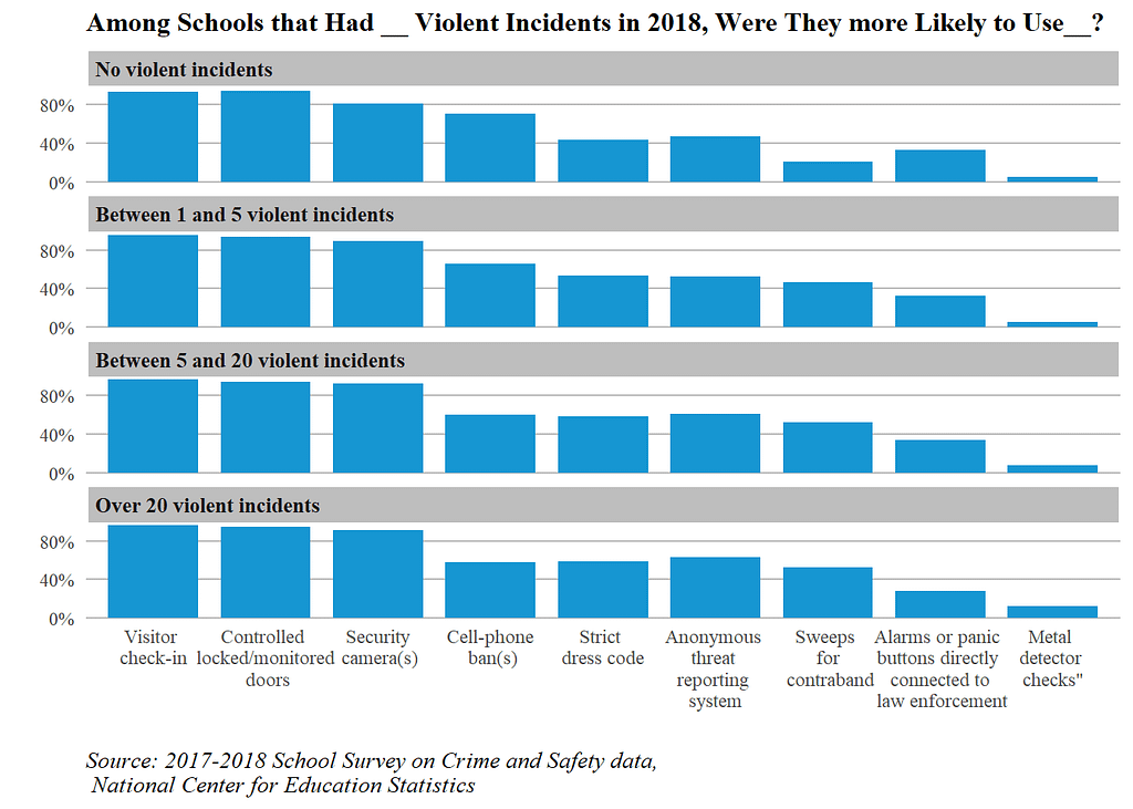
Small multiple charts created by AUTHOR

The above chart is created using the 2018 School Survey on Crime and Safety data, which collects information, such as public schools’ anti-crime policies, crisis awareness, and violent incident levels at the schools. To make the chart, I first built a few helper functions to ease the data-cleaning process and utilized facet_wrap to create the chart.

So what can we read from it? First of all, it allows us to see the specific information in schools with certain violent incident levels. For example, for schools with no violent incidents at all in 2018 (the chart at the top), over 80 percent of them adopted visitor check-in, ground-controlled locked/monitored doors, and security cameras in the hallway to ensure students’ safety. Comparatively, most of them did not conduct contraband sweeps and metal detector checks.

Moreover, we are able to do comparisons. After creating this chart, I noted “… Schools where a lot of violent incidents (>5) occurred had a higher proportion of enforcing a strict dress code, doing sweeps for contraband searches, and conducting metal detect checks than schools where fewer than 5 violent incidents happened. Surprisingly, the same pattern is not reflected in the method of installing alarms or panic buttons directly corrected to law enforcement, for which schools that had over 20 violent incidents happened seemed to be the group that was the least likely to do so”.

Ending Notes — Data Storytelling

In this post, I talked about one special form of data visualization — small multiple charts. However, I hope you have grappled with more than knowledge about the chart but also a few takeaways on data storytelling and applied data science. As a practitioner of data science in the policy and criminal justice domain, I hope that you, my reader, could understand that storytelling is a chemical of audience, objective, format (content), data, and domain knowledge. As I articulated, the most difficult part of creating effective and compelling visualizations is not the “how” but the parts before “how”, i.e. “what” and “why”. Loving your data, caring about your impacts, and knowing the subject matter. Your heart decides if your visualization could make its end meet. Small multiple is a beautiful chart but it is the most beautiful when it is used at the right place. Remember:

Words have power. Visualizations have power.

Appendix — Full Codes

The following codes render the first graph (see the beginning of this article for the two graphs):

t %>%
ggplot(aes(x = `Violent Incident Group`, y = Percent)) +
geom_col(position = 'dodge', fill = "#1696d2") +
theme_classic()+
scale_y_continuous(expand = c(0,0),
labels = scales::percent,
breaks = c(0,.15,.3)) +
facet_wrap(~Strategy,
nrow=3) +
labs(title = "Among Schools Adopting __ to Curb Crimes, How Many Violent Incidents Happened?",
caption = "Source: 2017-2018 School Survey on Crime and Safety data,\n National Center for Education Statistics",
x = "",
y = "") +
theme(legend.position = "none",
axis.line.y = element_blank(),
panel.grid.major.y = element_line(linetype="solid", # add grid line
color = "grey",
size =0.6),
axis.ticks = element_blank(),
axis.ticks.x = element_blank(),
text = element_text(family = "serif"), # format texts
plot.title = element_text(size = 12,
face="bold",
hjust= 0),
plot.caption = element_text(size = 10,
face = "italic",
hjust=0),
strip.background = element_rect(fill = "grey", # facet label background fill
color = "white"), # facet label background border color
strip.text.x = element_text(hjust=0.5,
face = "bold",
size = 8)) # center facet label)

The following renders the second:

v %>%
mutate(Strategy = fct_recode(Strategy,
`Visitor \ncheck-in` = "School practice require visitor\n check-in and badges",
`Controlled \nlocked/monitored\n doors` = "Building access controlled\n locked/monitored doors",
`Security\n camera(s)`="Security camera(s) monitor\n the school",
`Cell-phone\n ban(s)`= "Prohibit non-academic use of \ncell phones during school hours",
`Strict \ndress code`= "Practice to enforce a \nstrict dress code",
`Anonymous \nthreat \nreporting \nsystem`="Provide a structured anonymous\n threat reporting system",
`Sweeps \nfor\n contraband`="Random sweeps for contraband",
`Alarms or panic \nbuttons directly \nconnected to\n law enforcement`="Silent alarms or panic buttons\n directly connected to law enforcement",
`Metal \ndetector \nchecks"`="Have random metal detector\n checks on students"
)) %>%
ggplot(aes(x = Strategy, y = Percent)) +
geom_col(position = 'dodge', fill = "#1696d2", width = .8) +
theme_classic()+
facet_wrap(~`Violent Incident Group`,
nrow=4) + # note: we could add parameter as_labeller(c(old_label = new_label)) # can change label name
scale_y_continuous(expand = c(0,0),
labels = scales::percent,
breaks = c(0,.4, .8)) +
labs(title = "Among Schools that Had __ Violent Incidents in 2018, Were They more Likely to Use__?",
caption = "Source: 2017-2018 School Survey on Crime and Safety data,\n National Center for Education Statistics",
x = "",
y = "") +
theme(legend.position = "none",
axis.line = element_blank(),
axis.ticks = element_blank(),
panel.grid.major.y = element_line(linetype="solid", # add grid line
color = "grey",
size =0.4),
text = element_text(family = "serif"), # format texts
plot.title = element_text(size = 12,
face="bold",
hjust= 0),
plot.caption = element_text(size = 10,
face = "italic",
hjust= 0),
strip.background = element_rect(fill = "grey", # facet label box background
color = "white"), # facet label box contour/border color
strip.text.x = element_text(hjust=0,
face = "bold",
size = 9.5)) # center facet label)

The full codes can be found on my project GitHub page.

Below are some other resources that may be helpful:

Please follow me if you wish to see more interesting content!

Read My Other Works:

Level Up Coding

Thanks for being a part of our community! Before you go:

🚀👉 Join the Level Up talent collective and find an amazing job


Small Multiple Charts: The Sky Has A Million Stars, and Their Glow Weaves A Poem of Light was originally published in Level Up Coding on Medium, where people are continuing the conversation by highlighting and responding to this story.


This content originally appeared on Level Up Coding - Medium and was authored by Vincent Liu


Print Share Comment Cite Upload Translate Updates
APA

Vincent Liu | Sciencx (2023-03-13T02:56:33+00:00) Small Multiple Charts: The Sky Has A Million Stars, and Their Glow Weaves A Poem of Light. Retrieved from https://www.scien.cx/2023/03/13/small-multiple-charts-the-sky-has-a-million-stars-and-their-glow-weaves-a-poem-of-light/

MLA
" » Small Multiple Charts: The Sky Has A Million Stars, and Their Glow Weaves A Poem of Light." Vincent Liu | Sciencx - Monday March 13, 2023, https://www.scien.cx/2023/03/13/small-multiple-charts-the-sky-has-a-million-stars-and-their-glow-weaves-a-poem-of-light/
HARVARD
Vincent Liu | Sciencx Monday March 13, 2023 » Small Multiple Charts: The Sky Has A Million Stars, and Their Glow Weaves A Poem of Light., viewed ,<https://www.scien.cx/2023/03/13/small-multiple-charts-the-sky-has-a-million-stars-and-their-glow-weaves-a-poem-of-light/>
VANCOUVER
Vincent Liu | Sciencx - » Small Multiple Charts: The Sky Has A Million Stars, and Their Glow Weaves A Poem of Light. [Internet]. [Accessed ]. Available from: https://www.scien.cx/2023/03/13/small-multiple-charts-the-sky-has-a-million-stars-and-their-glow-weaves-a-poem-of-light/
CHICAGO
" » Small Multiple Charts: The Sky Has A Million Stars, and Their Glow Weaves A Poem of Light." Vincent Liu | Sciencx - Accessed . https://www.scien.cx/2023/03/13/small-multiple-charts-the-sky-has-a-million-stars-and-their-glow-weaves-a-poem-of-light/
IEEE
" » Small Multiple Charts: The Sky Has A Million Stars, and Their Glow Weaves A Poem of Light." Vincent Liu | Sciencx [Online]. Available: https://www.scien.cx/2023/03/13/small-multiple-charts-the-sky-has-a-million-stars-and-their-glow-weaves-a-poem-of-light/. [Accessed: ]
rf:citation
» Small Multiple Charts: The Sky Has A Million Stars, and Their Glow Weaves A Poem of Light | Vincent Liu | Sciencx | https://www.scien.cx/2023/03/13/small-multiple-charts-the-sky-has-a-million-stars-and-their-glow-weaves-a-poem-of-light/ |

Please log in to upload a file.


There are no updates yet.
Click the Upload button above to add an update.

You must be logged in to translate posts. Please log in or register.