This content originally appeared on DEV Community and was authored by Obinna Isiwekpeni
Pink Design is an open-source system from Appwrite used to build consistent and reusable user interfaces. It enhances collaboration, development experience, and accessibility. This tutorial demonstrates how to use Appwrite’s Pink Design to create a Dashboard with Next.js.
GitHub
Check out the complete source code here.
Prerequisites
To follow along with this tutorial, you should have a working knowledge of the following:
- React, Next.js, and CSS
- An IDE of your choice
Creating a Next.js project
To create a Next.js project, perform the following steps:
- Open a terminal and run this command line to scaffold a Next.js app:
npx create-next-app sample-dashboard
- Go to the project directory and start the development server on
localhost:3000with this command:
cd sample-dashboard && npm run dev
Getting started with Pink Design
You can integrate Pink Design into a project via a content delivery network (CDN) or Node Package Manager (NPM). In this tutorial, we’ll use NPM.
To install Pink Design, open a terminal in the project directory and run the following command:
npm install @appwrite.io/pink
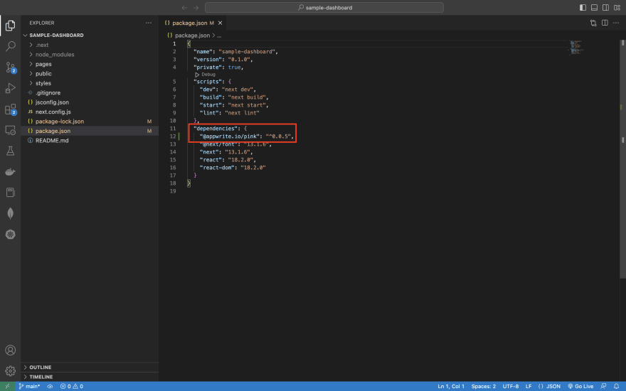
The package should be found in your package.json file.
To use Pink Design in your project, import it into your project’s JavaScript files.
Creating the dashboard
For the purpose of this tutorial, you will create a simple dashboard that shows some dummy contract data using Pink Design.
- Create a
src/componentsfolder at the root of your project. In the folder, create aContractStatus.jscomponent and paste the code below into it.
import "@appwrite.io/pink";
import "@appwrite.io/pink-icons";

const ContractStatus = () => {
    return (
        <div class="u-flex u-main-center">
            <div class="u-margin-32">
                <div class="status is-complete">
                    <span class="status-icon"></span>
                    <span class="text">Accepted</span>
                </div>
                <h4 class="heading-level-4 u-text-center">2,340</h4>
            </div>
            <div class="u-margin-32">
                <div class="status is-pending">
                    <span class="status-icon"></span>
                    <span class="text">In Contract</span>
                </div>
                <h4 class="heading-level-4 u-text-center">1,782</h4>
            </div>
            <div class="u-margin-32">
                <div class="status is-processing">
                    <span class="status-icon"></span>
                    <span class="text">In Approval</span>
                </div>
                <h4 class="heading-level-4 u-text-center">1,596</h4>
            </div>

        </div>
    )
}
export default ContractStatus;
The code above does the following:
- Lines 1 and 2 import Appwrite’s Pink Design package and its icons.
- In the main container, the u-flex class from Pink Design styles the container as flex, and u-main- center justifies the container’s content to the center.
- status is-complete, is-pending, is-processing specify the status of a process.
- The status-icon class uses the icon that matches the specified status class.
- heading-level-4 is a typographic functionality that specifies the heading size.
- u-margin-32 defines the margin of the container or item.
You can see from the code above how Pink Design makes it easy to style elements.
- Import the
src/components/ContractStatus.jscomponent into thepages/index.jsfile. The file should look like this at this point:
import Head from 'next/head'
import ContractStatus from '@/src/components/ContractStatus';
import "@appwrite.io/pink";
export default function Home() {
  return (
    <>
      <Head>
        <title>Contract Dashboard</title>
      </Head>
      <div class="box u-margin-32 u-padding-block-12">
        <h1 class="heading-level-1 u-text-center">Contract Dashboard</h1>
        <ContractStatus />
      </div>
    </>
  )
}
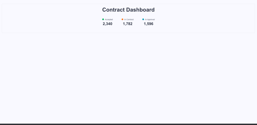
In the code above, the box class styles the container as a box, u-margin-32 applies a margin of 32px, and u-padding-block-12 applies a padding of 0.75rem.
At this point, your UI should look like this:
- Create a
src/components/CycleTime.jscomponent and paste the code below into it.
const CycleTime = () => {
    return (
        <div>
            <h4 class="heading-level-4 u-text-center">Average Cycle Time</h4>
            <div class="u-flex u-main-space-between">
                <div class="alert is-success u-width-250 u-margin-32">
                    <div class="alert-grid">
                        <div class="u-flex u-gap-32 u-cross-center">
                            <p class="u-bold">25 days</p>
                            <p class="u-bold">NDA</p>
                            <img
                                class="avatar"
                                width="32"
                                height="32"
                                src="https://unsplash.it/41"
                                alt="image"
                            />
                        </div>
                    </div>
                </div>
                <div class="alert is-success u-width-250 u-margin-32">
                    <div class="alert-grid">
                        <div class="u-flex u-gap-24 u-cross-center">
                            <p class="u-bold">12 days</p>
                            <p class="u-bold">Insurance</p>
                            <img
                                class="avatar"
                                width="32"
                                height="32"
                                src="https://unsplash.it/41"
                                alt="image"
                            />
                        </div>
                    </div>
                </div>
                <div class="alert is-success u-width-250 u-margin-32">
                    <div class="alert-grid">
                        <div class="u-flex u-gap-32 u-cross-center">
                            <p class="u-bold">45 days</p>
                            <p class="u-bold">Lease</p>
                            <img
                                class="avatar"
                                width="32"
                                height="32"
                                src="https://unsplash.it/41"
                                alt="image"
                            />
                        </div>
                    </div>
                </div>
                <div class="alert is-success u-width-250 u-margin-32">
                    <div class="alert-grid">
                        <div class="u-flex u-gap-24 u-cross-center">
                            <p class="u-bold">18 days</p>
                            <p class="u-bold">Purchase</p>
                            <img
                                class="avatar"
                                width="32"
                                height="32"
                                src="https://unsplash.it/41"
                                alt="image"
                            />
                        </div>
                    </div>
                </div>
            </div>

        </div>
    )
}

export default CycleTime;
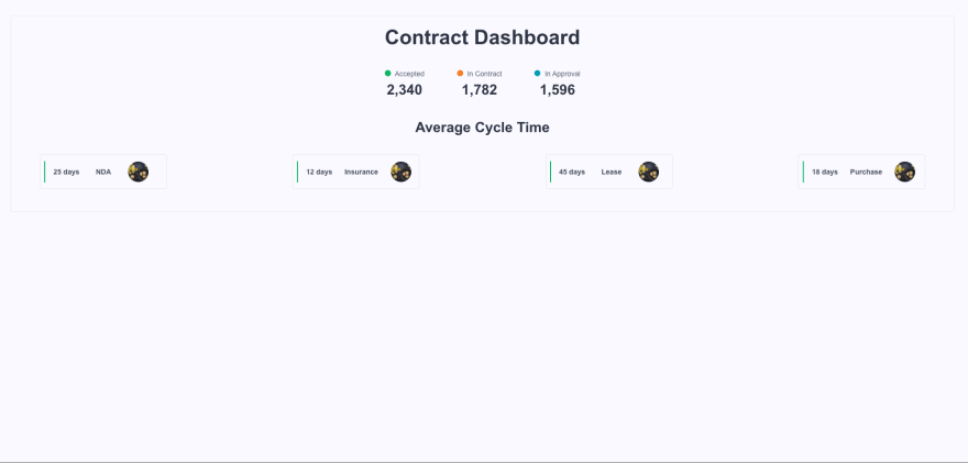
The code above creates a series of alert-grids for displaying some data. Alerts indicate task-generated and system-generated messages. In this case, it is static, but the purpose is to show how easy Pink Design aids in creating alerts. The type of alert must be set by the user: for example, is-success, is-warning, and is-info.
- Import the
src/components/CycleTime.jscomponent into thepages/index.jsfile. The file should look like this at this point:
import Head from 'next/head'
import ContractStatus from '@/src/components/ContractStatus';
import CycleTime from '@/src/components/CycleTime';
import "@appwrite.io/pink";

export default function Home() {
  return (
    <>
      <Head>
        <title>Contract Dashboard</title>
      </Head>
      <div class="box u-margin-32 u-padding-block-12">
        <h1 class="heading-level-1 u-text-center">Contract Dashboard</h1>
        <ContractStatus />
        <CycleTime/>
      </div>
    </>
  )
}
At this point, the UI should look like this:
- Create a
src/components/ContractTable.jscomponent and paste the code below into it.
import "@appwrite.io/pink";
import "@appwrite.io/pink-icons";

const ContractTable = () => {
    return (
        <div>
            <h4 class="heading-level-4 u-text-center">My Contracts</h4>
            <table class="table">
                <thead class="table-thead">
                    <tr class="table-row">
                        <th class="table-thead-col"><span class="eyebrow-heading-3">Serial No.</span></th>
                        <th class="table-thead-col">
                            <span class="eyebrow-heading-3">Name</span>
                        </th>
                        <th class="table-thead-col">
                            <span class="eyebrow-heading-3">Value</span>
                        </th>
                        <th class="table-thead-col">
                            <span class="eyebrow-heading-3">Status</span>
                        </th>
                        <th class="table-thead-col">
                            <span class="eyebrow-heading-3">Deadline</span>
                        </th>
                    </tr>
                </thead>
                <tbody class="table-tbody">
                    <tr class="table-row">
                        <td class="table-col" data-title="Name">
                            <div class="u-inline-flex u-cross-center u-gap-12">
                                <span class="text u-break-word u-line-height-1-5">1001</span>
                            </div>
                        </td>
                        <td class="table-col" data-title="Name">
                            <div><span class="text">Horizon Tech</span></div>
                        </td>
                        <td class="table-col" data-title="Value">
                            <span class="text">$48,292</span>
                        </td>
                        <td class="table-col" data-title="Status">
                            <div class="tag is-success">
                                <span class="text">Active</span>
                            </div>
                        </td>
                        <td class="table-col" data-title="Deadline">
                            <span class="text">01.01.2024</span>
                        </td>
                    </tr>
                    <tr class="table-row">
                        <td class="table-col" data-title="Name">
                            <div class="u-inline-flex u-cross-center u-gap-12">
                                <span class="text u-break-word u-line-height-1-5">1002</span>
                            </div>
                        </td>
                        <td class="table-col" data-title="Name">
                            <div><span class="text">Flowtech Labs</span></div>
                        </td>
                        <td class="table-col" data-title="Value">
                            <span class="text">$20,500</span>
                        </td>
                        <td class="table-col" data-title="Status">
                            <div class="tag is-warning">
                                <span class="text">Draft</span>
                            </div>
                        </td>
                        <td class="table-col" data-title="Deadline">
                            <span class="text">-</span>
                        </td>
                    </tr>
                    <tr class="table-row">
                        <td class="table-col" data-title="Name">
                            <div class="u-inline-flex u-cross-center u-gap-12">
                                <span class="text u-break-word u-line-height-1-5">1003</span>
                            </div>
                        </td>
                        <td class="table-col" data-title="Name">
                            <div><span class="text">ServerTech</span></div>
                        </td>
                        <td class="table-col" data-title="Value">
                            <span class="text">$15,800</span>
                        </td>
                        <td class="table-col" data-title="Status">
                            <div class="tag is-success">
                                <span class="text">Active</span>
                            </div>
                        </td>
                        <td class="table-col" data-title="Deadline">
                            <span class="text">01.03.2024</span>
                        </td>
                    </tr>
                    <tr class="table-row">
                        <td class="table-col" data-title="Name">
                            <div class="u-inline-flex u-cross-center u-gap-12">
                                <span class="text u-break-word u-line-height-1-5">1004</span>
                            </div>
                        </td>
                        <td class="table-col" data-title="Name">
                            <div><span class="text">DoveTech</span></div>
                        </td>
                        <td class="table-col" data-title="Value">
                            <span class="text">$20,500</span>
                        </td>
                        <td class="table-col" data-title="Status">
                            <div class="tag is-success">
                                <span class="text">Active</span>
                            </div>
                        </td>
                        <td class="table-col" data-title="Deadline">
                            <span class="text">01.01.2024</span>
                        </td>
                    </tr>
                </tbody>
            </table>

        </div>
    )
}
export default ContractTable;
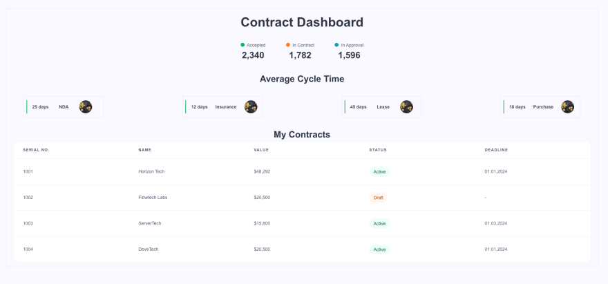
The code above creates a table using Appwrite’s Pink Design. Tables consist of five components:
| Class | Type |
|---|---|
| table-thead | Head |
| table-thead-col | Head Column |
| table-tbody | Body |
| table-row | Row |
| table-col | Column |
- Import the
src/components/ContractTable.jsinto thepages/index.jsfile. The file should look like this:
import Head from 'next/head'
import ContractStatus from '@/src/components/ContractStatus';
import ContractTable from '@/src/components/ContractTable';
import CycleTime from '@/src/components/CycleTime';
import "@appwrite.io/pink";

export default function Home() {
  return (
    <>
      <Head>
        <title>Contract Dashboard</title>
      </Head>
      <div class="box u-margin-32 u-padding-block-12">
        <h1 class="heading-level-1 u-text-center">Contract Dashboard</h1>
        <ContractStatus />
        <CycleTime/>
        <ContractTable/>
      </div>
    </>
  )
}
Finally, the UI should look like this at this point.
Conclusion
This tutorial described how to use Appwrite’s Pink Design to create a Dashboard. It showed the ease of use of Pink Design and its accessibility.
The resources below will be helpful:
This content originally appeared on DEV Community and was authored by Obinna Isiwekpeni
Obinna Isiwekpeni | Sciencx (2023-03-20T21:55:45+00:00) Building a dashboard with Next.js using Appwrite’s Pink Design. Retrieved from https://www.scien.cx/2023/03/20/building-a-dashboard-with-next-js-using-appwrites-pink-design/
Please log in to upload a file.
There are no updates yet.
Click the Upload button above to add an update.


