This content originally appeared on Telerik Blogs and was authored by Suzanne Scacca
Every year, design publications talk about exciting new trends to use in web design. But before you go implementing new trends and features in your digital products, make sure to clean out the old stuff that doesn’t belong there. Here are five trends and features that have passed their expiration dates.
Every year, the face of the web changes little by little as new design trends are introduced to the fold. The only problem is that it can easily make a website feel like a hoarder as it accumulates new features and design trends without letting go of the old ones.
Take the cookie consent bar. Back in 2018, these notification bars were everywhere thanks to the GDPR and all the news surrounding it. Over the last couple of years, however, fewer websites have these cookie notices affixed to the bottoms of their screens. But many still remain.
Web designers that aren’t paying attention to outdated trends as much as they are new ones can end up with websites with a bunch of useless features or ineffective designs. Rather than let that happen, let’s chip away at some of the trends that need to be tossed out for good and make room for the new ones to come.
5 Website Features & Design Trends We Don’t Need Anymore
By cleaning out the old features and designs that no longer serve us, we can make room for new and useful web design trends that make the internet a better place to be.
1. The Endless Scroll
I was going to label this one “infinite scroll,” but that trend thankfully isn’t as common today as it was just a couple years ago. That doesn’t mean that web designers and developers have completely done away with it though.
Take a look at this post on the Engadget site:
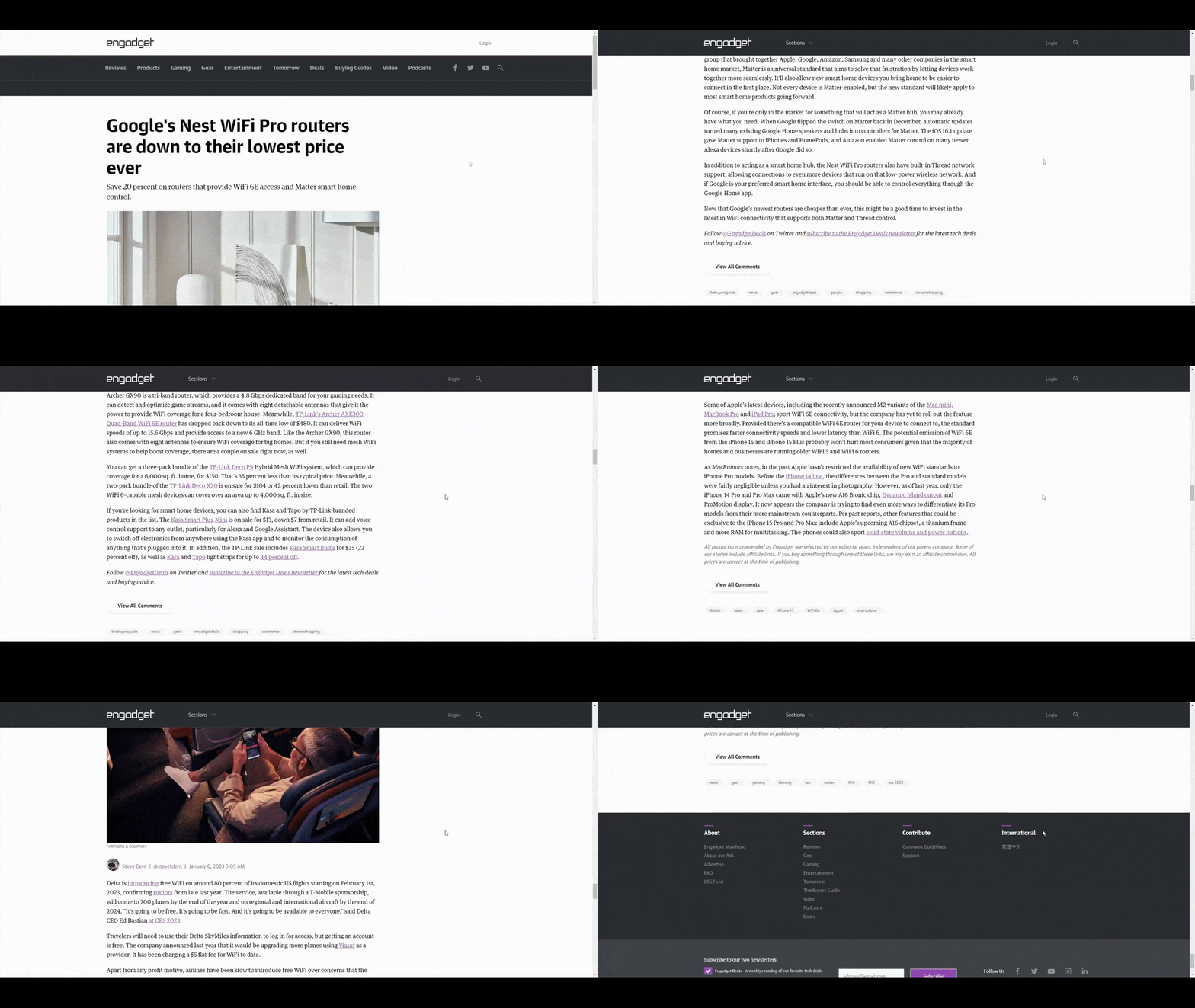
The reason someone would click the link to this page is to learn more about the Google router. And that’s what they’ll find at the top of the page. However, as they scroll past it, they’re going to discover five additional posts before they reach the end of the page.
Let’s be honest, this strategy employed by sites like Engadget and TechCrunch isn’t for the improvement of the user experience. It’s to decrease their own bounce rate, increase the time-on-page, and also make more money from affiliate marketing and advertising.
Although the infinite scroll was originally created to solve a pagination issue, it’s made websites like these (as well as social media apps that employ the infinite scroll) very addictive. As this post explains, users essentially adjust their “appetites” based on the perception of how much stuff is coming their way, which leads to the addictive endless scrolling and rabbit holes that sites like these offer.
There’s no reason to be designing web pages with infinite-like scrolls anymore, especially knowing the harms they can cause users. Take a look at Lifehacker, for example:
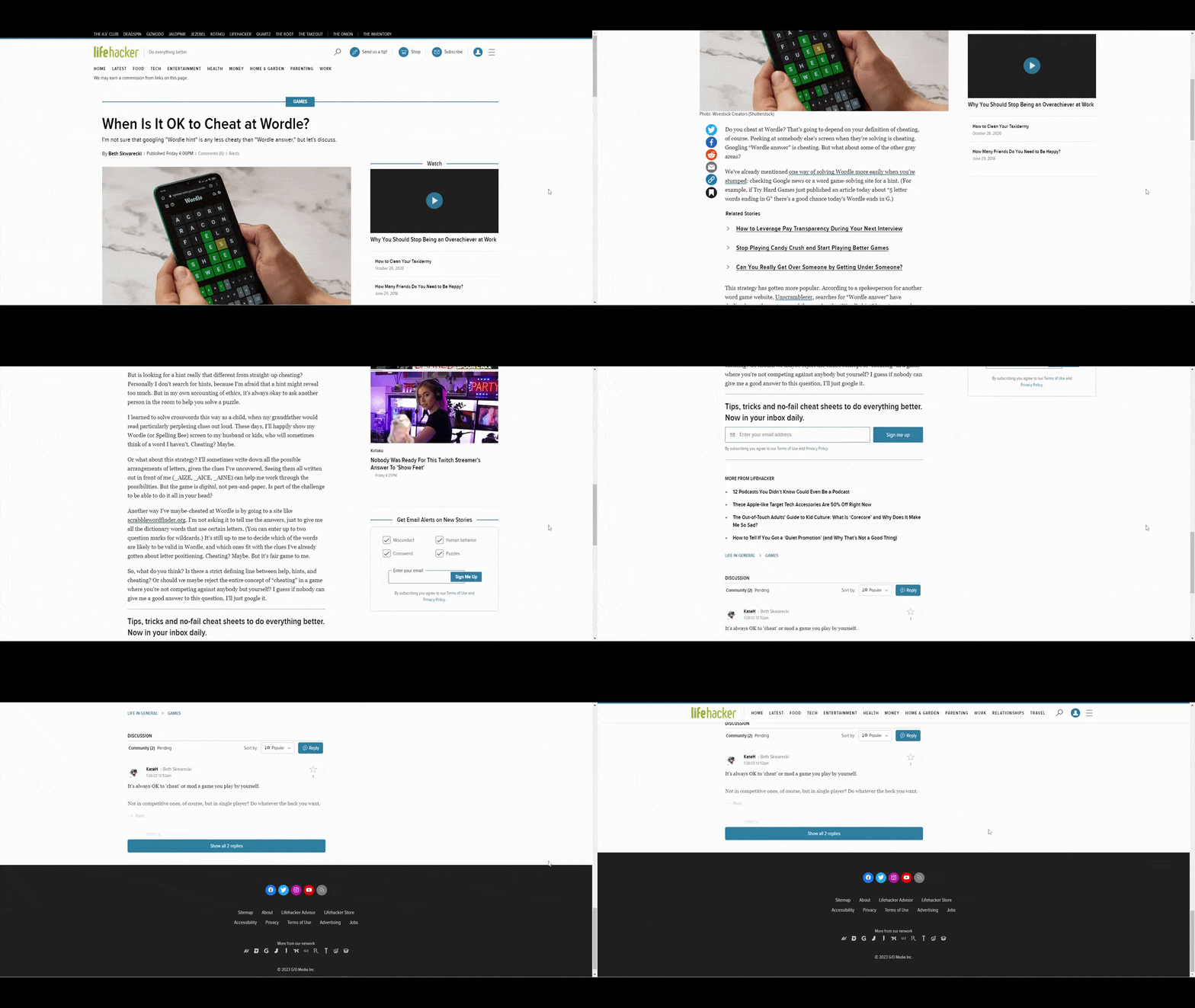
They operate in the same space as Engadget and have been successful in their own right. Yet, their content doesn’t go on and on, imploring users to keep reading or exploring other options. Even the comments section has been shortened to keep the length of the pages short.
2. Newsletter Popups
I’ve long been opposed to poorly placed website popups, especially those asking people to subscribe to their newsletter. I thought that when Google introduced its penalty on intrusive mobile popups, that would be the end of this practice.
However, this trend appears to be alive and well. For instance, when someone visits the Problogger blog and opens a post, they see the content for a brief moment before this full-screen interstitial popup slides into view.
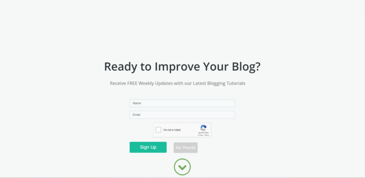
Before they’ve even had a chance to read the content and to know if it’s of any value, they’re being asked if they want to subscribe to the blog. What’s worse, they can’t dismiss this newsletter subscription pop-up the way they do other ones.
There’s no “X” in the top-right corner. Instead, they either have to click on the grayed-out “No Thanks” button, click the green down arrow, or scroll downward. All of these actions are intentionally unintuitive.
The better option is to do away with intrusive newsletter popups and build them into the reading experience. This way, you can properly time them and place them within the context of the blog.
Search Engine Journal is a good example to follow. The first appearance of the newsletter subscription form is at the top of the sidebar.
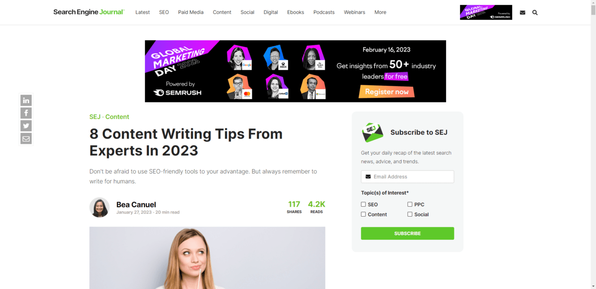
The form again appears beneath each post. This one asks for a bit more information from the user.
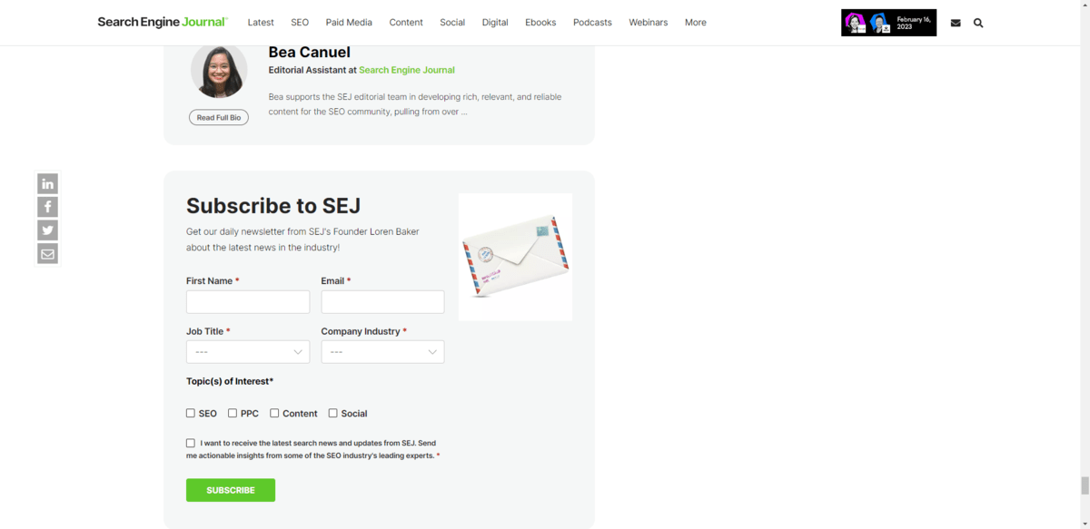
This is likely a more in-depth subscription form for two reasons. One is the amount of space available at the end of a post. Also, if someone has actually read to the bottom of a post, they’re likely going to be more interested in reading this type of content and willing to get tailored results.
3. Non-Standard Header Icons
The header is one of the most used and useful components on a website. To deviate from the norm can cause issues for users, especially ones who might not be as tech savvy and who depend on predictable header layouts and content to get around a site.
One trend, in particular, that needs to go away is non-standard header icons.
I often see this on heavily stylized websites—ones where the designer has gone overboard with custom imagery and iconography. While that can be good for establishing a unique style, you also have to consider what it does for usability.
For smaller sites that attract younger users, perhaps it’s not as big of a deal. However, for popular sites like BBC, using less popular icon designs can be problematic.
Here we see three horizontal dots at the end of the list of navigation links.
![]()
While this symbol is common in mobile app design, it’s not something you often see in web design. Tech-savvy and younger users will probably see the symbol and instantly recognize it as a place to go for other information or settings. Other users might not, though.
If you’re going to hide additional navigation links or settings under an icon (or the entire navigation altogether), then use the symbol that the majority of users will recognize without issue: The hamburger icon.
The Telegraph not only uses the hamburger icon, but it places it at the very right end of the header so it can be easily found.
![]()
The hamburger icon—and other commonly used website iconography—might not feel very exciting. However, in cases like these, the user experience matters more than creativity.
4. Accessibility Widgets
I had a meeting with a web designer recently who told me that he puts an accessiBe widget onto every website he builds. When I asked why, he explained that he was worried his clients would get sued for having an inaccessible website and that they’d in turn sue him.
That’s not a good reason to place one of those widgets onto a website as it’s not true web accessibility. There is no substitute for accessible design and development.
Accessibility widgets like the ones made by accessiBe and UserWay might still seem like a good way to supplement what you’re doing for accessibility with design, code and content. However, in some cases, they’ve actually rendered some websites inaccessible.
The issue has reached a boiling point with countless parties calling for businesses to stop using these automated accessibility plugins on their sites.
For instance, UsableNet’s 2021 Year End Report found that there were more than 400 lawsuits in 2021 brought against websites that had accessibility widgets. UsableNet explains:
“The promise to prevent ADA lawsuits by using an accessibility widget or overlays isn’t real. Many lawsuits in 2021 list widgets and overlay features as a barrier to equal access in addition to other inaccessible aspects of the website. This means these approaches give plaintiffs more claims to add to a lawsuit, not less.”
What’s more, accessiBe had their sponsorship revoked by the National Federation for the Blind in 2021. Here’s why:
“[I]t is the opinion of the Board that accessiBe peremptorily and scornfully dismisses the concerns blind people have about its products and its approach to accessibility. The Board is deeply concerned that the company treats blind access technology experts shabbily and disrespectfully in private meetings and disparages the blind in the press and their other communications. It seems that accessiBe fails to acknowledge that blind experts and regular screen reader users know what is accessible and what is not.”
So if you’ve used any of these accessibility plugins on a website before or you encounter a new client with one, get rid of them ASAP. Accessibility built into the product might take more time and effort to produce, but it provides more authentic accessibility as well as a better shield for companies nervous about being sued.
5. SEO Footers
The footer of a website should serve a purpose. What that purpose is depends on what type of website you run and how much content you have.
Footers most commonly serve as storage for:
- Secondary navigations
- Copyright info
- Social media links
- Privacy statements and terms of use
- Trust marks
What they shouldn’t do, however, is serve as a space to place a whole bunch of search-optimized text. This deceptive SEO practice can not only hurt how your website ranks in search, but it will likely cause a poor user experience.
Let’s look at the SurveyMonkey footer as an example:
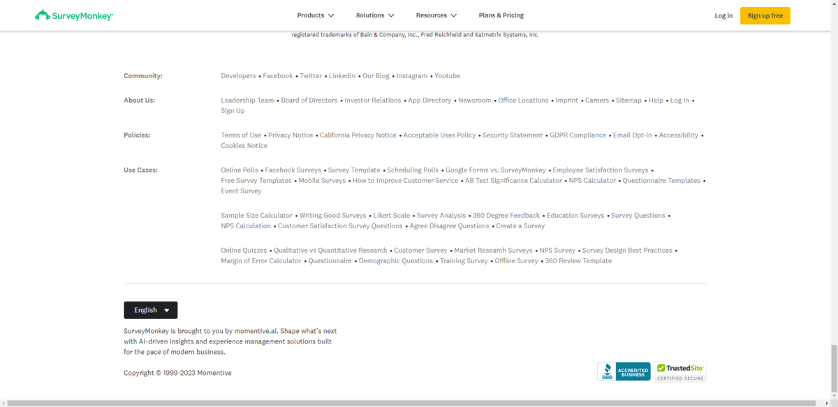
The first giveaway that this footer was designed for SEO and not for usability is the layout. You never see horizontally aligned footer links for a reason. It’s just too difficult to sift through all the options in this format, at this text size and in this lighter font color.
Secondly, the “Use Cases” links aren’t all pointing to SurveyMonkey tools. For instance, some of them point to blog posts and how-tos. This particular section of the footer looks like it was put together in order to craft a story about what SurveyMonkey does. And because the footer appears on every page, it means that this “story” will be associated with every page when it’s being indexed and ranked by search engines.
There is no excuse for black hat SEO in 2023, especially when we know what good SEO looks like and how to implement it.
So, when it comes time to design a footer for your website, take the approach that Target does.
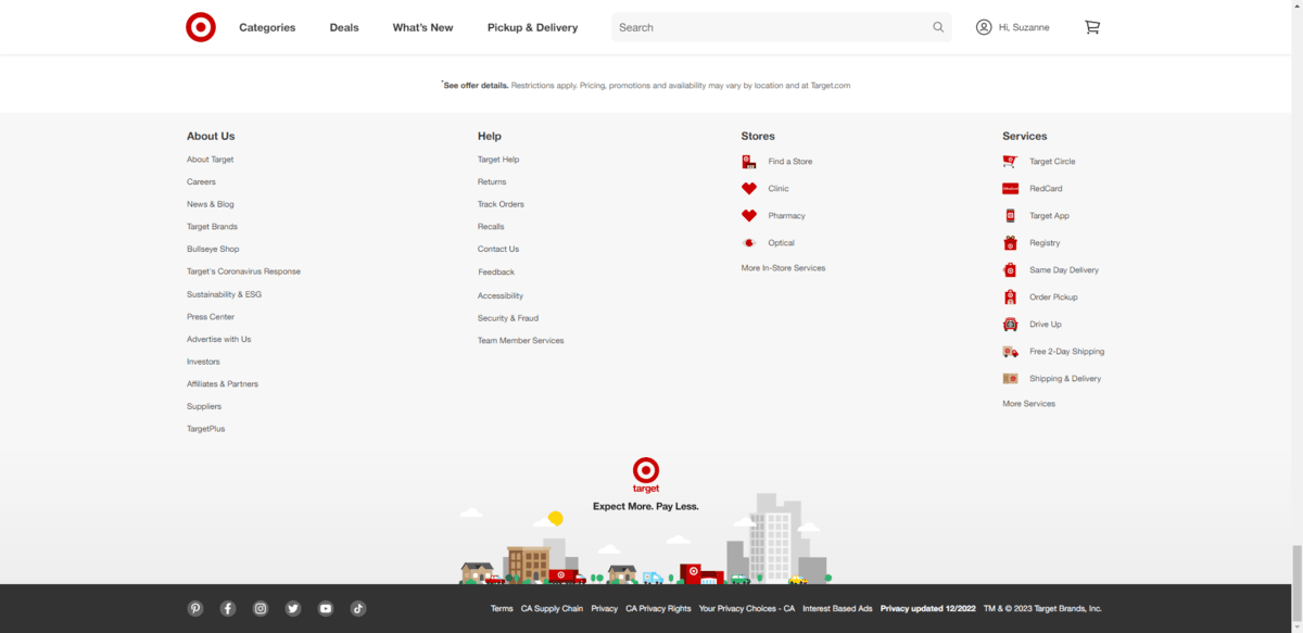
This is a more traditional footer in the sense that it stores all the stuff that doesn’t fit in the primary navigation or just doesn’t belong there. That said, you can see that vertically aligned navigation links don’t have to be boring.
Target’s designer has added relevant icons to the Stores and Services links, which makes them much easier to search through. There’s also a cute illustration at the bottom. And, beneath that, is the bar containing other important links—to social media as well as the terms and privacy pages. This is both an attractive and useful footer designed for users, not search engines.
Wrapping up
While these website trends and features are ones that have clearly passed their expiration dates, they’re not the only ones. So before you go implementing new design features or trends on a website, review what’s there now.
Is there anything that’s from a previous era of design? Or that feels like it’s overused on the web? Or that’s ineffective and is just getting in the way?
Stay on the lookout when building new sites and redesigning existing ones. Just because a trend or feature was popular at one point, that doesn’t mean it always will be. Plus, the more you can clear out the old, the more room you’ll have for new and innovative trends.
This content originally appeared on Telerik Blogs and was authored by Suzanne Scacca
Suzanne Scacca | Sciencx (2023-03-24T07:36:01+00:00) 5 Features & Trends That Shouldn’t Appear on Websites in 2023. Retrieved from https://www.scien.cx/2023/03/24/5-features-trends-that-shouldnt-appear-on-websites-in-2023/
Please log in to upload a file.
There are no updates yet.
Click the Upload button above to add an update.
