This content originally appeared on Bits and Pieces - Medium and was authored by ugur salin

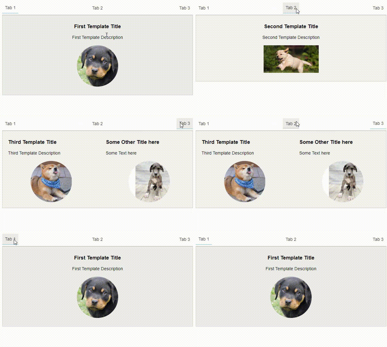
We want to build a tabs component that is widely used in web applications.
A simple structure could look something like this:
As you can see in the structure, we need two components to make this happen.
- ui-tab-item — holds the state (tabName, template, and content)
- ui -tabs — renders the template using its children
The ui-tab-item component receives tabName, template, and content that will be displayed by the parent.
Notice that the template of the ui-tab-item will not be rendered on DOM, since it is not technically part of the parent component template.
We access the children’s state on the parent like this:
We access the child components using the ContentChildren decorator in the .ts file. Child components will be available in the ngAfterContentInit life-cycle hook.
This reference allows us access to UITabItem Components passed between the <ui-tabs></ui-tabs> tags in the initial HTML file.
In ui-tabs HTML file, we can iterate over the tabs, and display the state we want — tabName for starters.
Now you should be able to see the tab names in the UI. But we still need to implement changing the active tab and displaying the active tab’s content.
By default, we are assigning the second UITabItem Component (indexed 1) to be the active tab. You can make another one active by using one of the other options.
We allow the user to change the active tab using a click event in the HTML file, which triggers the activateTab function.
The content of the active tab is displayed like this:
Using ngTemplateOutlet, we tell Angular to render activeComponent’s template. ngTemplateOutletContext allows us to specify which data to use.
These values will be bound to chosen template in the app.component.html to display the active tab and its contents.
Now we just should add some CSS to make it look better.

This was a minimal implementation of a Tabs component in Angular to help you get started if you want to build one of your own.
💡 Note: Once you’ve created your Tabs component, you can use an open-source toolchain such as Bit to “harvest” it from your codebase and share it on bit.dev. This would let you reuse your component across multiple projects and teams. You can learn more about this here.
Stackblitz demo can be found below:
Build Angular Apps with reusable components, just like Lego

Bit’s open-source tool help 250,000+ devs to build apps with components.
Turn any UI, feature, or page into a reusable component — and share it across your applications. It’s easier to collaborate and build faster.
Split apps into components to make app development easier, and enjoy the best experience for the workflows you want:
→ Micro-Frontends
→ Design System
→ Code-Sharing and reuse
→ Monorepo
Learn more:
- Introducing Angular Component Development Environment
- 10 Useful Angular Features You’ve Probably Never Used
- 11 Top Angular Developer Tools for 2020
- How We Build Micro Frontends
- How to Share Angular Components Between Projects and Apps
- How we Build a Component Design System
Creating a Tabs Component in Angular was originally published in Bits and Pieces on Medium, where people are continuing the conversation by highlighting and responding to this story.
This content originally appeared on Bits and Pieces - Medium and was authored by ugur salin
ugur salin | Sciencx (2023-04-03T05:07:07+00:00) Creating a Tabs Component in Angular. Retrieved from https://www.scien.cx/2023/04/03/creating-a-tabs-component-in-angular/
Please log in to upload a file.
There are no updates yet.
Click the Upload button above to add an update.
