This content originally appeared on Level Up Coding - Medium and was authored by Artiom Khalilyaev
A Step-by-Step Guide to Implementing a User-Friendly and Engaging UI Element
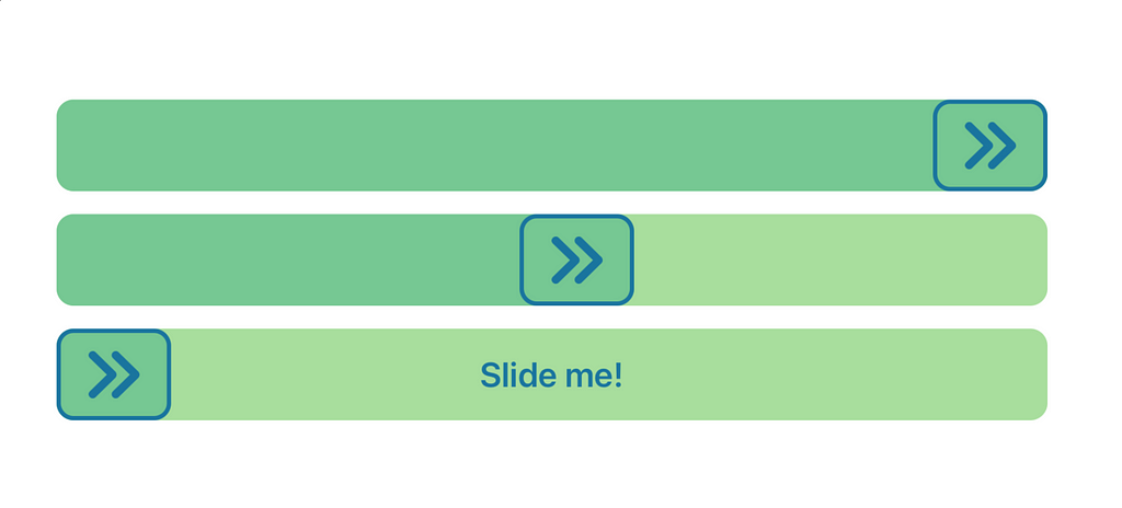
A slide to action button is a type of button that requires the user to slide or swipe a finger across the button in order to activate it. It is a popular design pattern in mobile app interfaces that helps prevent accidental clicks or taps, while also providing a more engaging and interactive experience for users.
Apple’s native UI frameworks don’t provide us with this component. In this series of articles, I’m going to show you how to implement it using both UIKit and SwiftUI frameworks. This article covers UIKit implementation.
Decomposition
Before we start coding, I want to decompose slide to action button. It will help you to get better understanding of what we are going to do.
Here’s a breakdown of the slide to action button into its subviews:
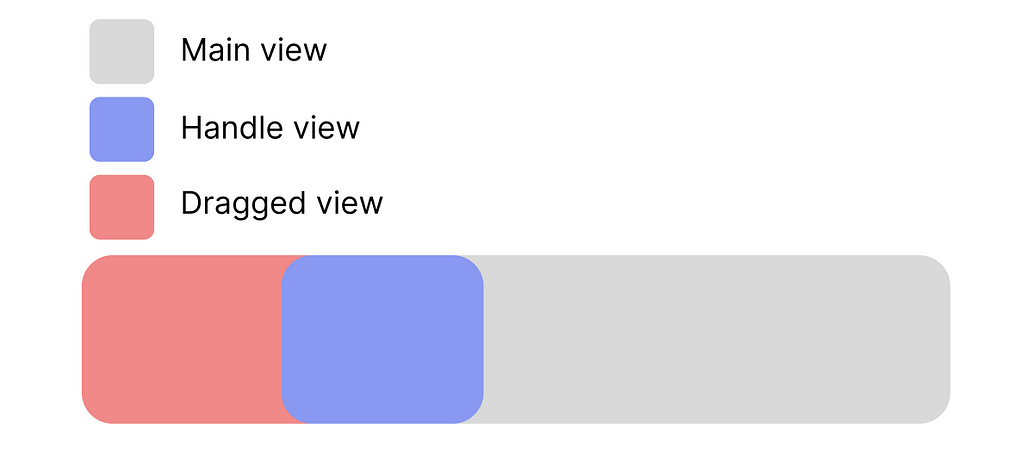
- Main view. This is the primary view of the slide to action button, which serves as the background or base of the button. It typically includes the background color, shape, and any text or graphics on the button;
- Handle view. This is the view that represents the handle or slider of the slide to action button;
- Dragged view. This is the view that appears when the user drags the handle view to a certain point.
UIKit implementation
This is the button we are going to create in this chapter:
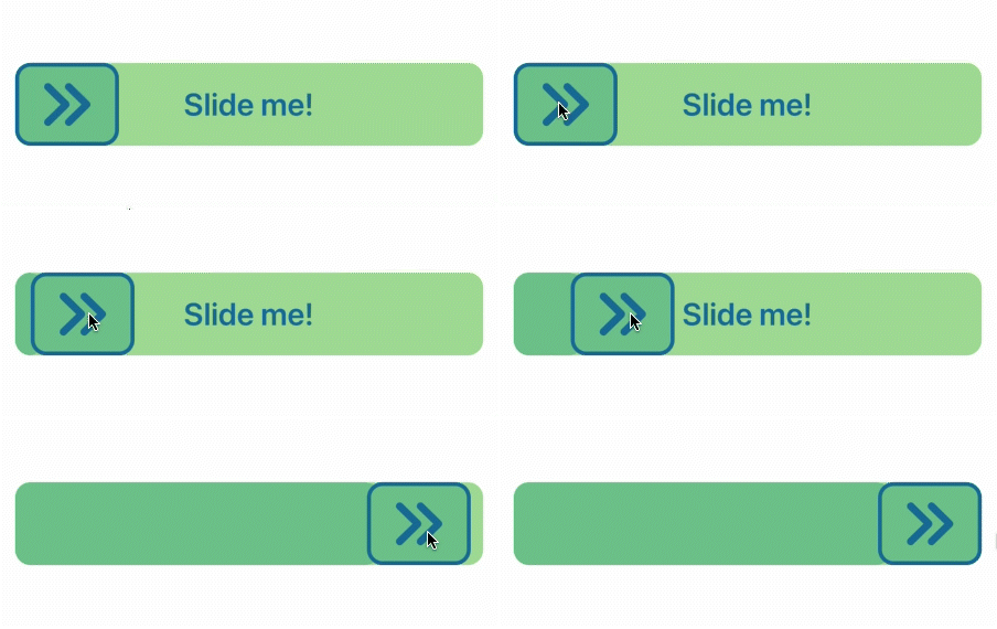
In addition to a background, the button has three subviews: label, handle, and dragged view. To create this button, we will need to make a UIView subclass and name it SlideToActionButton.
class SlideToActionButton: UIView {

    init() {
        super.init(frame: .zero)
    }

    required init?(coder: NSCoder) {
        super.init(coder: coder)
    }

}
Before we can add and configure the subviews, we need to add the Colors struct to our project. This struct contains all the colors we will need for our slide to action button.
struct Colors {
    static let background = #colorLiteral(red: 0.657153666, green: 0.8692060113, blue: 0.6173200011, alpha: 1)
    static let draggedBackground = #colorLiteral(red: 0.462745098, green: 0.7843137255, blue: 0.5764705882, alpha: 1)
    static let tint = #colorLiteral(red: 0.1019607843, green: 0.4588235294, blue: 0.6235294118, alpha: 1)
}
Now it’s time to add label, handle, and dragged views. We will use UIView with an image inside as a handle.
let handleView: UIView = {
    let view = UIView()
    view.translatesAutoresizingMaskIntoConstraints = false
    view.backgroundColor = Colors.draggedBackground
    view.layer.cornerRadius = 12
    view.layer.masksToBounds = true
    view.layer.borderWidth = 3
    view.layer.borderColor = Colors.tint.cgColor
    return view
}()

let handleViewImage: UIImageView = {
    let view = UIImageView()
    view.translatesAutoresizingMaskIntoConstraints = false
    view.image = UIImage(systemName: "chevron.right.2", withConfiguration: UIImage.SymbolConfiguration(font: .systemFont(ofSize: 40, weight: .bold)))?.withRenderingMode(.alwaysTemplate)
    view.contentMode = .scaleAspectFit
    view.tintColor = Colors.tint
    return view
}()

let draggedView: UIView = {
    let view = UIView()
    view.translatesAutoresizingMaskIntoConstraints = false
    view.backgroundColor = Colors.draggedBackground
    view.layer.cornerRadius = 12
    return view
}()

let titleLabel: UILabel = {
    let label = UILabel()
    label.translatesAutoresizingMaskIntoConstraints = false
    label.textAlignment = .center
    label.textColor = Colors.tint
    label.font = .systemFont(ofSize: 24, weight: .semibold)
    label.text = "Slide me!"
    return label
}()
Once we have configured all the subviews, we will need to add them to our button and configure their constraints. However, before we proceed with this step, it’s important to understand how the slider works.
To achieve the desired functionality, we will need to move the handleView using a pan gesture. This means that we will need to have a reference to the constraint that connects the left side of the handleView to the left side of its superview. By changing the offset value of this constraint, we will be able to move the handleView and track its position.
To accomplish this, we need to create a property of type NSLayoutConstraint?, which we will use to store a reference to the handleView’s left constraint.
private var leadingThumbnailViewConstraint: NSLayoutConstraint?
Now we need to add all subviews to the superview and set up their constraints. Create a setup() method for that purpose:
func setup() {
    backgroundColor = Colors.background
    layer.cornerRadius = 12
    addSubview(titleLabel)
    addSubview(draggedView)
    addSubview(handleView)
    handleView.addSubview(handleViewImage)

    //MARK: - Constraints

    leadingThumbnailViewConstraint = handleView.leadingAnchor.constraint(equalTo: leadingAnchor)

    NSLayoutConstraint.activate([
        leadingThumbnailViewConstraint!,
        handleView.topAnchor.constraint(equalTo: topAnchor),
        handleView.bottomAnchor.constraint(equalTo: bottomAnchor),
        handleView.widthAnchor.constraint(equalToConstant: 80),
        draggedView.topAnchor.constraint(equalTo: topAnchor),
        draggedView.bottomAnchor.constraint(equalTo: bottomAnchor),
        draggedView.leadingAnchor.constraint(equalTo: leadingAnchor),
        draggedView.trailingAnchor.constraint(equalTo: handleView.trailingAnchor),
        handleViewImage.topAnchor.constraint(equalTo: handleView.topAnchor, constant: 10),
        handleViewImage.bottomAnchor.constraint(equalTo: handleView.bottomAnchor, constant: -10),
        handleViewImage.centerXAnchor.constraint(equalTo: handleView.centerXAnchor),
        titleLabel.leadingAnchor.constraint(equalTo: leadingAnchor),
        titleLabel.trailingAnchor.constraint(equalTo: trailingAnchor),
        titleLabel.centerYAnchor.constraint(equalTo: centerYAnchor)
    ])
}
The handleView should have constraints to the top, bottom, and left sides of its superview, as well as a fixed width of 80. The handleImageView and titleLabel should be positioned in the center of their superviews.
Now let’s take a closer look at the draggedView constraints. The draggedView should have top, bottom, and leading constraints to its superview, as well as a trailing constraint to the handleView. You may notice that the trailing constraint is equal to the handleView’s trailing constraint rather than its leading constraint. This is because of the handleView’s corner radius.
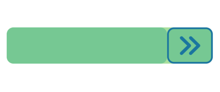
A small part of a background is visible, since handleView has a shape of rounded rectangle. When the draggedView trailing constraint is equal to the handleView trailing constraint, the right end of the draggedView is covered by the handleView, so the background will not be visible, regardless of the shape of the handleView.
Call setup() method inside the init().
init() {
    super.init(frame: .zero)
    setup()
}
Now that the UI has been configured, we can add the SlideToActionButton to the screen and see how it looks. However, at this point, it is just a static view. To add swipe functionality, we need to attach a UIPanGestureRecognizer to the handleView.
To get started, we need to create a property for the UIPanGestureRecognizer as well as a handler function that will respond to the gesture.
private var panGestureRecognizer: UIPanGestureRecognizer!

@objc private func handlePanGesture(_ sender: UIPanGestureRecognizer) { }
Add gesture recognize to the handleView inside setup() method:
  panGestureRecognizer = UIPanGestureRecognizer(target: self, action: #selector(self.handlePanGesture(_:)))
  panGestureRecognizer.minimumNumberOfTouches = 1
  handleView.addGestureRecognizer(panGestureRecognizer)
Now, let’s focus on the handlePanGesture method, where we will implement the swiping logic. Our first step is to obtain the current position of the user’s finger and assign this value to the offset of the leadingThumbnailViewConstraint.
@objc private func handlePanGesture(_ sender: UIPanGestureRecognizer) {
    let translatedPoint = sender.translation(in: self).x
    leadingThumbnailViewConstraint?.constant = translatedPoint
}
Start your project, to see how it works. Did you find an issue? I did. We can move our handle outside the button bounds.
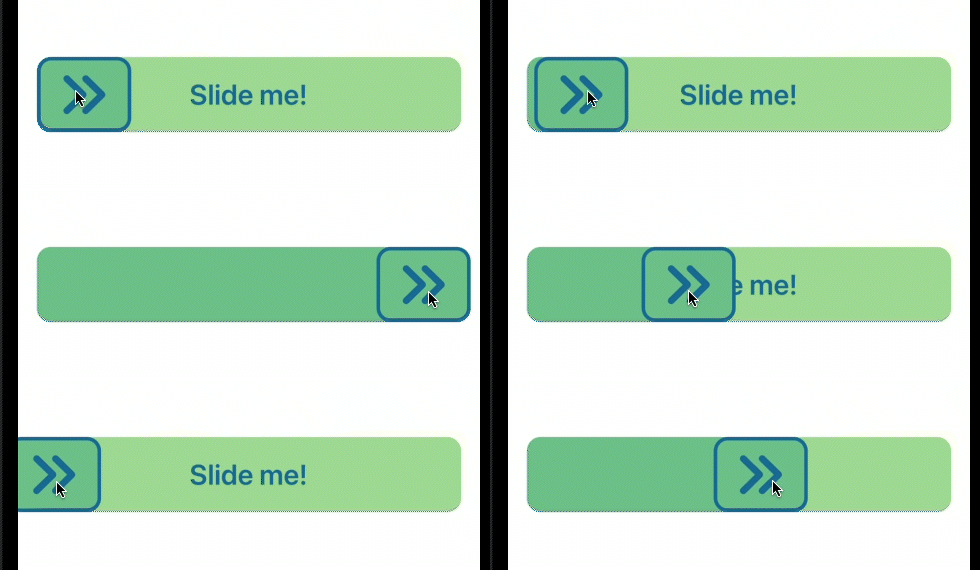
To properly set up a pan gesture, we need a way more than two lines of code.
Before we continue working on the pan gesture handler, let’s create some helper properties and methods. Our first step is to determine the ending X point of the button so that we can determine if we have reached the end of the slider. This point is equal to the button’s width minus the handleView’s width.
private var xEndingPoint: CGFloat {
    return (bounds.width - handleView.bounds.width)
}
We also need a boolean flag to determine whether the sliding action has been completed or not.
private var isFinished = false
And let’s add two methods for changing the handleView position and resetting slider state.
private func updateHandleXPosition(_ x: CGFloat) {
    leadingThumbnailViewConstraint?.constant = x
}

func reset() {
    isFinished = false
    updateHandleXPosition(0)
}
Now, we can return to handlePanGesture. The UIPanGestureRecognizer has a few states, but we only need to handle two of them: .changed and .ended. We can use a switch statement inside handlePanGesture to do this.
@objc private func handlePanGesture(_ sender: UIPanGestureRecognizer) {
    let translatedPoint = sender.translation(in: self).x

    switch sender.state {
    case .changed:
        //TODO: - Handle changed state
    case .ended:
        //TODO: - Handle ended state
    default:
        break
    }
}
UIPanGestureRecongnizer state is equal to .changed when we interact with its view. Here we need to update the handleView position and make sure, that the handleView is inside the button’s bounds.
@objc private func handlePanGesture(_ sender: UIPanGestureRecognizer) {
    let translatedPoint = sender.translation(in: self).x

    switch sender.state {
    case .changed:
        if translatedPoint <= 0 {
          updateHandleXPosition(0)
        } else if translatedPoint >= xEndingPoint {
          updateHandleXPosition(xEndingPoint)
        } else {
          updateHandleXPosition(translatedPoint)
        }
    case .ended:
        //TODO: - Handle ended state
    default:
      break
    }
}
With the help of the if statements, we validate the current gesture X position. If the translatedPoint is equal to or less than 0, we set the handleView position to 0. If the translatedPoint is equal to or greater than xEndingPoint, we set the handleView position to the xEndingPoint value. And if the translatedPoint is inside the button bounds, we update the handleView position to the translatedPoint value.
Now we can move the handleView inside the button bounds, but we are not handling an action. Action should be handled when the user releases the handleView and handleView reaches the xEndingPoint position. We will handle it inside .ended case.
@objc private func handlePanGesture(_ sender: UIPanGestureRecognizer) {
  if isFinished { return }
  let translatedPoint = sender.translation(in: self).x

  switch sender.state {
  case .changed:
      if translatedPoint <= 0 {
          updateHandleXPosition(0)
      } else if translatedPoint >= xEndingPoint {
          updateHandleXPosition(xEndingPoint)
      } else {
          updateHandleXPosition(translatedPoint)
      }
  case .ended:
      if translatedPoint >= xEndingPoint {
          self.updateHandleXPosition(xEndingPoint)
          isFinished = true
          //TODO: - add action handler
      } else {
          UIView.animate(withDuration: 1) {
              self.reset()
          }
      }
  default:
    break
  }
}
We check if the translatedPoint is equal to or greater than the xEndingPoint, and if it is, we set the handleView position to the xEndingPoint value and the isFinished property to true. At the beginning of this function, we check the value of the isFinished property, and if it is true, we do nothing. If the translatedPoint is less than the xEndingPoint, we reset the state with a smooth animation.
We are almost done, the last step is to add a delegate to our button. With its help, we will be able to inform button’s superview that button action was finished.
Create a protocol, that we will use as a delegate:
protocol SlideToActionButtonDelegate: AnyObject {
    func didFinish()
}
Add delegate property to the SlideToActionButton:
weak var delegate: SlideToActionButtonDelegate?
And now replace the TODO comment from the last code snippet with a delegate method:
   if translatedPoint >= xEndingPoint {
       self.updateHandleXPosition(xEndingPoint)
       isFinished = true
       delegate?.didFinish()
   } else {
       UIView.animate(withDuration: 1) {
           self.reset()
       }
   }
We are done. We’ve just created a slide to action button using UIKit framework.
Conclusion
A slide to action button is a useful UI component. In this article, I’ve showed you how to create it using UIKit framework. In the next part, I will show you how to create it using SwiftUI.
I hope you enjoyed this article and find it useful. Thanks for your time and see you later!
Source code can be found here.
Check out my other articles about iOS Development

https://medium.com/@artem.khalilyaev
Level Up Coding
Thanks for being a part of our community! Before you go:
- 👏 Clap for the story and follow the author 👉
- 📰 View more content in the Level Up Coding publication
- 💰 Free coding interview course ⇒ View Course
- 🔔 Follow us: Twitter | LinkedIn | Newsletter
🚀👉 Join the Level Up talent collective and find an amazing job
Designing a Slide-to-Action Button in Swift Using UIKit Framework was originally published in Level Up Coding on Medium, where people are continuing the conversation by highlighting and responding to this story.
This content originally appeared on Level Up Coding - Medium and was authored by Artiom Khalilyaev
Artiom Khalilyaev | Sciencx (2023-04-06T02:40:40+00:00) Designing a Slide-to-Action Button in Swift Using UIKit Framework. Retrieved from https://www.scien.cx/2023/04/06/designing-a-slide-to-action-button-in-swift-using-uikit-framework/
Please log in to upload a file.
There are no updates yet.
Click the Upload button above to add an update.
