This content originally appeared on Telerik Blogs and was authored by Jon Hilton
Learn how the Telerik UI for Blazor Data Grid can make working with data in your Blazor web applications much easier.
If there’s one thing you’re likely to find yourself doing in your Blazor web applications, it’s working with data. The simplest (and most common) way to do this is often via a table (or grid). User lists, Recent Purchase Orders, Last Week’s Sales—there’s seemingly no limit to the types of data you can show in a table.
But when you’re asked to create that “recent sales” table, how do you go about it? You could turn to a foreach loop and a basic HTML table to get the job done; after all, that’s probably the simplest option.
But then, inevitably, the product owner wanders over and asks if you can make the table “sortable.”
You have a go, but very quickly, the requirements start to pile up. Now you need to make it possible to add and edit rows. Oh, and while you’re at it, can you enable filtering, grouping and aggregating data (to show totals)?
Suddenly that “simple” HTML table isn’t so simple after all!
Step up, Telerik UI for Blazor’s Data Grid.
Telerik UI for Blazor Data Grid
The Blazor Data Grid from Progress Telerik UI for Blazor makes it much easier to present tabular data (complete with all those “advanced” features, like filtering, sorting and paging).
To use it you need a data source. For a simple (and quick) option, to get up and running, you can use the Data parameter and give your grid an IEnumerable<T>.
First we need to declare an instance of the grid, and point it at some data:
GridDemoBasic.razor
<TelerikGrid Data="sales">
</TelerikGrid>
In this case we can use a hardcoded list as our data source:
@code {

    private IEnumerable<Sale> sales = Enumerable.Range(1, 100).Select(x => new Sale
    {
        Placed = DateTime.Now.AddDays(x),
        CustomerName = "Customer " + x,
        Id = x,
        Value = x * 20
    });

    private class Sale
    {
        public int Id { get; set; }
        public DateTime Placed { get; set; }
        public string CustomerName { get; set; }
        public decimal Value { get; set; }
    }

}
In production, this data could would come from a database query (for Blazor Server) or via an API call (Blazor WASM).
This, by itself, isn’t enough to make the grid work; we need to choose which columns to show.
For this we can specify one or more GridColumns:
<TelerikGrid Data="sales">
    <GridColumns>
        <GridColumn Field="Id" />
        <GridColumn Field="Placed" />
        <GridColumn Field="CustomerName" />
        <GridColumn Field="Value" />
    </GridColumns>
</TelerikGrid>
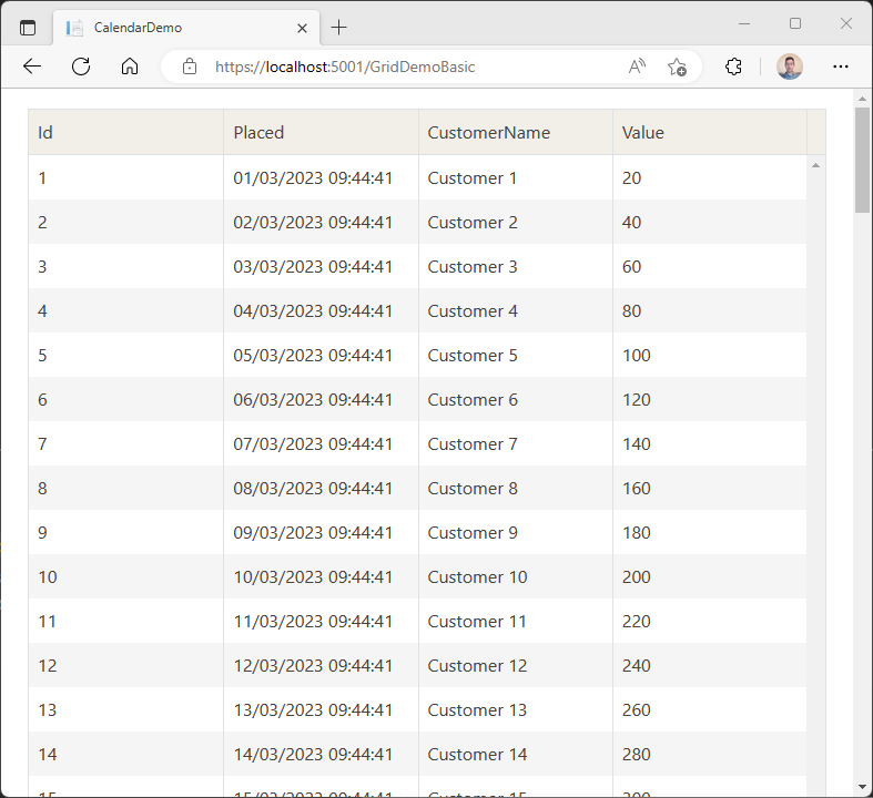
Now we have a nice simple grid of sales.
Make It Sortable
Let’s make the grid sortable:
<TelerikGrid Data="sales" Sortable="true">
    <GridColumns>
        <GridColumn Field="Id" />
        <GridColumn Field="Placed" />
        <GridColumn Field="CustomerName" />
        <GridColumn Field="Value" />
    </GridColumns>
</TelerikGrid>
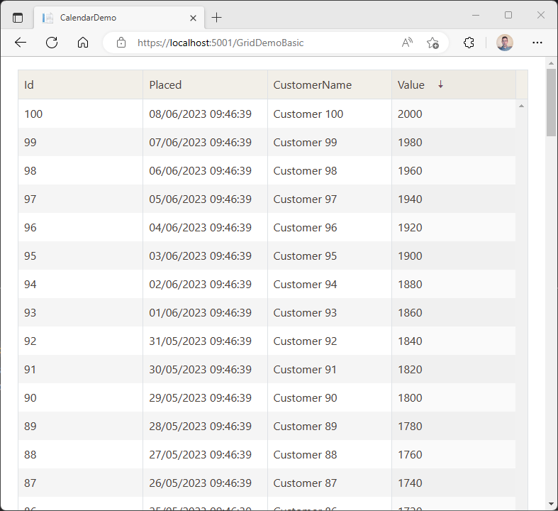
No we can click a column heading to sort it (multiple clicks toggle between sorting ascending, descending or not at all).
Enable Paging
Realizing there could be a lot of sales, we probably don’t want to show all of them at once. To make this a little more manageable, we can enable paging via the Pageable parameter:
<TelerikGrid Data="sales" Sortable="true" Pageable="true">
    <GridColumns>
        <GridColumn Field="Id" />
        <GridColumn Field="Placed" />
        <GridColumn Field="CustomerName" />
        <GridColumn Field="Value" />
    </GridColumns>
</TelerikGrid>
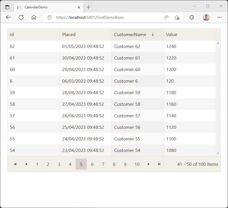
With this, we’ll get a paging footer for the grid, with a link to each page (and a summary of which items we’re looking at, and how many there are in total).
Group by Any Column
At this point it could be useful to group the data—for example, to see sales by product or customer.
Let’s adapt our example slightly to include a couple of products (we’ll assume one product per sale to keep things simple).
@code {

    private IEnumerable<Sale> sales = Enumerable.Range(1, 100).Select(x => new Sale
    {
        Placed = DateTime.Now.AddDays(x),
        CustomerName = "Customer " + x,
        Id = x,
        Value = x * 20,
        Product = x < 50 ? "iPhone" : "Android Phone" // split sales between two products
    });

    private class Sale
    {
        public int Id { get; set; }
        public DateTime Placed { get; set; }
        public string CustomerName { get; set; }
        public decimal Value { get; set; }
        // added this field
        public string Product { get; set; }
    }

}
This will split our auto-generated orders in half, with half being for an iPhone and the rest for an Android Phone.
Now let’s enable grouping for our grid:
<TelerikGrid Data="sales" Sortable="true" Groupable="true">
    <GridColumns>
        <GridColumn Field="Id" />
        <GridColumn Field="Product" />
        <GridColumn Field="Placed" />
        <GridColumn Field="CustomerName" />
        <GridColumn Field="Value" />
    </GridColumns>
</TelerikGrid>
I’ve included a GridColumn for the new Product field, set the Groupable parameter to true and, to keep things simple, removed the Pageable property for now.
With this we have a groupable (and still sortable) list of sales.
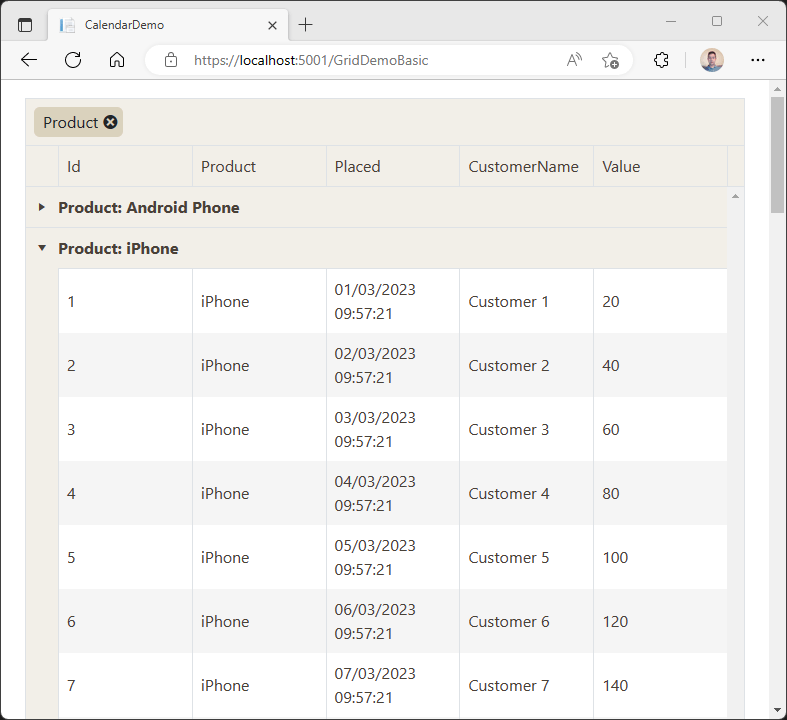
With grouping enabled, we can drag any column heading up to the top of the grid and the data will be grouped by that column (or columns).
Keeping up Appearances
At this point, there are some tweaks we can make to improve the look and feel of our data.
The Value field represents currency amounts, so we can go ahead and instruct the Data Grid to format those accordingly, in one of two ways:
One option is to apply a DisplayFormat to the property to the Sale itself using Microsoft’s Data Annotations.
private class Sale
{
    public int Id { get; set; }
    public DateTime Placed { get; set; }
    public string CustomerName { get; set; }

    [DisplayFormat(DataFormatString = "{0:c}")]
    public decimal Value { get; set; }
    public string Product { get; set; }
}
Alternatively, we can specify a DisplayFormat when we define the GridColumn in the grid.
<TelerikGrid ...>
    <GridColumns>
        ...
        <GridColumn Field="Value" DisplayFormat="{0:c}"/>
    </GridColumns>
</TelerikGrid>
Note that this will format the value according to the current culture of the thread that Blazor is running on.
Aggregate the Data
It’s pretty common, with a grid like this, to want to show aggregated data, such as sales totals.
To calculate aggregates, we first have to define them in the Grid itself:
<TelerikGrid ...>
    <GridAggregates>
        <GridAggregate Field="@nameof(Sale.Value)" Aggregate="GridAggregateType.Sum"/>
    </GridAggregates>
    <GridColumns>
        ...
    </GridColumns>
</TelerikGrid>
This won’t show the aggregate (yet) but enables the sum aggregate for the Value field on our Sale data.
Note the use of @nameof(Sale.Value) here; nameof() is a handy way to avoid accidentally using an incorrect name when referencing fields in the data source.
Every GridColumn can have an optional footer, defined via a FooterTemplate. These will appear at the bottom of the column, and are useful for showing totals or other information relating to that specific column.
Let’s define one for the Value column, and use it retrieve (and display) our aggregate (sum).
<TelerikGrid ...>
    <GridAggregates>
        <GridAggregate Field="@nameof(Sale.Value)" Aggregate="GridAggregateType.Sum"/>
    </GridAggregates>
<GridColumns>
...
        <GridColumn Field="Value" DisplayFormat="{0:c}">
            <FooterTemplate>
                @context.Sum
            </FooterTemplate>
        </GridColumn>
    </GridColumns>
</TelerikGrid>
We can access the context item for our footer template, which in turn provides access to the aggregate(s) for that field.
This value will come through without any formatting by default. If we want it formatted, we can do that by providing a format when calling .ToString():
<GridColumn Field="Value" DisplayFormat="{0:c}">
    <FooterTemplate>
        @context.Sum?.ToString("C", CultureInfo.CurrentCulture)
    </FooterTemplate>
</GridColumn>
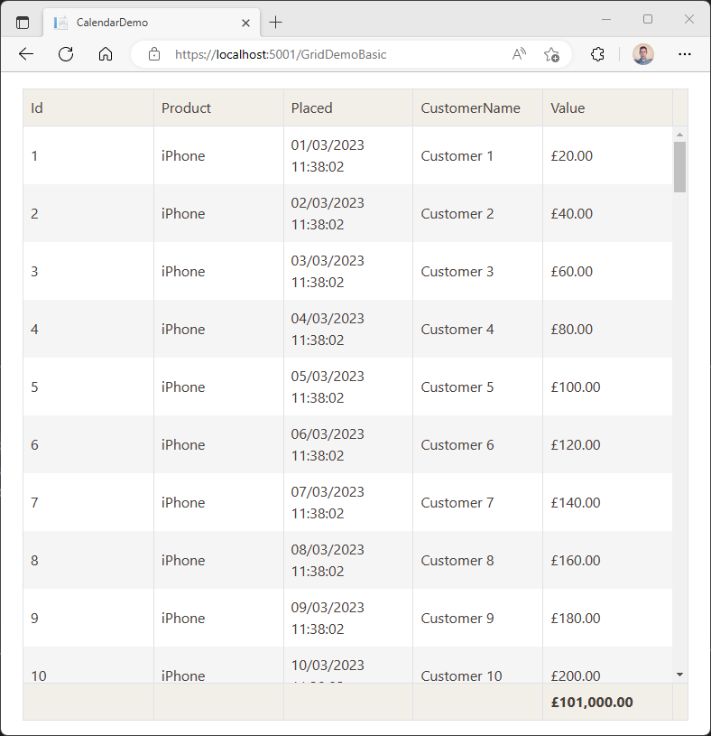
You can show data in a footer for any groups you end up with too.
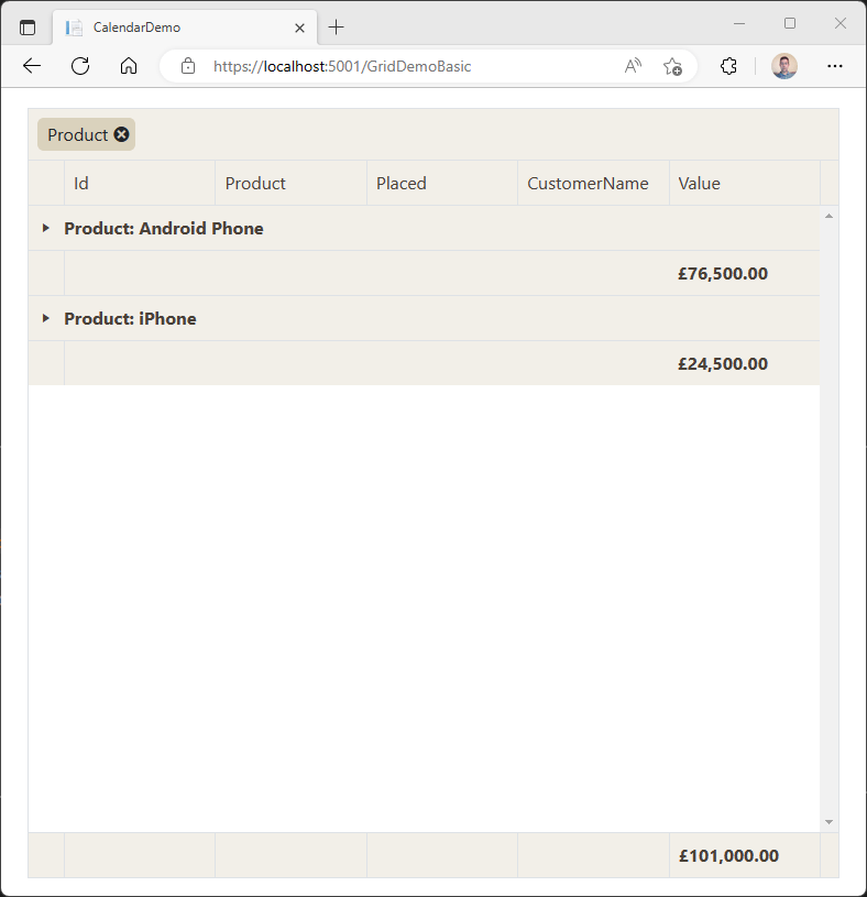
Going back to our grouping example from earlier (where we grouped results by Product), we can define a GroupFooterTemplate for the Value column, and that will show up when items are grouped.
<GridColumn Field="Value" DisplayFormat="{0:c}">
    <FooterTemplate>
        @context.Sum?.ToString("C", CultureInfo.CurrentCulture)
    </FooterTemplate>
    <GroupFooterTemplate>
       @context.Sum?.ToString("C", CultureInfo.CurrentCulture)
    </GroupFooterTemplate>
</GridColumn>
Here’s how it looks when we group by Product.
Optimizing the Grid with OnRead
So far all of our examples have made use of the Data parameter to get data into the grid.
With this approach, the entire data source is loaded in one go, then any operations the user performs (like filtering, grouping and sorting) are all performed on that data.
This works well for relatively small amounts of data, and is definitely the easiest way to get started. But you might want to take more control over that process, perhaps calling the server to perform operations like filtering and paging.
Let’s say, for example, you’re presenting every sale for the last year and don’t want to load thousands of records all in one go.
Telerik Grid provides another option—the OnRead event.
Telerik Grid will fire the OnRead event when it determines it needs to load more data. That might be when the user clicks to view Page 2 of results, or when they click to sort by a specific column, or any other event which requires the grid
to fetch a new “chunk” of data.
Let’s modify our previous example to use OnRead instead of Data:
<TelerikGrid OnRead="FetchData" TItem="@Sale" Pageable="true" ...>
    ...
</TelerikGrid>
We’ve dropped the Data parameter and replaced it with OnRead and TItem.
OnRead points to a method (which will ultimately fetch the data) and TItem informs the grid that our list will be a list of items of type Sale.
Now to handle the data fetching:
@code {

    private async Task FetchData(GridReadEventArgs args)
    {
        args.Data = sales
            .Skip((args.Request.Page-1)*args.Request.PageSize)
            .Take(args.Request.PageSize);

       args.Total = sales.Count();
    }

}
For this demo, we’ve already got our list of sales, so we’ll stick with that. In a real-world context you’d likely be interacting with a database (or service) here, as that’s where you’d see significant benefits from only loading the data you need to show on screen at any given time.
We can use the incoming GridReadEventArgs to find out what Page the user has requested, and the current PageSize. Armed with this information we can go ahead and fetch the relevant results from our sales collection.
We then need to provide the grid with Data and a Total, which we do via that GridReadEventArgs parameter.
With this, when someone interacts with the grid and requests a specific page of results, the code in FetchData will pull back just those results from the sales collection.
Where the grid previously held the entire collection in memory (when we were using the Data parameter), now the grid will only hold the current page in memory.
But what if you want to enable sorting, grouping and all the other useful functionality we explored earlier? It seems like we could spend quite a bit of time implementing that functionality in our code.
As it happens, there’s a handy extension method we can use to perform these operations automatically:
@code {

    private async Task FetchData(GridReadEventArgs args)
    {
        var dataSourceResult = sales.ToDataSourceResult(args.Request);

        args.Data = dataSourceResult.Data;
        args.Total = dataSourceResult.Total;
    }

}
You can use ToDataSource with any DataTable, IQueryable or IEnumerable and it will automatically apply all the necessary logic based on the user’s interactions with your grid (filtering, sorting,
grouping).
Not Just for Viewing Data—Edit Records as You Go
Finally, there are times you’ll want to make it easy for users to edit, delete or add records to your data via the grid.
Making this work is a case of enabling editing, then wiring up some handlers for the various events (add, edit, delete).
<TelerikGrid OnRead="FetchData" TItem="@Sale" EditMode="@GridEditMode.Inline"
             OnUpdate="@UpdateHandler" OnDelete="@DeleteHandler" OnCreate="@CreateHandler" ...>
    ...
</TelerikGrid>
Here we’ve hooked up three key events:
OnUpdate- fires when a modified item is savedOnCreate- fires when a newly added item is savedOnDelete- fires when an item is deleted
The content of those handlers will vary depending on your specific scenario.
@code {

    ...

    private void UpdateHandler(GridCommandEventArgs args)
    {
        var item = (Sale)args.Item;
        // save item
    }

    private void DeleteHandler(GridCommandEventArgs args)
    {
        var item = (Sale)args.Item;
        // delete item
    }

    private void CreateHandler(GridCommandEventArgs args)
    {
       var item = (Sale)args.Item;
        // save/add new entry
    }

}
Now if you were to view this grid right now, you won’t notice any changes—nothing is editable yet. For editing to work, we need to provide some buttons (for adding, editing and deleting).
Let’s start with a button to add a new entry:
<TelerikGrid OnRead="FetchData" TItem="@Sale" EditMode="@GridEditMode.Inline"
             OnUpdate="@UpdateHandler" OnDelete="@DeleteHandler" OnCreate="@CreateHandler" ...>
    <GridToolBarTemplate>
        <GridCommandButton Command="Add" Icon="@FontIcon.Plus">Add</GridCommandButton>
    </GridToolBarTemplate>
    ...
</TelerikGrid>
Now our grid will display a handy Add button which, when clicked, will add a new entry to the table.
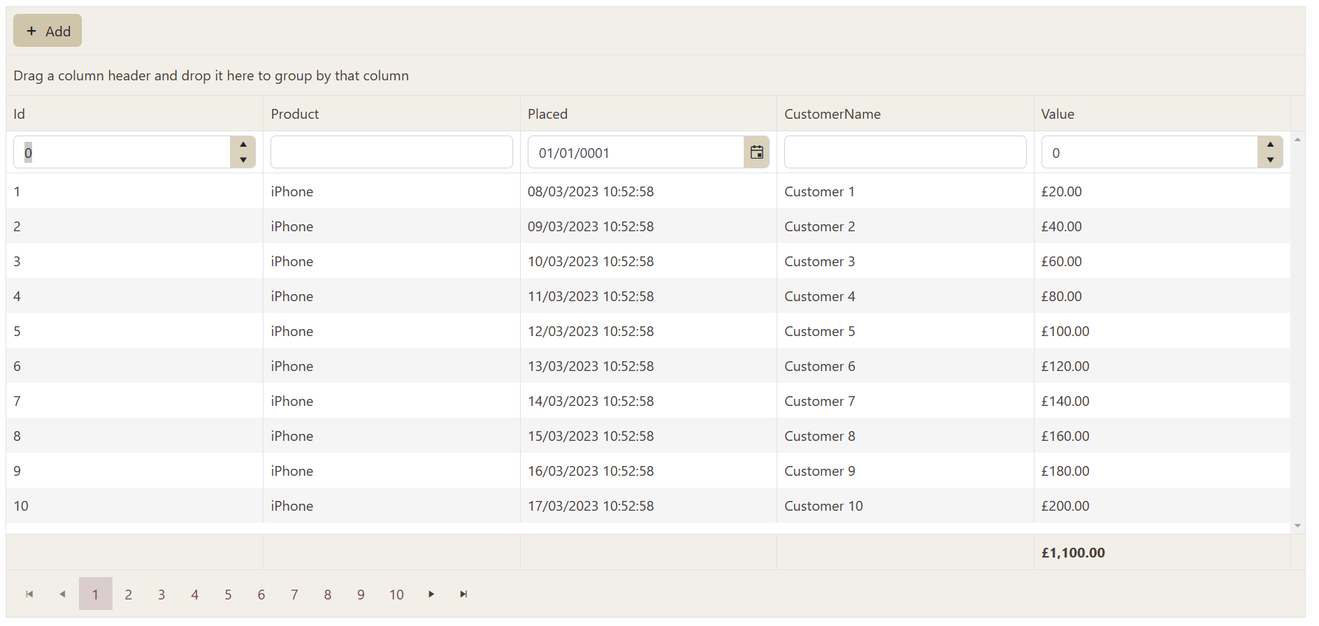
Notice how the Id column is currently editable. We can fix that with a little more config when defining our grid columns:
<GridColumns>
    <GridColumn Field="Id" Editable="false"/>
    ...
</GridColumns>
Finally, to add the Edit and Delete buttons, we can set content for the GridCommandColumn inside GridColumns:
<GridColumns>
    ...
<GridCommandColumn>
        <!-- these show up on each row -->
        <GridCommandButton Command="Edit" Icon="@FontIcon.Pencil">Edit</GridCommandButton>
        <GridCommandButton Command="Delete" Icon="@FontIcon.Trash">Delete</GridCommandButton>

         <!-- these appear for the row being edited -->
        <GridCommandButton Command="Save" Icon="@FontIcon.Save" ShowInEdit="true">Update</GridCommandButton>
        <GridCommandButton Command="Cancel" Icon="@FontIcon.Cancel" ShowInEdit="true">Cancel</GridCommandButton>
    </GridCommandColumn>
</GridColumns>
Now each row can be edited or deleted:
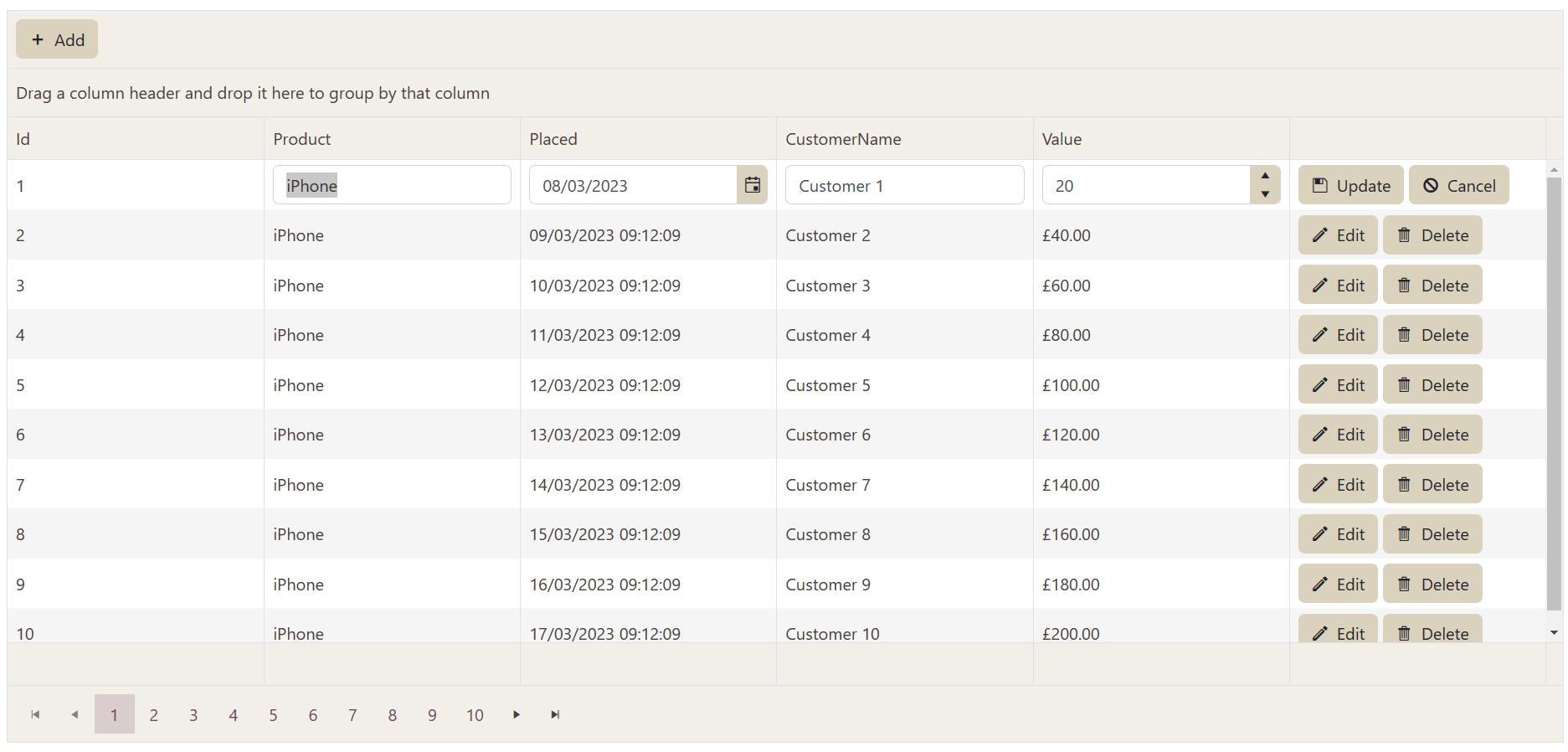
We also get buttons for the row being edited (or added) to Update the record, or Cancel (discard changes).
In Summary
We’ve just scratched the surface of what the Telerik UI for Blazor DataGrid can do.
If you need to present data in tabular form and/or make it easy to add, edit and delete items, the grid has your back.
With built-in support for filtering, paging, grouping and aggregating data the grid makes it quick and easy to present data, while also leaving you free to customize how the grid behaves.
You can tweak the appearance of all parts of the grid, including rows, columns, aggregates and command columns. And, when you need a little more control, you can wire up event handlers (like OnUpdate and OnRead) to perform additional
actions in response to grid events.
Try out Telerik UI for Blazor Today
Want to start taking advantage of Telerik Grid, or any of the other 100+ ready-made components? Start a free trial today and experience for yourself that building rich interactive applications for half the time is just a click away.
Feel free to share your experience and ideas in the comments section below or by visiting the Telerik UI for Blazor Feedback Portal. Your input makes a difference.
This content originally appeared on Telerik Blogs and was authored by Jon Hilton
Jon Hilton | Sciencx (2023-04-13T13:52:00+00:00) How to Get Started with Telerik Blazor Data Grid. Retrieved from https://www.scien.cx/2023/04/13/how-to-get-started-with-telerik-blazor-data-grid/
Please log in to upload a file.
There are no updates yet.
Click the Upload button above to add an update.
